If your website isn't converting visitors into customers, it's time to take action.
Fortunately, improving a website's conversion rate doesn't have to be complicated or expensive.
From writing compelling headlines and tweaking underlying code to running email marketing campaigns and A/B testing, numerous proven tactics can help you get better results from your online presence.
Ready to jumpstart conversions?
Read on for ten actionable techniques guaranteed to skyrocket your website's conversion rates!

Technique 1: A/B testing
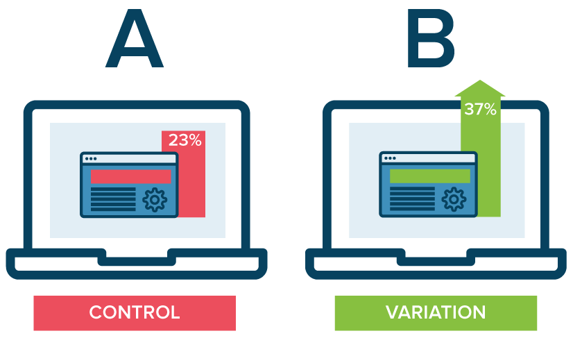
In short, A/B testing, also known as split testing, tests two versions of a web page against each other.
By running an A/B test, you can determine which version performs better. This allows you to optimize your website for maximum conversions.

How Can It Improve My Website's Conversion Rate?
A/B testing is an incredibly powerful tool for increasing conversion.
This is because it gives you an easy way to test different elements on your web page such as:
- headlines
- images
- copy
- or even the layout
so that you can quickly see which changes have the biggest impact on conversions.
You can also use A/B tests to identify potential issues with your web page's design or functionality that might hinder its performance.
For example, suppose one version of your web page performs significantly better than the other.
In that case, it could indicate a problem with the design or functionality that needs to be addressed.
You can significantly boost your website's overall conversion rate over time by running regular A/B tests and making improvements based on the results.
Steps for Implementing an A/B Test on Your Website:
- Create two versions of your webpage - one "Control" version (A) and one "Variation" version (B). Be sure to make only one change between each version to identify which change had the greatest impact on conversions easily.
- Set up tracking software so you can measure each version's performance using metrics like clicks, impressions, and conversions.
- Launch both versions simultaneously and let them run for a predetermined time (e.g., one week).
- Analyze the results and determine which version performed better than the other based on the metrics collected by your tracking software.
- Make any necessary changes based on what you learned from the test and start again.
- Rinse and repeat! Keep running new tests until you've optimized every element of your webpage for maximum conversions.
Technique 2: Optimizing website design

The first step in optimizing website design is ensuring all of the basics are accounted for.
Your website should accurately reflect your brand, from the look and feel of each piece of content.
Ensure that all information is fresh, comprehensive, and uncompromisingly correct for maximum engagement with viewers.
You don't want potential customers getting discouraged because they can't find what they're looking for.
Additionally, ensure that all of the links on your page are working properly so visitors don't encounter broken links while navigating through your site.
Building Trust Through Design Elements
Once you have the basics covered, it's time to build trust with potential customers by strategically using design elements throughout your page.
For example, adding customer reviews or testimonials will allow visitors to see what other people think of your product or service before they take the plunge and purchase themselves.
Additionally, adding photos and videos of real people using and enjoying your product or service will create a stronger connection between them and what you're selling.
Finally, consider adding a live chat feature where users can ask questions about products or services before committing to anything - this will help build trust with potential customers by allowing them to get their questions answered quickly and easily.
Making Navigation Effortless
Navigation should be easy for visitors - if it's not easy for them to find what they're looking for, they won't stick around long enough to make a purchase.
Make sure that navigation menus are clearly visible, easy to use, and take visitors directly where they need to go without any unnecessary clicks or steps.
Consider adding search bars at the top of each page so visitors can quickly search for specific items without having to manually comb through each page looking for what they need.
Technique 3: Creating compelling content
One way to increase your conversion rate is by creating compelling content that engages with visitors and convinces them to convert into customers.
Take a look at some techniques for creating content that will skyrocket your website's conversion rate.
Content Quality Matters
The first step in creating content that will boost your conversions is ensuring that the quality of your work is top-notch.
Make sure that there are no spelling or grammar errors and that your writing is engaging and informative.
People are more likely to stay on your page if they feel they're getting something valuable out of it; this could be knowledge, entertainment, or even a good laugh.
Always remember, quality trumps quantity in content creation; one great post can do more than five mediocre ones.
Incorporating Visuals
Another way to create compelling content is by incorporating visuals into your posts.
People are visual creatures; we respond better when we are able to see what we are reading about rather than just reading about it.
Add images, videos, infographics, and other forms of visual media throughout your posts.
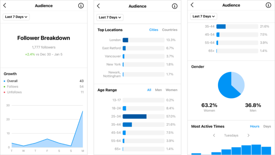
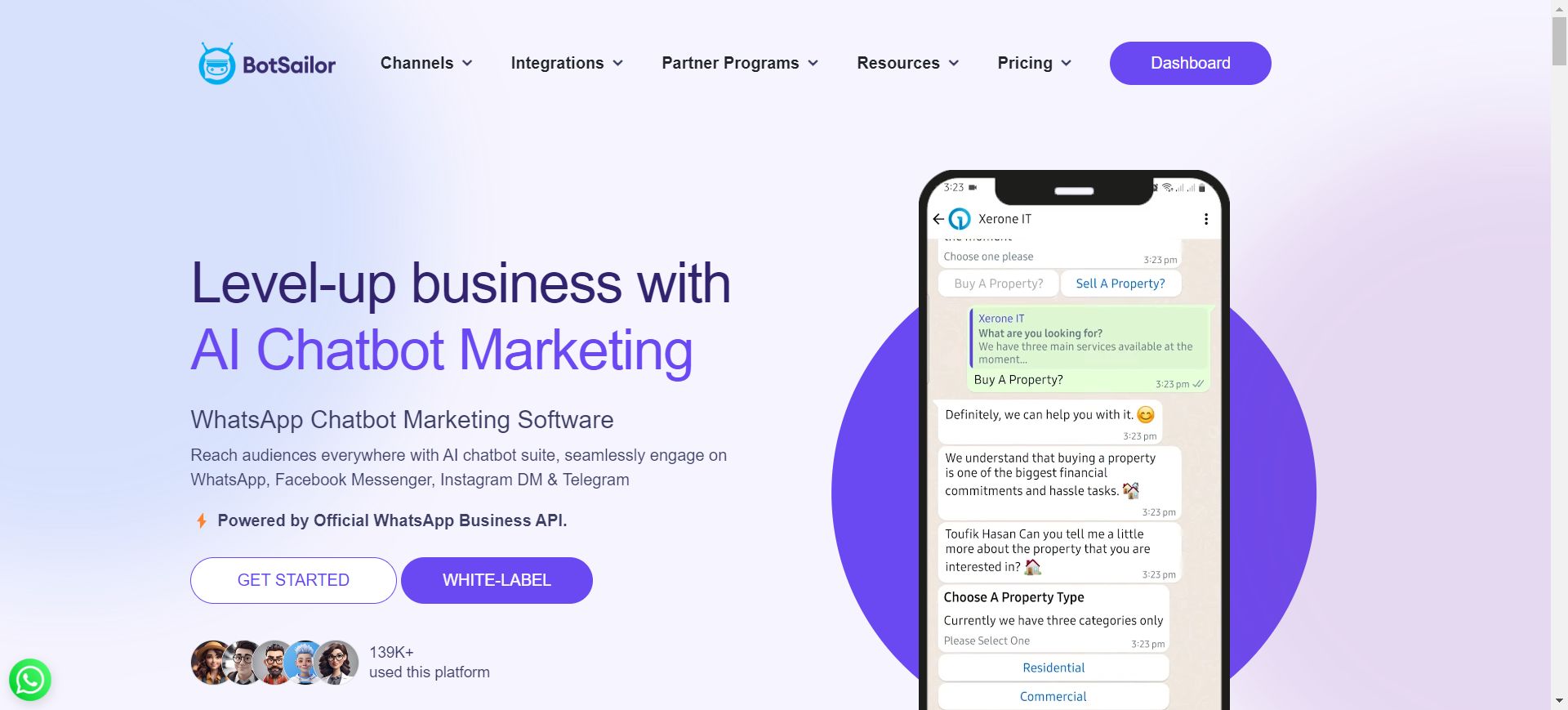
It's as easy as integrating a snapshot of analytics if you write about the best time to post on social media for example:

Not only does this make for a more interesting read, but it also gives readers something to look at if they become bored with the text-heavy content.
Visuals can help break up large chunks of text; this makes it easier for readers to digest and understand what you are trying to say without becoming overwhelmed by the amount of information being presented at once.
In many ways, this very article you are reading can be inspiring ;)
Make It Scannable
Finally, another effective technique for creating compelling content is ensuring it is scannable.
People have very short attention spans these days - especially when it comes to online reading - so you want to ensure that you don't bore people with long blocks of text or too many details all at once.
To make things easier (and more interesting) for readers, break up larger sections into smaller ones using headings, subheadings, and bullet points or numbered lists when appropriate.
This will allow readers to quickly scan through the post until they find what they're looking for without reading every word on the page.
Technique 4: Offering a clear value proposition
A value proposition is your website's promise to potential customers.
It should clearly explain what benefit you offer and how it differs from other products and services on the market.
A strong, clear value proposition can be the key to unlocking higher conversion rates, allowing you to turn more visitors into customers.
Identify Your Unique Selling Point (USP)
Your USP is what sets your website apart from the competition.
It could be a specific feature or service that nobody else offers, or it could simply be better quality products than your competitors provide at a lower cost.
For example:
At ABC Electronics, we offer the latest technology at prices that can't be beaten!
The first step in crafting an effective value proposition is identifying your USP so that you can capitalize on it in your messaging.
Focus on What Matters Most to Customers
The most successful value propositions address potential customers' needs by directly conveying how they will benefit from using your product or service.
What matters most to customers about buying something online:
- Low prices?
- Fast delivery?
- Great customer support?
Once you know what matters most, you can focus on these points in your value proposition and make sure it resonates with potential customers.
Be Specific
Your value proposition should always be as specific as possible so that potential customers easily understand exactly what you're offering them.
Try not to use generalizations like:
We offer great prices
Instead, be more specific:
Our prices beat our competitors by 10%!
This type of language will make your value proposition stand out and give people a compelling reason to choose your website over others.
Technique 5: Making the website mobile-friendly

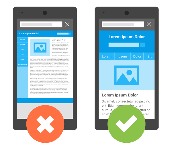
Whether running a small business or an established enterprise, having a mobile-friendly website is no longer an option--it's necessary.
More people today access websites via their phones rather than desktop computers.
A mobile-friendly website can be the difference between success and failure in terms of website conversion rates.
The Benefits of Mobile-Friendly Websites
Mobile-friendly websites provide users with an easy and intuitive way to access information on the go.
They are designed for small screens, with elements that are easy to click on, read, and navigate.
Users are more likely to stick around on your website instead of bouncing off as soon as they land there, increasing their chances of converting into customers.
Plus, since Google now factors in how user-friendly your website is on mobile devices when it comes to search engine rankings, having a mobile-friendly website is essential if you want your business to stay competitive in the digital age.
Making Your Website Mobile Friendly
You can take several steps to ensure your website is mobile-friendly.
First and foremost, you must ensure that your images are optimized for smaller screens.
Reduce their file size so they don't take too long to load, and make sure they look sharp even when scaled down for smaller screens.
You also need to adjust your font sizes so they're legible even when viewed on a small screen.
Add "clickable" links or buttons so users can quickly access the information they need without having to scroll too much or pinch their phone screen open and closed trying to zoom in and out of pages.
Finally, you should test out different layouts until you find one that looks great on any device no matter what size screen it has.
That way, users will have the same great experience regardless of which device they use!
Technique 6: Enhancing website speed
Conversion rate optimization (CRO) is optimizing your website so visitors are more inclined to complete a desired action, such as making a purchase, signing up for an email list, or downloading content.
One of the most important aspects of CRO is website speed.
If your website takes too long to load, it can have a negative impact on your conversion rates.
Here are some tips to ensure your website runs at optimal speeds and maximizes conversions.
Reduce Image File Sizes
Images can be one of the biggest culprits when slowing down your website.
You want high-quality images, but if they are too large in file size, they will take a long time to download and slow down your site's loading speed.
Compress image files using tools like ILoveIMG or Squoosh before adding them to your site.
This will help reduce their file size without sacrificing quality.
Minimize HTTP Requests
Every time someone visits your webpage, the browser needs to send out an HTTP request in order to fetch all the files necessary for displaying the page properly, such as:
- HTML files
- CSS files
- Javascript files
- Images
- Etc.
The more requests there are, the longer it takes for all those elements to be loaded onto the page and, therefore, slower loading times for your site.
To minimize HTTP requests, you can combine multiple files into one larger file and use Gzip compression on text-based components such as CSS and JavaScript.
Utilize Content Delivery Networks
Content delivery networks (CDNs) have servers located around the world that store cached versions of static content from websites such as images and videos.
That way they can be quickly accessed by users nearby instead of having them download direct from the originating server, which would take longer due to distance factors involved with data transfer over long distances.
By utilizing a CDN, you can drastically improve performance.
It reduces latency and increases download speeds across different locations around the world.
Thus improving user experience overall, which helps lead to higher conversion rates.
Technique 7: Improving website navigation
Navigation is one of the most important elements of website design and, when done correctly, can have a huge impact on your website's conversion rate.
After all, if visitors can't find what they're looking for quickly and easily, they won't stick around long enough to convert.
Clean Up Your Navigation Bar
Your navigation bar should be clean and organized so visitors can quickly find what they need without having to scroll through endless menus or search for obscure links.
Include only the most important links in your navigation bar and organize them in an intuitive way.
Additionally, ensure that the font size is large enough to be easily read on desktop and mobile devices.
Highlight Key Pages
Highlighting key pages in your navigation menu will draw visitors' attention to them as soon as they land on your page.
This can help increase conversions by making it easier for visitors to find what they are looking for right away.
You can highlight key pages by using drop-down menus or by featuring them more prominently in the main navigation bar than on other pages.
Make Use of Search Bars
Search bars make it easy for visitors to find exactly what they are looking for without having to click through multiple pages or scan through lengthy lists of options in the navigation menu.

This helps keep users engaged and increases the chances that they will convert into customers.
When adding a search bar, ensure it is clearly visible and optimized with keywords to quickly and accurately raise relevant results.
Technique 8: Utilizing social proof
Did you know that social proof can be an incredibly powerful tool for converting website visitors into customers?
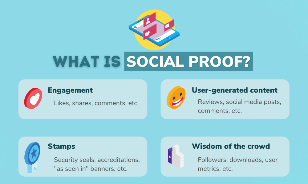
What is Social Proof?
Social proof is a psychological phenomenon whereby people are more likely to adopt the opinions and behaviors of the masses.
Humans often feel more comfortable making decisions when others have taken similar actions or given their approval first.
For example, if you see that a product has hundreds of positive reviews, you're far more likely to buy it than if there were no reviews.
This is one form of social proof.
Here are a few others:

How Do You Utilize Social Proof on Your Website?
There are several ways to utilize social proof on your website to boost conversions.
First and foremost, ensure that any products or services offered on your website have plenty of customer reviews.
This will give potential customers confidence when considering purchasing from you, so make sure to collect as many reviews as possible to maximize the effectiveness of this tactic.
Additionally, showcasing awards or accolades from industry leaders or publications can be a great way to utilize social proof on your website.
One final way to utilize social proof on your website is through testimonials from satisfied customers.
A short testimonial featuring real customer feedback can boost conversions by giving potential customers an insight into how others have benefited from your product or service.
This type of social proof can be especially effective with visual elements such as pictures or videos of happy customers using the product or service.
Technique 9: Creating a sense of urgency
Creating a sense of urgency effectively influences people's behavior because it taps into the fear of missing out on something--and that's a powerful motivator.
It can also be used as a way to build credibility and trust with customers, as well as establish yourself as an expert in your field.
Here are some tactics you can use to create urgency for your website visitors.
Time-Sensitive Discounts and Special Offers
Start by offering time-sensitive discounts or special offers.
This helps create a sense of urgency by incentivizing people to act quickly and purchase before the offer expires.
You can also use countdown timers or progress bars on product pages or in emails, which will display how much time is left before the offer expires.
Consider using "limited stock" messaging when promoting popular items, which will let people know that they need to act fast if they want to take advantage of the deal.
Creating Limited-Time Experiences
Another great way to generate urgency is by creating limited-time experiences, such as webinars, workshops, or classes that only last for a certain period of time.
People will have no choice but to sign up immediately if they want access before the event ends--so make sure you publicize these events widely through social media channels and email newsletters!
Using Social Proof
Social proof can be used in many different ways.
Still, one particularly effective method involves displaying customer reviews on product pages or emails--this shows potential customers that others have already had success with your product/service and should motivate them to take action sooner rather than later.
You could even consider running special promotions where customers can receive discounts based on how many reviews they leave!
This creates urgency and encourages more user engagement with your brand/website.
Technique 10: Implementing retargeting
If you're looking to improve your website's conversion rate, one of the most effective strategies you can employ is retargeting.
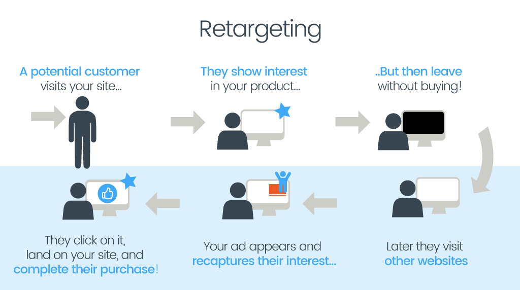
This marketing method involves tracking individuals who have visited your website and then displaying targeted ads to those same visitors as they browse other websites.
It's an incredibly powerful tool that can be used to boost conversions and keep your business at the top of consumers' minds.

How Does Retargeting Work?
Retargeting works by utilizing a piece of code, commonly known as a "pixel," which tracks when someone visits your website.
This code allows ads to be served to those visitors on other websites or social media platforms.
You can think of it as leaving a digital "breadcrumb trail" that follows the user throughout the web--allowing you to stay in front of them with personalized messages and product recommendations long after they leave your site.
Retargeting Strategies
Once you have installed the pixel on your website, there are several strategies that you can use in order to maximize its effectiveness.
One popular method is showing dynamic ads--ads that feature specific products or services viewed previously by the user during their visit to your site.
Another strategy is using frequency capping, which limits the number of times an ad is shown per person over a certain period.
This helps ensure that people aren't bombarded with too many ads, keeping them engaged instead of overwhelmed or annoyed by overexposure.
You should also consider segmentation when creating retargeting campaigns, breaking up users into categories based on their activity on site, such as:
- Cart "abandonmenters"
- Recent purchasers
- Etc.
By doing this, you can tailor specific messages for each group and ensure that all retargeted users are getting relevant content tailored specifically for them.
Finally, A/B testing is an essential part of any successful retargeting campaign; by experimenting with different versions of ads (images, text copy, call-to-action buttons, etc.), you'll be able to identify what works best for each segment and tweak accordingly until you find the perfect combination for maximum conversions!
In closing, implementing the ten proven techniques discussed in this article will help to skyrocket your website's conversion rate and ensure that you are able to maximize your success.
From offering discounts to creating limited-time experiences and leveraging retargeting, there are many different strategies that you can employ--so experiment with as many as possible until you find what works for your website.
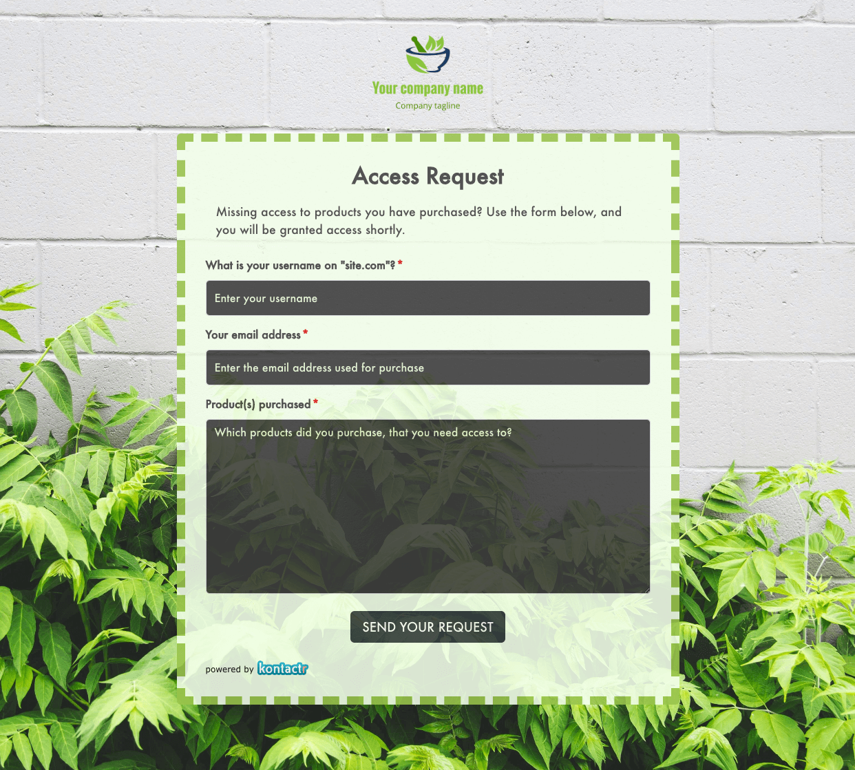 Access Request Form
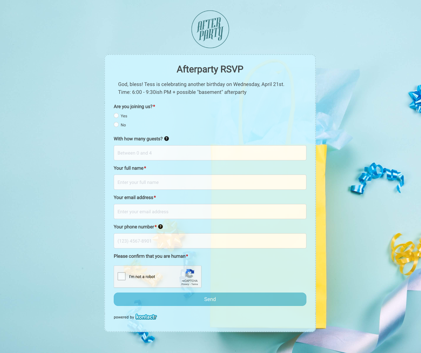 Afterparty RSVP Form
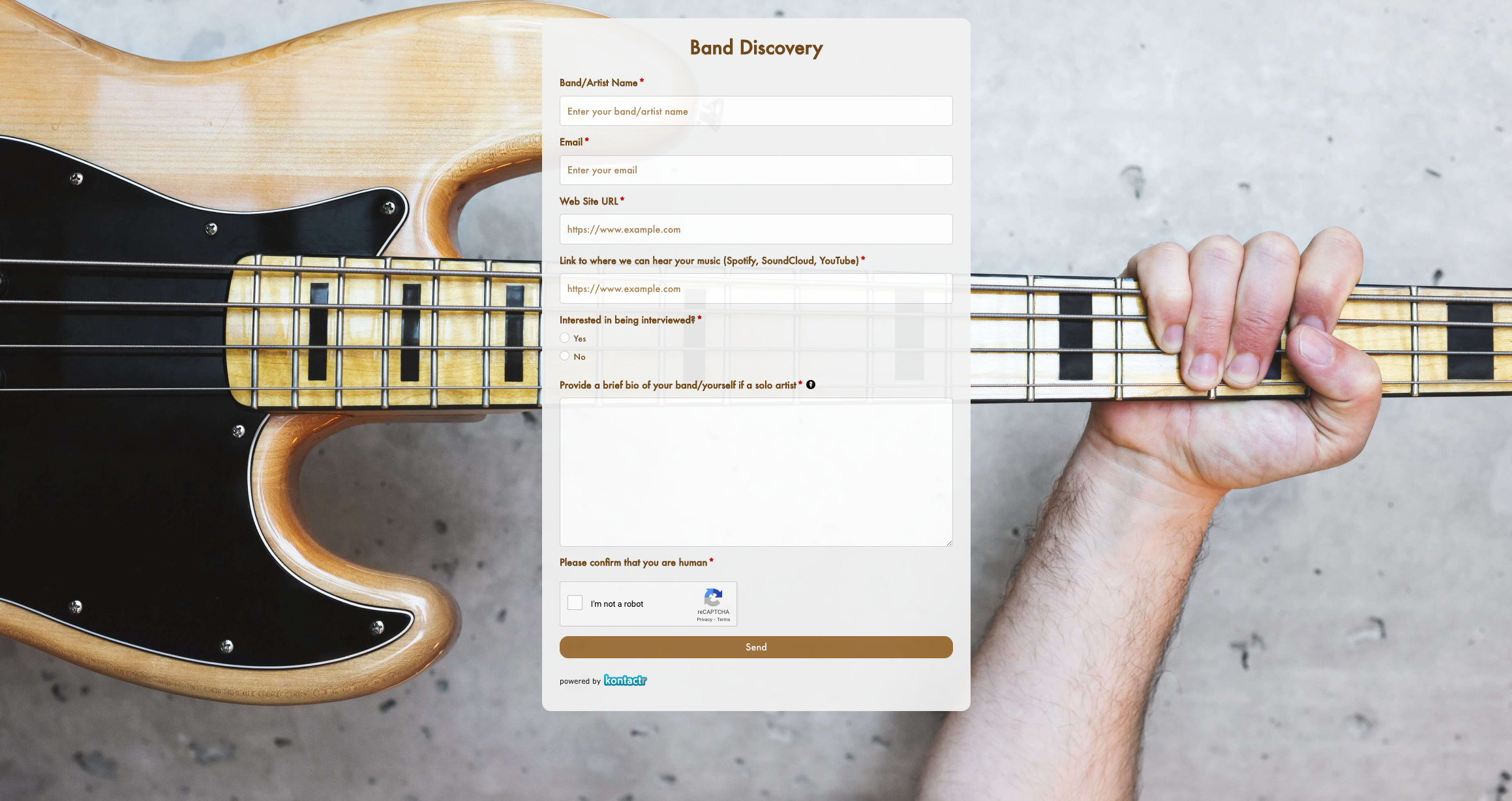 Band Discovery Form
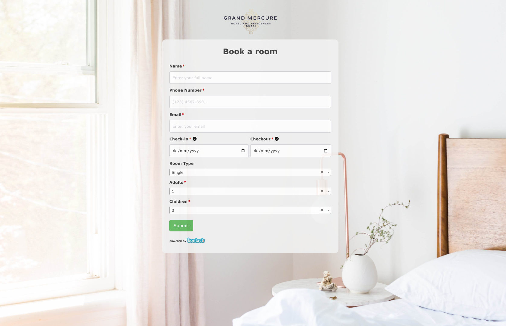 Book a room Form
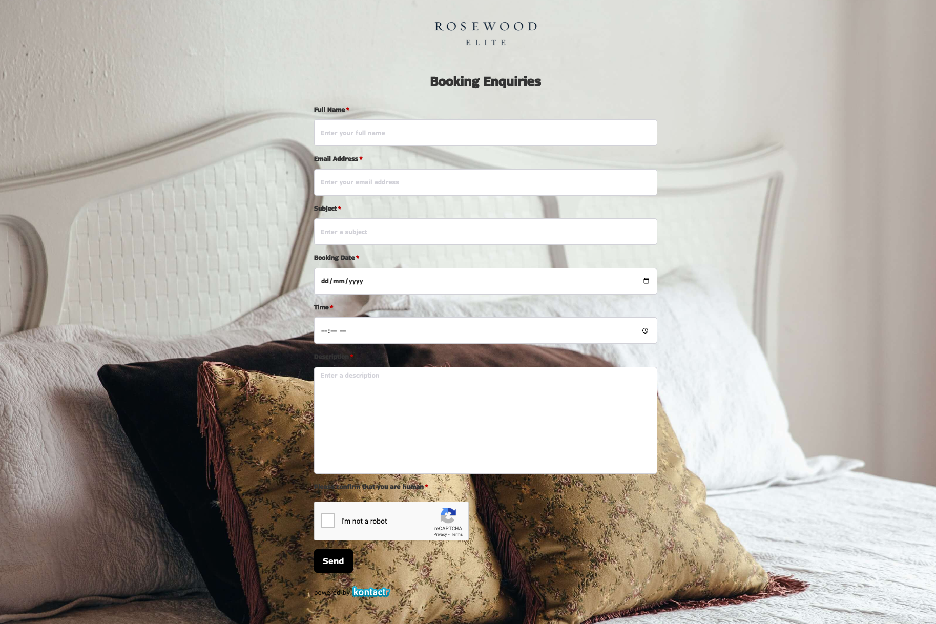 Booking Enquiries Form
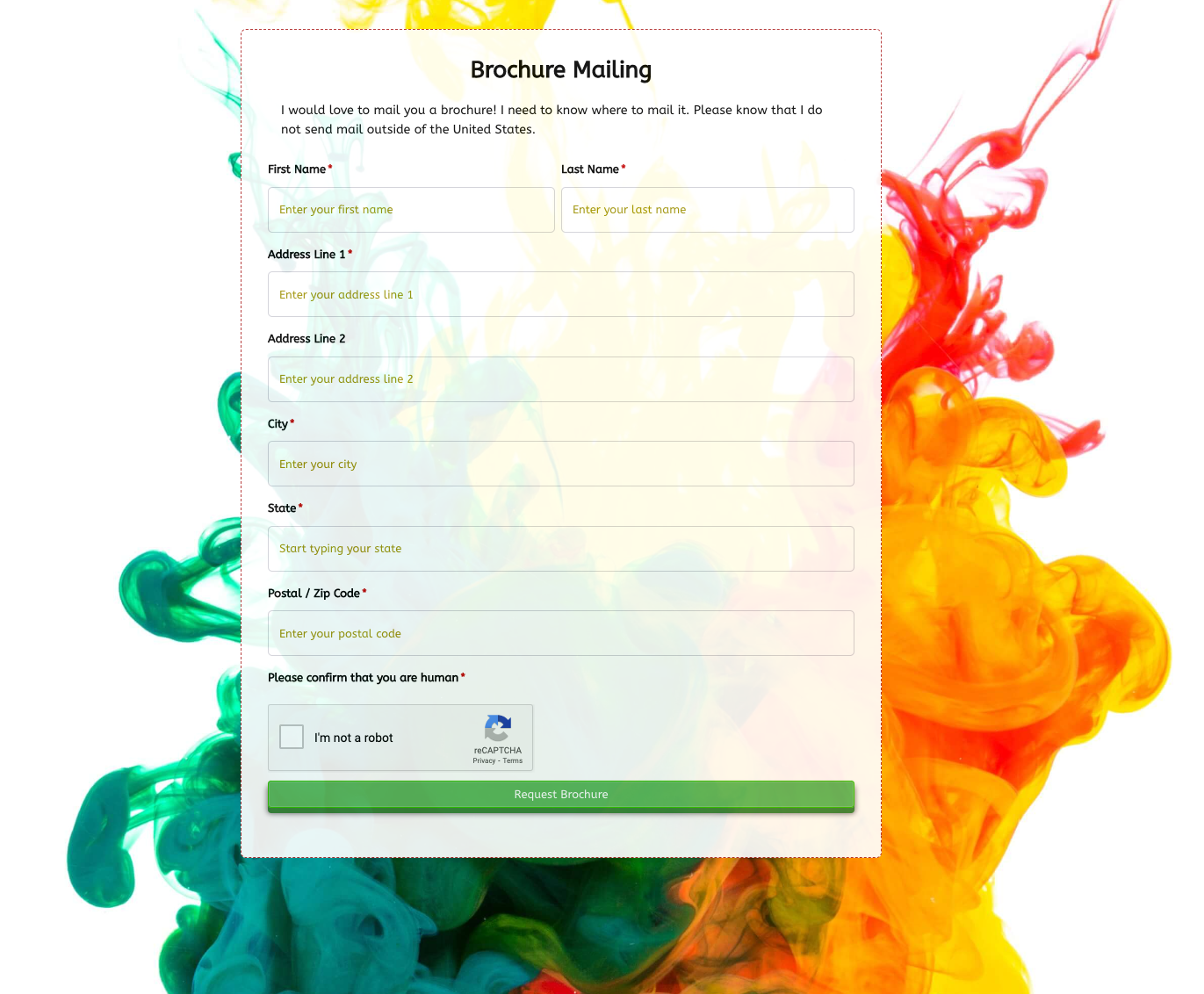 Brochure Mailing Form
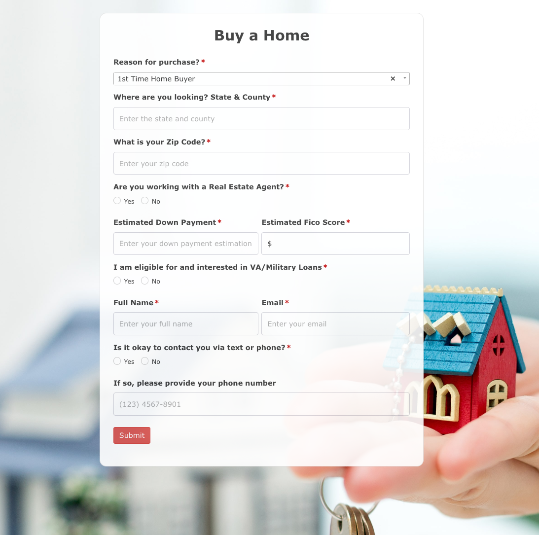 Buy a Home Form
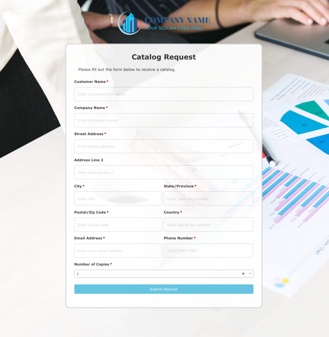 Catalog Request Form
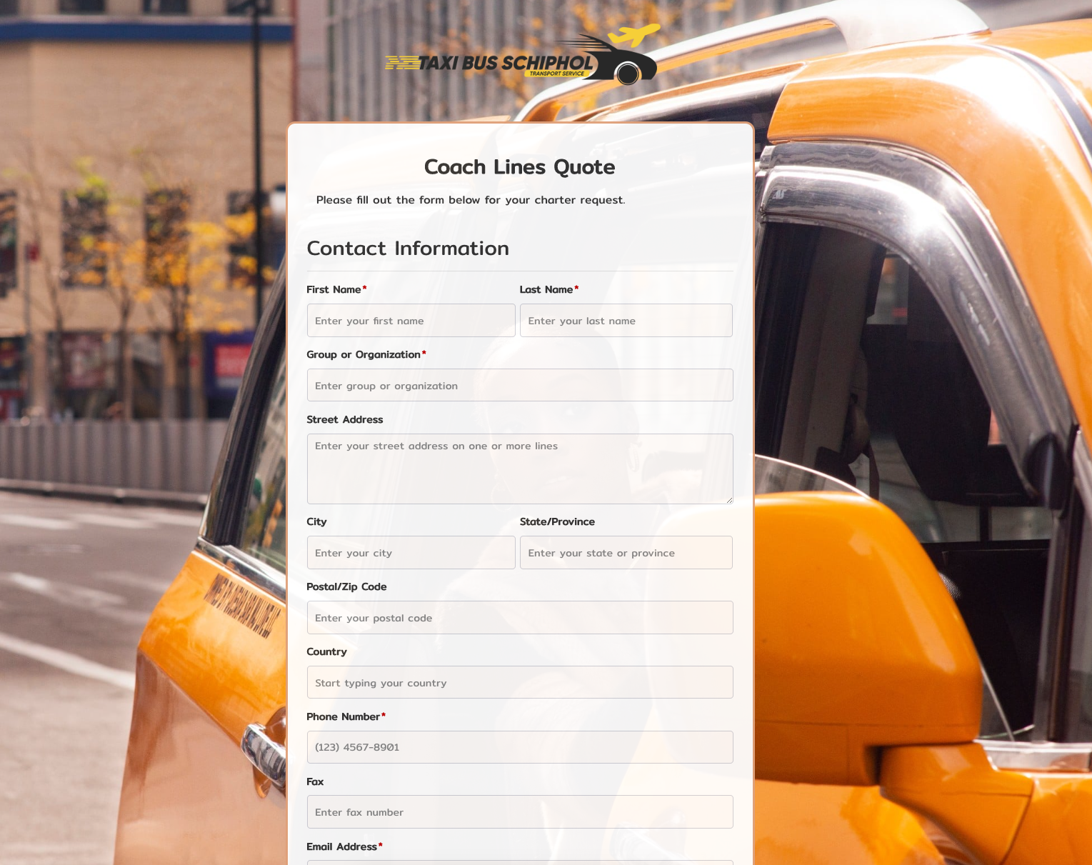 Coach Lines Quote Form
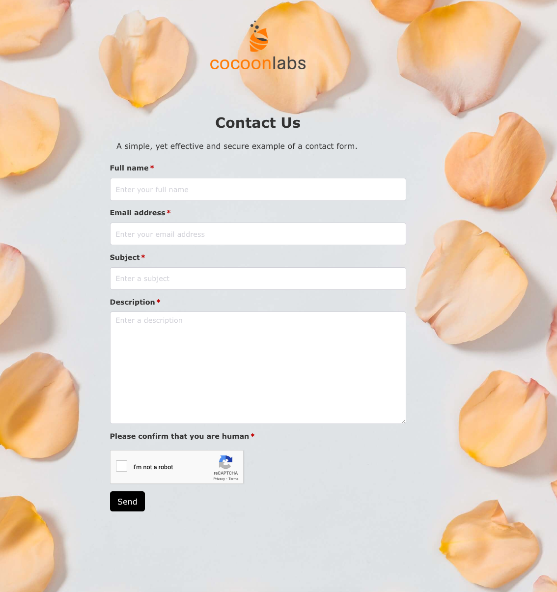 Contact Us Form
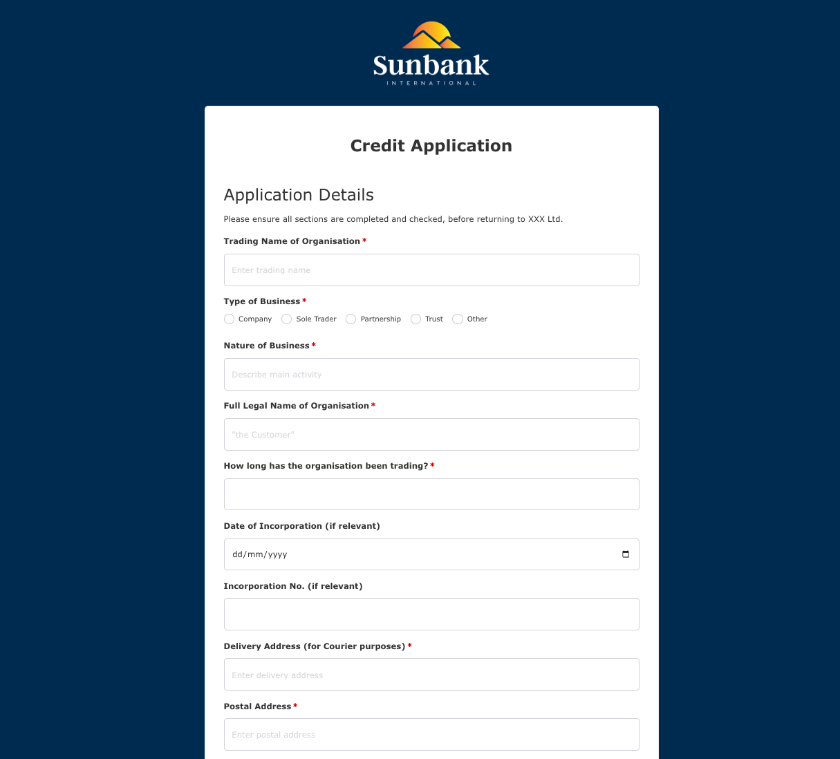 Credit Application Form
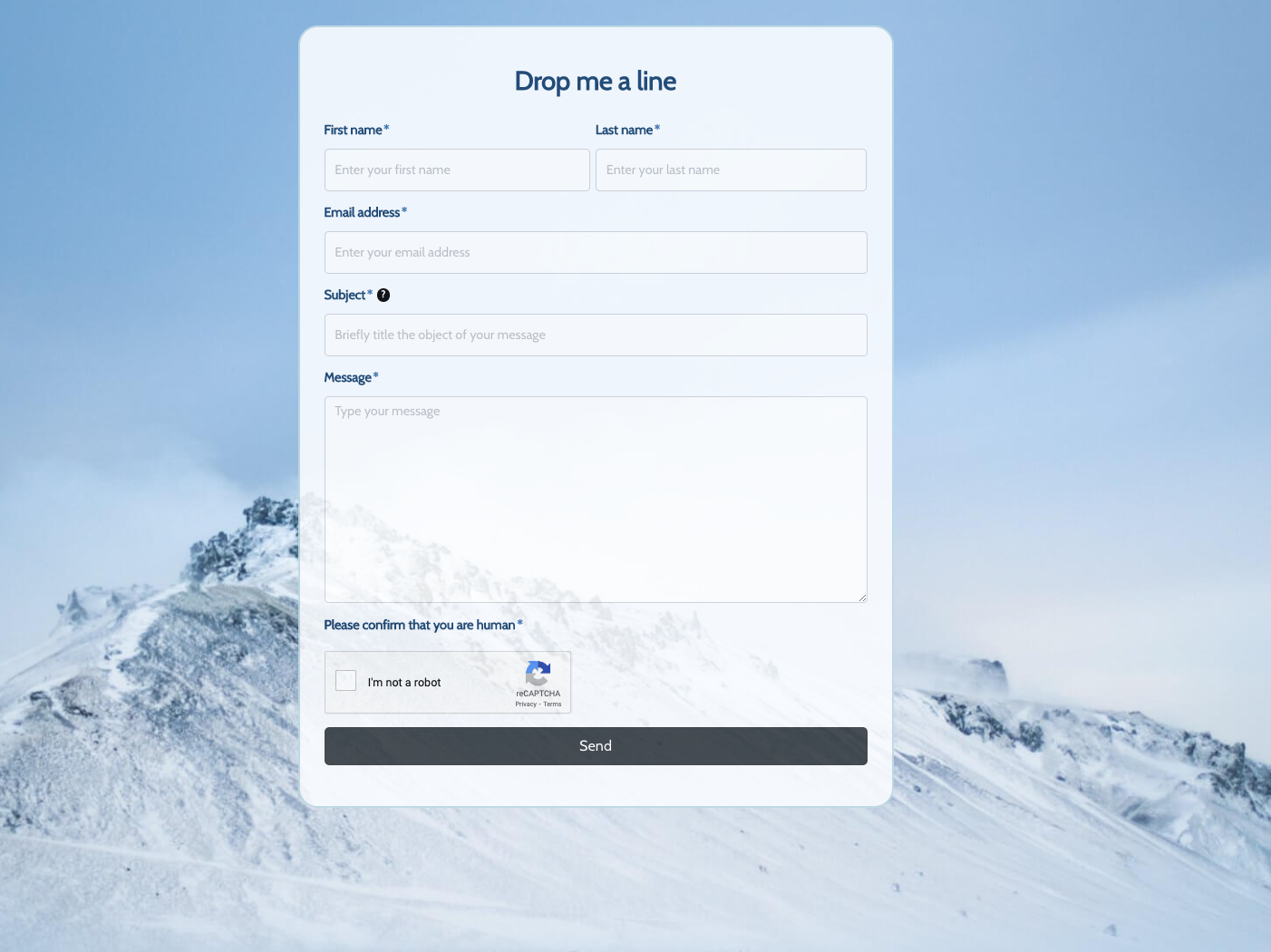 Drop me a line Form
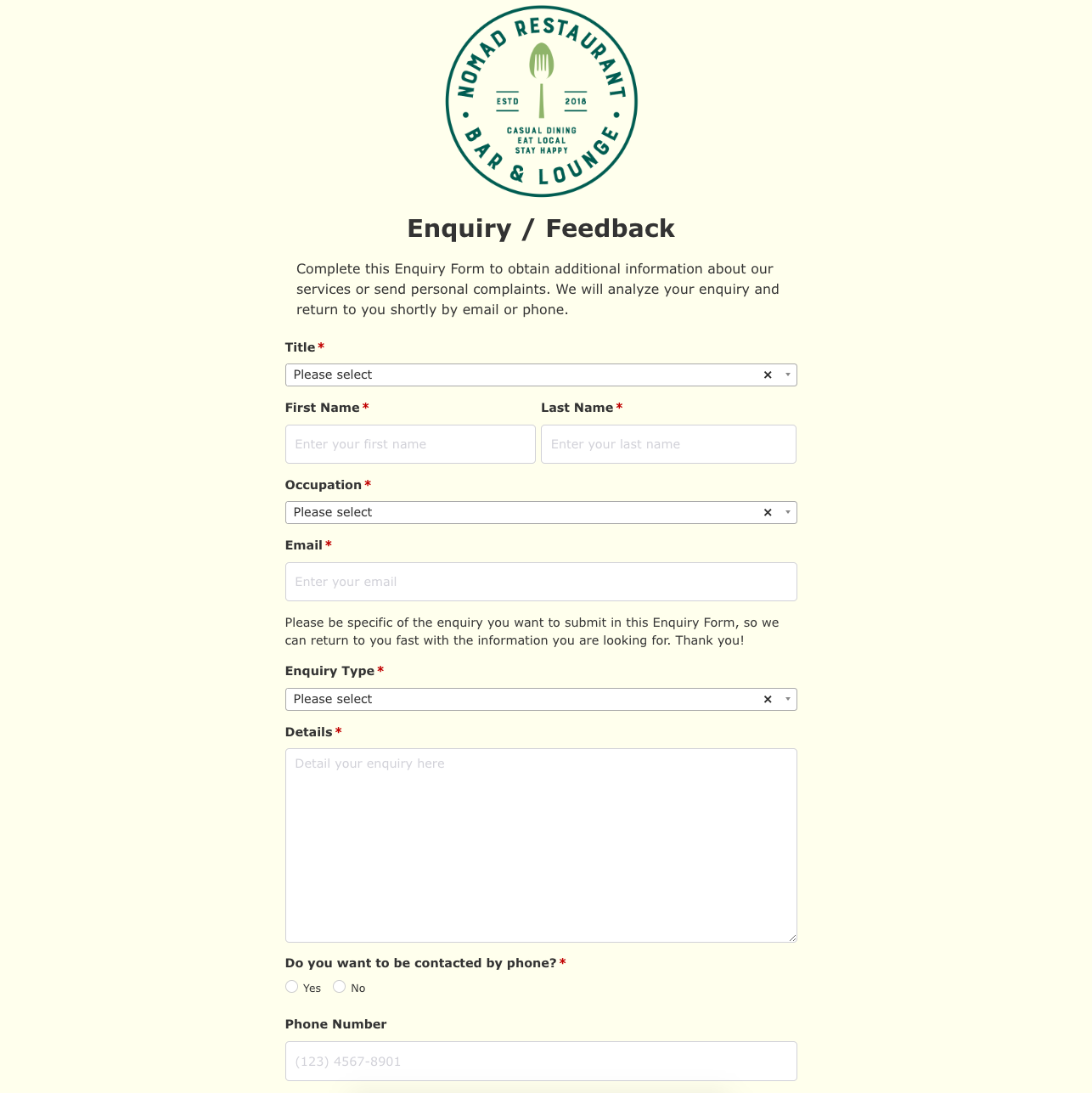 Enquiry / Feedback Form
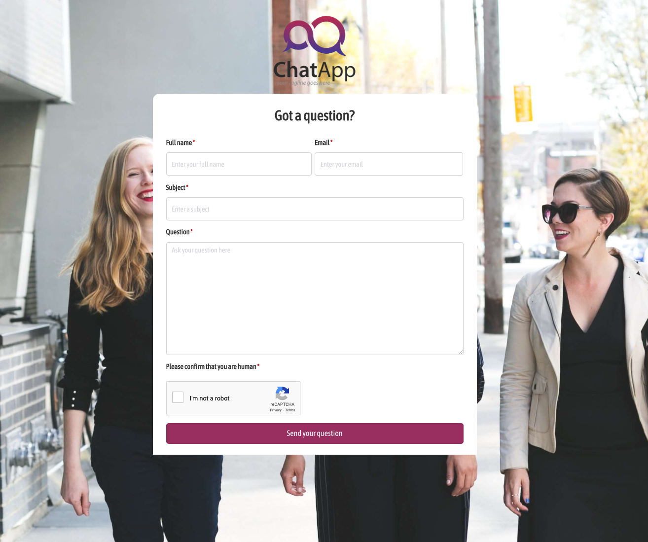 Got a question? Form
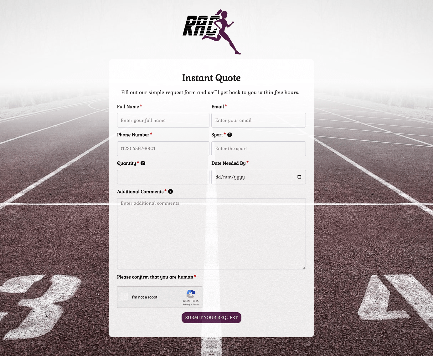 Instant Quote Form
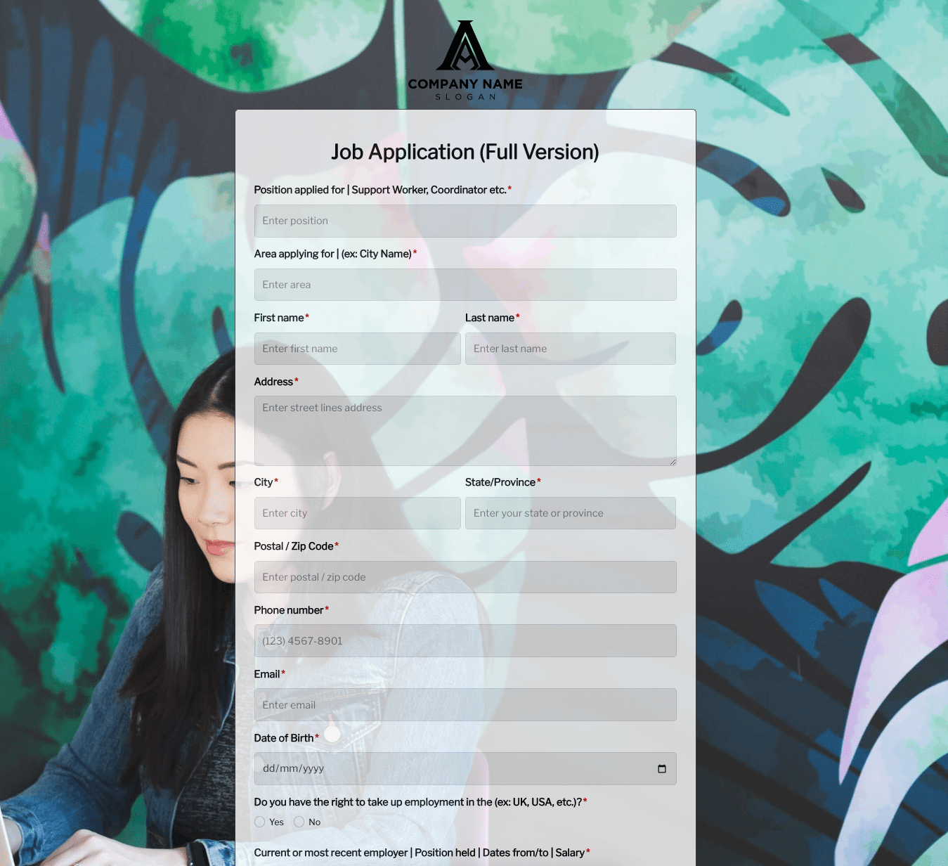 Job Application Form
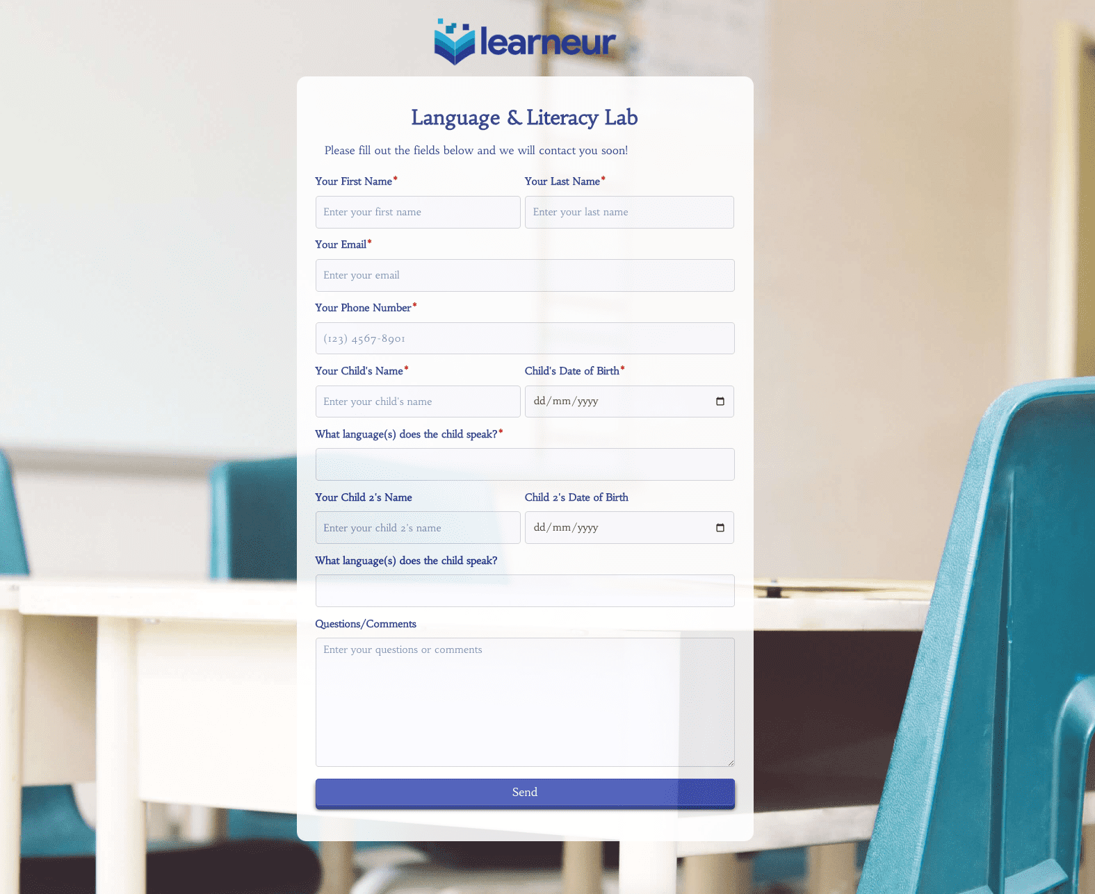 Language & Literacy Lab Form
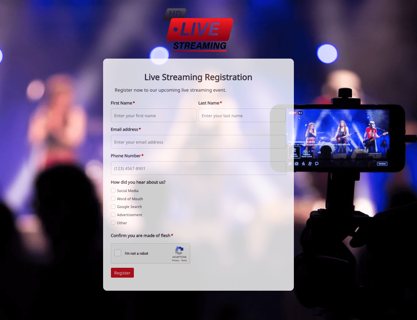 Live Streaming Registration Form
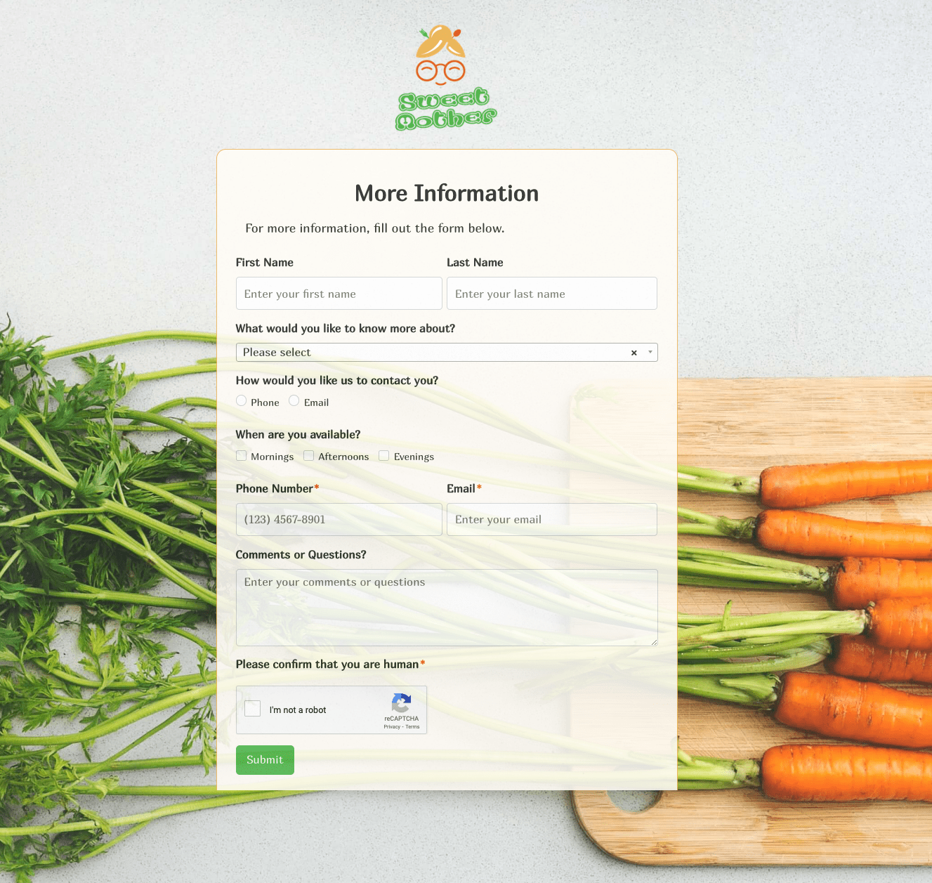 More Information Form
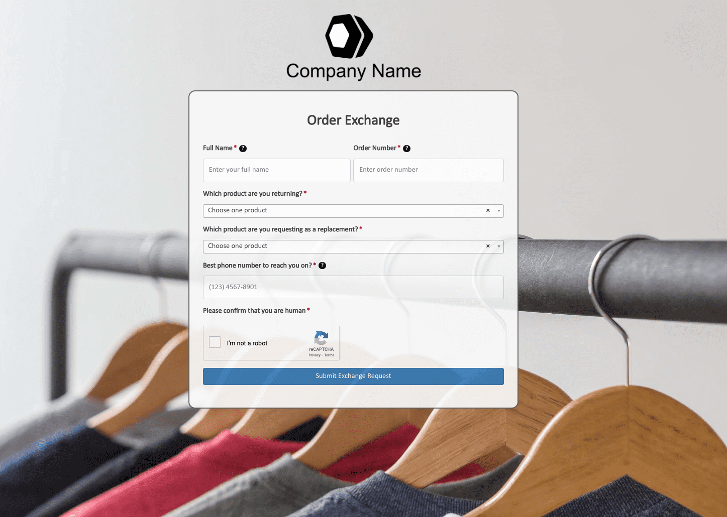 Order Exchange Form
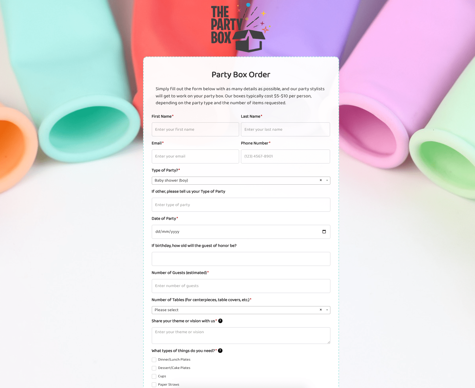 Party Box Order Form
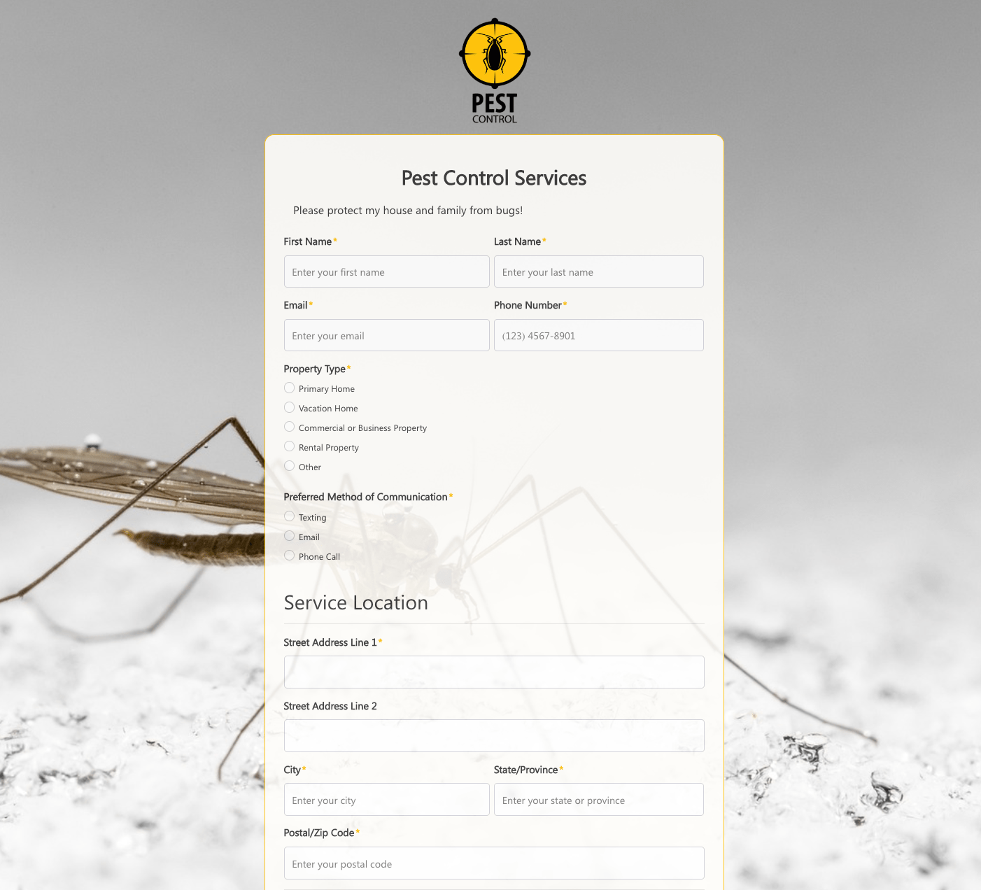 Pest Control Services Form
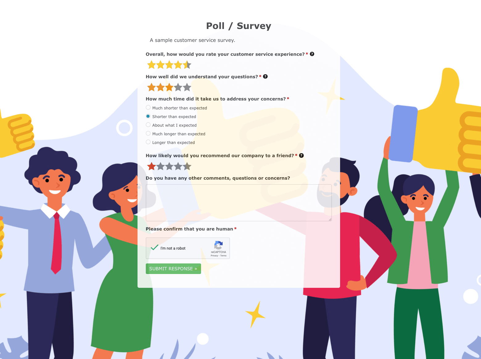 Poll / Survey Form
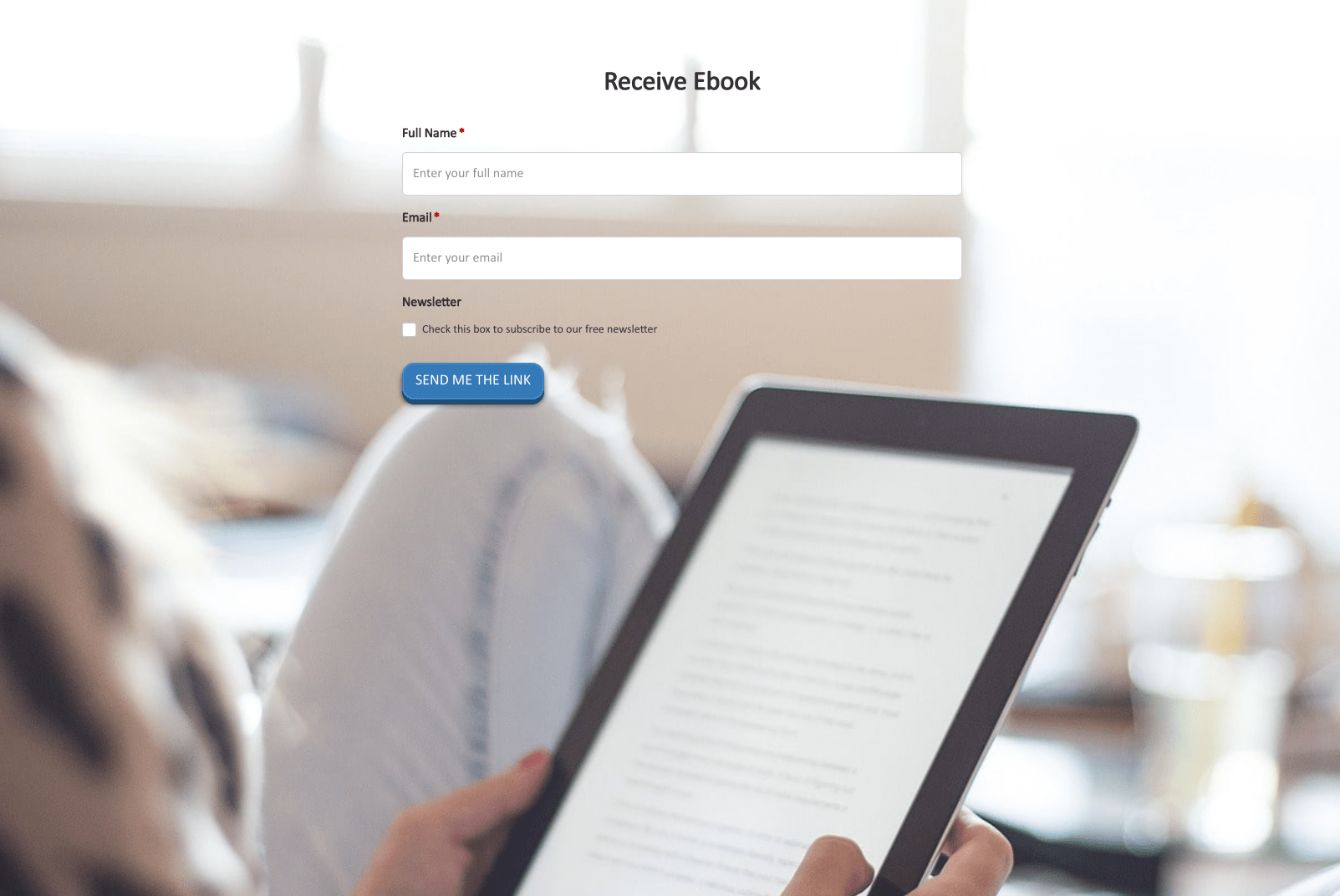 Receive Ebook Form
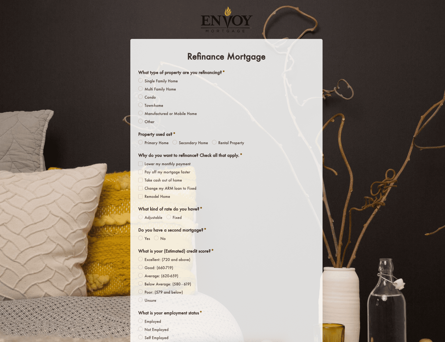 Refinance Mortgage Form
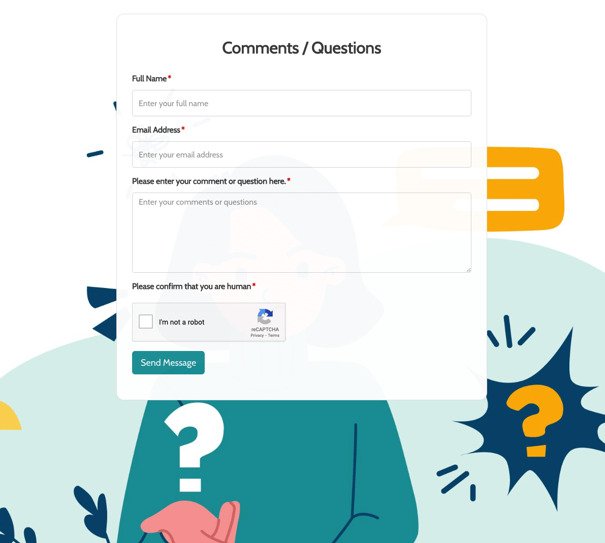 Remarks / Questions Form
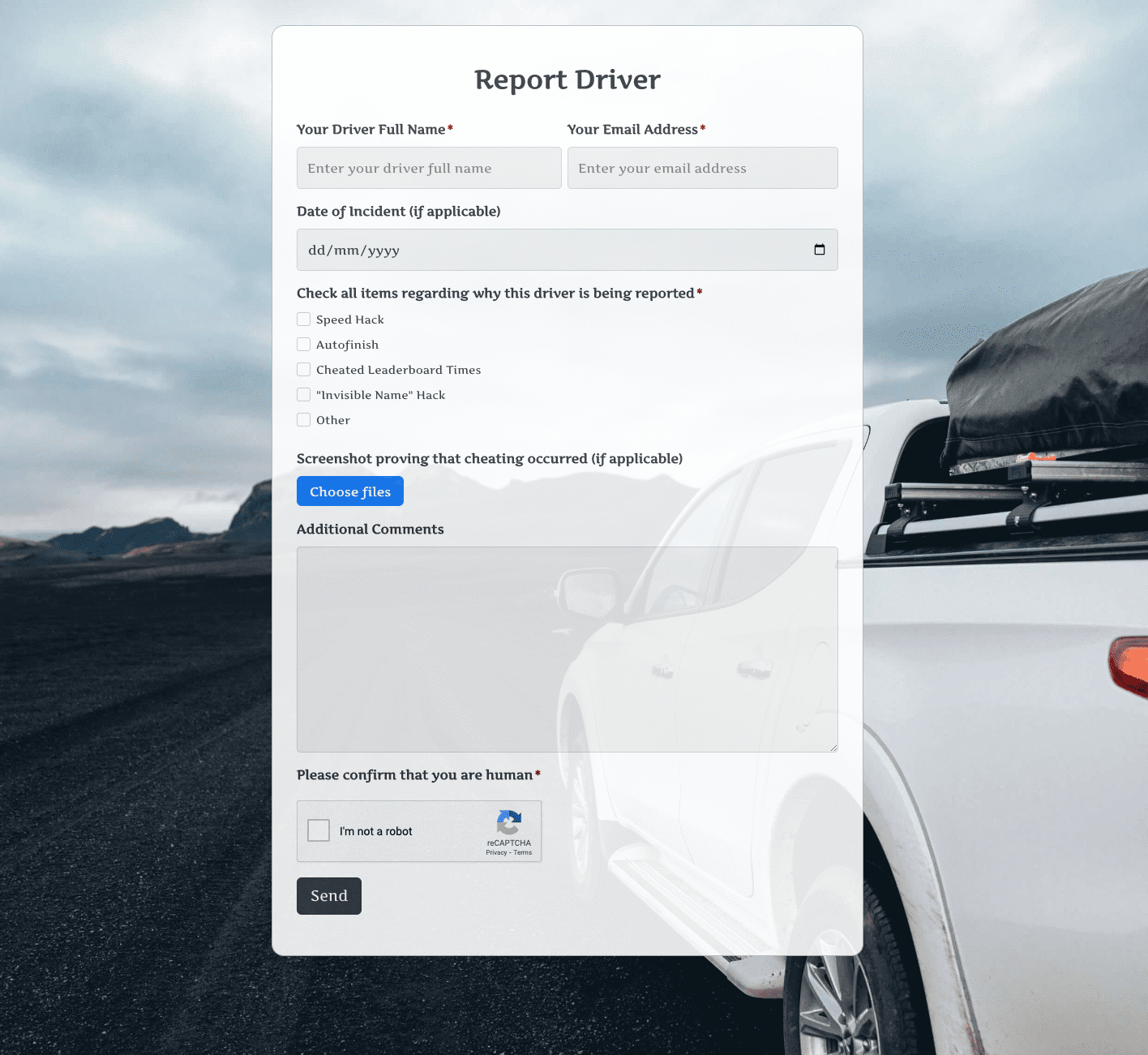 Report Driver Form
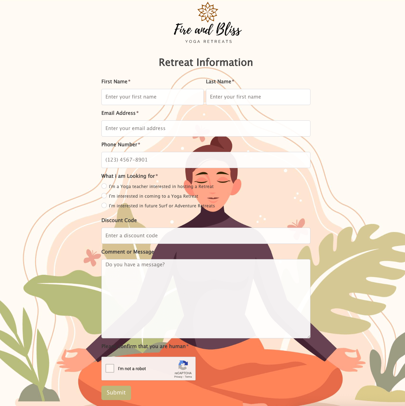 Retreat Information Form
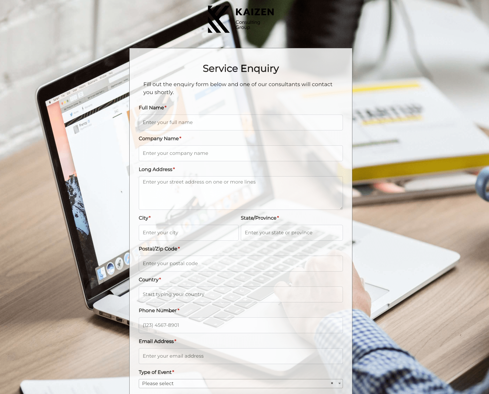 Service Enquiry Form
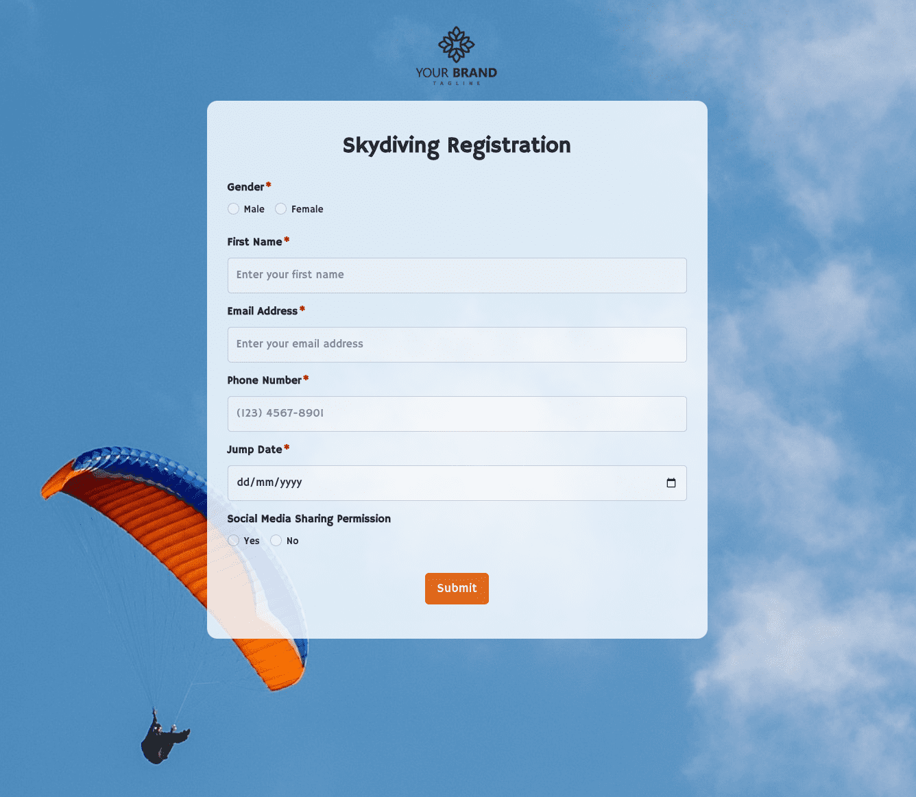 Skydiving Registration Form
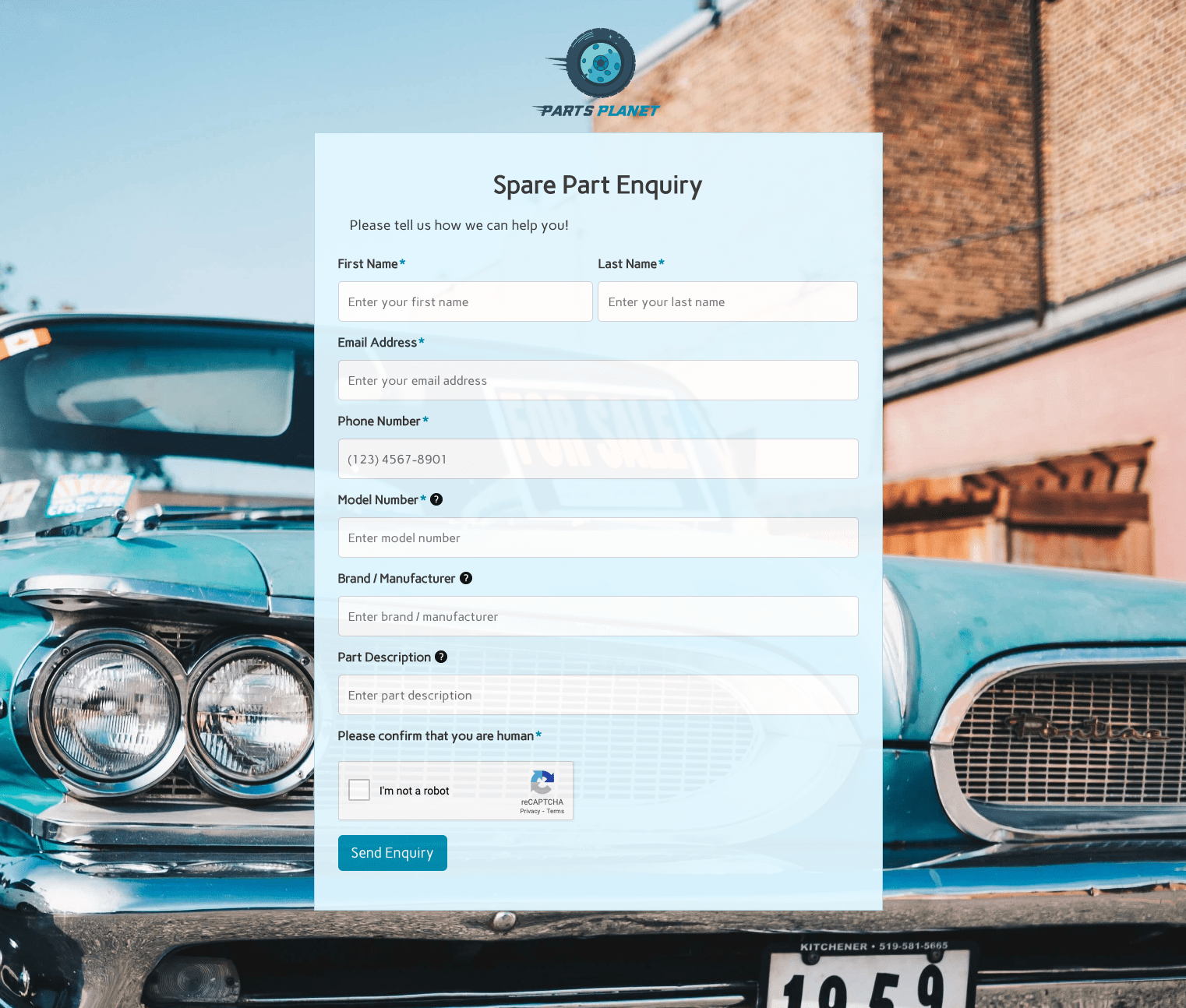 Spare Part Enquiry Form
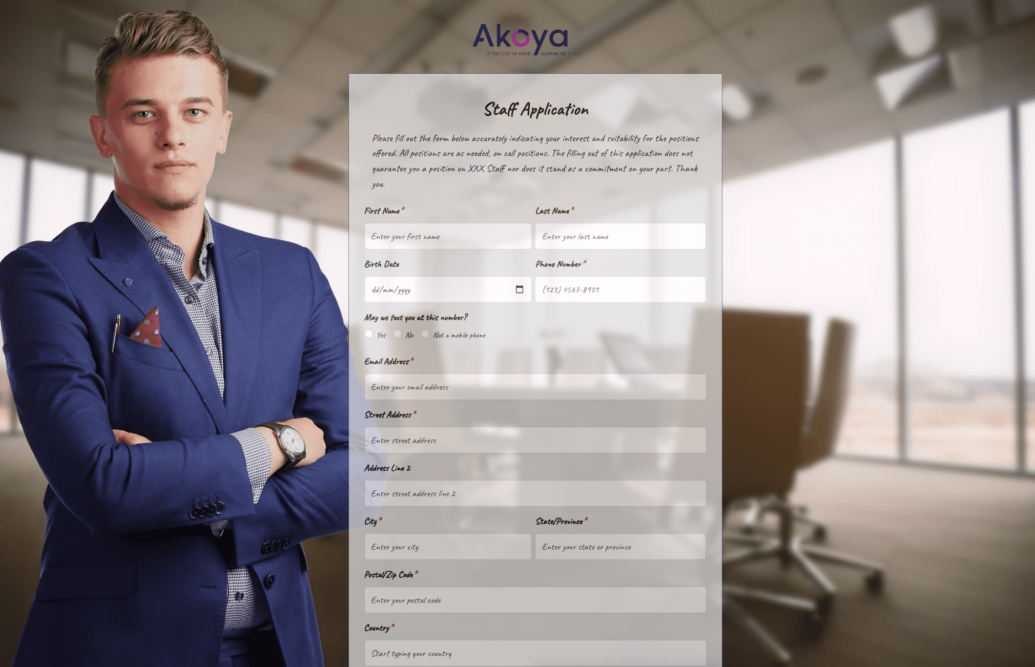 Staff Application Form
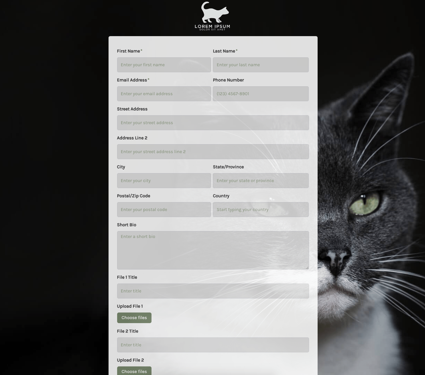 Submission Form
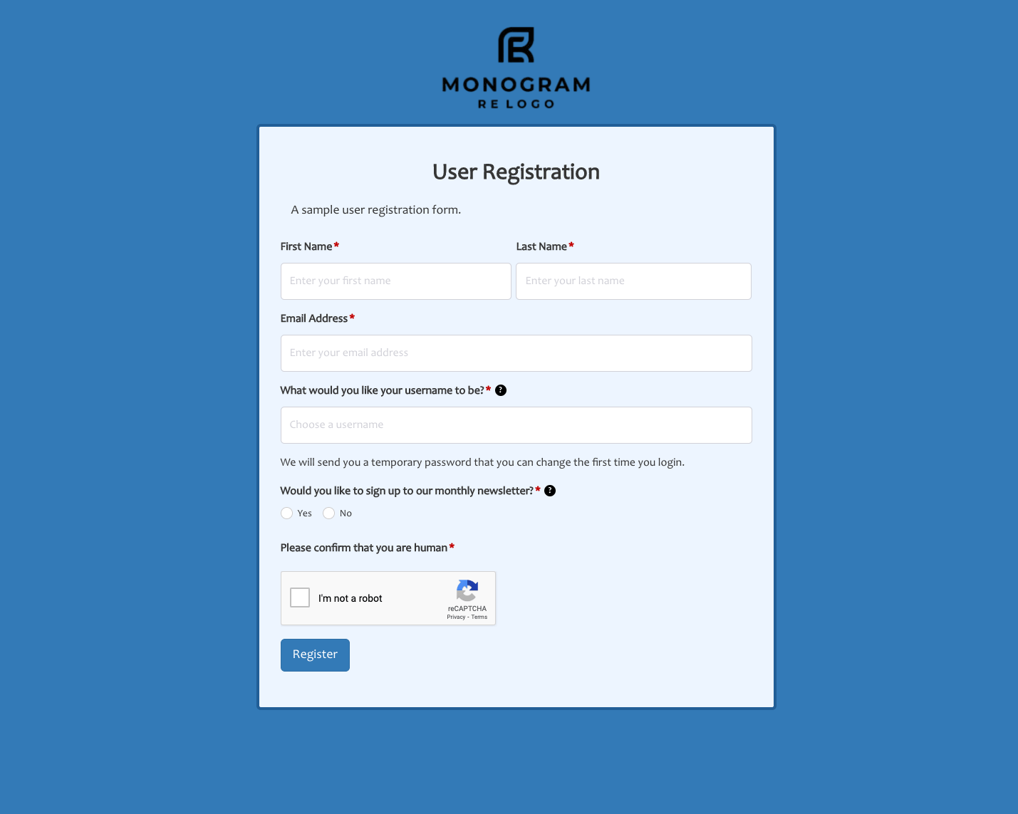 User Registration Form
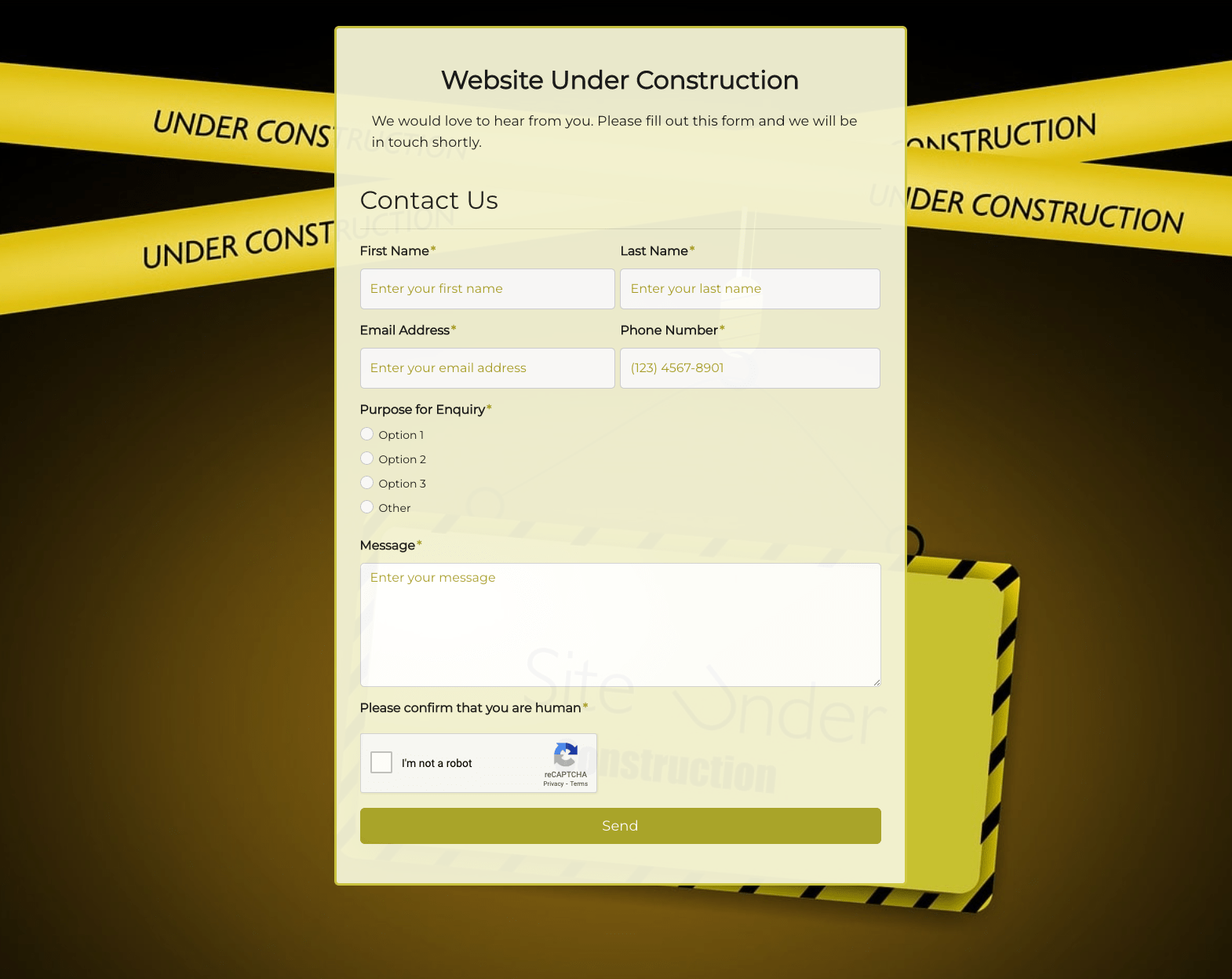 Website Under Construction Form
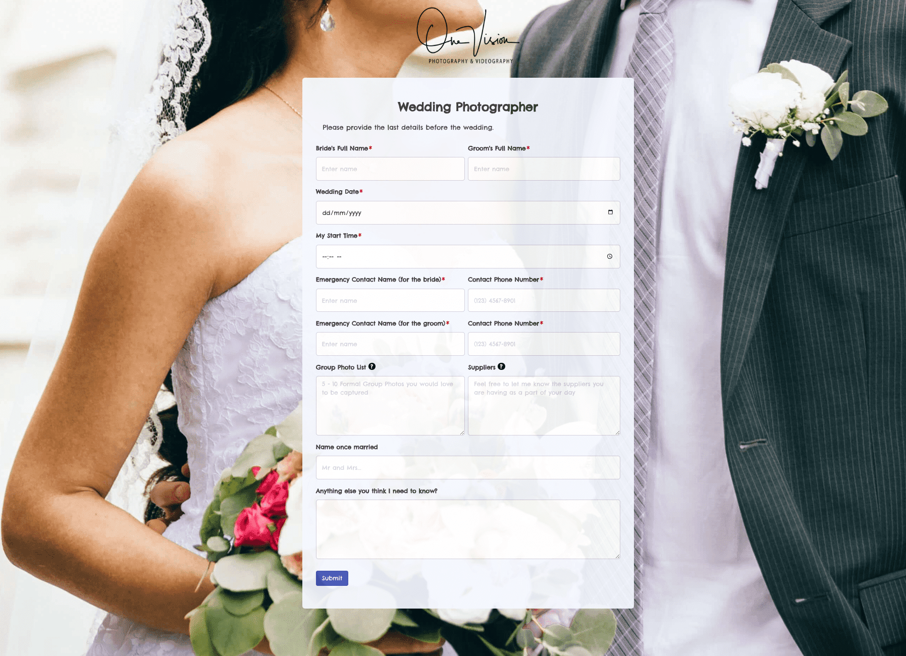 Wedding Photographer Form
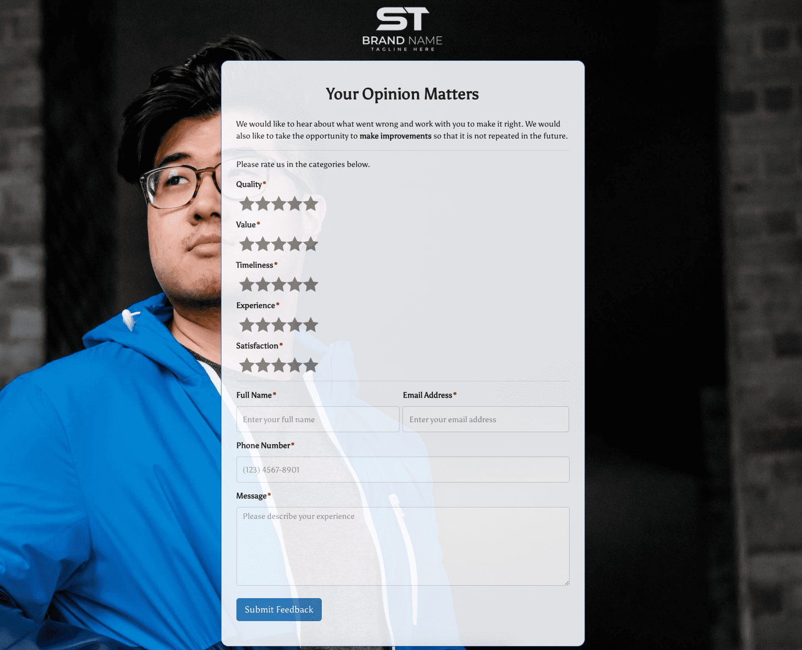 Your Opinion Matters Form

