When it comes to digital marketing, few things can make or break your success like your landing page. A high-converting landing page isn’t just about looking good; it’s about performing well.
Every button, image, and line of text needs to work together to nudge your visitors toward taking action. Sounds overwhelming? It doesn’t have to be. Let’s break down exactly how to create landing pages that don’t just look great—they drive results.
Whether you’re launching a new product, growing your email list, or promoting a special offer, a strategically designed landing page can be the difference between a visitor clicking away and a customer clicking "buy". With the right approach, you can turn your landing page into a conversion powerhouse.
Ready to dive in?
Contents:
- What Makes a Landing Page High-Converting?
- Essential Elements of a Winning Landing Page
- Common Mistakes to Avoid
- Best Practices for Optimizing Landing Pages
- Tools and Resources to Simplify the Process
- Examples of High-Converting Landing Pages
Conclusion
1. What Makes a Landing Page High-Converting?
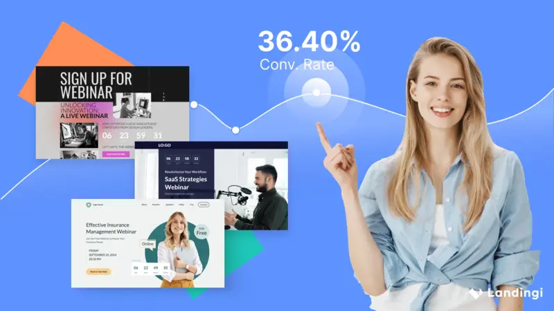
A high-converting landing page grabs attention, builds trust, and makes it ridiculously easy for visitors to take action.
But how do you achieve that?
It starts with understanding your audience and focusing on a single, clear goal.
Let’s say you’re promoting a free eBook. Your landing page should focus entirely on that eBook:
- Why it’s valuable
- How it solves a problem
- And what the visitor gets by downloading it
No fluff, no distractions.
High-converting pages keep the user journey simple and intuitive.
Another critical factor is load speed.
According to Google, pages that take longer than three seconds to load lose over half of their visitors. So, if your landing page isn’t lightning-fast, even the best design won’t save it.
Clarity, simplicity, and speed are the pillars of high-converting landing pages.
Lastly, high-converting pages leverage trust signals.
This could include customer reviews, testimonials, or security badges.
Why?
Because trust is a major driver of conversions. When visitors see that others have benefited from your offer, they’re far more likely to take the leap themselves.
2. Essential Elements of a Winning Landing Page
Every successful landing page shares a few must-have elements that guide visitors toward taking action. These aren’t just nice-to-haves; they’re non-negotiable.
Let’s break them down:
Compelling Headline
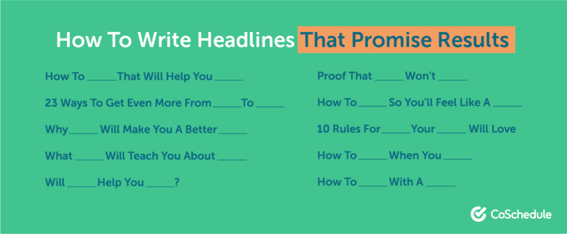
Your headline is the first thing visitors see.
Make it clear, benefit-driven, and impossible to ignore.
For example:
Double Your Sales in 30 Days with Our Proven Strategy.
Attention-Grabbing Visuals
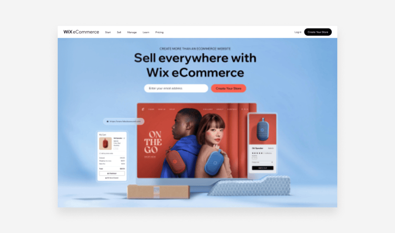
A clean, visually appealing design helps convey your message at a glance. Use professional images, videos, or graphics that align with your offer.
Call-to-Action (CTA)
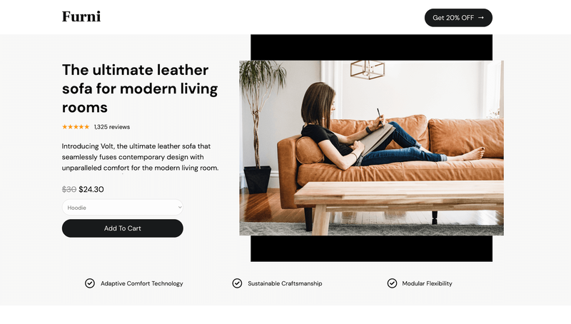
Your CTA needs to stand out—think bright colors, bold fonts, and action-oriented text like
Get Started
or
Claim Your Discount
Concise, Benefit-Driven Copy
.webp)
Keep your text short and impactful. Focus on what the user gains, not just what you’re offering.
Mobile Optimization
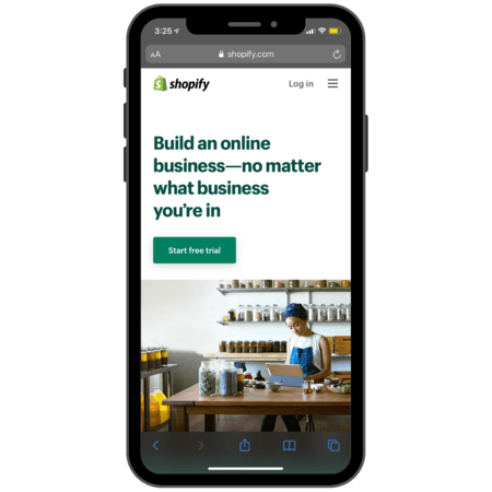
With over half of web traffic coming from mobile devices, your landing page must look and function flawlessly on smartphones.
Think of these elements as puzzle pieces. When they fit together seamlessly, your landing page becomes a conversion machine.
3. Common Mistakes to Avoid
Even the best intentions can go awry when designing a landing page.
Here are some pitfalls to watch out for.
First, avoid information overload.
A cluttered page with too many choices confuses visitors and tanks your conversion rates. Stick to one clear goal and eliminate distractions.
Second, don’t bury your CTA.
If users have to scroll endlessly to find the action button, they’ll likely give up before they get there. Place your CTA prominently above the fold.
Lastly, avoid ignoring data.
Tools like Google Analytics and Hotjar can provide invaluable insights into how users interact with your page. If you’re not tracking performance, you’re missing opportunities to improve.
A successful landing page isn’t built on guesswork—it’s driven by data.
4. Best Practices for Optimizing Landing Pages
Optimizing your landing page is not a one-and-done process. It requires continuous improvement and attention to detail.
The good news?
Small tweaks can lead to big gains in your conversion rates.
Start with A/B testing.
.png)
This involves creating at least two versions of your landing page, and testing them against each other to see which performs better.
For example, you could test different headlines or CTAs.
Platforms like Optimizely make it easy to run these experiments and collect data-driven insights.
Another best practice is to use heatmaps.
Tools like Hotjar allow you to see where users are clicking, scrolling, or dropping off. This information is invaluable for identifying weak points in your design.
Optimized landing pages don’t just convert better—they build trust and create a seamless user experience.
Speed is another crucial factor.
Compress images, minimize scripts, and use a reliable hosting service to ensure your page loads quickly. According to Google, a one-second delay can decrease conversions by up to 7%.
Finally, make your landing page shareable. Add social proof like testimonials, case studies, or trust badges. When visitors see evidence of your credibility, they’re more likely to convert.
5. Tools and Resources to Simplify the Process
Building and optimizing a landing page doesn’t have to be daunting. With the right tools, you can streamline the process and focus on what matters most—conversions.
Here are some of the best tools available.
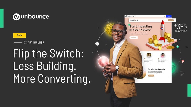
Unbounce

A user-friendly platform for creating landing pages with drag-and-drop functionality. Perfect for beginners and pros alike.
Instapage

Known for its advanced personalization features, this tool helps you create tailored experiences for your audience.
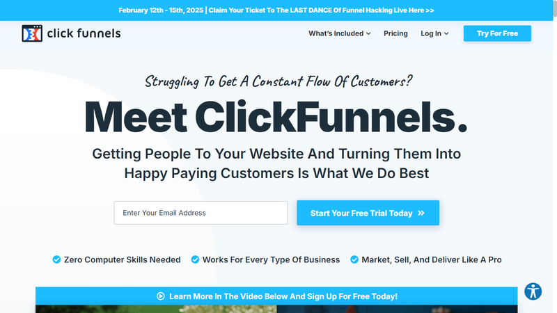
ClickFunnels

Ideal for creating sales funnels that guide users from the first click to final purchase.
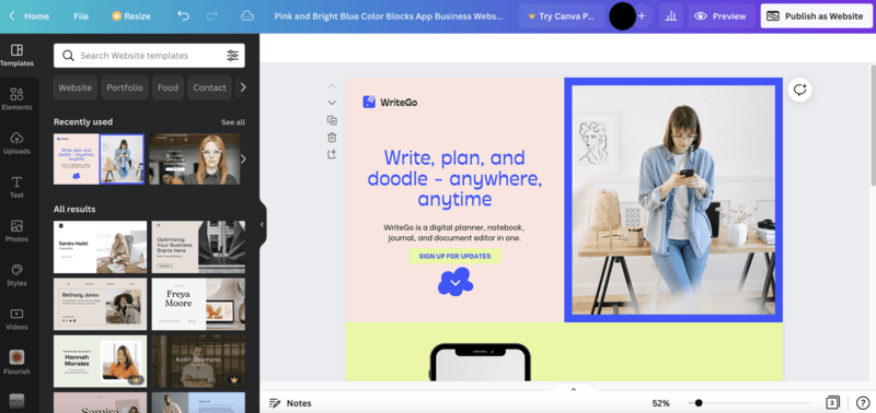
Canva

Not just for social media graphics—use it to create visually appealing landing page assets like banners and headers.
Each of these tools is designed to simplify your workflow, so you can spend less time troubleshooting and more time driving results.
Remember, even the most powerful tools won’t guarantee success if your strategy isn’t sound. Focus on understanding your audience and testing what works for them.
6. Examples of High-Converting Landing Pages
Looking for inspiration?
Let’s break down some examples of landing pages that convert like crazy and what makes them work.
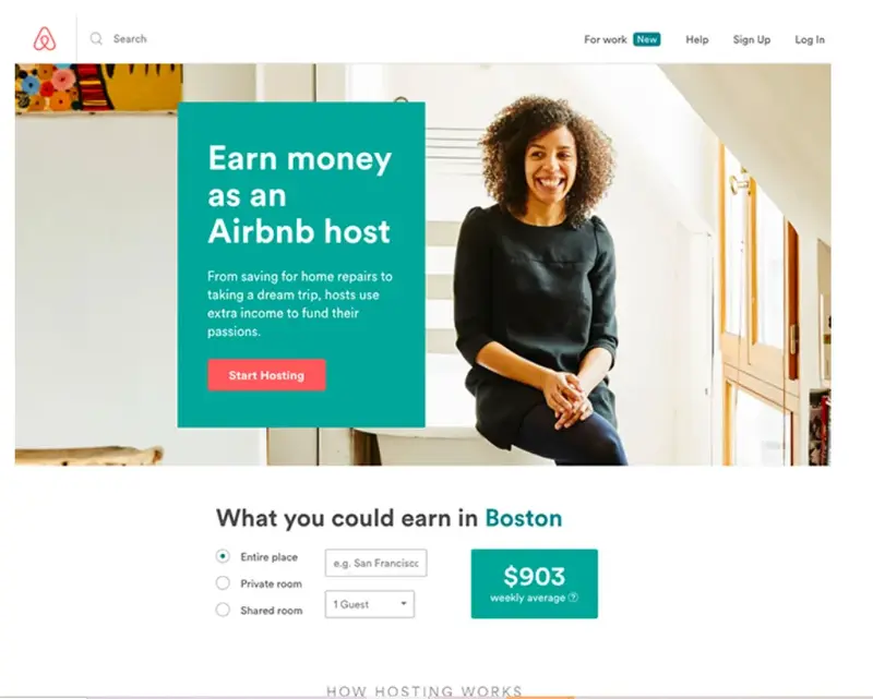
Airbnb

Airbnb’s landing page is the epitome of simplicity and trust-building. With a bold headline, stunning visuals, and a clear CTA (“Start Hosting”), they make it easy for users to take the next step.
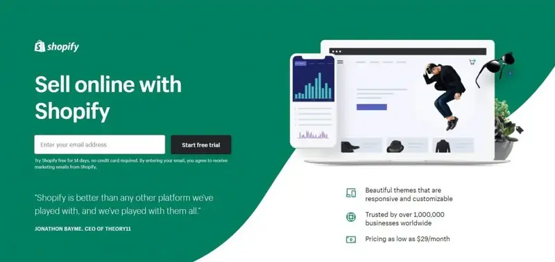
Shopify

Shopify’s landing page focuses on benefits with a headline like “Sell online with Shopify”. The page is loaded with social proof, including testimonials and success stories.
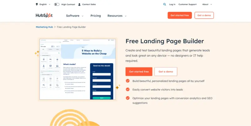
HubSpot

Known for their landing page builder, HubSpot keeps the layout clean and focused. A concise content, clear headline, and engaging copy make their pages highly effective.
The best landing pages don’t just sell—they solve a problem and make it irresistible for users to act.
By studying these examples, you can identify patterns and strategies that might work for your landing page.
Conclusion
Creating high-converting landing pages is both an art and a science. By focusing on clear goals, actionable CTAs, and a seamless user experience, you can significantly boost your conversions.
From mastering the basics to leveraging advanced tools like Instapage and Hotjar, this guide has covered everything you need to know to get started—and go far. Remember, testing and optimization are your best friends. What works today might need tweaking tomorrow, so stay flexible and data-driven.
Now it’s your turn. Go ahead, apply these strategies, and watch your landing pages transform into powerful conversion machines.

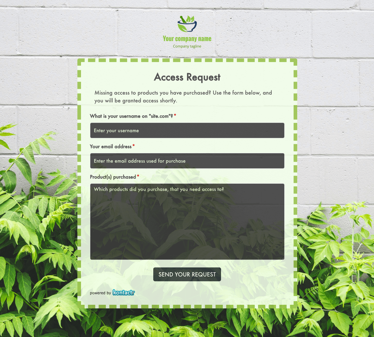 Access Request Form
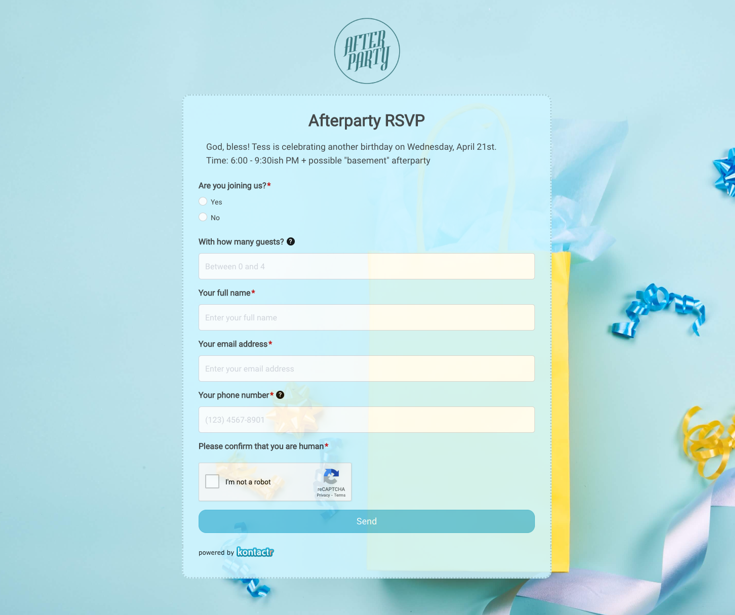 Afterparty RSVP Form
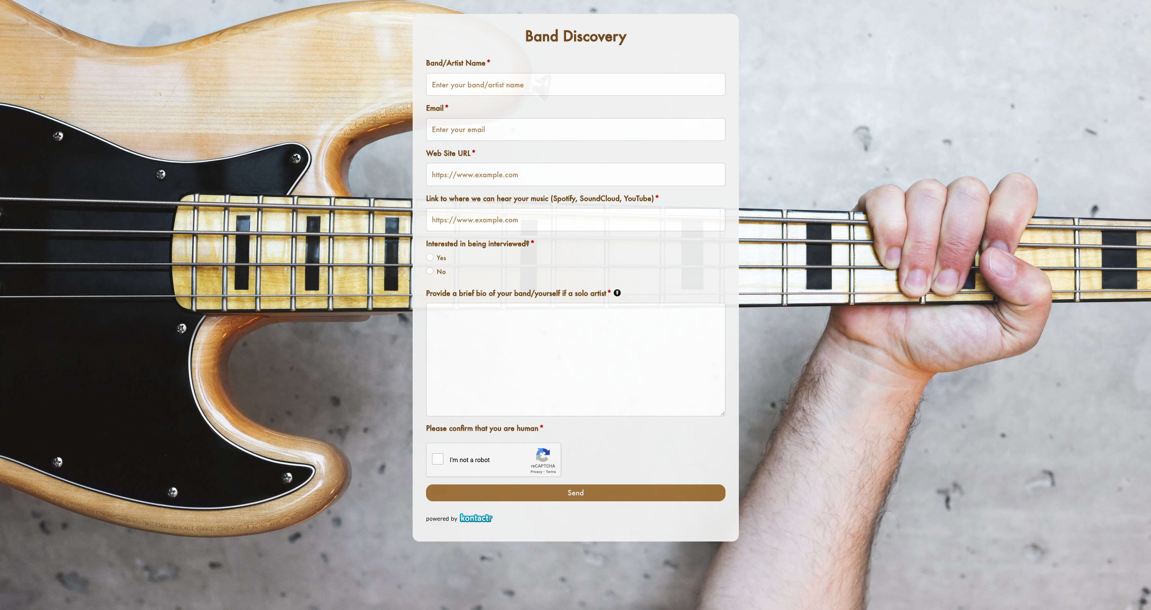 Band Discovery Form
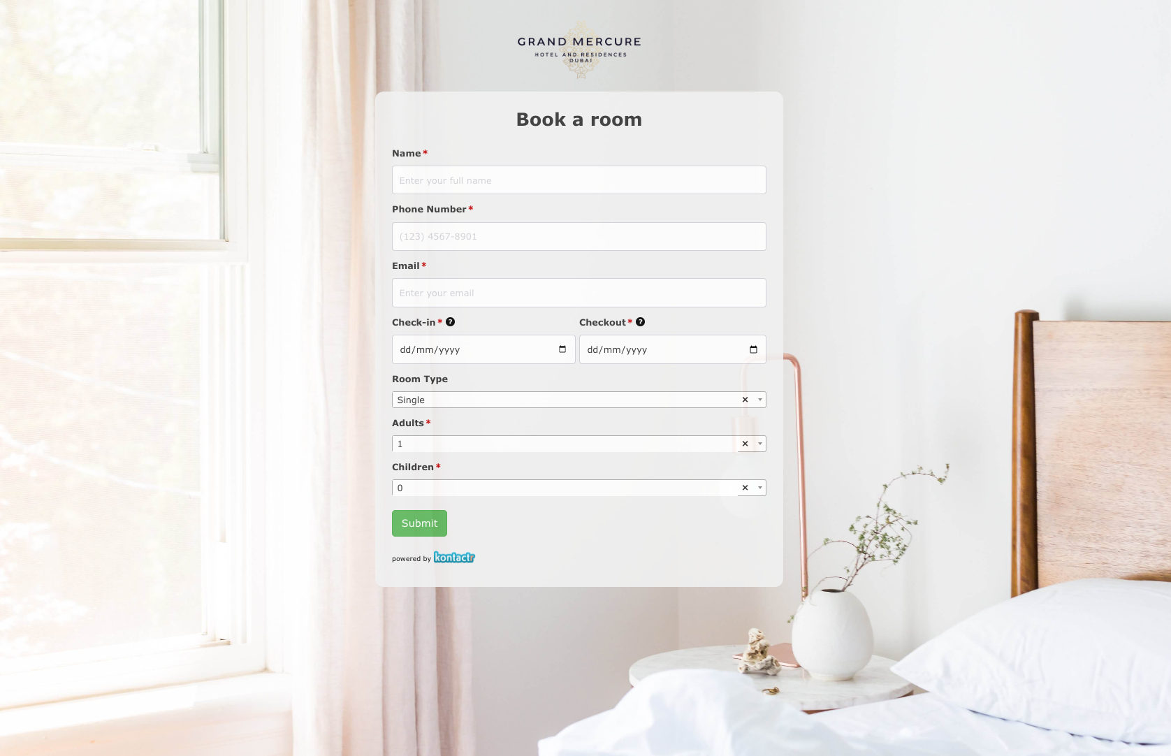 Book a room Form
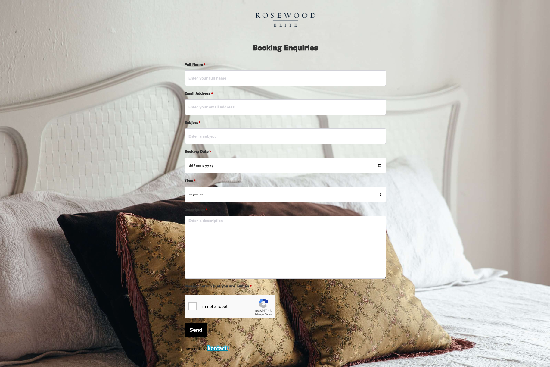 Booking Enquiries Form
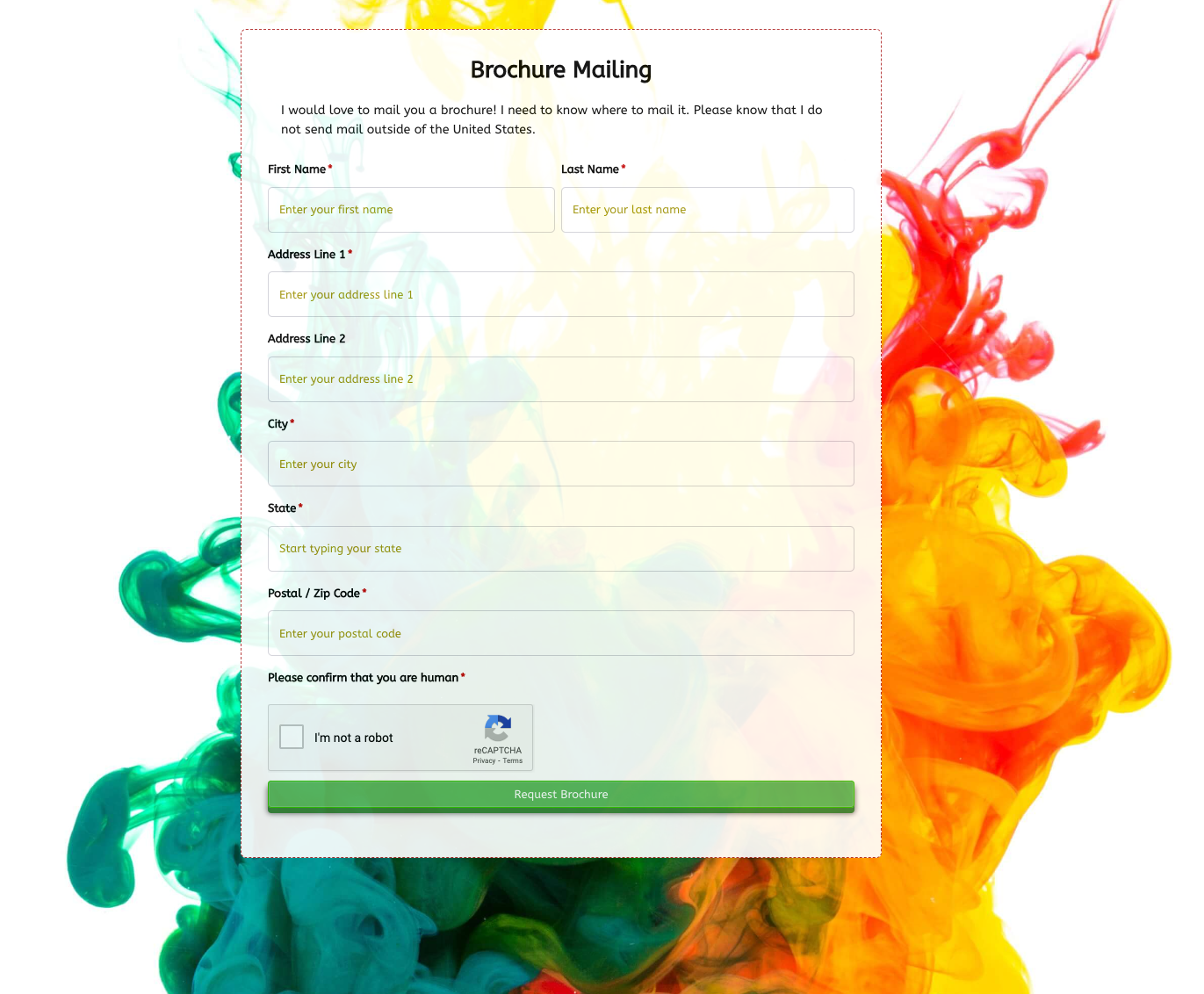 Brochure Mailing Form
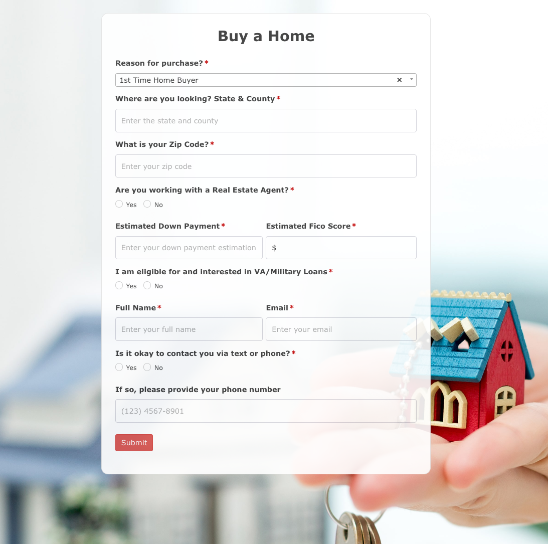 Buy a Home Form
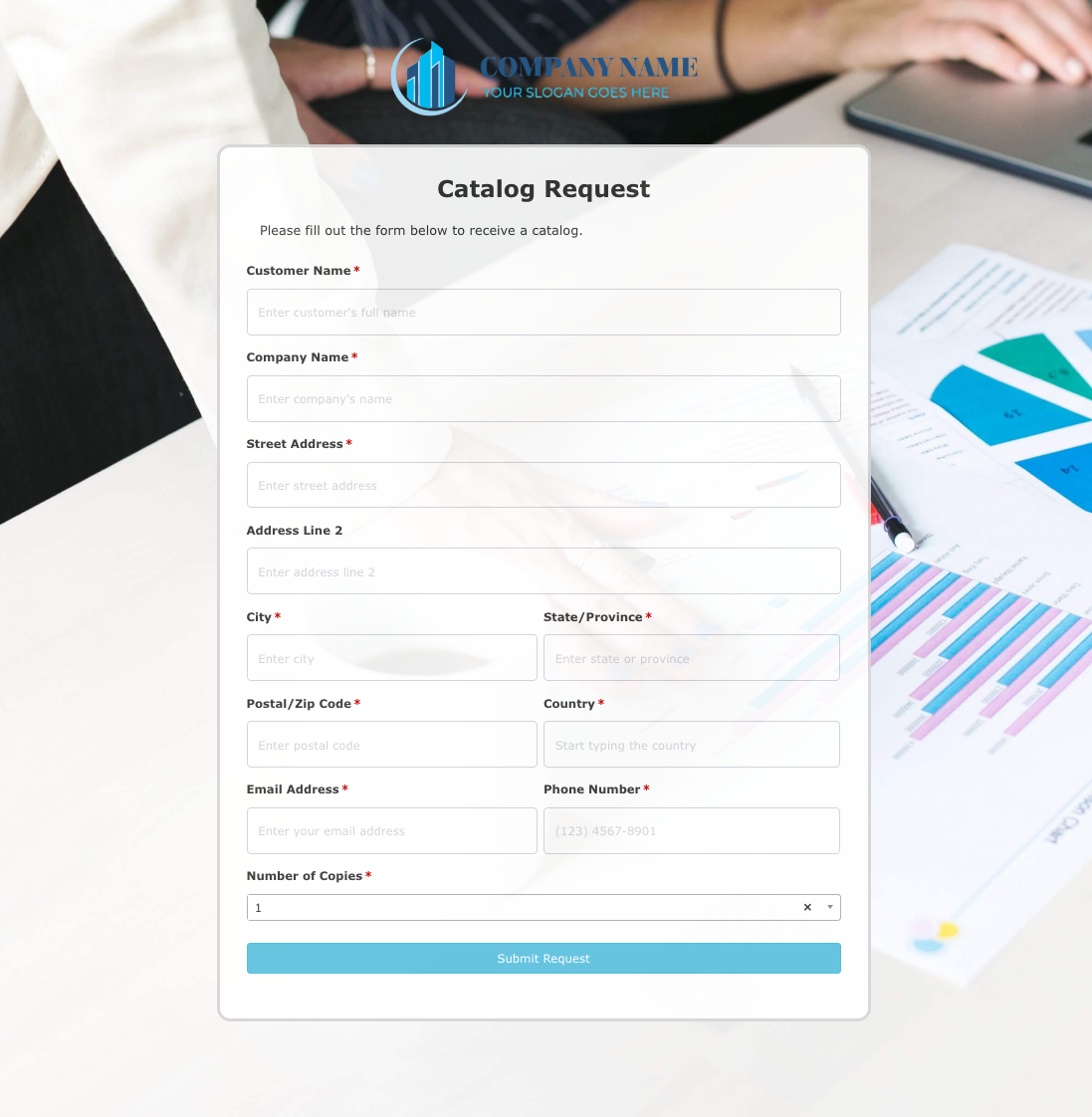 Catalog Request Form
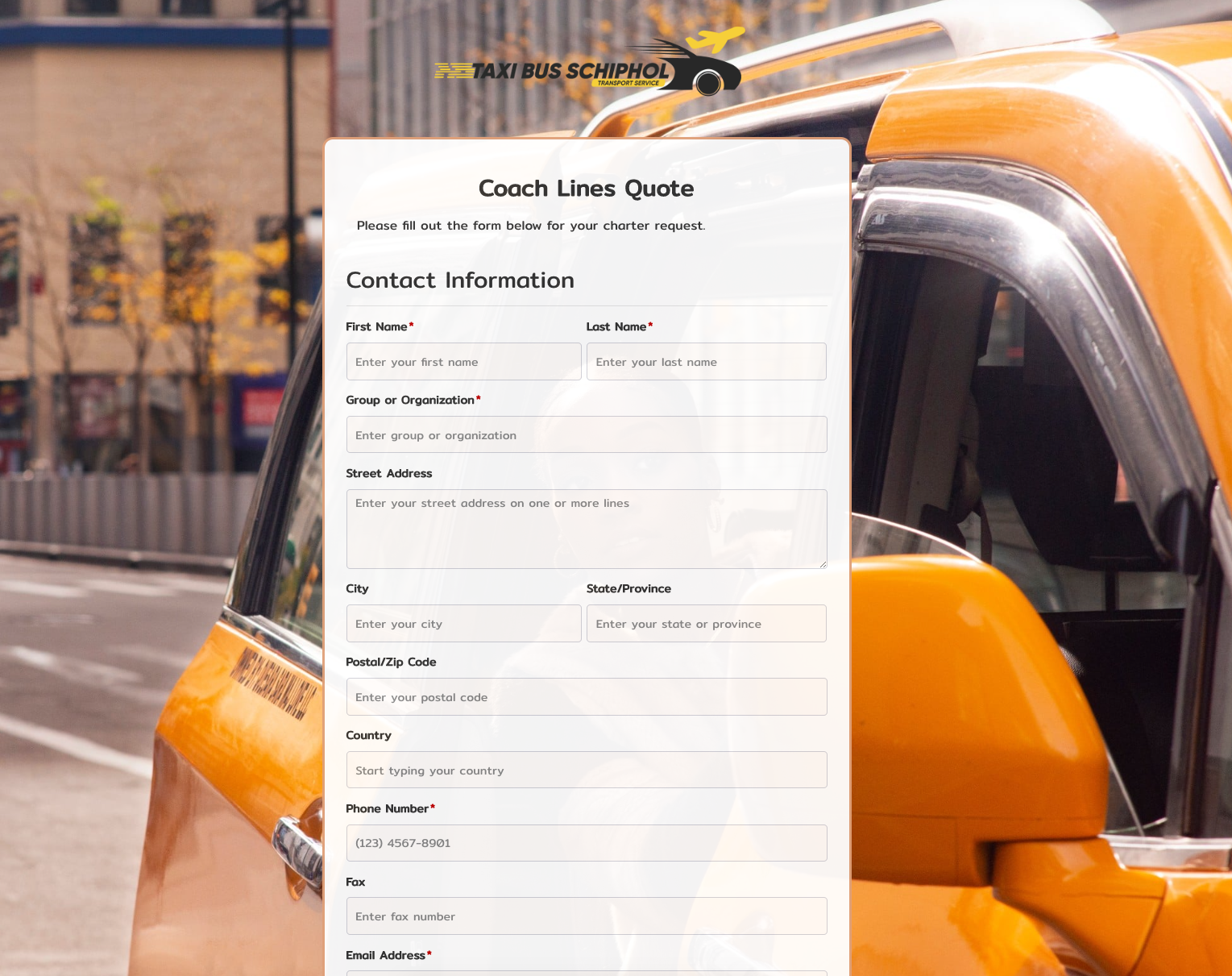 Coach Lines Quote Form
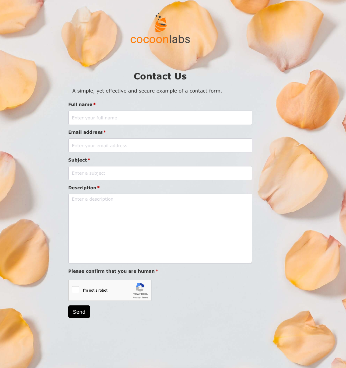 Contact Us Form
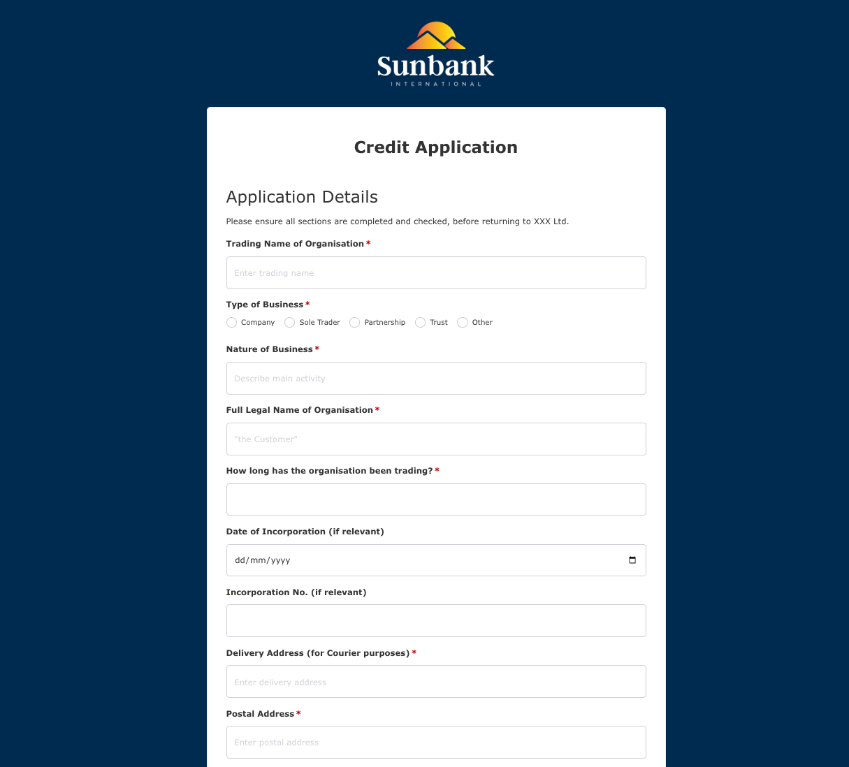 Credit Application Form
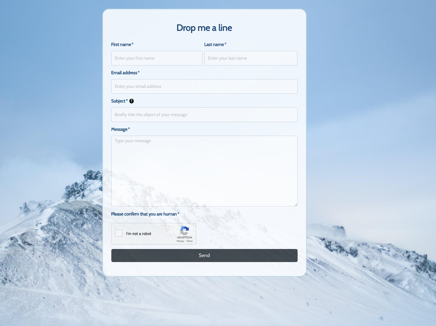 Drop me a line Form
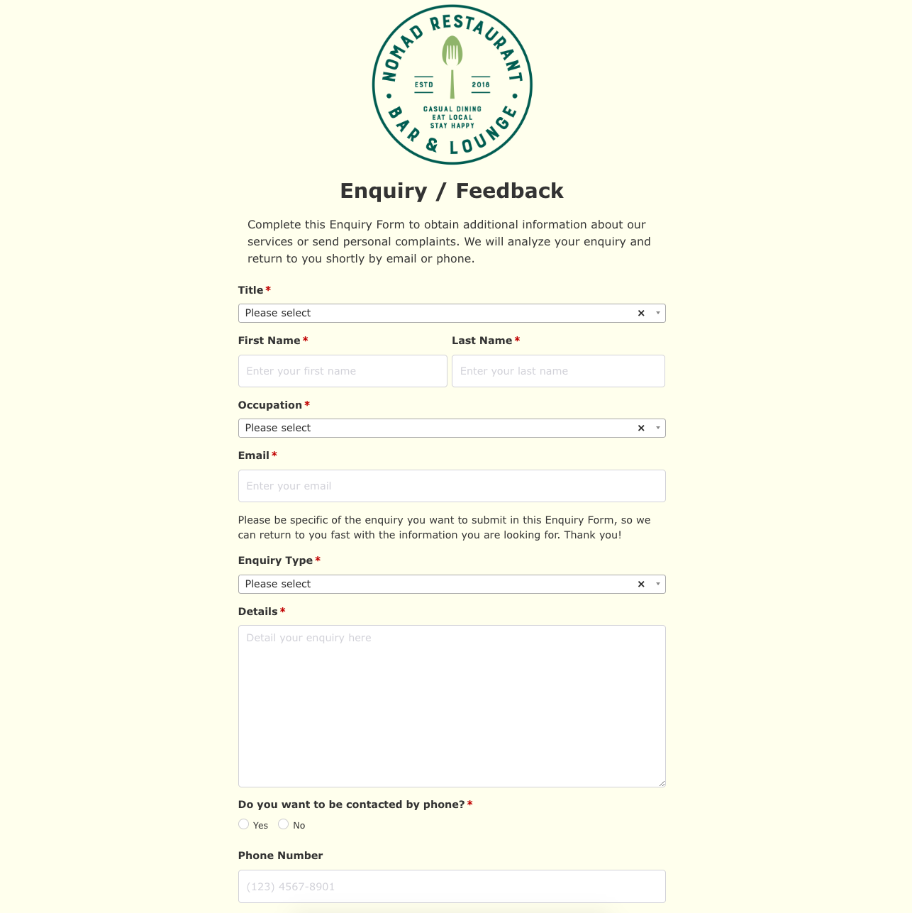 Enquiry / Feedback Form
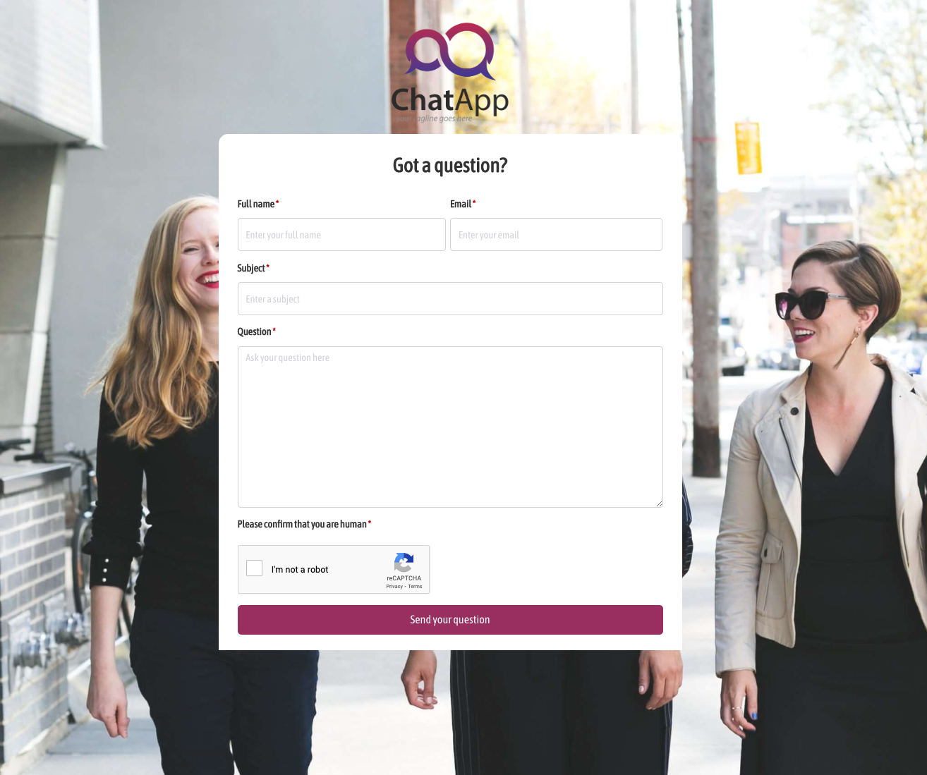 Got a question? Form
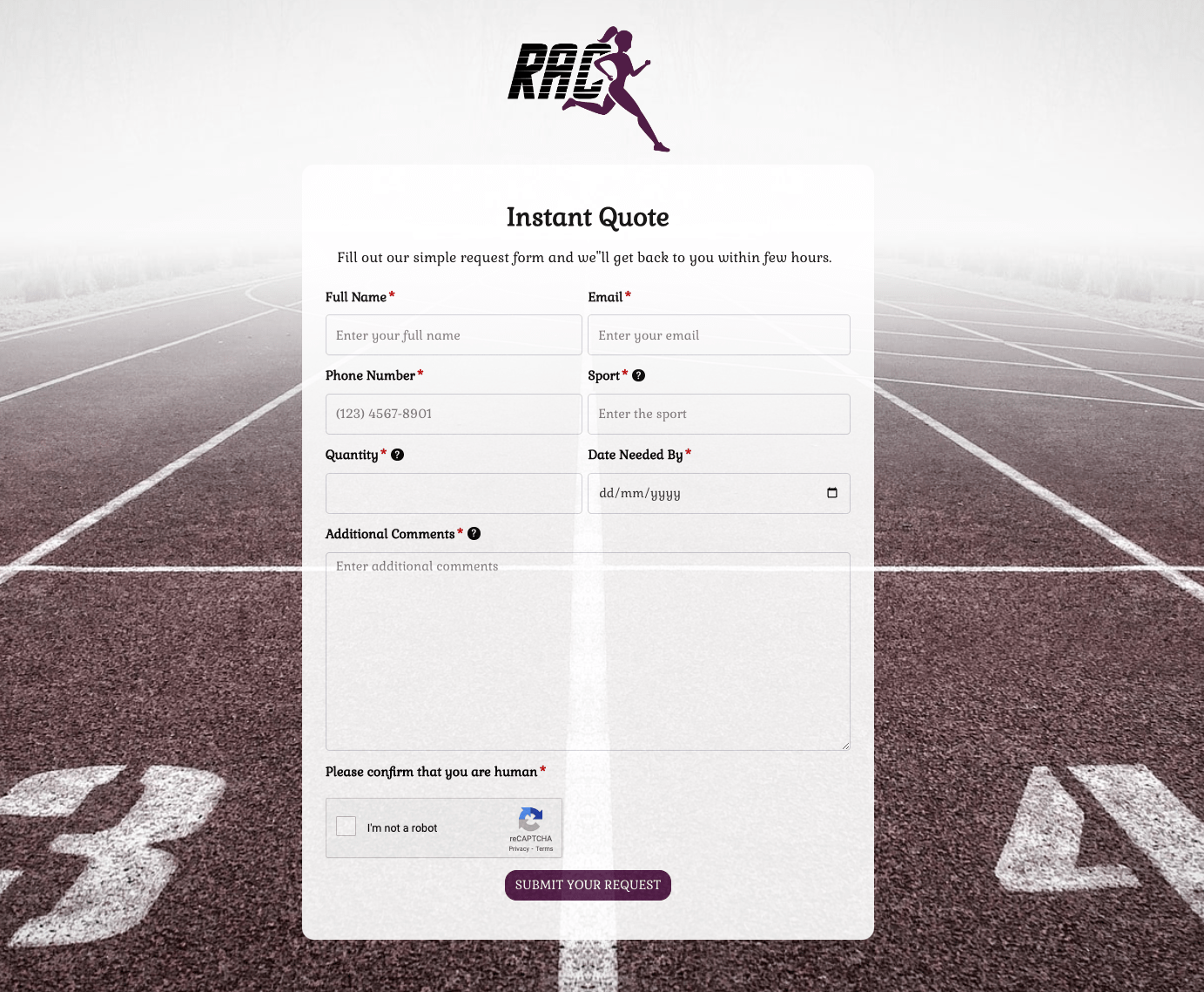 Instant Quote Form
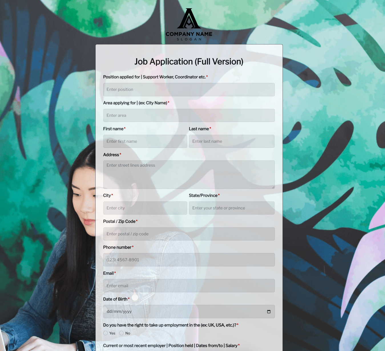 Job Application Form
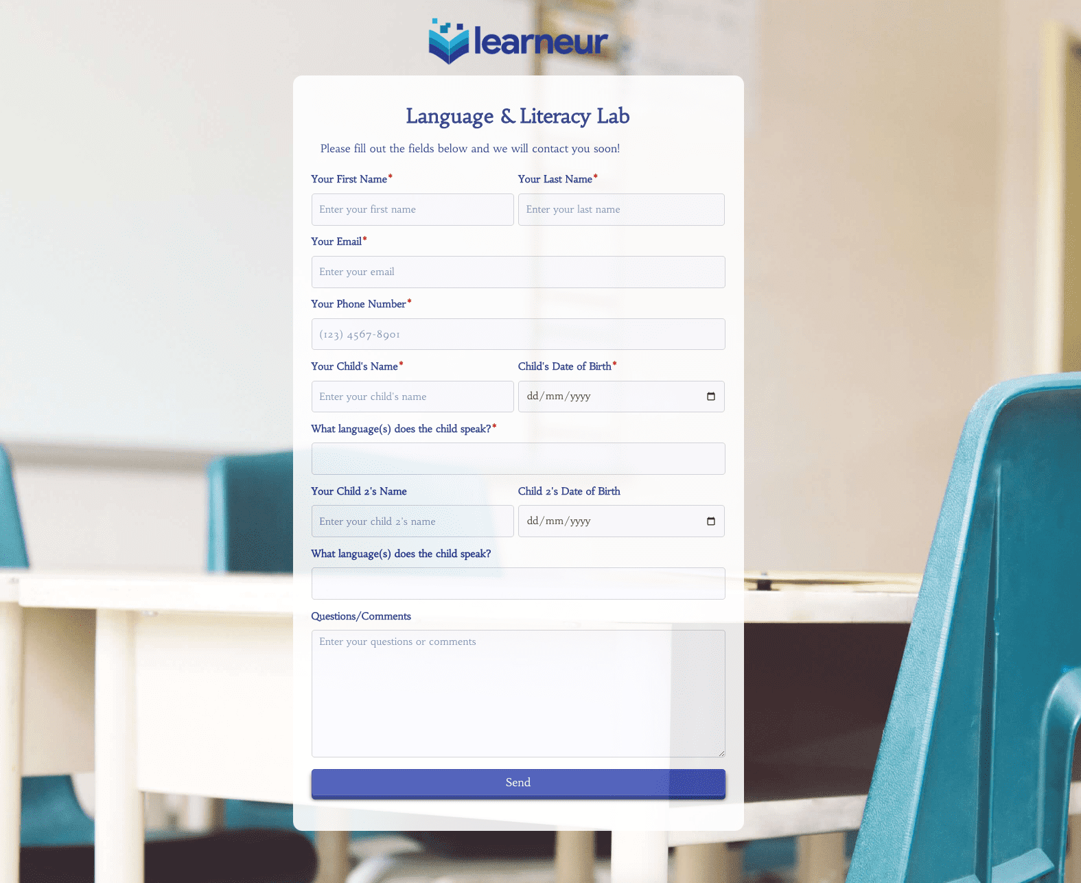 Language & Literacy Lab Form
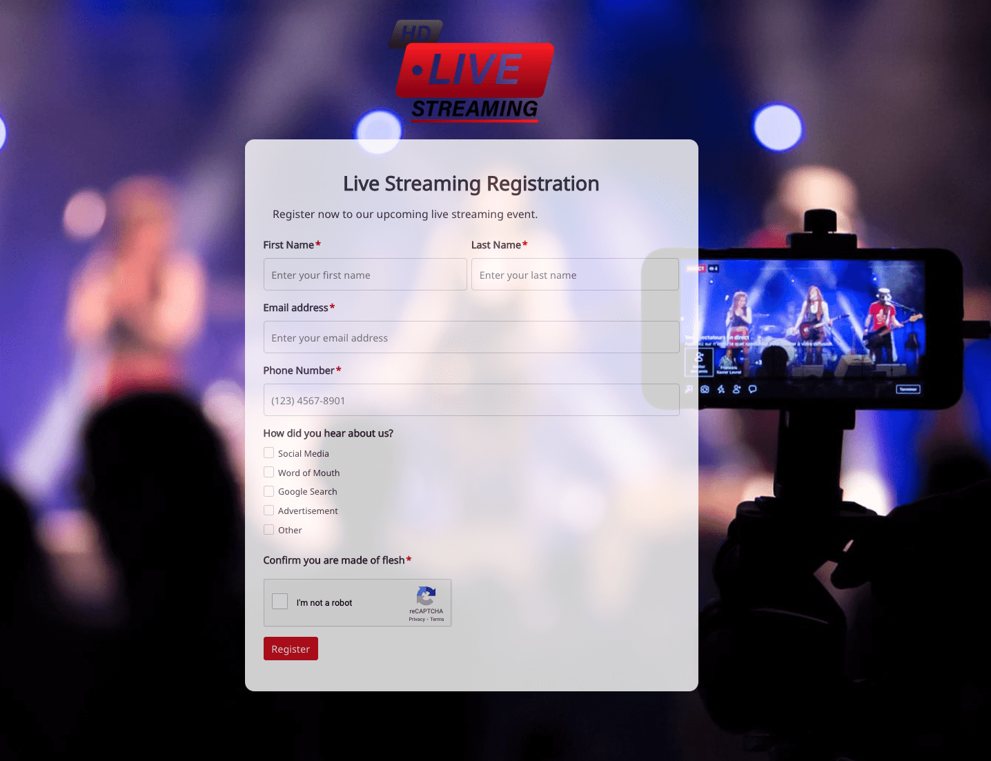 Live Streaming Registration Form
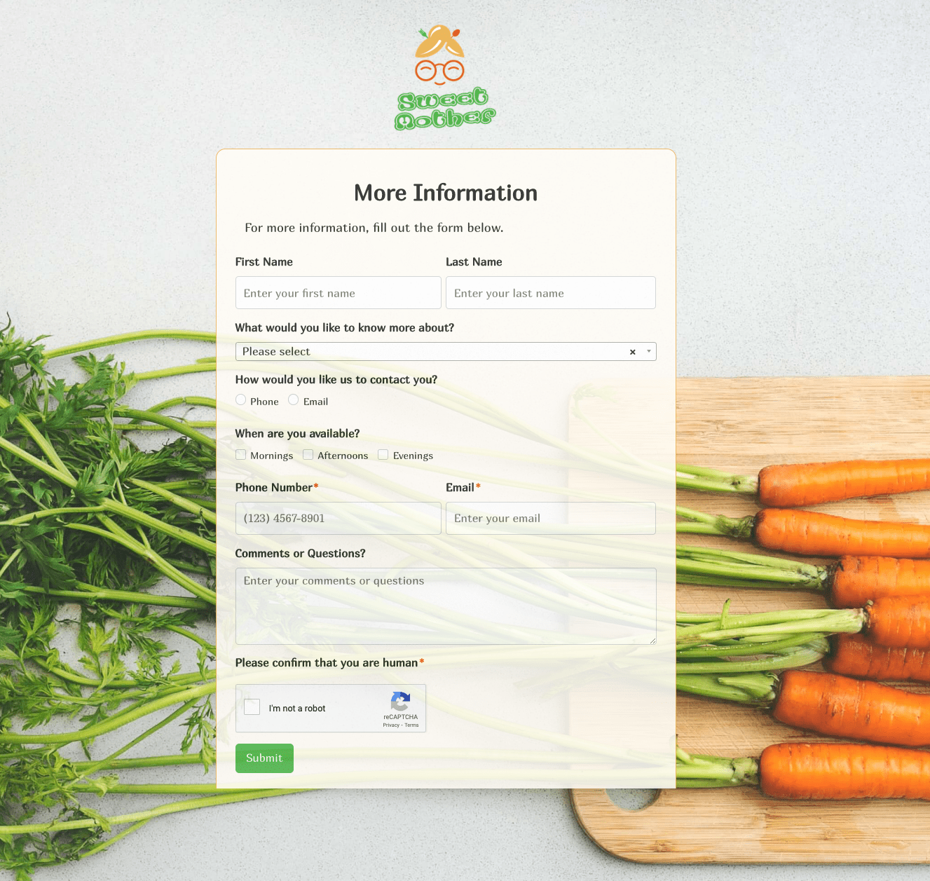 More Information Form
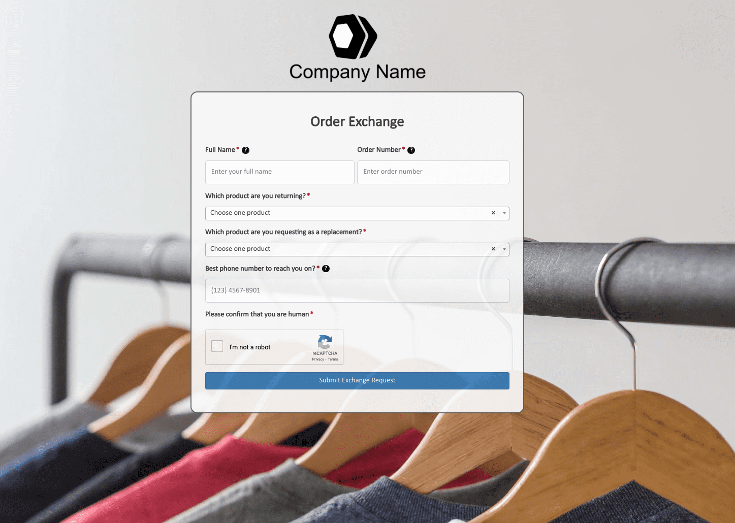 Order Exchange Form
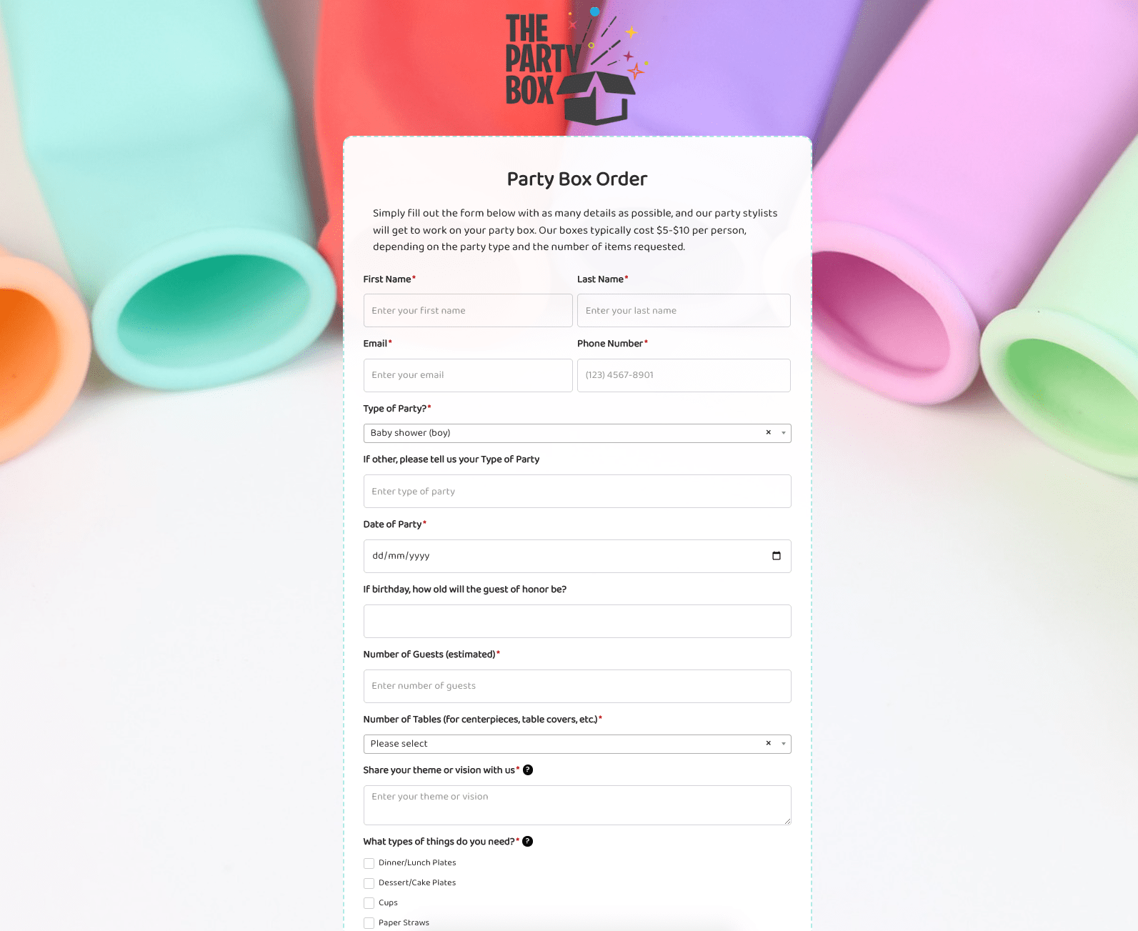 Party Box Order Form
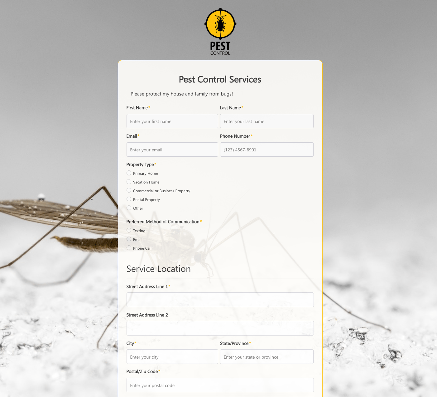 Pest Control Services Form
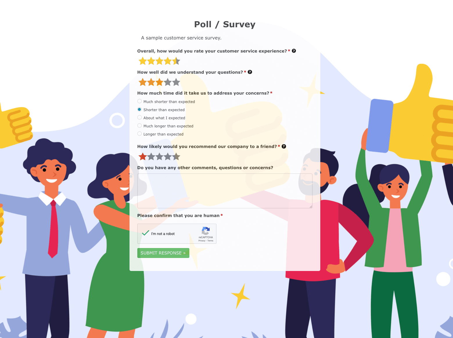 Poll / Survey Form
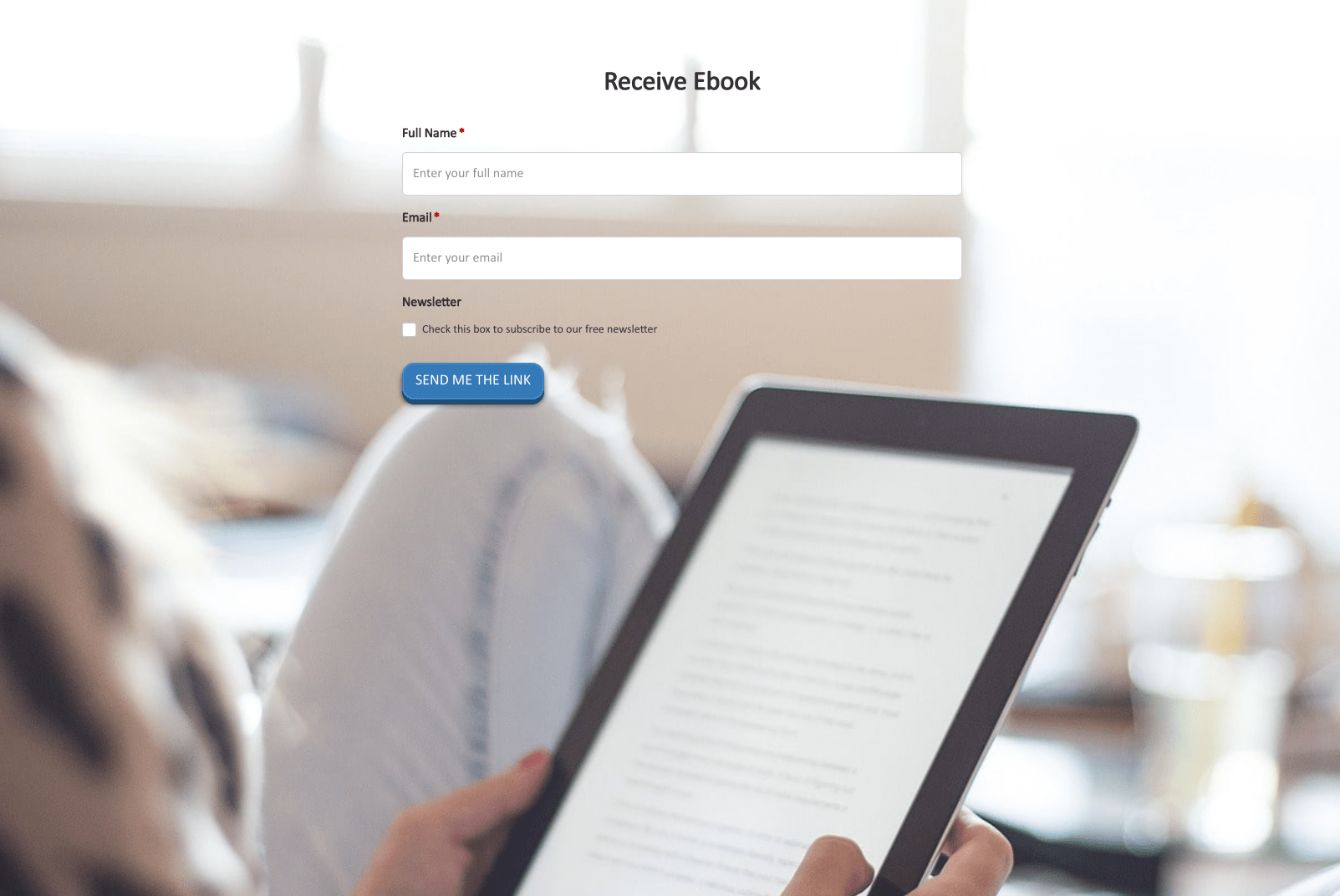 Receive Ebook Form
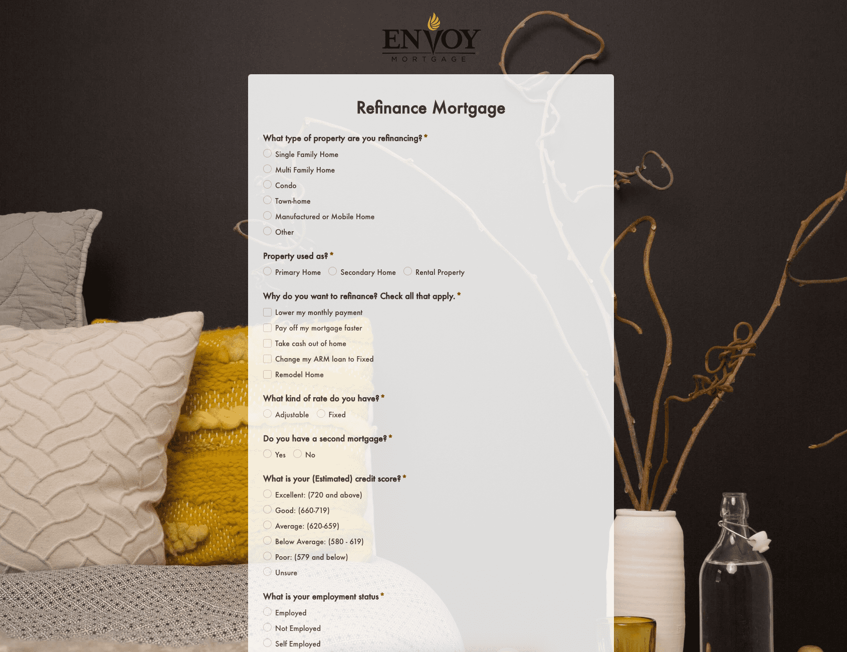 Refinance Mortgage Form
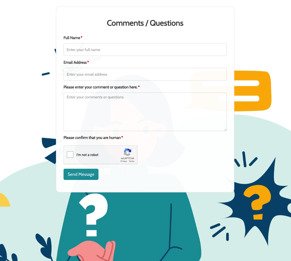 Remarks / Questions Form
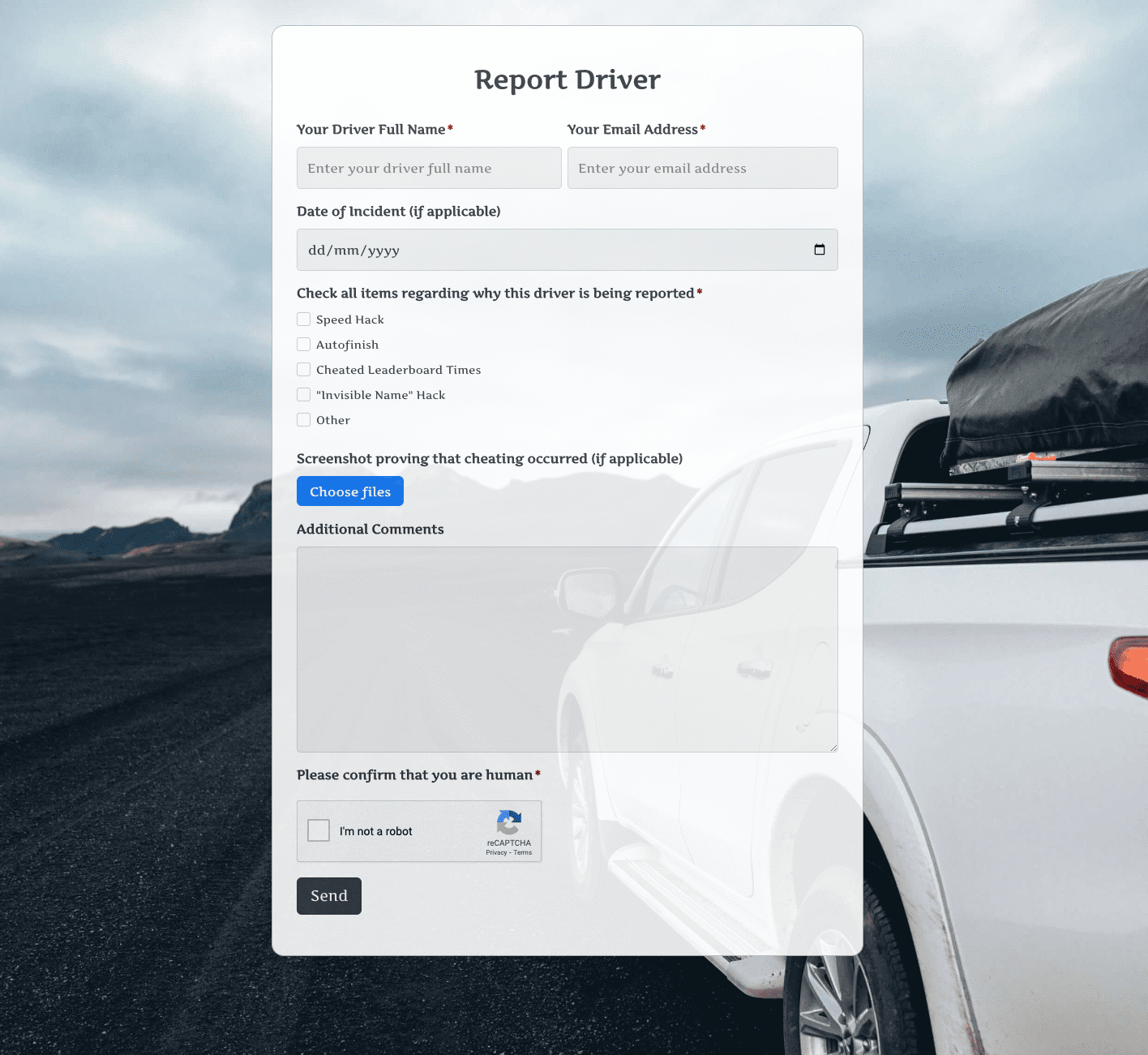 Report Driver Form
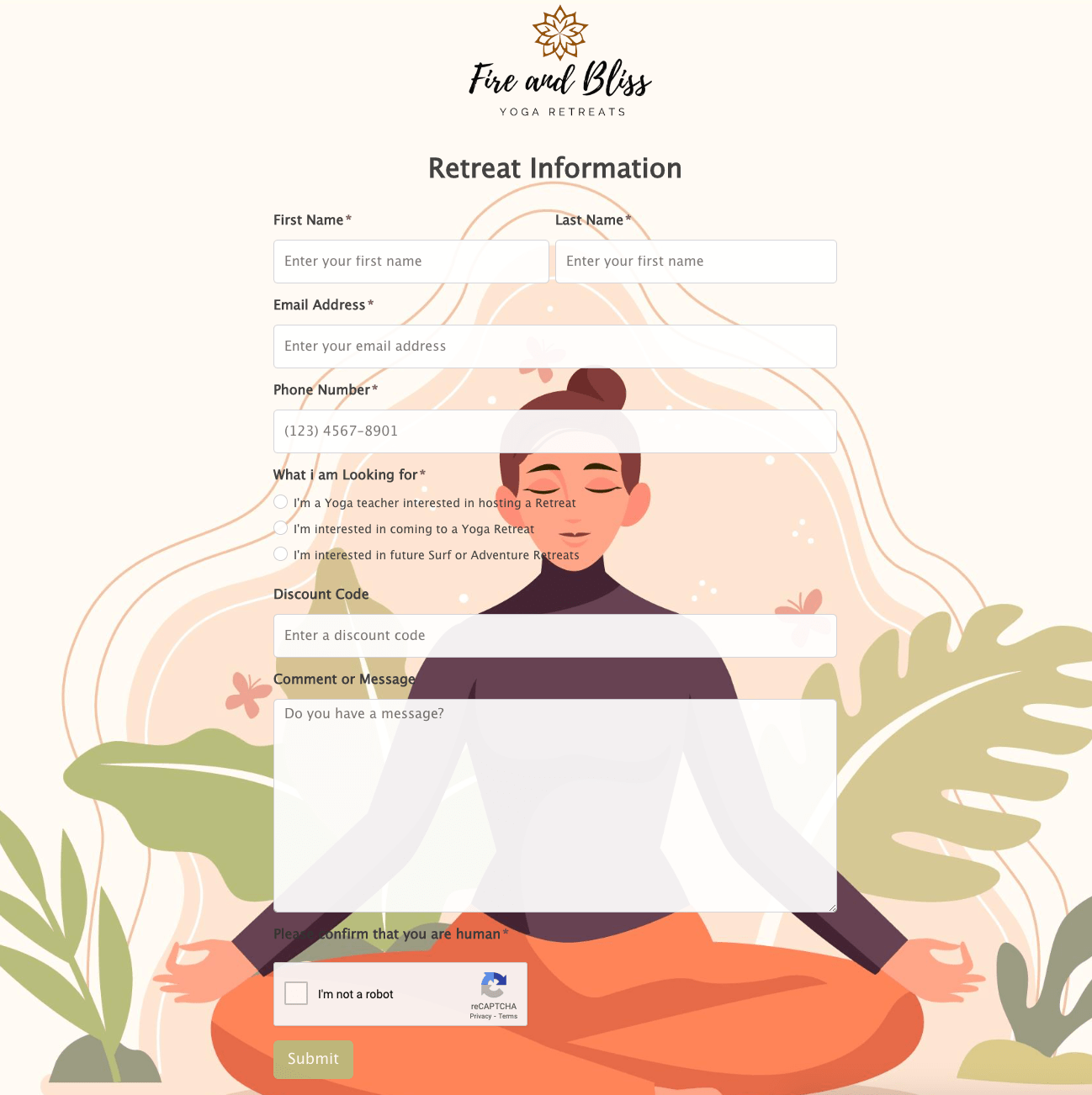 Retreat Information Form
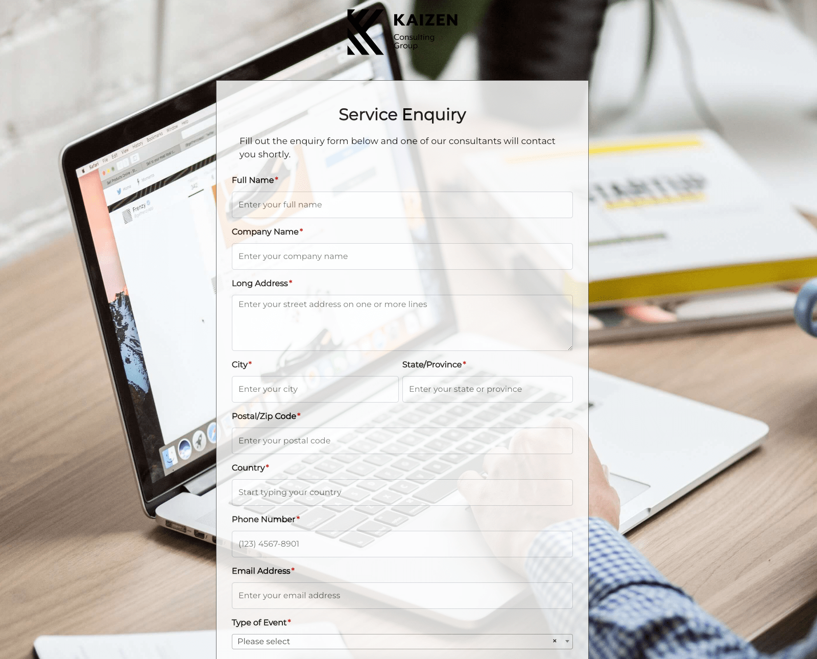 Service Enquiry Form
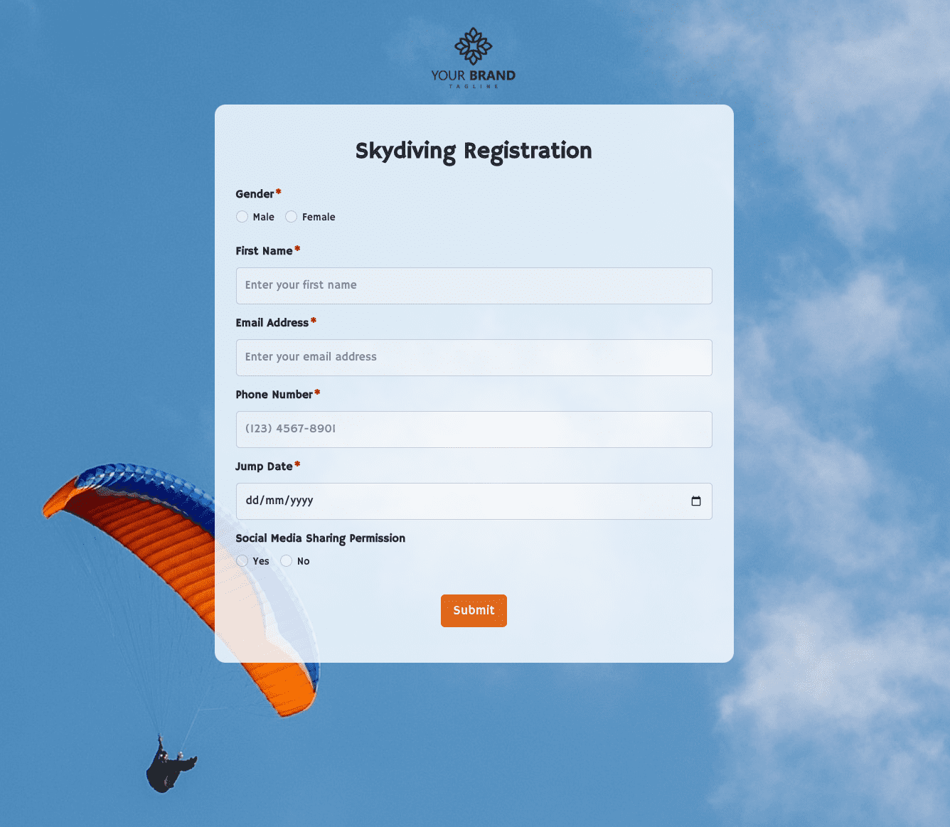 Skydiving Registration Form
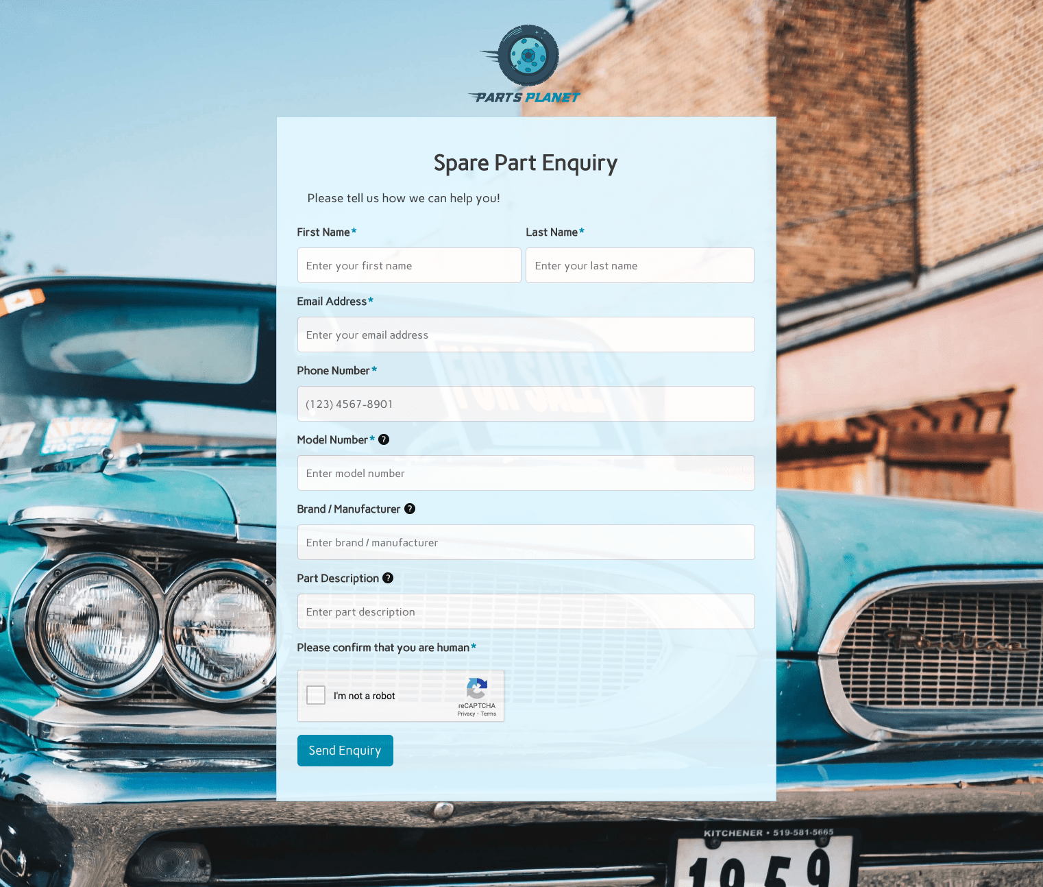 Spare Part Enquiry Form
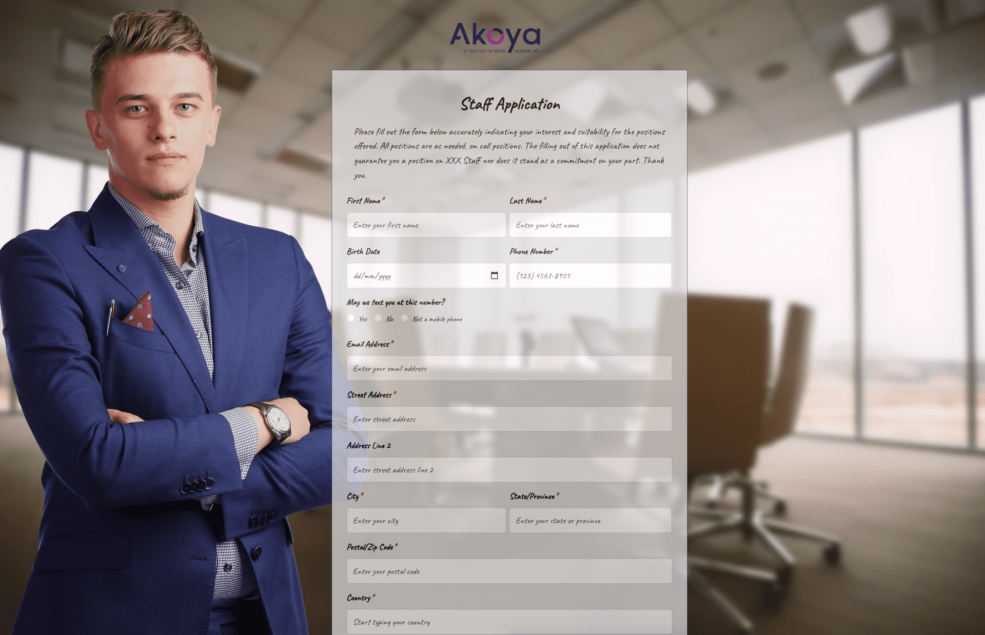 Staff Application Form
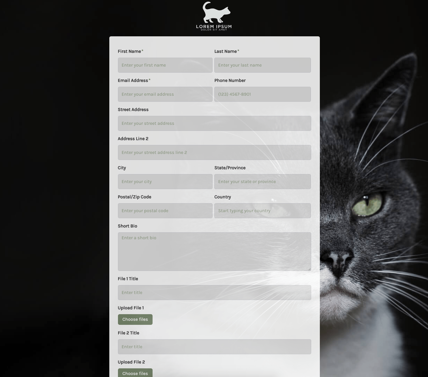 Submission Form
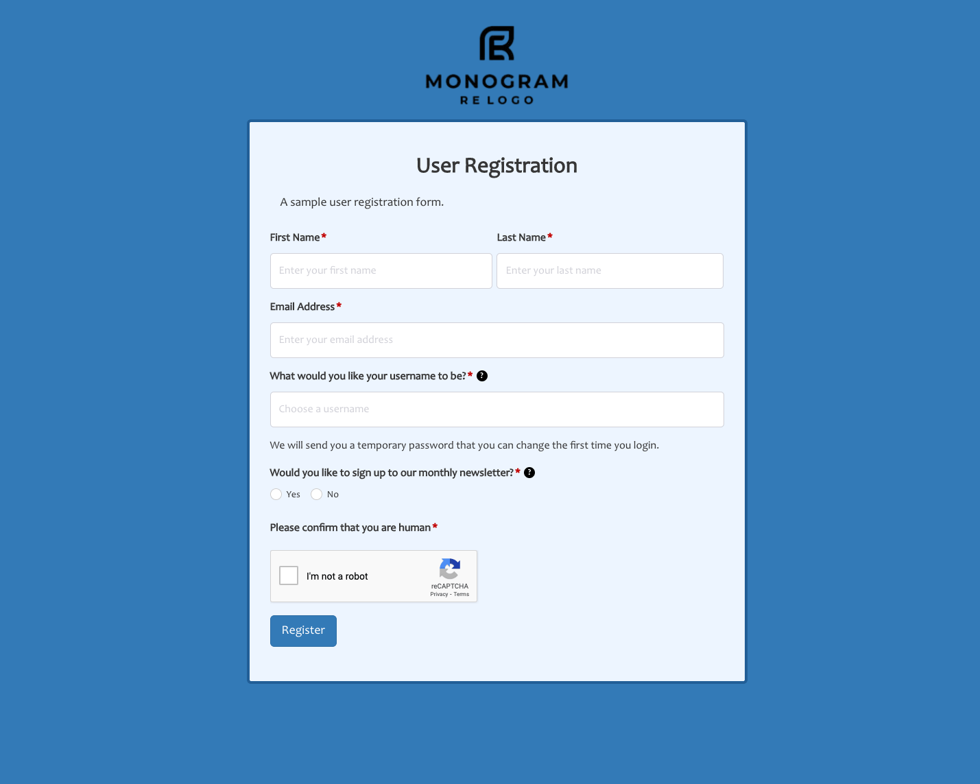 User Registration Form
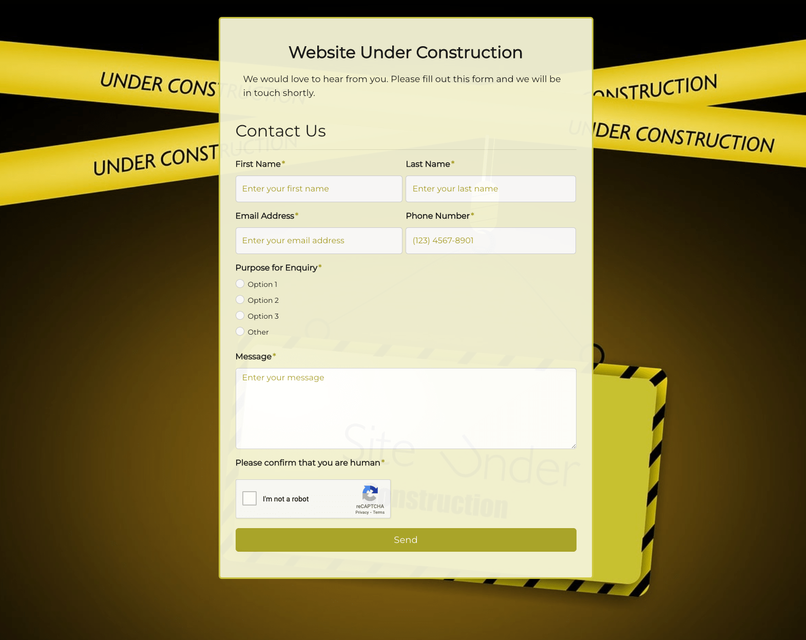 Website Under Construction Form
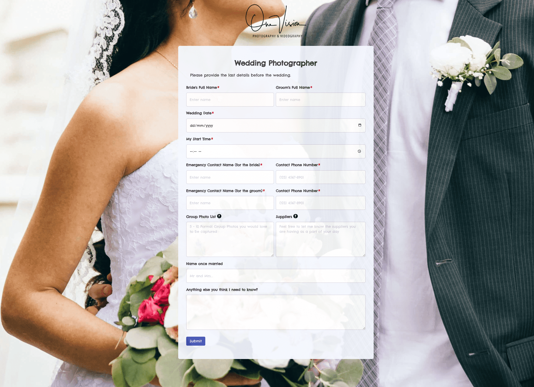 Wedding Photographer Form
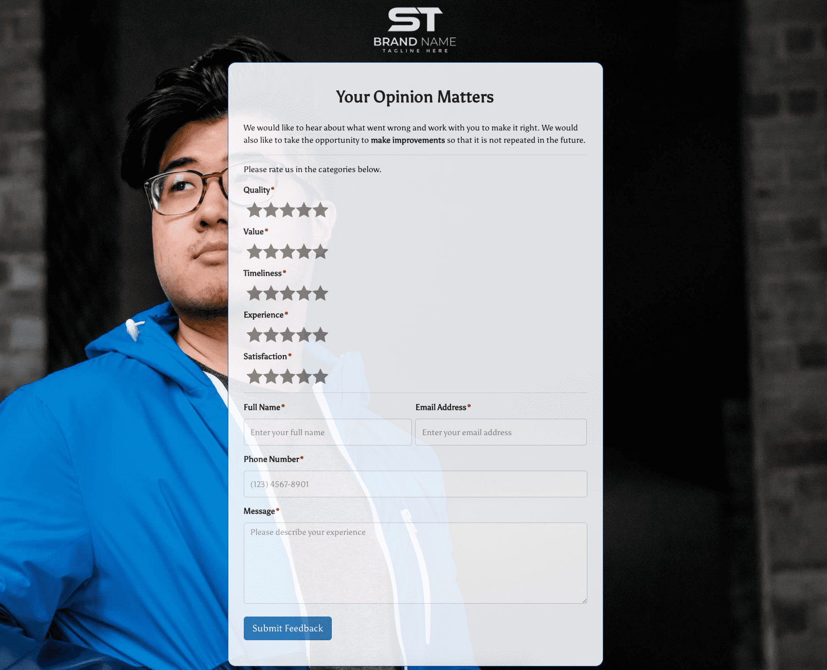 Your Opinion Matters Form


.webp)

.png)
