With Google’s shift to mobile-first indexing, optimizing your website for mobile devices has become more critical than ever. In 2024, websites that are not mobile-friendly will struggle to rank well on search engines. This guide will help you optimize your website for mobile-first indexing, focusing on responsive design, page speed improvements, and mobile SEO best practices.
Contents:
- What is Mobile-First Indexing?
- Why Mobile-First Indexing Matters in 2024
- Responsive Design: The Foundation of Mobile Optimization
- Improving Page Speed for Mobile Users
- Optimizing Content for Mobile Devices
- Mobile SEO Best Practices

1. What is Mobile-First Indexing?
.jpg)
Mobile-first indexing means that Google predominantly uses the mobile version of your website for indexing and ranking. Previously, Google indexed desktop versions of websites first, but with the growing use of mobile devices, they now prioritize the mobile version. If your website is not optimized for mobile devices, it could negatively impact your rankings on search engine results pages (SERPs).
What This Means for Your Website
When Googlebot crawls your site, it looks at the mobile version first. If your mobile site is incomplete, slow, or unoptimized, your search rankings may suffer. This makes mobile optimization a top priority for SEO in 2024.
2. Why Mobile-First Indexing Matters in 2024

With over 60% of all web traffic now coming from mobile devices, Google’s focus on mobile-first indexing makes sense. In 2024, failing to optimize your site for mobile devices will result in lower rankings and a poor user experience. Moreover, a mobile-first approach is no longer optional — it is essential for website success.
Impact on SEO
- Lower rankings: Websites that aren’t mobile-friendly are likely to see a drop in rankings as Google continues to prioritize mobile usability.
- Higher bounce rates: If a website doesn’t load well on mobile, visitors are more likely to leave, which can increase bounce rates and hurt SEO.
- Decreased user engagement: Mobile users expect fast, responsive experiences. If your site performs poorly on mobile, you’ll lose engagement.
3. Responsive Design: The Foundation of Mobile Optimization
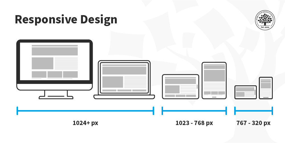
Responsive web design is the most crucial element of mobile-first optimization. It ensures that your website adapts to different screen sizes, providing an optimal viewing experience whether the user is on a smartphone, tablet, or desktop. Google has stated that responsive design is their recommended solution for mobile-first indexing.
Key Aspects of Responsive Design
- Fluid grids: Design layouts should be flexible and scalable across devices.
- Flexible images: Images should automatically resize depending on the user’s screen size. Use CSS to set maximum widths, ensuring they don’t overflow.
- Media queries: Use CSS media queries to apply different styles for various screen sizes. This ensures that the layout adjusts based on the device dimensions.
Why It’s Essential for SEO
Responsive design is not just a design trend; it’s an essential part of SEO. A site that doesn’t adjust well to different screen sizes will result in a poor user experience, higher bounce rates, and lower search rankings.
4. Improving Page Speed for Mobile Users

Page speed is one of the most critical ranking factors for mobile SEO. In 2024, users expect websites to load quickly — especially on mobile devices. A slow-loading site can lead to a poor user experience, lower rankings, and reduced conversions.
Tips to Improve Page Speed
- Optimize images: Compress images without sacrificing quality. Use modern formats like WebP for faster loading.
- Use a Content Delivery Network (CDN): A CDN can help reduce load times by delivering content from servers closer to the user.
- Minimize JavaScript and CSS: Reduce the size of your JavaScript and CSS files by removing unnecessary code and minifying files.
- Leverage browser caching: Store some resources locally in the browser, so they don’t need to be reloaded every time a user visits your site.
- Enable lazy loading: Load images and videos only when they are needed, preventing unnecessary data consumption and improving page load time.
By optimizing your page speed, you can improve user satisfaction and reduce bounce rates, which will positively impact your search engine rankings.
5. Optimizing Content for Mobile Devices

Content that works well on desktop may not always perform as effectively on mobile devices. Optimizing content for mobile is about ensuring readability, user engagement, and proper formatting for smaller screens.
Tips for Mobile Content Optimization
- Shorter paragraphs: Keep paragraphs brief and easy to read on small screens. Aim for 2–3 sentences per paragraph.
- Use larger fonts: Ensure that text is large enough to read on mobile devices without zooming in. Aim for at least 16px for body text.
- Use concise headlines: Keep your headings clear and concise to make it easier for users to scan your content.
- Break up text: Use bullet points, numbered lists, and subheadings to make your content more scannable and digestible.
- Prioritize key information: Ensure that the most important information appears near the top of the page, so users don’t need to scroll excessively.
6. Mobile SEO Best Practices
In addition to responsive design and content optimization, mobile SEO involves a few key best practices to help your site rank higher in mobile search results.
1. Optimize for Local Search
Many mobile searches are location-based. Ensure that your website is optimized for local SEO by including location keywords, optimizing Google My Business, and using structured data to indicate your location.
2. Implement AMP (Accelerated Mobile Pages)
AMP is a Google-backed project that allows you to create fast-loading mobile pages. Implementing AMP can significantly improve page speed, making it easier for your content to rank higher in mobile searches.
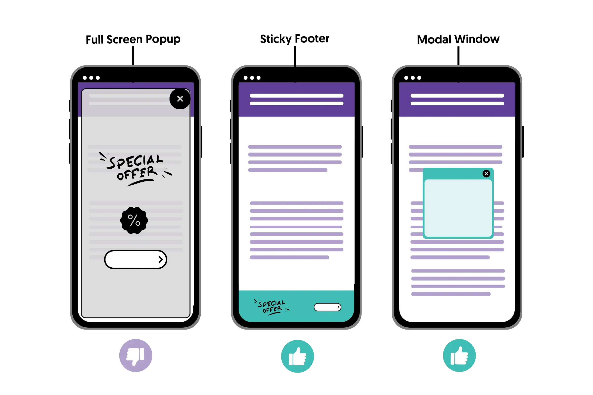
3. Avoid Intrusive Pop-ups
Intrusive interstitials (like large pop-ups) that cover the main content can result in penalties from Google. Ensure that your pop-ups are small and easy to dismiss on mobile devices.
4. Optimize for Voice Search
With the rise of voice search, optimizing for long-tail keywords and natural language queries is essential. Focus on creating content that answers specific questions and includes conversational phrases.
5. Test Your Mobile Website Regularly
Regularly testing your website on different mobile devices is essential to ensure that everything functions smoothly. Use Google’s Mobile-Friendly Test tool to evaluate your site’s mobile performance and identify areas for improvement.
6. Implement Structured Data
Adding structured data, such as schema markup, helps search engines understand the content on your mobile site. This can lead to better search visibility, especially for features like rich snippets and voice search results. Use Google’s Structured Data Markup Helper to implement schema on your site.
7. Ensure Cross-Device Compatibility
Your mobile site should work across a variety of devices, including smartphones and tablets. Ensure that elements like buttons, forms, and interactive features work seamlessly across different screen sizes and devices.
Conclusion
Optimizing your website for mobile-first indexing in 2024 is essential for maintaining strong search engine rankings and providing a seamless user experience. By focusing on responsive design, improving page speed, optimizing content, and following mobile SEO best practices, you can ensure that your website thrives in a mobile-first world.
As mobile usage continues to dominate, prioritizing mobile optimization will not only boost your SEO performance but also enhance user engagement and satisfaction. With the right strategies in place, your site will be well-prepared for the mobile-first future.
 Access Request Form
 Afterparty RSVP Form
 Band Discovery Form
 Book a room Form
 Booking Enquiries Form
 Brochure Mailing Form
 Buy a Home Form
 Catalog Request Form
 Coach Lines Quote Form
 Contact Us Form
 Credit Application Form
 Drop me a line Form
 Enquiry / Feedback Form
 Got a question? Form
 Instant Quote Form
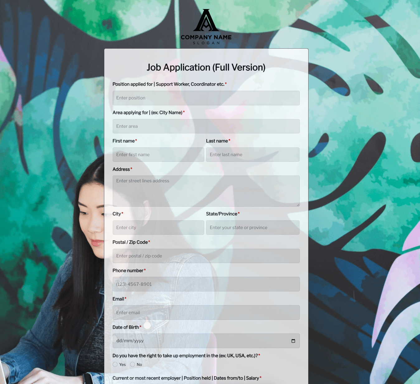 Job Application Form
 Language & Literacy Lab Form
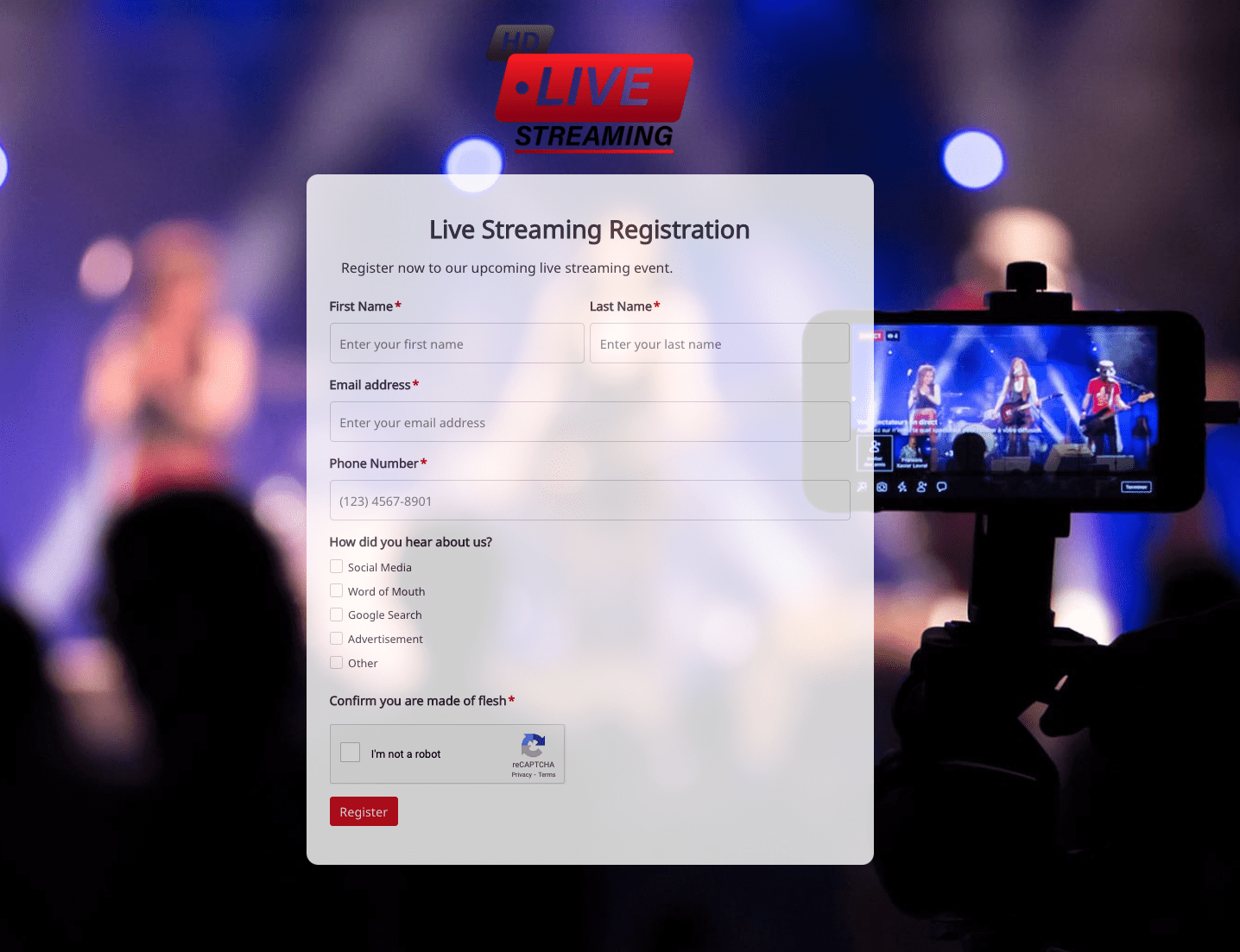 Live Streaming Registration Form
 More Information Form
 Order Exchange Form
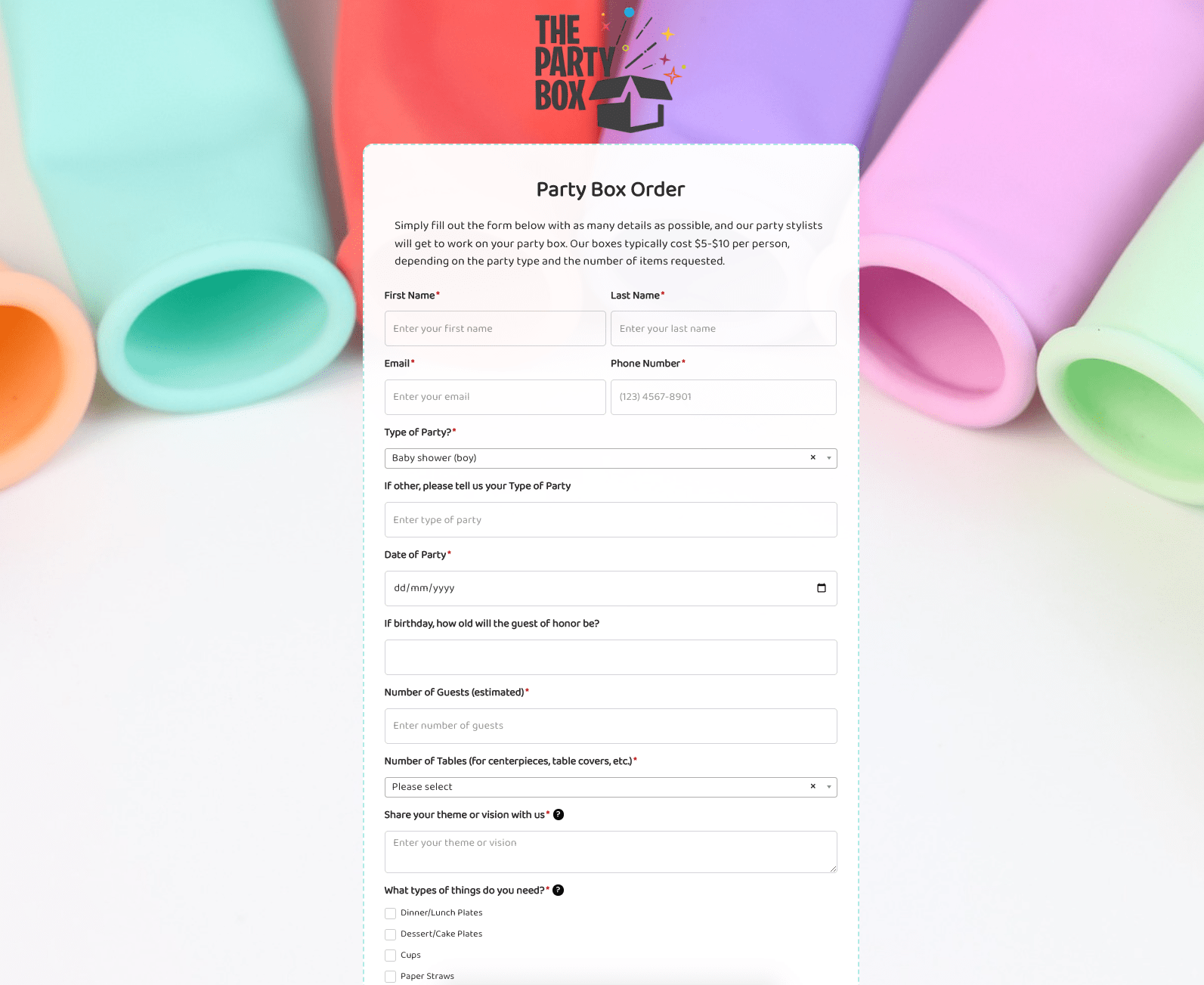 Party Box Order Form
 Pest Control Services Form
 Poll / Survey Form
 Receive Ebook Form
 Refinance Mortgage Form
 Remarks / Questions Form
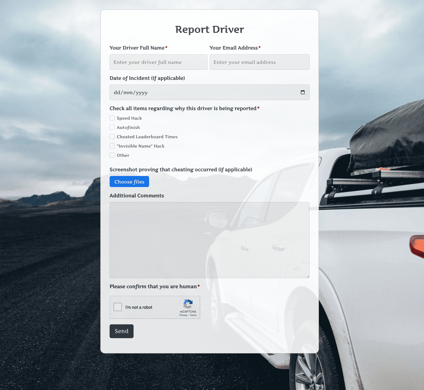 Report Driver Form
 Retreat Information Form
 Service Enquiry Form
 Skydiving Registration Form
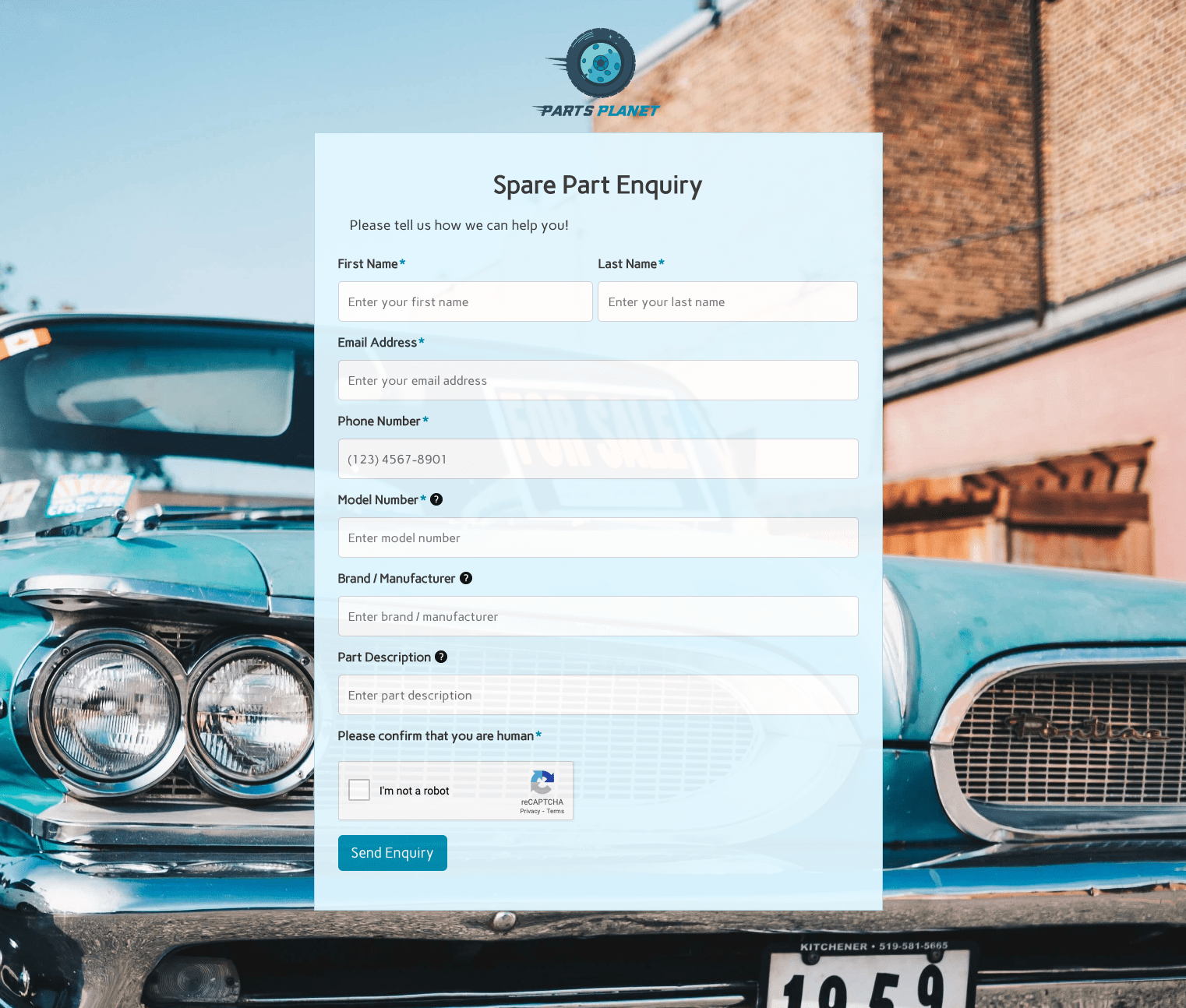 Spare Part Enquiry Form
 Staff Application Form
 Submission Form
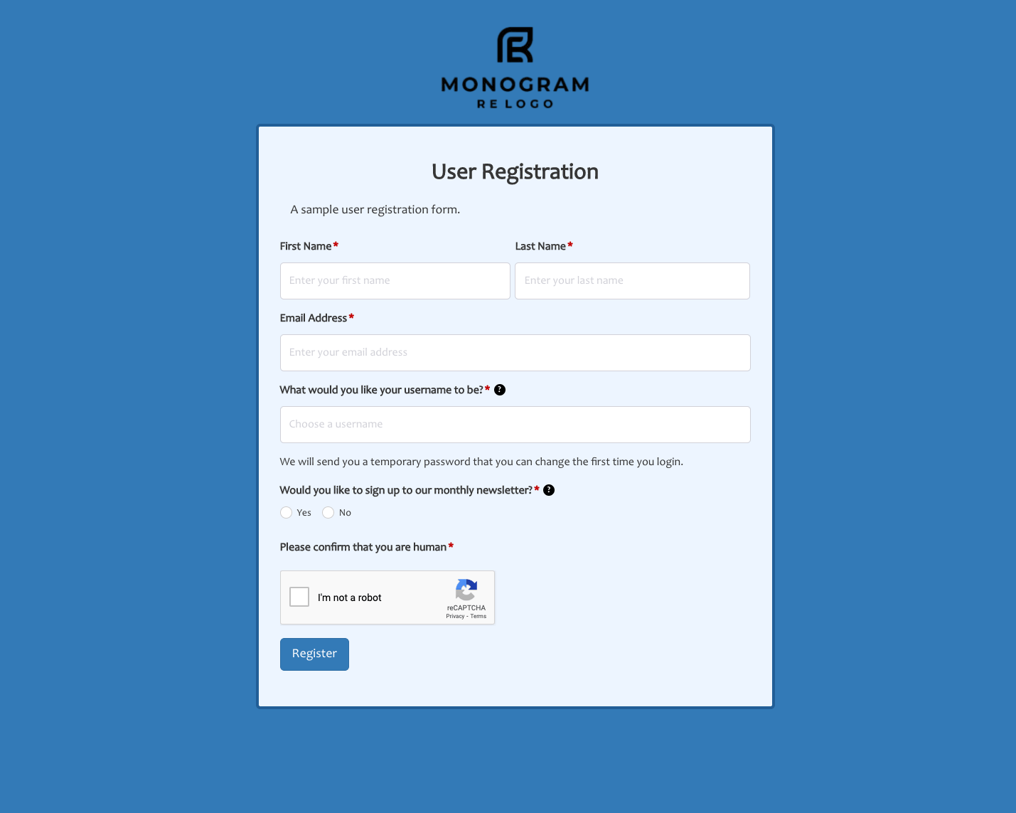 User Registration Form
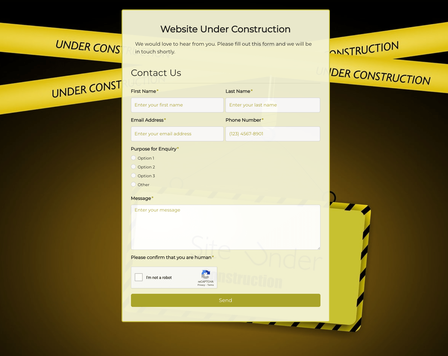 Website Under Construction Form
 Wedding Photographer Form
 Your Opinion Matters Form