If people can't access your website, you are losing traffic before it even arrives. If users struggle to read the text on your website, some traffic that does arrive won't stay for long.
To maximize traffic and engagement, your website must maximize accessibility.
Text is a central part of many websites.
It also tends to be a particularly significant part of interactions with websites, usually through forms, so it's important to ensure it's accessible.
Using text for accessibility can involve providing subtitles or similar alternatives to non-text content, but the focus here will be on how text and typefaces are actually presented.
This involves not only their visual aspect but also the underlying webpage structures.
Consequently, it does need to be considered in the broader context of understanding why accessibility matters and how it can be approached as a principle of web design.
1. Accessibility
Accessible web design brings more people to your website and helps to keep them there.
Getting started with accessible design and development can feel daunting, but working on accessibility will pay dividends as that bigger potential audience drives more engagement and conversion.
When first considering accessibility, we often think about long-term issues such as blindness or deafness and perhaps mobility issues that make using a mouse or trackpad impossible.
These are, of course, important considerations, but there are wider benefits, too.
Websites that are designed to be accessible will work well not just for users with long-term issues but also for those with shorter-term problems.
A more accessible website will be much easier for someone with a broken wrist or who has forgotten their glasses.
Clear layout and structure can help visitors who are not fluent in a site's main language.
The accessible aspects of a website may be distinct but should aim to provide a comparable experience.
There can be SEO advantages, too.
Indices will tend to favour accessible pages. Websites that are coherently structured and use high-quality tagging and other supporting information will benefit from that.
Search engine optimisation (SEO) is another aspect of increasing your audience and engagement.
2. POUR Principles
Before looking at the specifics of text, it's important to consider the broad principles of accessible design.
The POUR approach recommends that websites be:
- Perceivable
- Operable
- Understandable
- Robust
This is a good framework for approaching accessibility in general and accessible text in particular.
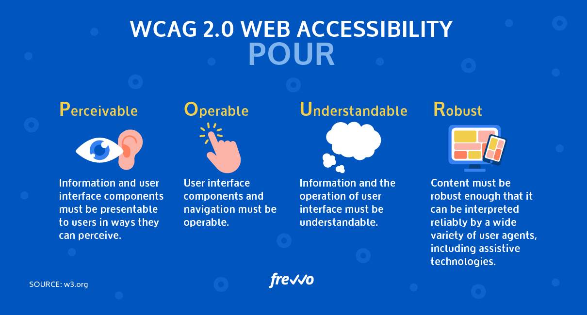
Perception might mean providing subtitles for video or transcripts for audio.
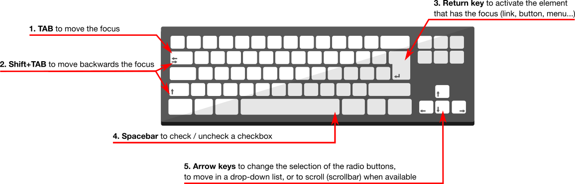
Operability could mean supporting interactions that don't require a mouse click or a tap, but it also has implications for underlying page structures.
To be understandable, a website should have things like a coherent structure and a clear layout.
A robust site will remain accessible across different screen sizes and orientations, operating systems, and browsers, and will work with a range of assistive technologies like screen readers.
Technologies like ARIA and modern HTML help implement accessible design and development principles.
Many popular JavaScript frameworks also incorporate accessibility supports.
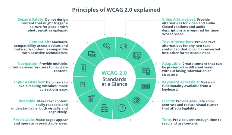
A good basis for assessing the accessibility of a site is the Web Content Accessibility Guidelines (WCAG).
Getting these broader foundations of accessibility sets the groundwork for a more specific focus on elements like text.
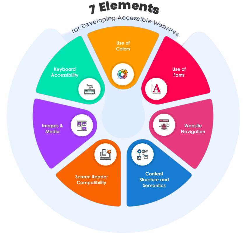
3. Applying POUR to Text
In accessible design, providing text alternatives to non-text content involves when rather than how text is presented.
You should avoid images of text unless the text is replicated elsewhere in an accessible format.
As well as avoiding errors like that, supporting screen readers, and providing accessible alternatives like audio for those who can't see type, text should be accessible for those who can see it.
Perceivable
Ensuring that text can be perceived involves dealing with the visual aspects of text and its layout and structure.
Clear visual presentation is key, so accessible web design for typefaces and settings has to consider issues of colour and contrast as well as column width and general layout.
It's generally best to use a standard font, as unusual character shapes can be more difficult to read.
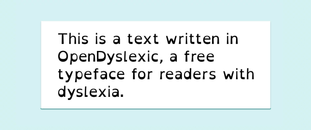
You might consider supporting a typeface like Open Dyslexic, specifically designed to help readers with dyslexia.
If you have chosen coloured text, you might also allow for colour adjustment to help those with colour blindness. You should also avoid using colour alone to indicate things like clickable text.
In any case, aim for a reasonable level of contrast between characters and background.
In assessing that, remember that the same font weight, size and colours may appear less clear in dark mode than in light mode; that is, when using pale type on a dark background rather than dark type on a pale background.
A webpage should support easy resizing of text without those changes causing the structure of the page layout to break.
This includes considering how layout adjusts to a change in screen orientation.
Amongst other things, ensuring that text can be resized means considering the spacing of text.
This will include the spacing between characters, words, and lines, but also the space around paragraphs, headings, and other blocks of text.
Particular attention should be given to how resized text interacts with other page elements, such as images.
Operable
Interacting with text often happens with links, buttons, and forms.
In all these cases, the underlying structure of the webpage is vital to accessibility as a whole.
On the visual level, target size is an important consideration for operability. For those with mobility issues, a larger clickable area makes interaction much easier.
A related issue is interaction timing.
This applies where timeouts or time limits might be an issue. These should be avoided where possible.
If timeouts are enforced, for example as a security feature, then ample warning should be given.
Those with reading difficulties or mobility issues should not find themselves locked out of forms, for example, or unable to read animated text.
The issue of animation as it relates to text is a further accessibility issue.
Early web design often used flashing or moving text, but this makes reading difficult and can, in certain circumstances, lead to seizures or other physical reactions. It should be avoided.
This should include careful consideration of any animations resulting from interactions with text elements, such as clicking links or buttons.
Where such animations are implemented, it should be possible for a user to reduce or disable them. Web development technologies like the CSS reduce-motion query support this.
Understandable
There are obvious overlaps between text being perceivable and understandable.
In general terms, it is not helpful to think of one aspect of POUR in isolation from the others.
For text to be understood, it must be possible to perceive it and, where necessary, interact with it effectively. All of that must work consistently across different contexts; that is, it must be robust.
Some webpage fundamentals support text that is readable and understandable.
Setting the default language of the page will help characters to display correctly. This should be set at the HTML document's root level.
If other languages appear on the page, they should be defined as appropriate at the element level.
To be understandable, the appearance and operation of a webpage, including any text, should be consistent and predictable.
Headings, sidebars, body text, menus, links or buttons, and other text elements should use consistent styles and behaviours.
This helps the legibility of the site in broad terms and should be implemented at a structural as well as a visual level.
Robust
With work done to ensure that the text on your website is perceivable, operable, and understandable, you should check that the implementation is robust.
This will involve testing across various platforms and should involve diverse users.
There are some steps that you can take to improve the robustness of text accessibility.
Using variable fonts allows browsers to select the correct font easily and efficiently.
Various typeface styles, weights, and widths can be loaded in a single file. All these variations can be accessed through CSS with a font-face reference.
This efficient variation allows accessible text choices without page-loading or storage overhead.
Relative sizing for text and layouts allows sizes to be defined not in absolute terms like pixels or points but relative to a parent element.
Sizing by rem is based on a font size set at the root of the page. This allows text to scale gracefully and consistently, supporting accessible readability.
Consistent sizing and scaling of type across different purposes are greatly helped by font scales and tokens.
Scales define a selection of font styles that are flexible but consistent. Multiple type scales can be used to accommodate a range of contexts, such as different screen sizes.
Design choices can be encapsulated in design tokens, which are simple tags that can be shared and used consistently across design and development and on different platforms and devices.
Defining text styles using design tokens ensures that accessibility choices will be applied consistently across your website or app.
The actual values assigned to the attributes set out in a design token are centrally defined, which means any value can be redefined once. That change will take effect everywhere the relevant token has been used.
Clear and consistent tagging of text using semantic HTML helps accessible designs and assistive technologies to present the text appropriately.
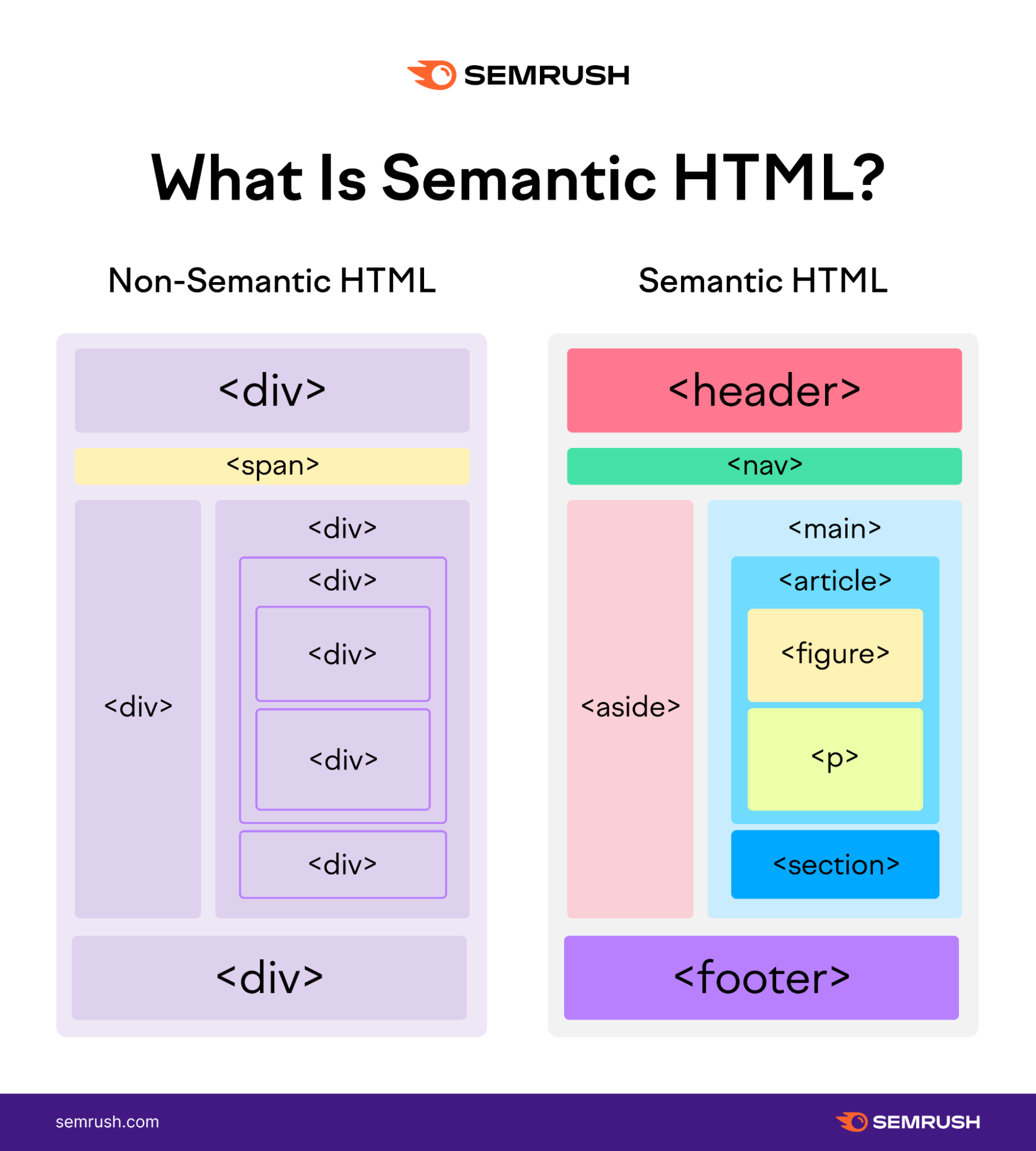
The use of structural elements like headings is part of this, and headings should use a proper hierarchy.
Tagging is also important when text is presented in structured elements like tables or forms.
While attention to structural aspects of text is particularly helpful to technologies like screen readers, it also ensures that the visual presentation of text is clear and consistent.
Robust design that presents text clearly and consistently helps to make that text perceivable, operable, and understandable.
This is a reminder that the POUR principles are interrelated. Accessible web design must consider how those aspects interact.
4. Conclusion
Using the POUR approach, particularly in WCAG–Web Content Accessibility Guidelines, will help you get the basics of accessible text right for your website.
An accessible website can address and be used by a wider audience.
Accessibility in general and of text in particular should be an integral part of your strategy to maximize traffic and engagement.
Share your thoughts! I would be glad to read them below.
 Access Request Form
 Afterparty RSVP Form
 Band Discovery Form
 Book a room Form
 Booking Enquiries Form
 Brochure Mailing Form
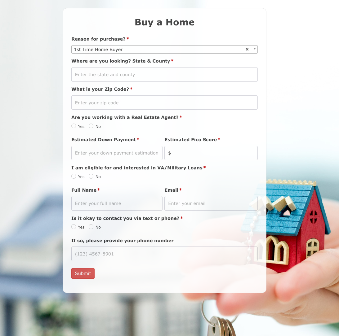 Buy a Home Form
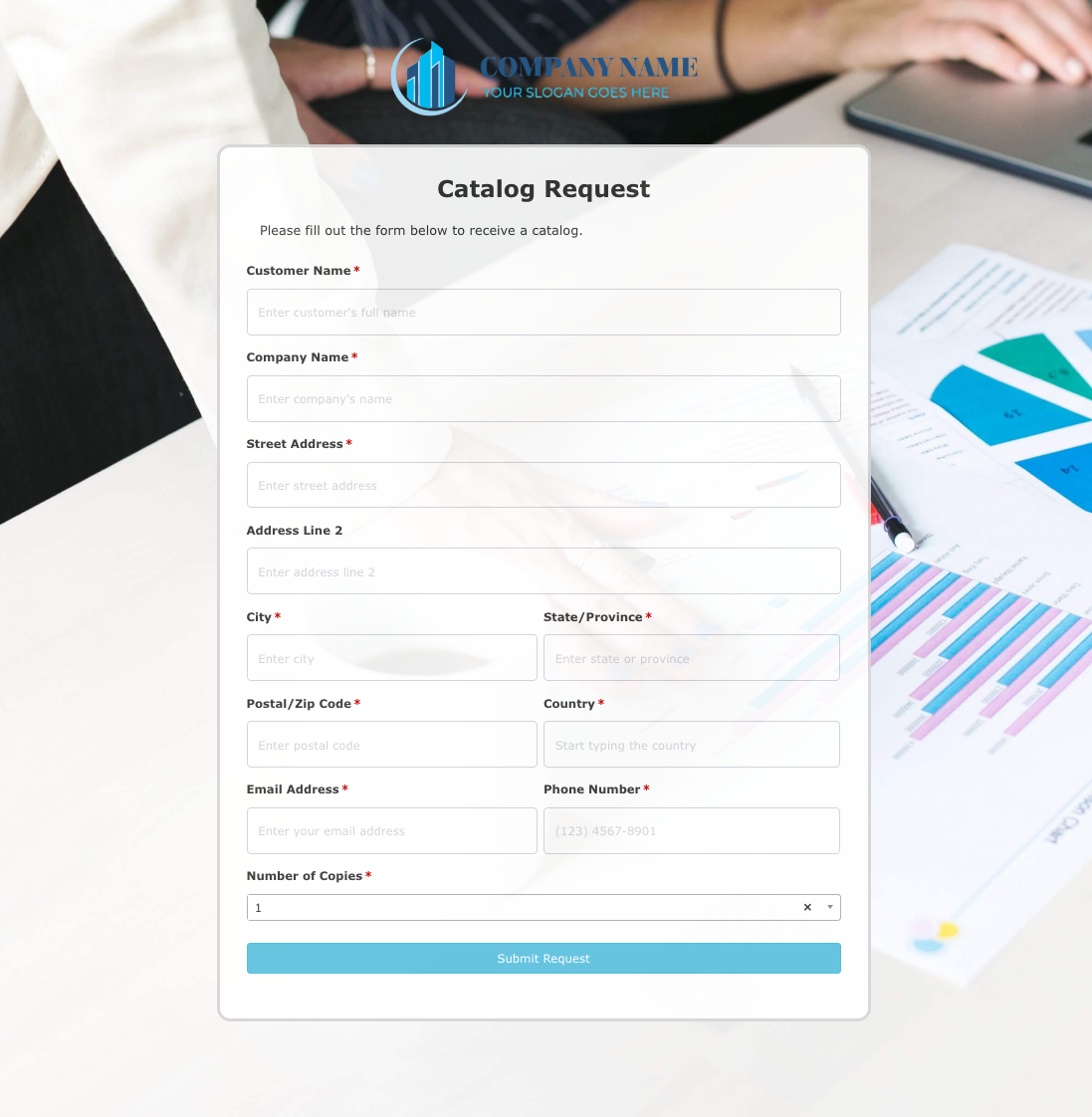 Catalog Request Form
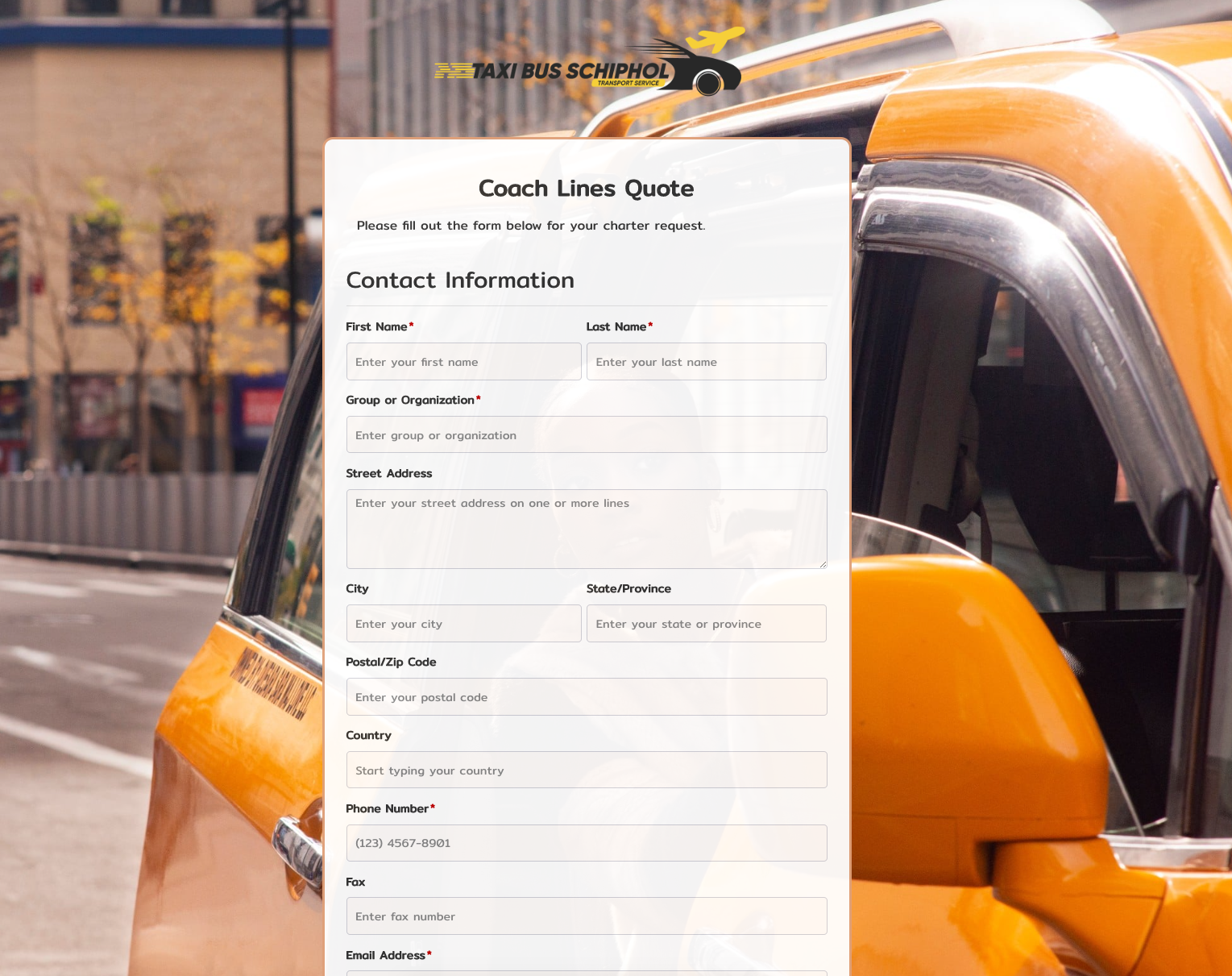 Coach Lines Quote Form
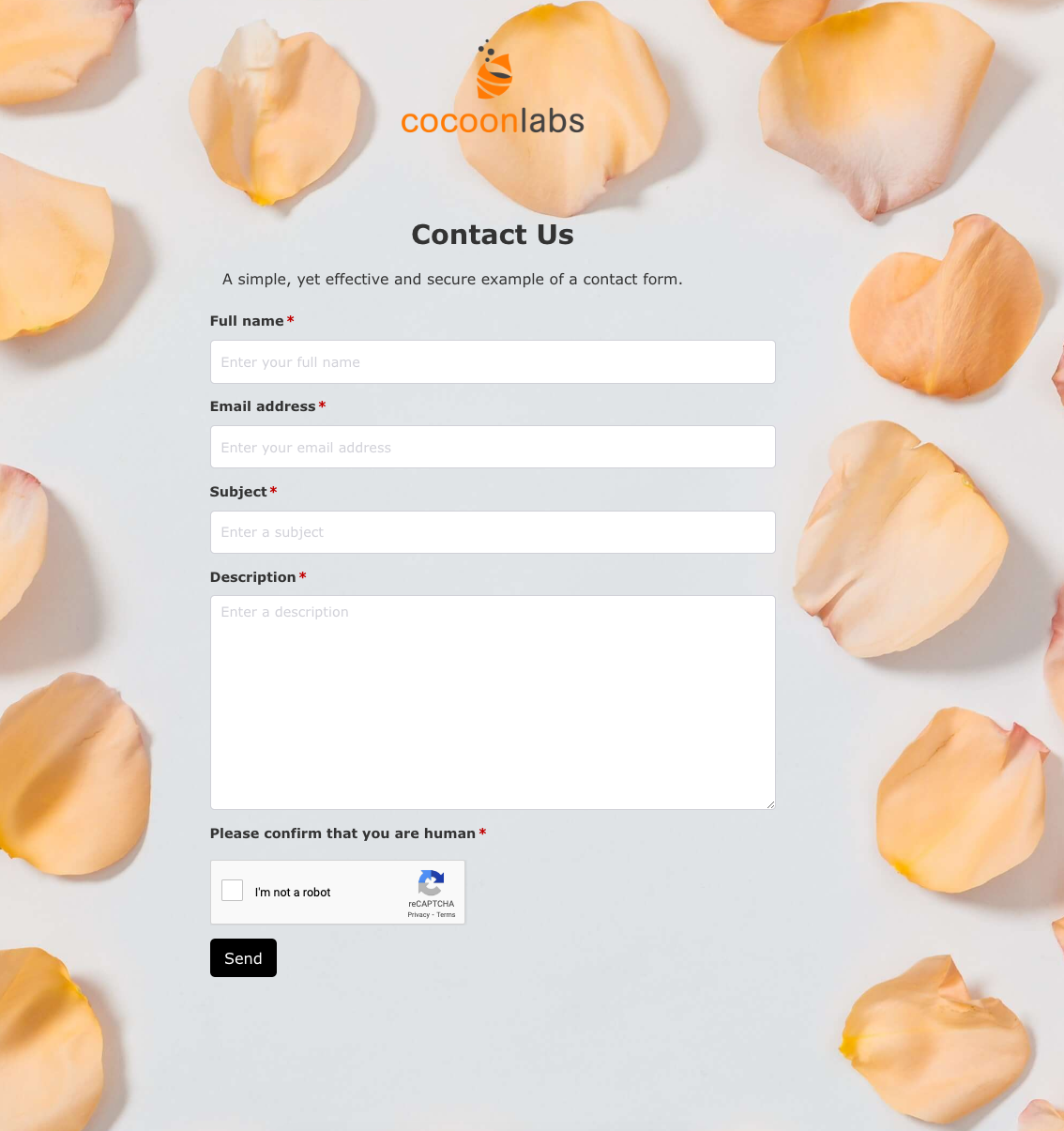 Contact Us Form
 Credit Application Form
 Drop me a line Form
 Enquiry / Feedback Form
 Got a question? Form
 Instant Quote Form
 Job Application Form
 Language & Literacy Lab Form
 Live Streaming Registration Form
 More Information Form
 Order Exchange Form
 Party Box Order Form
 Pest Control Services Form
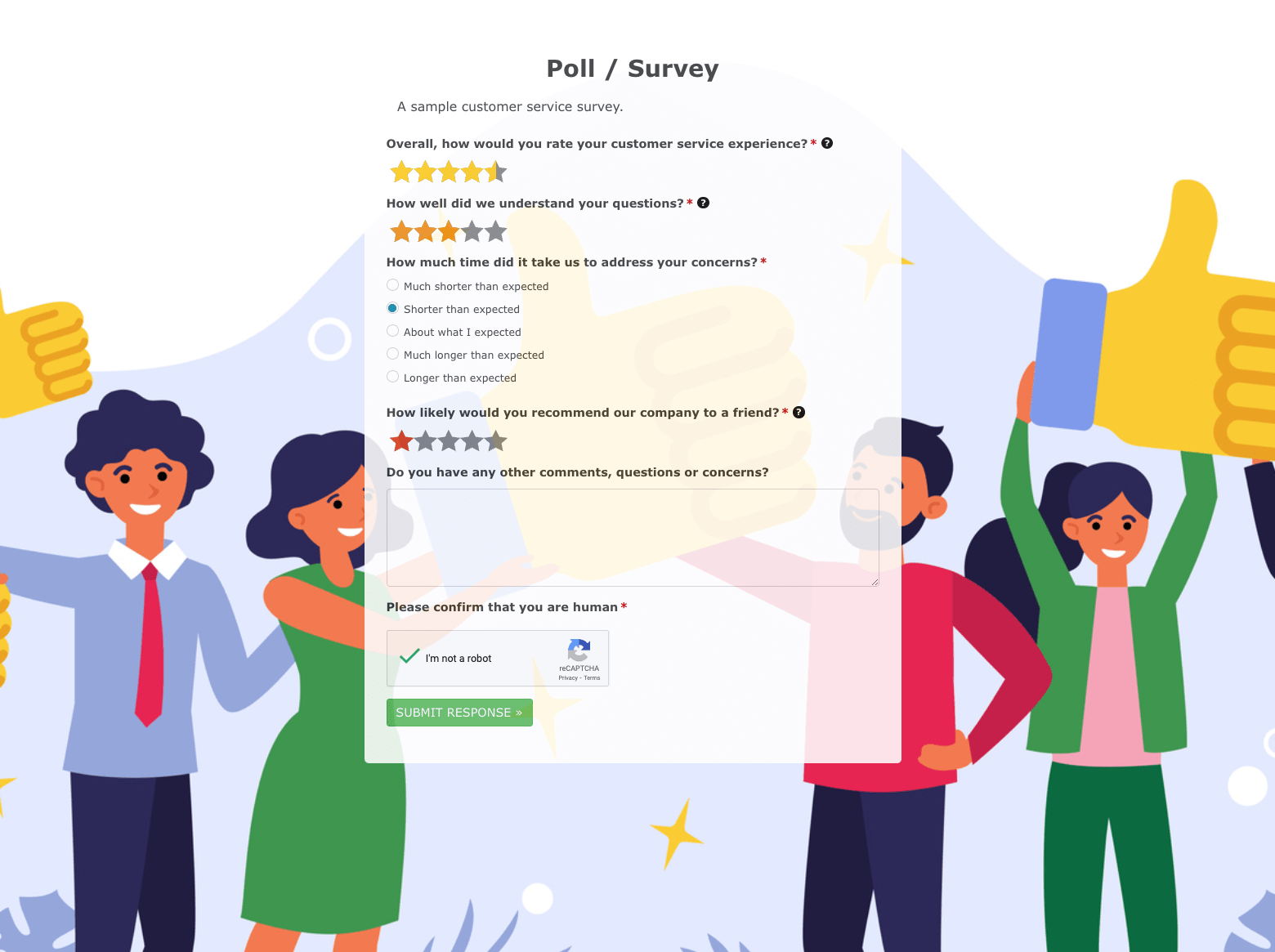 Poll / Survey Form
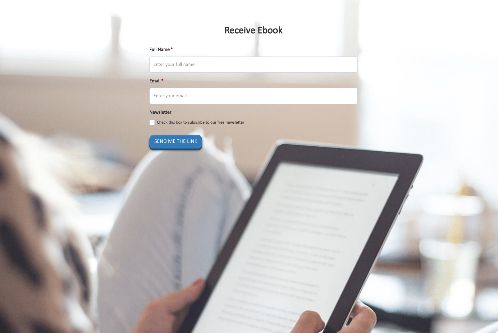 Receive Ebook Form
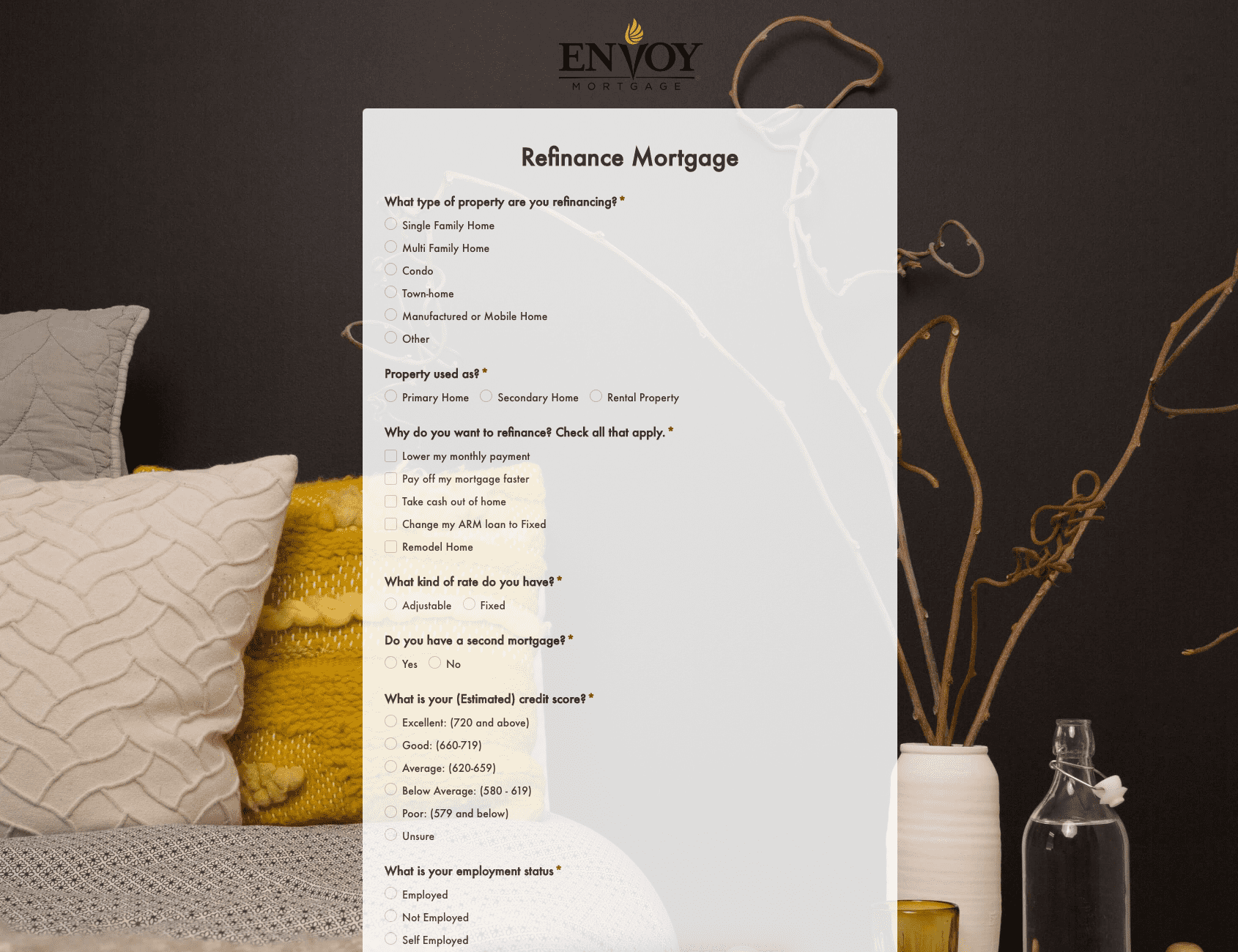 Refinance Mortgage Form
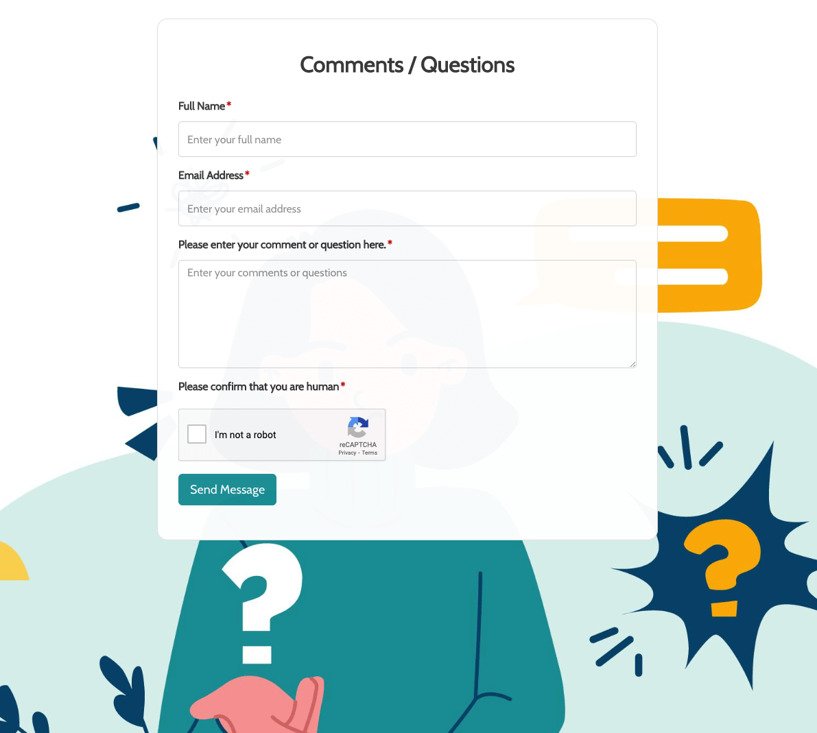 Remarks / Questions Form
 Report Driver Form
 Retreat Information Form
 Service Enquiry Form
 Skydiving Registration Form
 Spare Part Enquiry Form
 Staff Application Form
 Submission Form
 User Registration Form
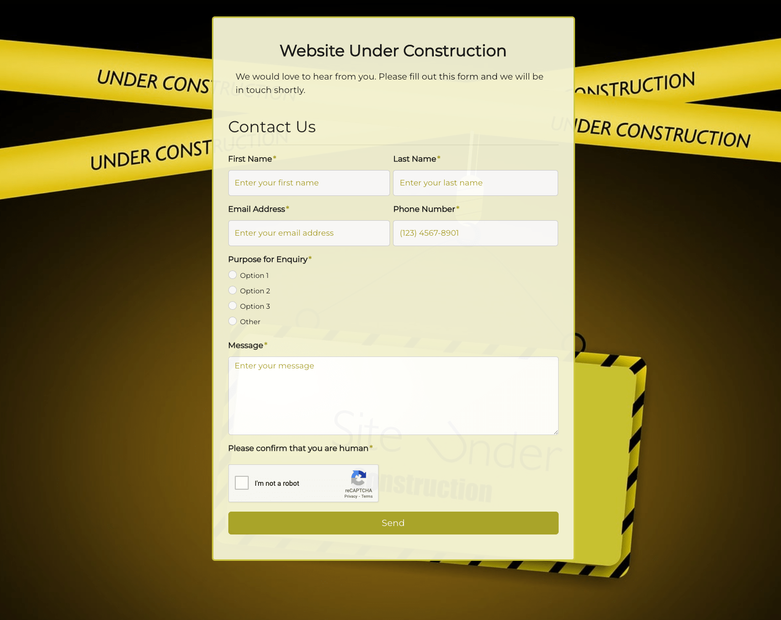 Website Under Construction Form
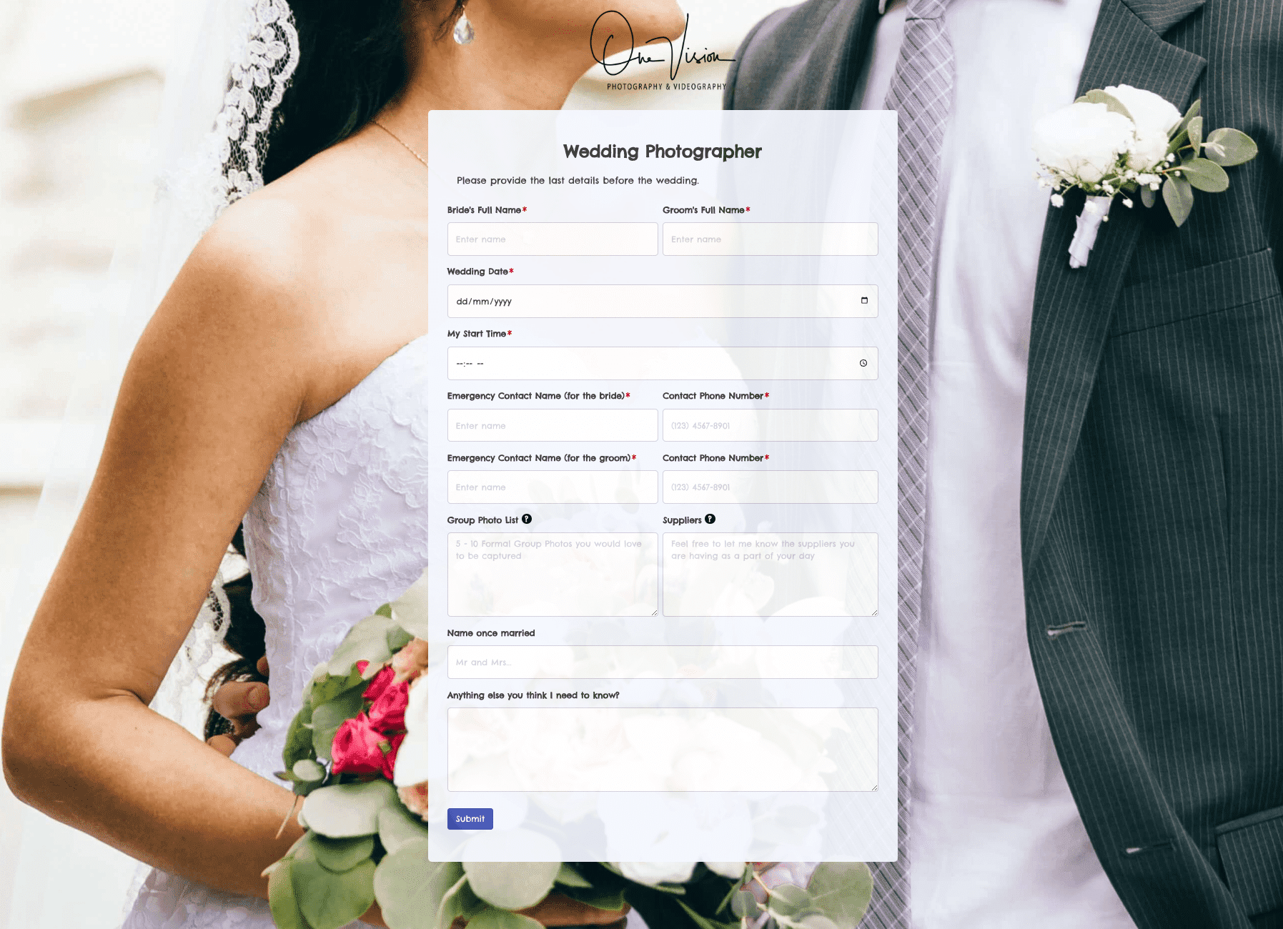 Wedding Photographer Form
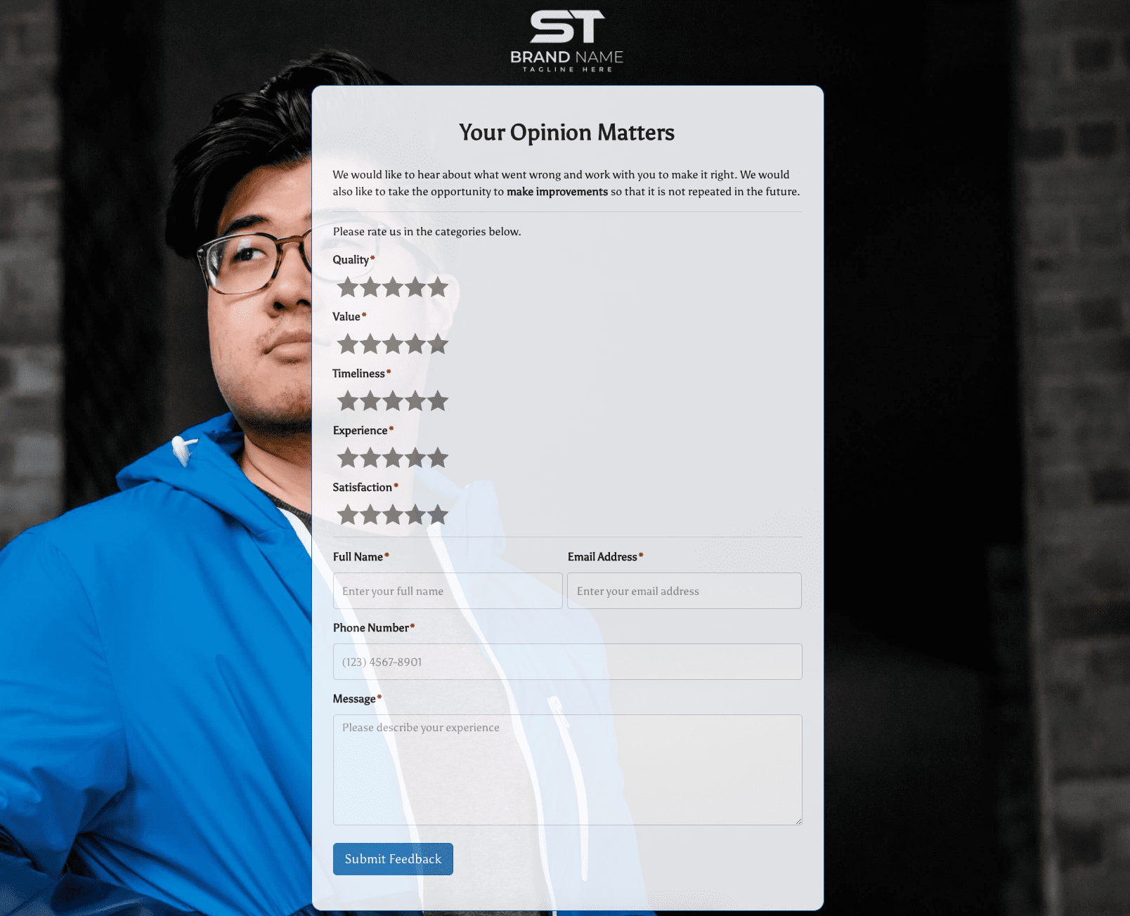 Your Opinion Matters Form