A dashboard should not just show numbers. It should help people decide what to do next. Many Power BI projects fail because teams add too many charts without asking what action the dashboard should support. A useful dashboard starts with business questions, clean data, strong metrics, and clear visual order. It also needs the right access setup, so each person sees the right information. This guide explains how to create a Power BI dashboard that turns data into decisions instead of creating another report nobody uses.
What Makes a Power BI Dashboard Useful for Decisions?
A good Power BI dashboard gives users a fast answer to a business question. It does not make them dig through ten pages to understand performance. It shows what changed, why it matters, and what action should happen next.
Power BI dashboards are built in the Power BI service by pinning visuals, tiles, or entire report pages from reports. Microsoft notes that pinned report pages can stay live, meaning users can interact with them from the dashboard. This makes dashboards useful when leaders need a simple view connected to deeper report analysis.
The best dashboards work like decision screens. A sales dashboard should show whether revenue is on target, which regions are behind, and where managers should focus. A finance dashboard should highlight cash flow, budget gaps, risk areas, and urgent exceptions.
Start With the Business Decision Before Adding Visuals
A decision-first dashboard starts with the action users need to take, then works backward into metrics, visuals, and filters.
Define the Main Decision
Before opening Power BI, ask what decision the dashboard should support. The answer may be pricing, staffing, sales focus, inventory planning, budget control, or client reporting. If the decision is unclear, the dashboard will become a collection of random charts.
Identify the Target User
Different users need different dashboard views. Executives may need trends and exceptions, while managers may need team-level breakdowns and task-level details. Build for the person making the decision, not for everyone who might open the report.
Set the Decision Frequency
Some dashboards support daily action, while others support weekly, monthly, or quarterly review. A daily operations dashboard needs fresh signals and alerts, not deep historical storytelling. A leadership dashboard can focus more on movement, performance, and strategic risk.
Choose Metrics That Point to Action
Metrics should show progress, risk, priority, or opportunity. If a number does not help someone act, it probably does not belong on the main dashboard. Keep supporting metrics inside reports, drill-through pages, or detail views.
Start with a small set of core KPIs. For example, a sales dashboard may need revenue, target progress, pipeline value, win rate, and sales cycle length. Too many KPIs make the dashboard look complete but harder to use.
Every metric needs business context. A revenue number means more when users can compare it with target, last month, forecast, or the same period last year. Context turns a metric from a number into a decision signal.
Dashboard Design Principles That Improve Decision-Making
Strong dashboard design makes the most important message easy to see before users start clicking, filtering, or comparing details.
- Put the most important KPI at the top, so users understand performance before scanning the full dashboard.
- Use fewer visuals on the main page, because crowded dashboards slow down reading and hide urgent business signals.
- Group related metrics together, so users can connect performance, cause, and next action without jumping around.
- Use filters only when they help decisions, not because every field in the model can become a slicer.
- Show targets, comparisons, and trends together, because single numbers rarely explain whether performance is good or bad.
- Keep labels simple and business-friendly, so non-technical users understand the dashboard without asking analysts for help.
Build the Dashboard in Power BI the Right Way
Power BI dashboard building works best when the model, report, and dashboard each have a clear role in the process.
Prepare the Semantic Model
The semantic model should hold clean relationships, measures, and business logic. If the model is messy, every dashboard visual becomes harder to trust. Build measures carefully, name fields clearly, and remove unused columns before publishing.
Create Report Pages First
In Power BI, dashboards usually pull visuals from reports. That means the report should carry the deeper analysis, while the dashboard gives the high-level decision view. Microsoft explains that users can pin visuals or entire report pages from reports into dashboards in the Power BI service.
Pin Only Decision-Level Tiles
Do not pin every chart from the report. Pin the visuals that answer the most important business questions quickly. If users need more detail, let them click from the dashboard into the full report experience.
Turn Visuals Into Decision Paths
A dashboard should guide users from signal to explanation. Start with the headline metric, then show what changed, where it changed, and what may need attention. This order helps people move from awareness to action.
Use visuals based on the question. Cards work well for KPIs, line charts show trends, bar charts compare categories, and tables work for exceptions or ranked lists. Avoid complex visuals when a simple chart explains the answer faster.
Think about the next click. If a leader sees revenue dropping, the dashboard should help them find the region, product, channel, or account behind the decline. A good dashboard does not end with a problem; it points toward the next investigation.
Common Power BI Dashboard Mistakes to Avoid
Most weak dashboards fail because they look busy, lack business focus, or give users numbers without clear next steps.
- Adding every available metric makes the dashboard feel complete, but users struggle to find the actual message.
- Designing for analysts instead of decision-makers creates dashboards that require too much interpretation before action.
- Ignoring mobile or small-screen views can make executive dashboards harder to use during meetings or travel.
- Using inconsistent date ranges creates confusion when users compare KPIs, trends, and category performance together.
- Hiding data quality issues makes users lose trust when numbers do not match other internal reporting sources.
- Giving everyone the same access can expose sensitive data and make client or department reporting less secure.
Control Access So the Right People See the Right Dashboard
A dashboard can only support better decisions when teams manage Power BI permission with clear roles, rules, and ownership.
Use Workspace Roles Carefully
Power BI workspaces use roles such as Admin, Member, Contributor, and Viewer to control what users can do. Microsoft describes workspaces as places where teams collaborate on dashboards, reports, semantic models, and paginated reports. Give editing roles only to builders, and keep normal consumers in Viewer access where possible.
Apply Row-Level Security When Data Must Be Filtered
Row-level security helps different users see different rows inside the same report or semantic model. Microsoft notes that RLS applies to users with Viewer roles in the workspace, even when those Viewers have Build permission. This is useful when sales teams, clients, branches, or departments need separate data views.
Plan External Sharing Before Sending Links
External users need extra control because they may be clients, vendors, agencies, or partners. Microsoft supports external sharing through Microsoft Entra B2B guest access, which helps organizations govern outside users centrally. Review tenant settings, guest access, app audiences, and dashboard permissions before sharing externally.
Conclusion
A Power BI dashboard becomes valuable when it helps people make faster and better decisions. Start with the business question, choose only action-focused metrics, design a simple visual path, and connect the dashboard to trusted data. Keep the main view clean, then let users move into reports for deeper analysis. Just as importantly, control access from the start so sensitive data stays protected. When design, data, and permissions work together, Power BI becomes more than a reporting tool. It becomes a decision system.
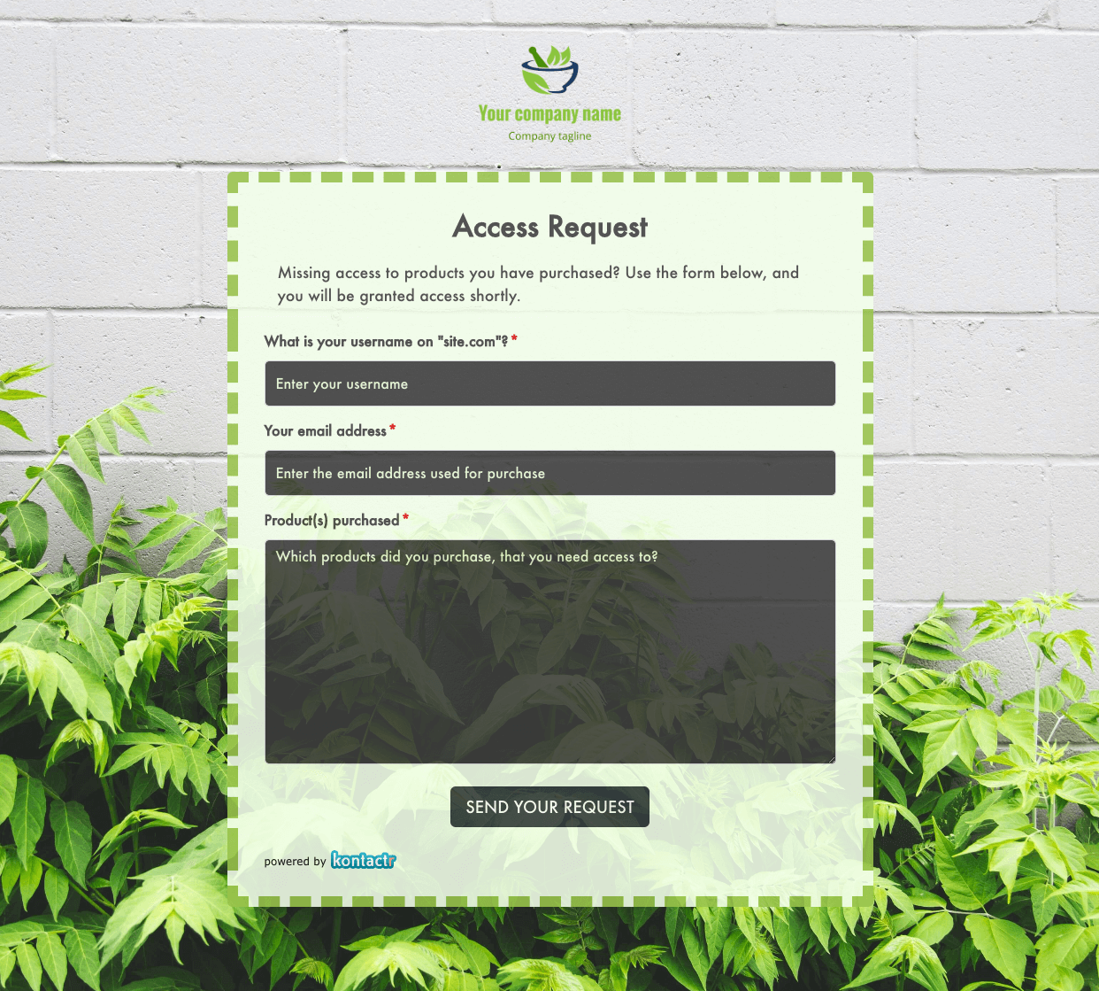 Access Request Form
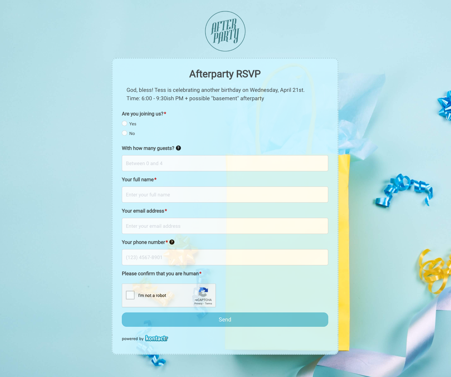 Afterparty RSVP Form
 Band Discovery Form
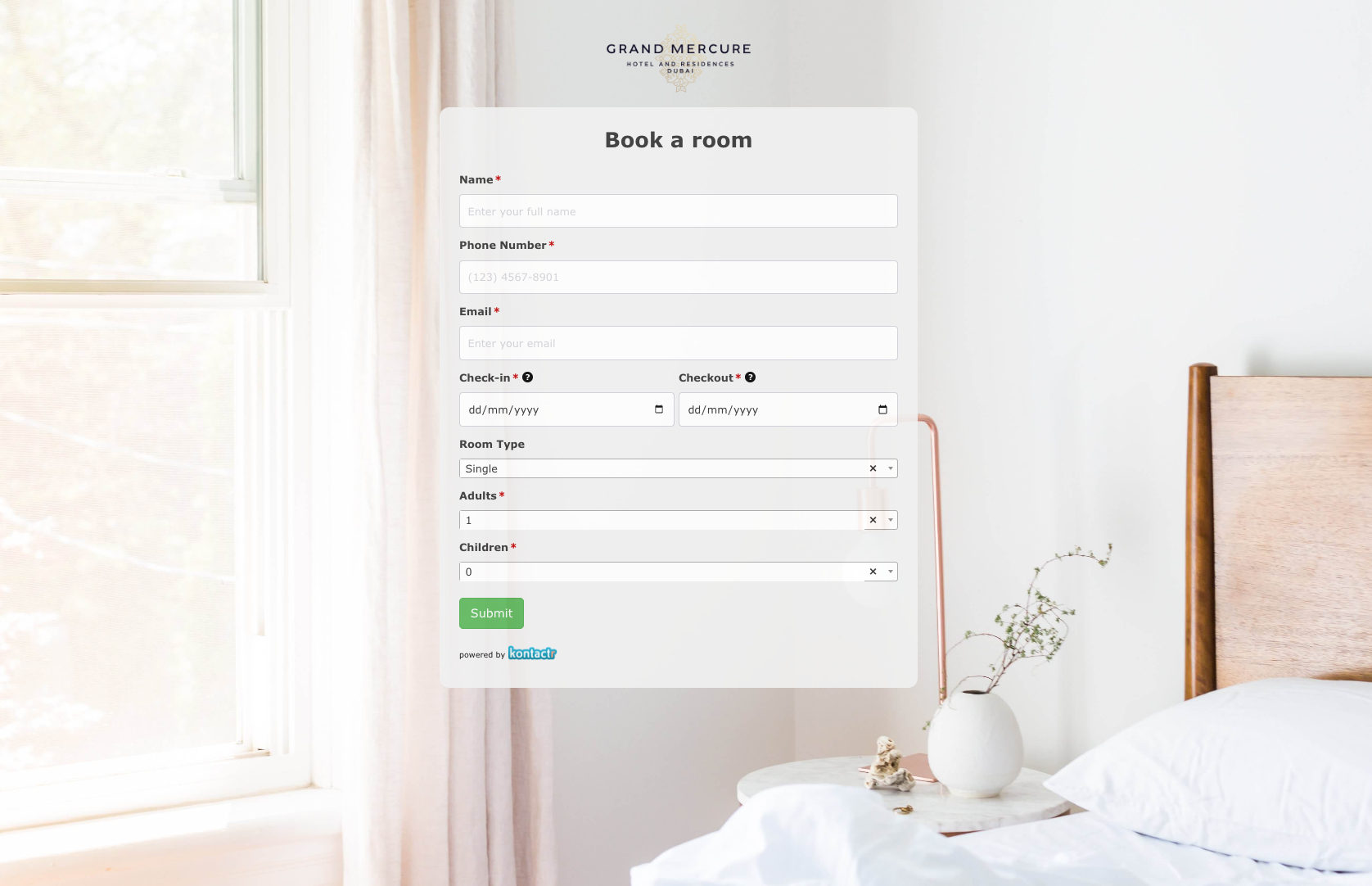 Book a room Form
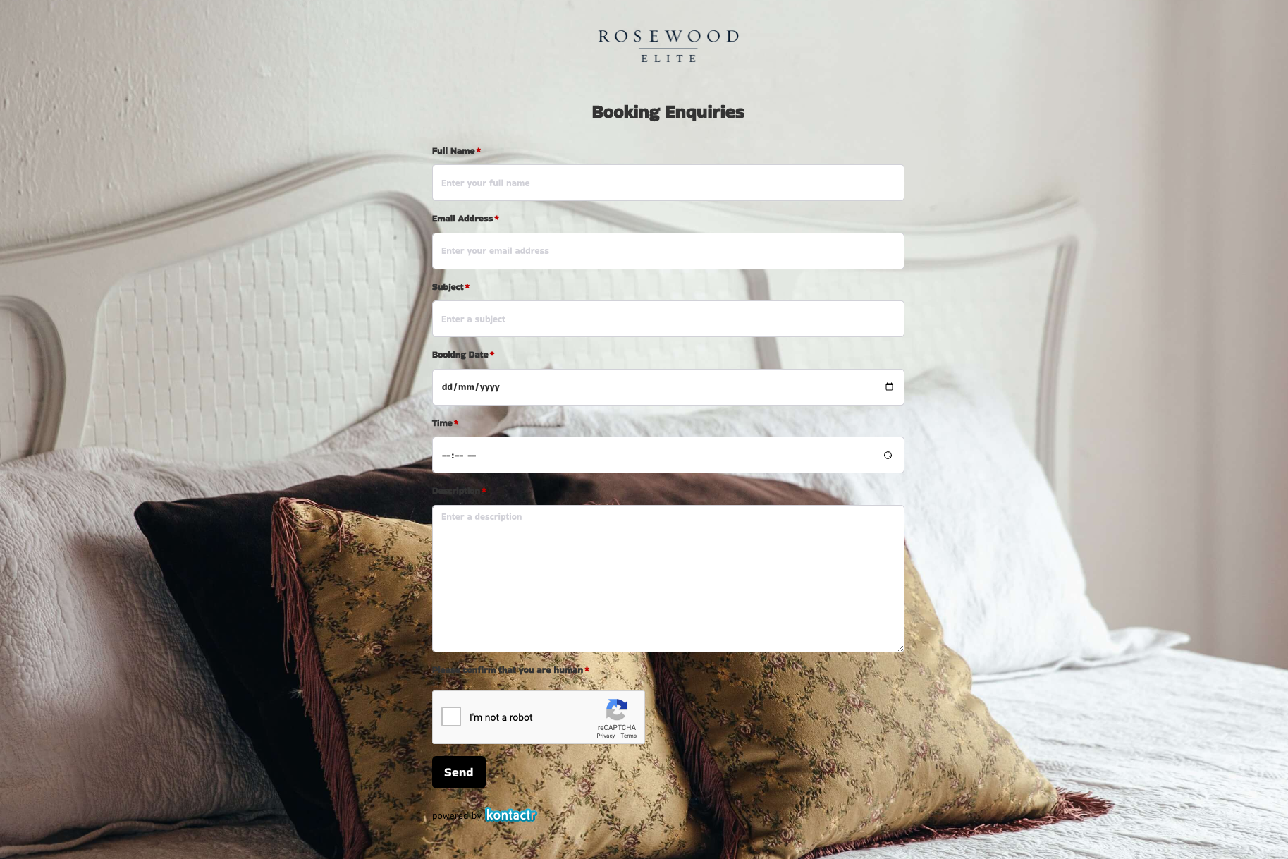 Booking Enquiries Form
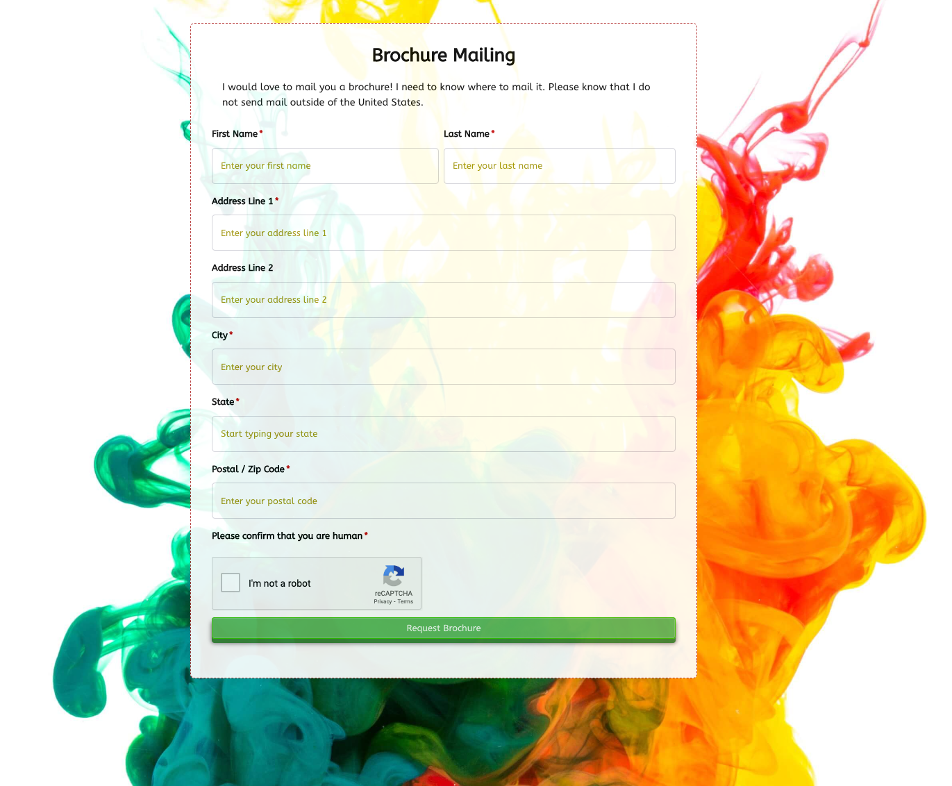 Brochure Mailing Form
 Buy a Home Form
 Catalog Request Form
 Coach Lines Quote Form
 Contact Us Form
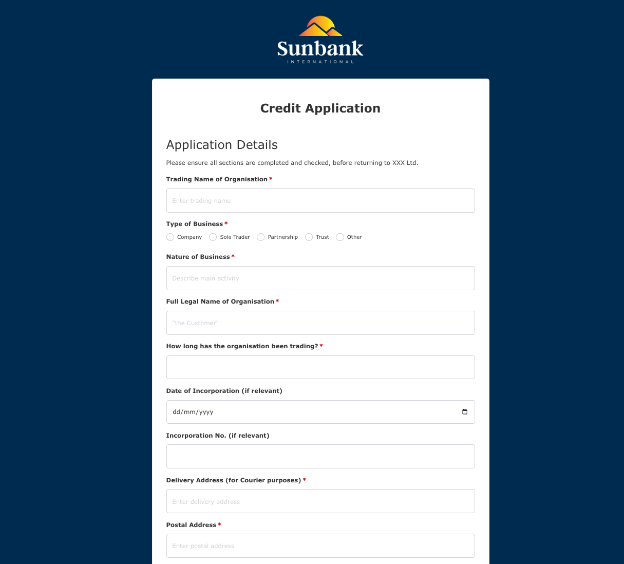 Credit Application Form
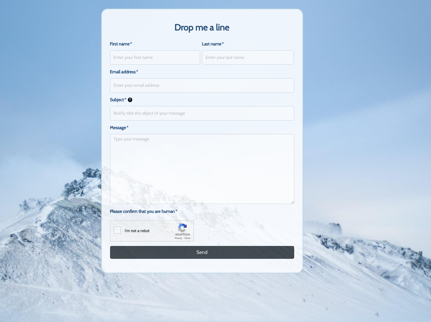 Drop me a line Form
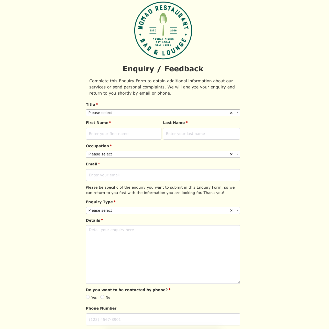 Enquiry / Feedback Form
 Got a question? Form
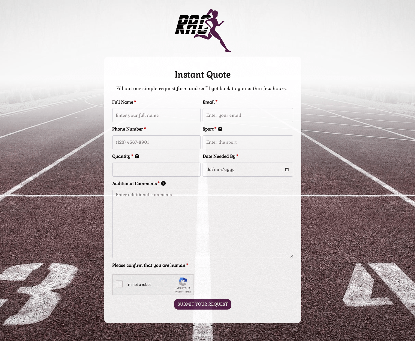 Instant Quote Form
 Job Application Form
 Language & Literacy Lab Form
 Live Streaming Registration Form
 More Information Form
 Order Exchange Form
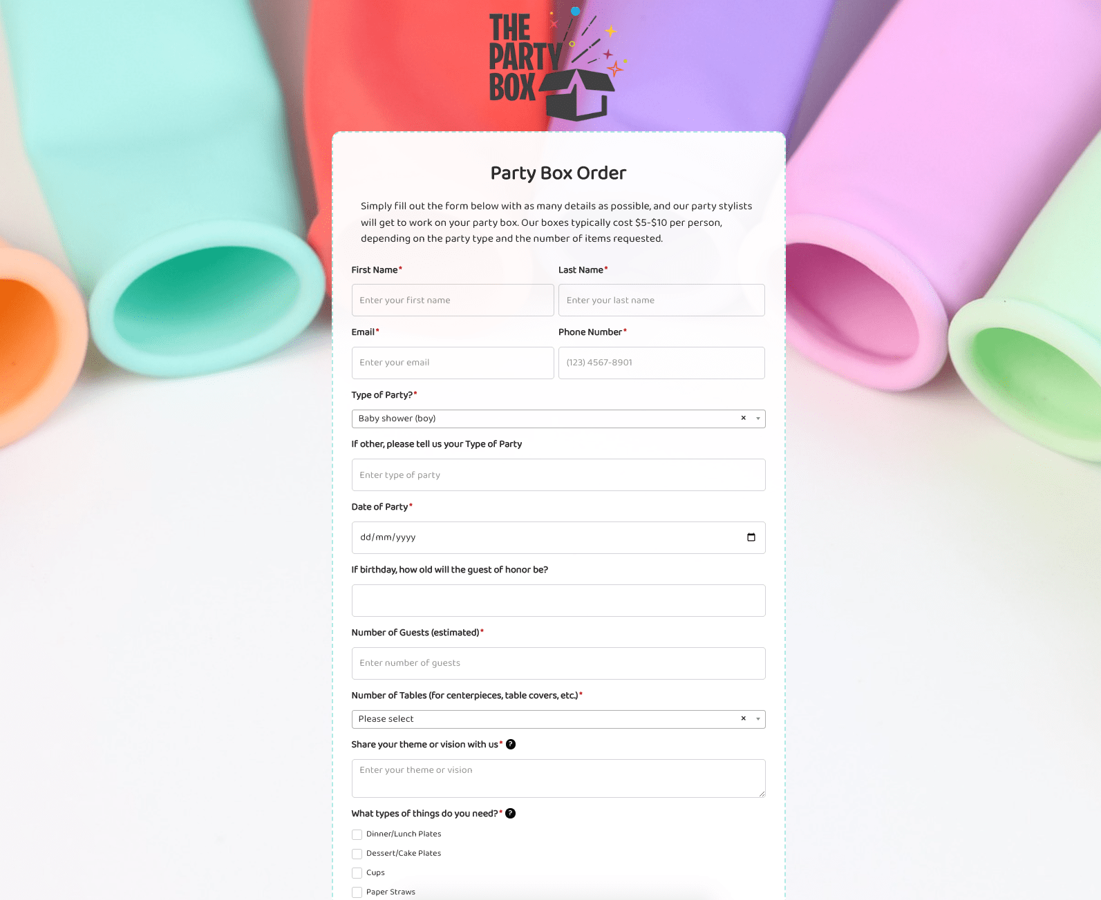 Party Box Order Form
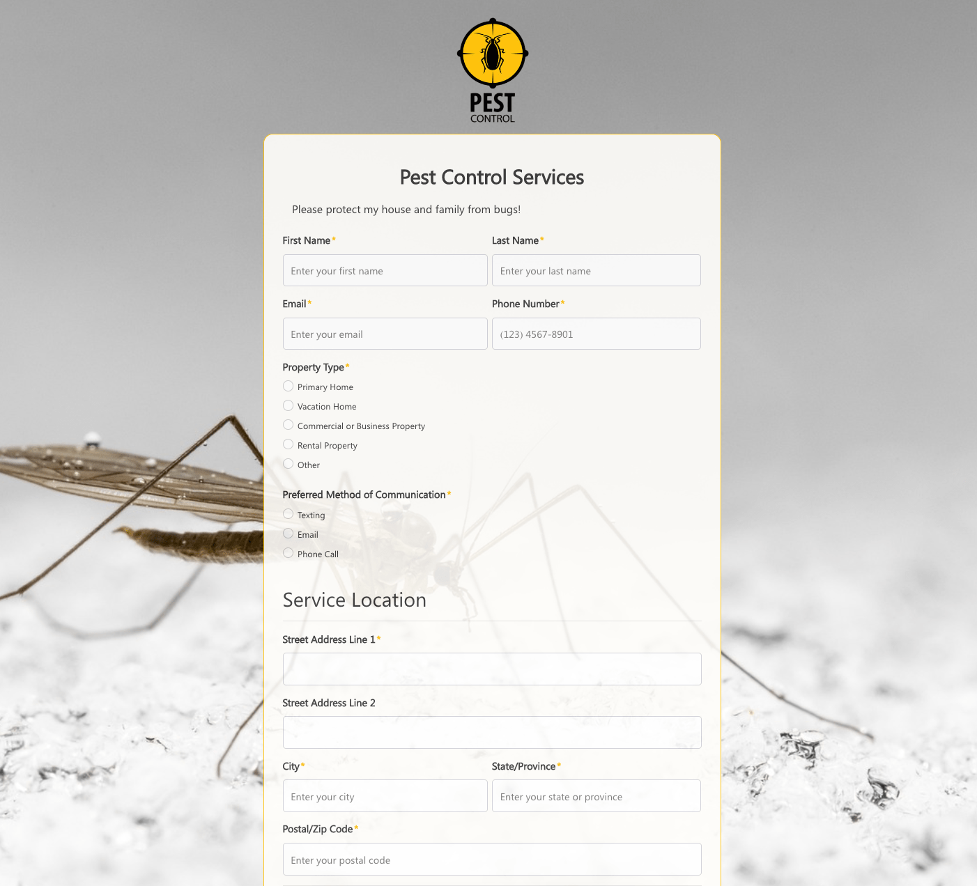 Pest Control Services Form
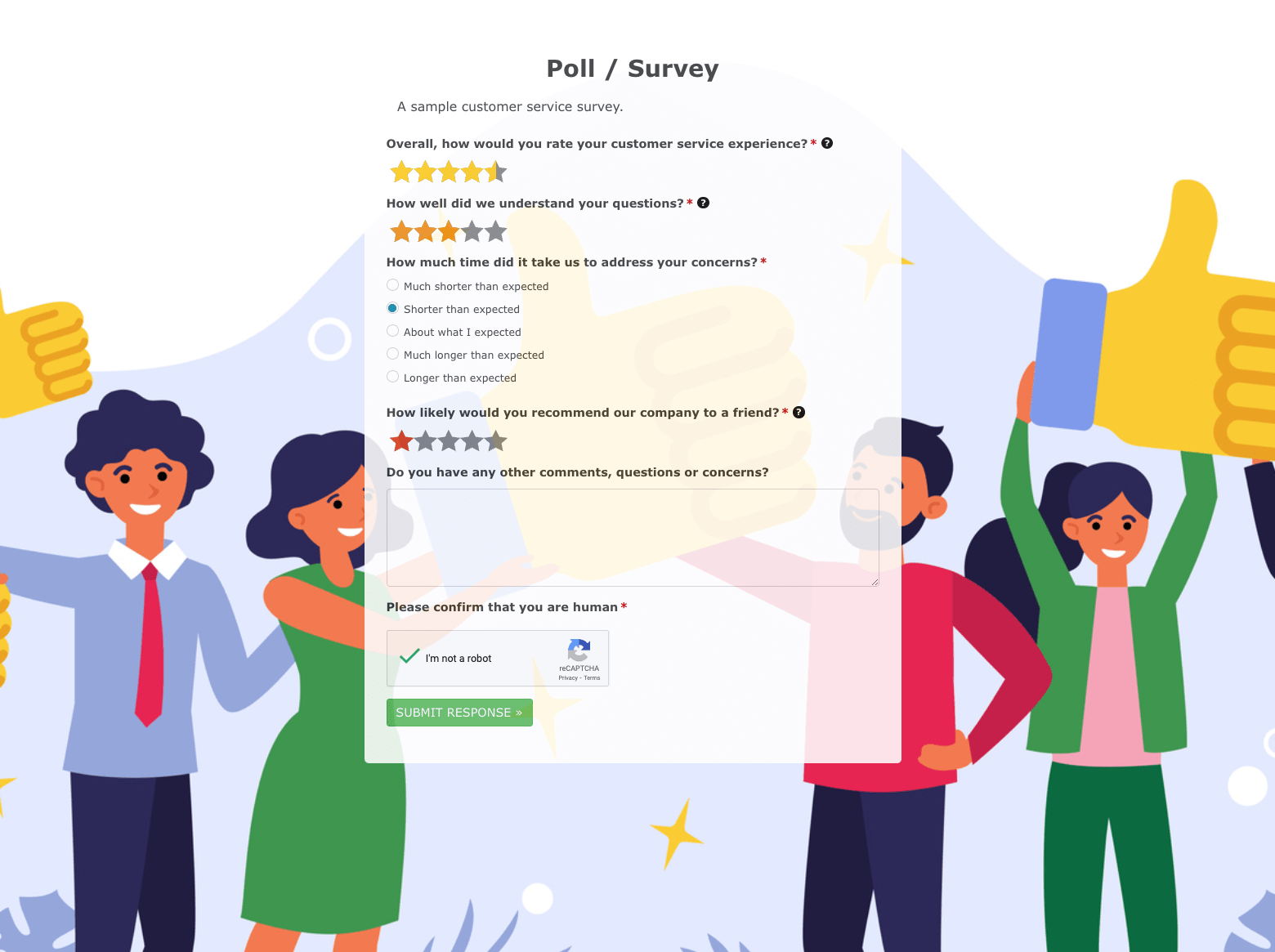 Poll / Survey Form
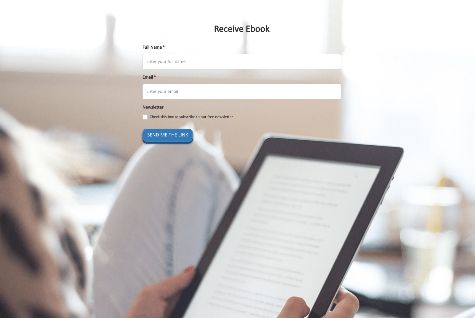 Receive Ebook Form
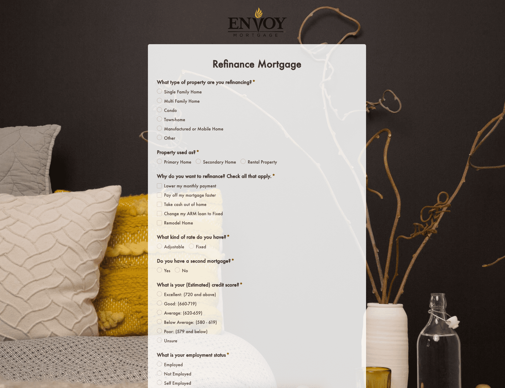 Refinance Mortgage Form
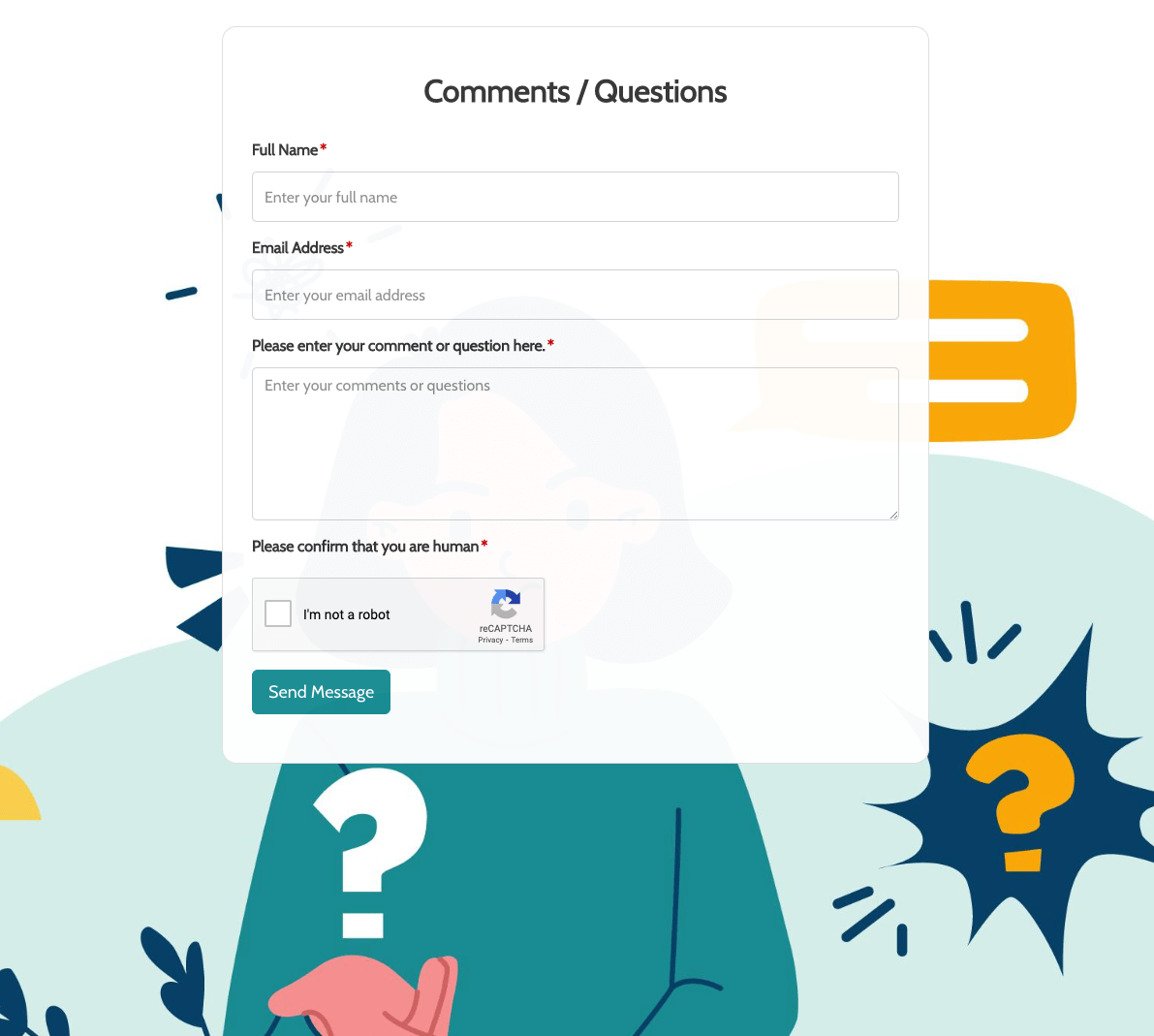 Remarks / Questions Form
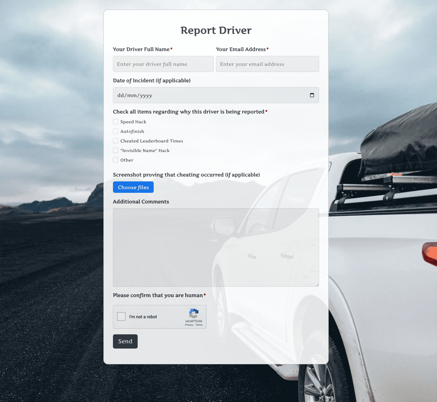 Report Driver Form
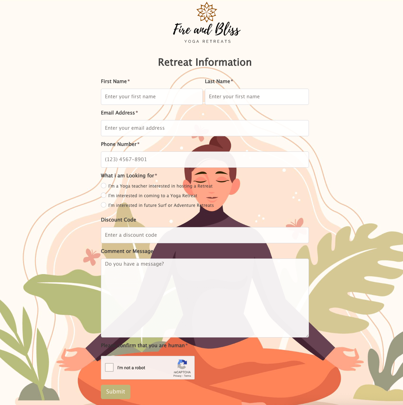 Retreat Information Form
 Service Enquiry Form
 Skydiving Registration Form
 Spare Part Enquiry Form
 Staff Application Form
 Submission Form
 User Registration Form
 Website Under Construction Form
 Wedding Photographer Form
 Your Opinion Matters Form