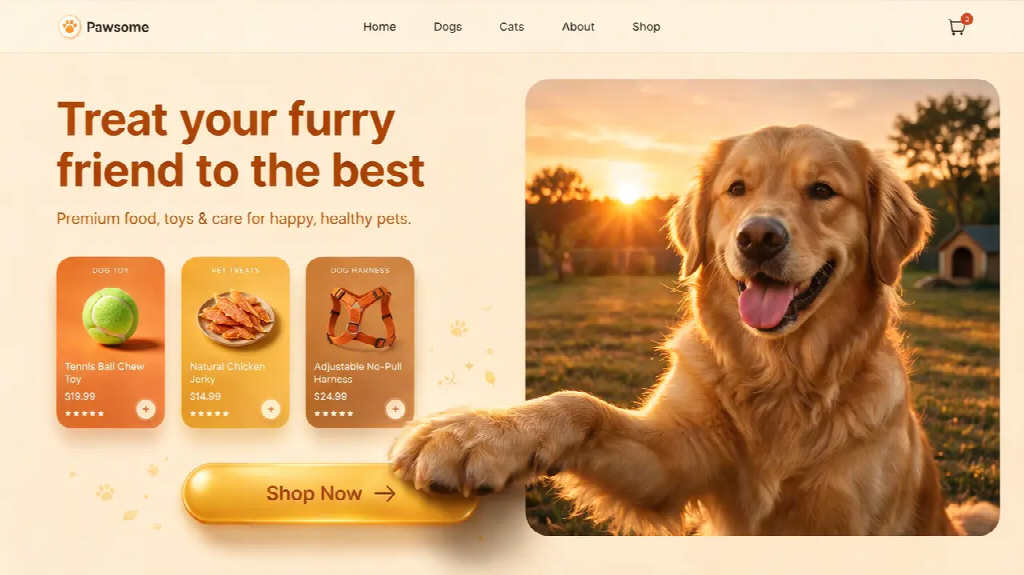
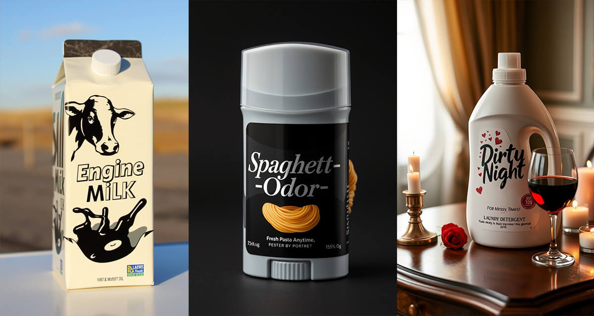
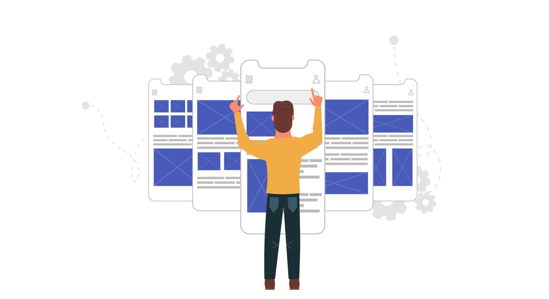
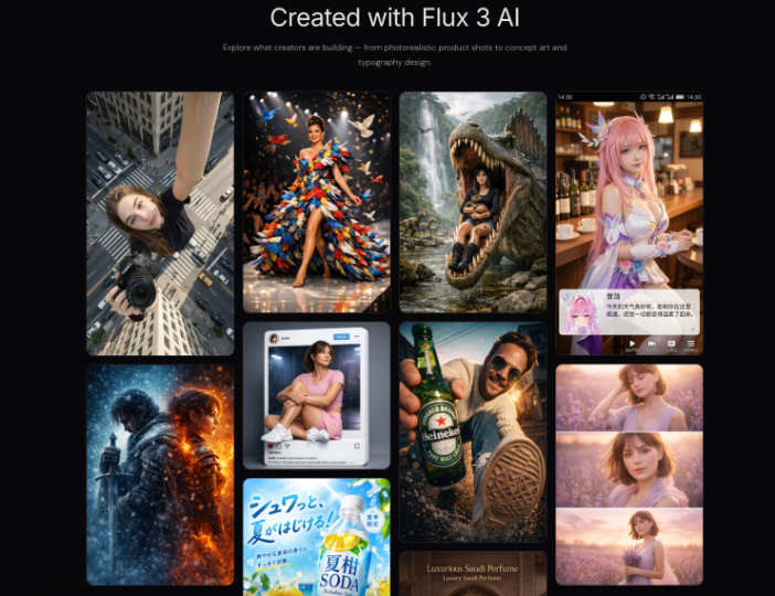
A visitor lands on your website, sees a polished image and a headline, and still has one question: “What does this business actually help me do?” That can happen when the visual looks attractive but does not support the message beside it. An ai image generator can help a small business explore original visual directions, but the useful starting point is the visitor’s question—not the image you can produce. The goal is to make the service easier to understand before asking someone to take the next step.
Start With the Decision the Page Needs to Support
A landing page usually has a particular job. It might invite a local business owner to request an accounting consultation, help a prospective client understand a home-organizing service, or explain what happens during an introductory design session. Before selecting an image, write down what a visitor should understand and what they can do next.
Consider a small home-organizing business. A visitor may be wondering whether the service covers an entire house or one room, whether the organizer works with them or takes items away, and whether they can ask for a quote before booking. A beautiful photograph of a tidy kitchen might set a mood, but it cannot answer all those questions. The headline, supporting copy and a clear next step still need to do their jobs.
Give each image a specific purpose. A hero image might help a reader recognize the type of service; a later visual might illustrate a stage in the process; a small graphic might distinguish two options. If the page already answers a question clearly in text, an additional image may not be necessary. Design the page around the visitor’s decision rather than filling every empty space.
Choose a Visual That Explains the Offer
A service business has a challenge that an online shop does not always face: there may be no single physical product to photograph. An accountant sells expertise and a process; a tutor offers time, guidance and a learning experience. A useful visual can make that intangible offer easier to picture without pretending to show an actual session.
For a tutoring service, a carefully designed illustration of a study space and learning materials could support an explanation of one-to-one lessons. For a bookkeeping service, a simple visual showing organized records and a laptop may help establish the context. In both cases, the important information—who the service is for, how sessions work and how to ask a question—belongs in accessible page text.
Avoid choosing a visual purely because it represents the industry in the broadest possible way. A generic handshake says very little about whether a consultant helps with payroll, tax planning or cash-flow reporting. A more specific scene that reflects the actual offer can give the headline useful context. It should not, however, display invented client names, financial figures or business documents that could be mistaken for real evidence.
If the image is a conceptual illustration, make that clear when there is a reasonable chance a visitor could mistake it for a real person, premises or result. For a service that depends heavily on local trust, authentic photos and accurate details may be more useful than a generated scene.
Give the Headline and Image Different Jobs
The top of a page often has limited room, especially on mobile. The headline should explain the main offer in words, while the image supports understanding or gives the page a recognizable visual character. If both communicate unrelated ideas, a visitor has to work harder to connect them.
Imagine a local garden designer using the headline “A garden that fits the way you live.” A visual could show a plausible outdoor layout with room to sit and garden, while the supporting copy explains the actual service area and what the first consultation includes. A dramatic image of a large estate may look impressive, but it could lead a visitor with a small courtyard to assume the service is not for them.
Leave enough space for the words and call to action. Text placed directly on a busy image can become difficult to read or disappear behind a crop on smaller screens. A common approach is to keep the headline and button as real page elements and use the image as a separate supporting layer. Check contrast and legibility on the devices your audience actually uses.
The same principle applies below the hero. If a visual illustrates three stages of a service, label those stages in the page’s text. Generated lettering can be misspelled or difficult to edit; adding labels in the website editor gives you more control and makes it easier to update the process later.
Turn a Service Brief Into an Image Brief
You do not need to begin with a long prompt. Start with a small written brief that a designer—or a generation tool—can understand: the service, the intended visitor, the purpose of the image, the setting, the desired tone and the space needed for page copy.
For example, a home-organizing business might start with: “Create a warm editorial illustration of a professional organizer and a client arranging books and storage boxes in a modest living room. Natural daylight, calm neutral colors, realistic proportions, no visible logos or text, with open space on the left for a separate headline.” This is a creative direction, not a claim that the scene depicts a real customer.
A second direction could focus on the result without suggesting a guaranteed transformation: “A tidy work corner in a small apartment, practical storage, soft daylight, everyday objects, no brand names, horizontal composition with room for page text.” Comparing the two concepts may reveal whether the page benefits more from showing the service interaction or the kind of space the visitor wants help organizing.
Change one major element at a time when refining a prompt. If you change the subject, lighting, composition and style together, it becomes difficult to know which change improved the result. Keep a record of the brief and the selected version so the next page or campaign does not have to start from scratch.
Explore Visual Directions, Then Edit With the Page in Mind
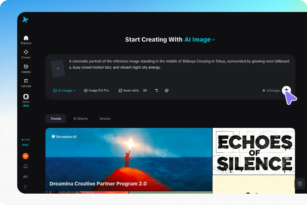
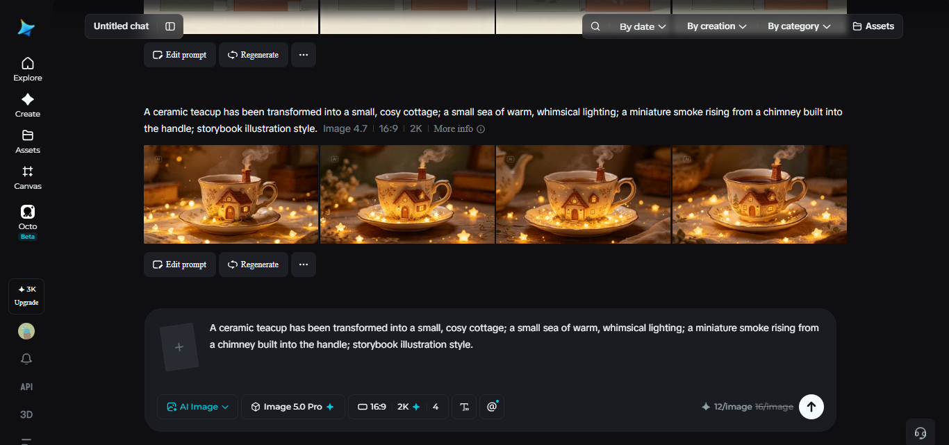
Dreamina’s image generator can create visuals from a written description and can also use a reference image to guide a new result. A small business might use it to compare a photographic direction with an illustration, or to explore several compositions for the same service. If using a reference photo, make sure you have the right to upload and use it, and avoid including confidential client information.
Generate a few variations around the same brief, then place the candidates beside the actual headline and button. An image can look strong on its own and still fail on the page: the subject may sit behind the words, the crop may remove the important action, or the image may suggest a service the business does not provide.
The tool also offers ways to refine generated results, including changes to a background and canvas expansion. Use those options where appropriate, but check the final asset at the intended size. Do not assume a generated image will reproduce a real product, building or person accurately without review.
The final choice does not need to be the most elaborate. A simple composition with a clear relationship to the offer can be easier to use across desktop and mobile. Keep brand colors and existing visual guidelines in mind so the landing page feels connected to the rest of the site.
Check What the Image Implies
For a small business, trust can be lost through a detail that looks harmless during design. A generated image of a clinic reception might imply a facility the business does not have. A fictional portrait beside a testimonial could look like the customer who supposedly gave it. A made-up certificate or badge might be read as proof of a qualification.
Separate concept imagery from evidence. Use actual, authorized photographs when showing the team, premises, completed work or customers. If a before-and-after result is important to the offer, use a genuine example with permission and enough context to avoid implying that every client will see the same outcome. Do not use a generated image as a substitute for a real case study.
Look closely at signs, screens, labels, hands and objects before publication. Make sure no recognizable third-party logo or person appears without appropriate rights. Review the relevant product terms and any applicable model or asset conditions for the intended commercial use. If you cannot verify an important detail, revise the visual or use a different image.
Prepare the Asset for a Real Page
An image that looks beautiful in a preview still has to load and remain legible on the published page. Export it in a size appropriate for its placement, avoid using a huge file for a small component, and preview how the page crops the image at desktop and mobile widths. Compress the asset while checking that important details remain clear.
Use descriptive alternative text when the image conveys information that a visitor needs. For an illustration that merely decorates a page and repeats nearby text, an empty alt attribute may be more appropriate; follow the accessibility approach used by your site. Keep important service details in real text rather than embedding them inside an image.
After publishing, check the complete journey. Can a visitor understand the offer, find the relevant service detail and reach the next step without the image covering a button? If the page includes a contact form, confirm that the form itself is usable and that the business receives submissions. A strong image cannot fix an unclear offer or a broken form.
Compare Ideas Without Guessing at Results
Before changing a live page, ask a few people who resemble your intended visitors to look at it. Give them a short task—such as identifying what the service offers and how to ask for a quote—and listen to where they hesitate. Avoid telling them what the image is supposed to mean before they answer; that can hide the confusion you are trying to find.
If you have enough suitable traffic and a way to measure results, compare versions carefully. Keep the offer and relevant page conditions stable when investigating an image change, define the action you want to observe, and give the test enough time to collect useful evidence. A change in inquiries can have several causes, so do not credit an image alone without considering the rest of the page.
For a smaller site, a formal experiment may not be practical. A structured review on a phone, a check of actual form submissions and a few conversations with prospective customers can still reveal whether the page is clear. Record what you changed and why, then revisit it when the offer or audience changes.
Make the Next Step Clear
The strongest landing-page visual is not necessarily the most dramatic one. It helps the right visitor recognize the offer, understand the context and continue toward a useful next step. AI can make exploring visual ideas more accessible, but the business still needs to choose an honest direction, review the details and explain the service in its own words.
Start with one page and one visitor question. Build a brief around it, compare a few visual approaches in the real layout and keep the image that makes the offer easier to understand. That is a more useful goal than simply adding another attractive picture.
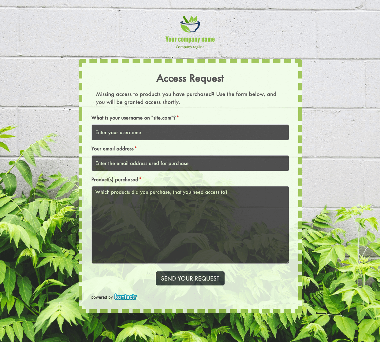 Access Request Form
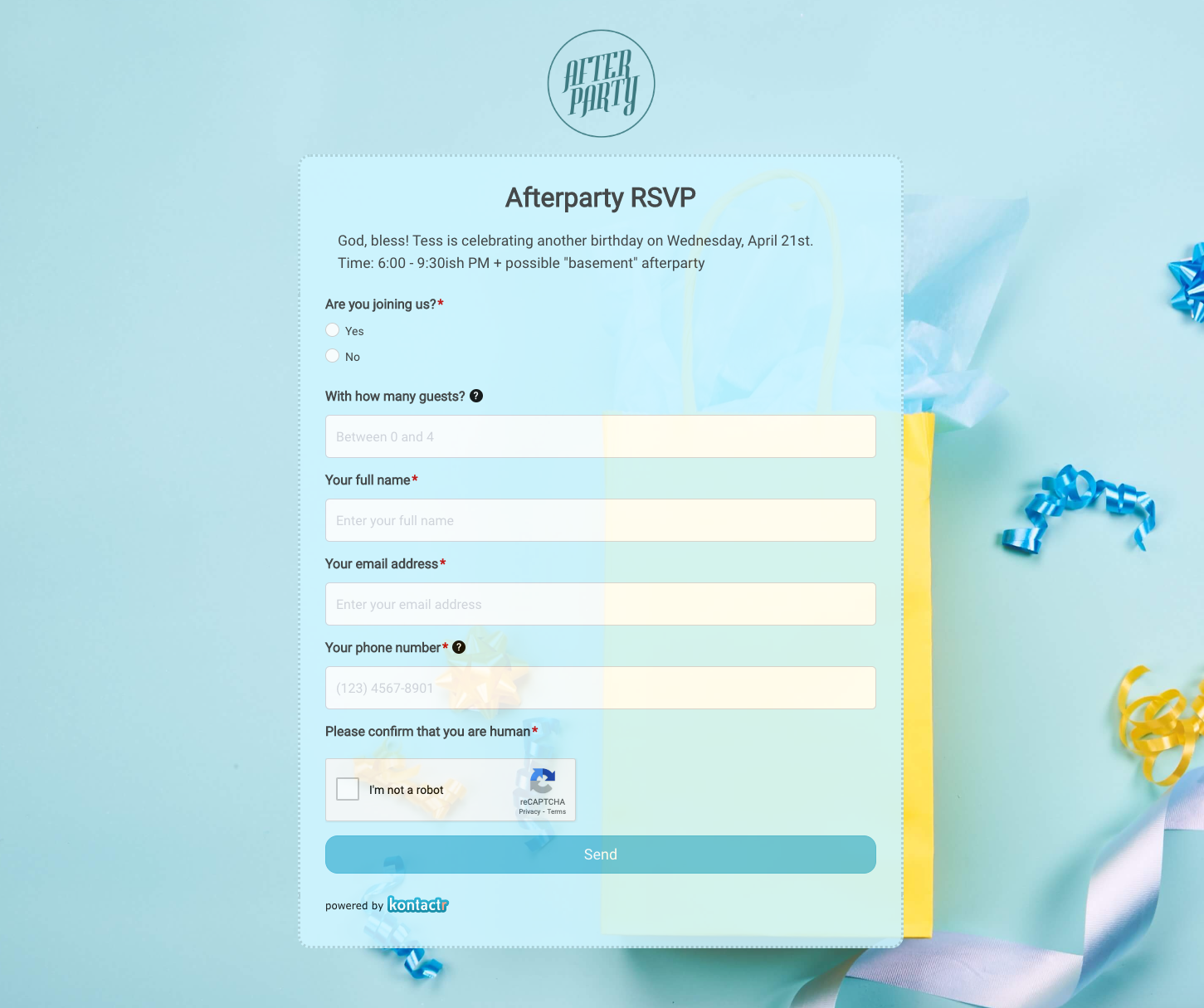 Afterparty RSVP Form
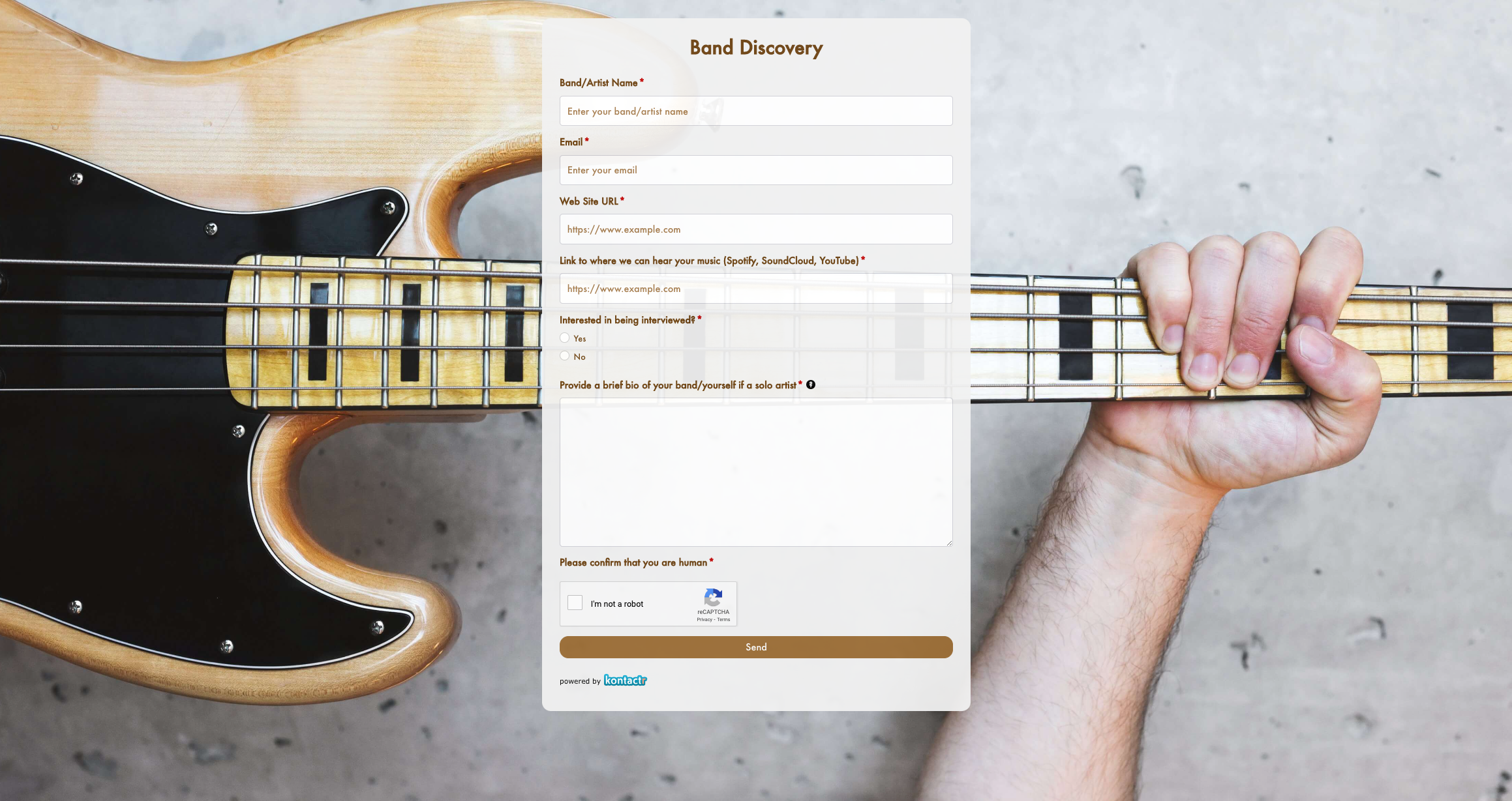 Band Discovery Form
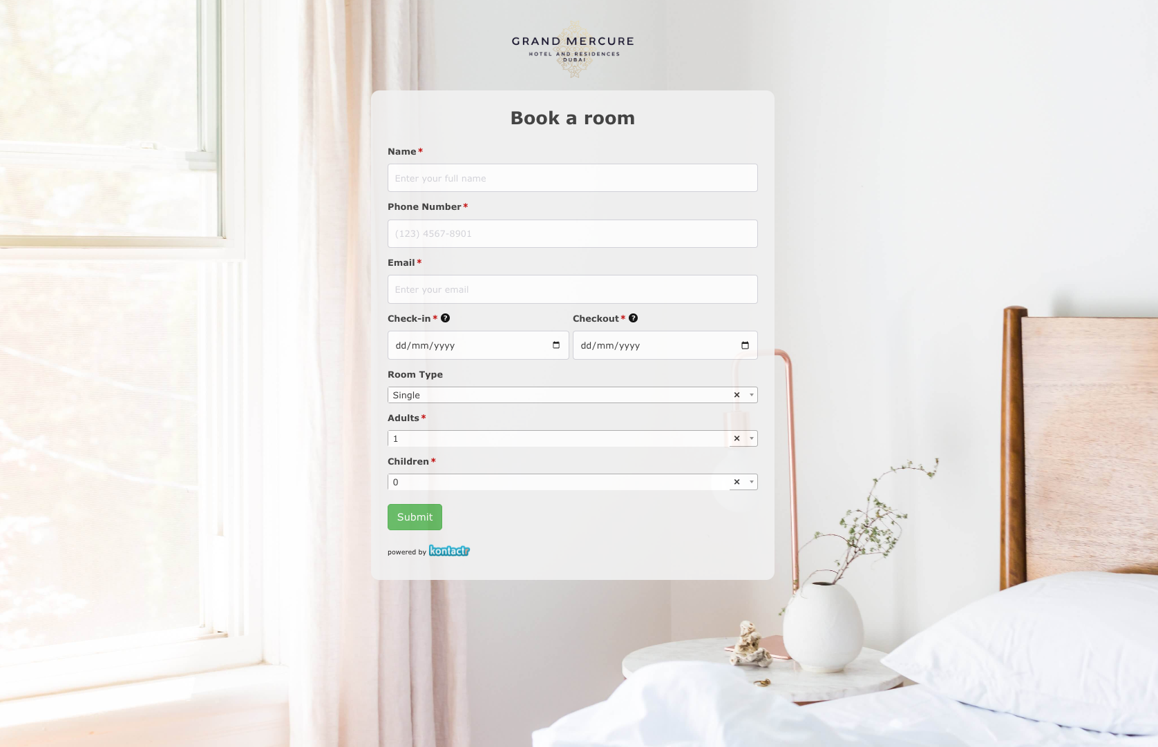 Book a room Form
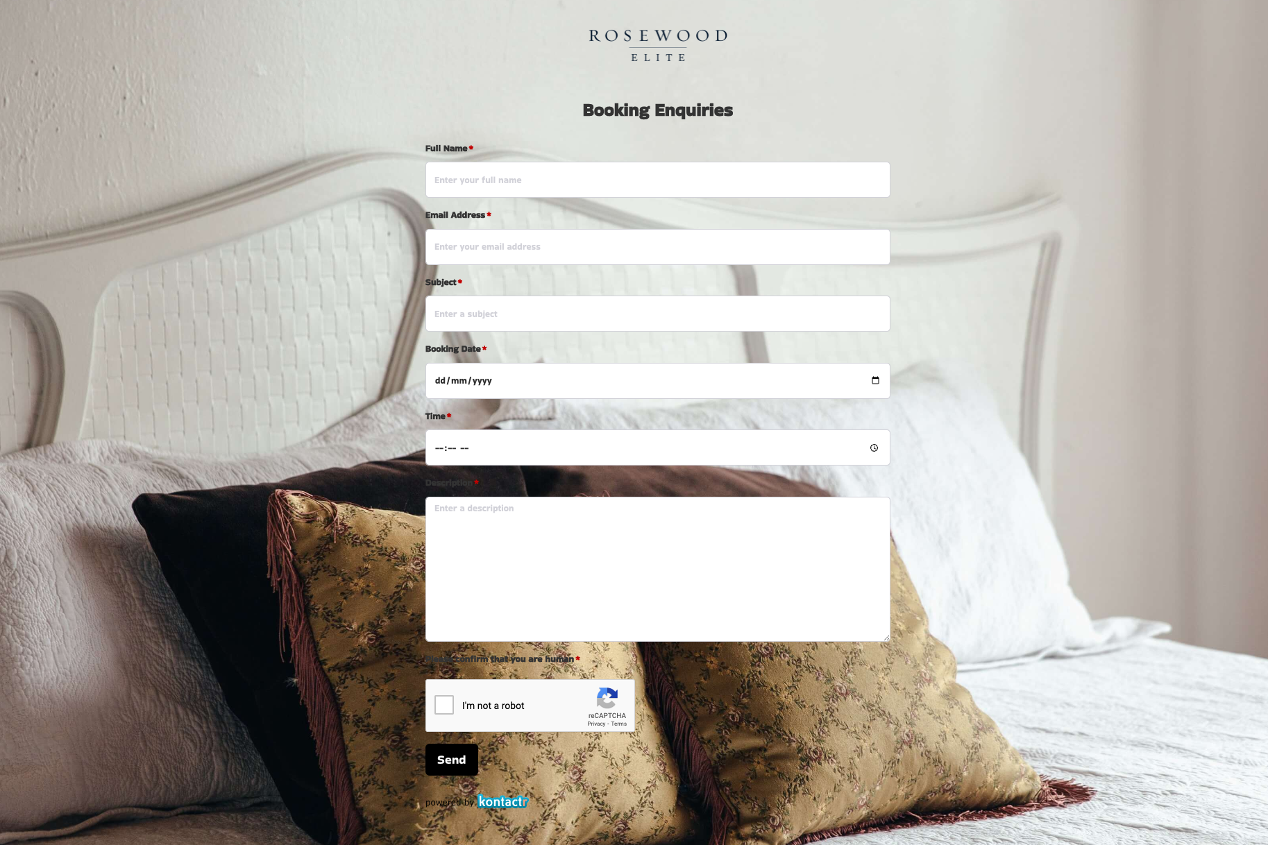 Booking Enquiries Form
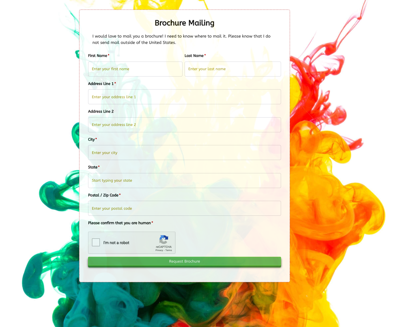 Brochure Mailing Form
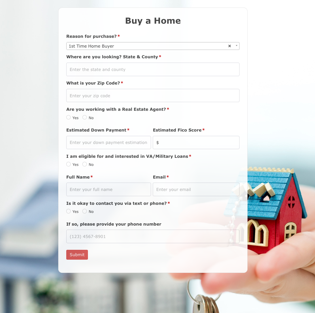 Buy a Home Form
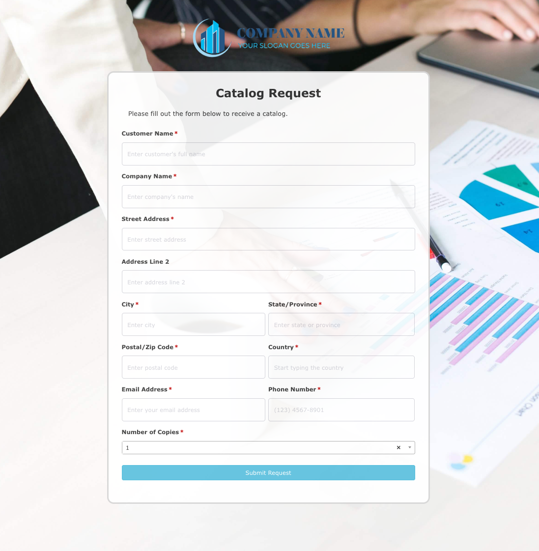 Catalog Request Form
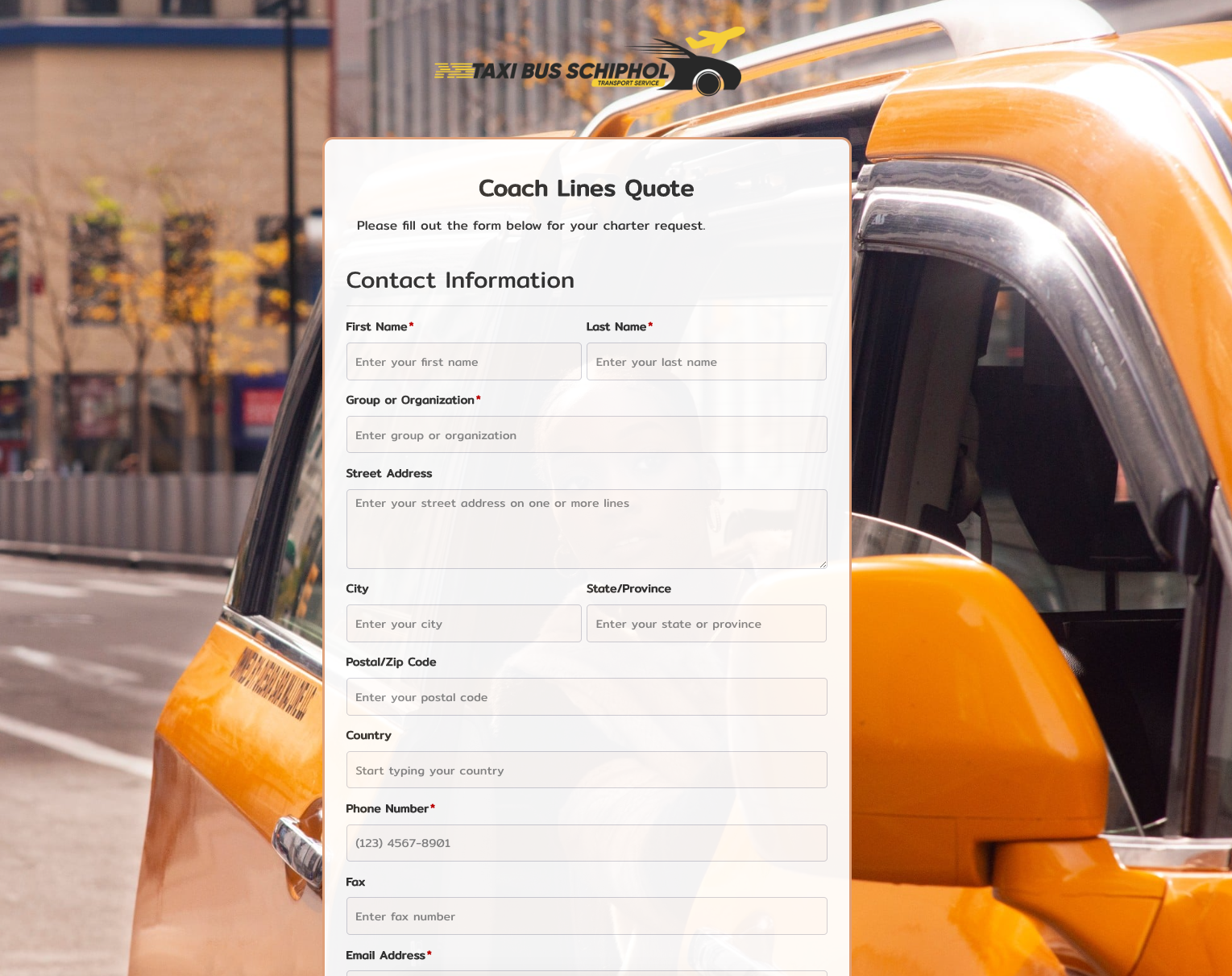 Coach Lines Quote Form
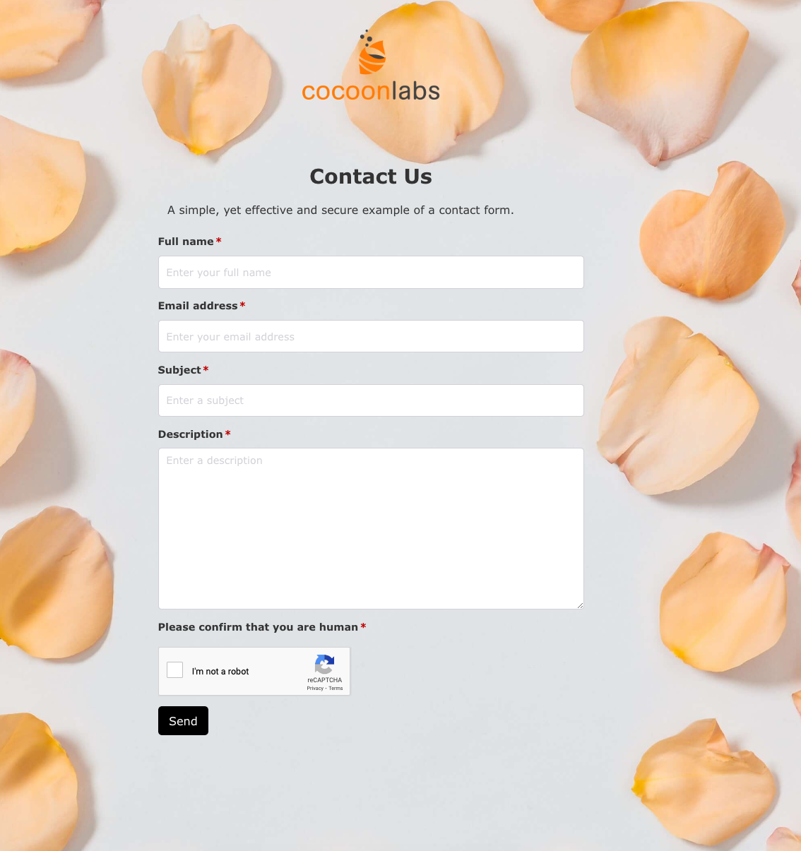 Contact Us Form
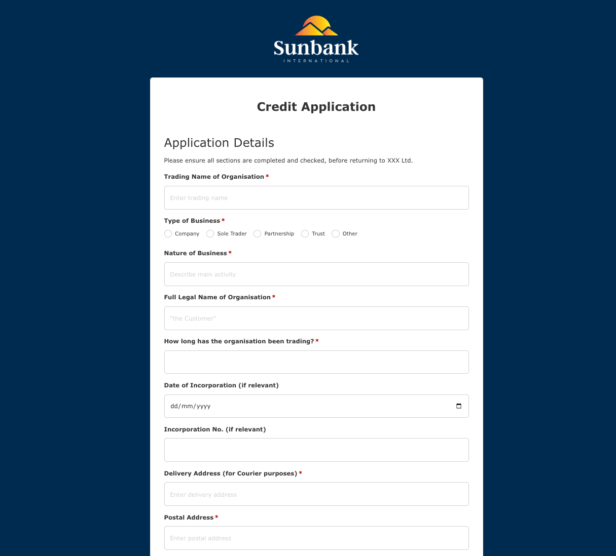 Credit Application Form
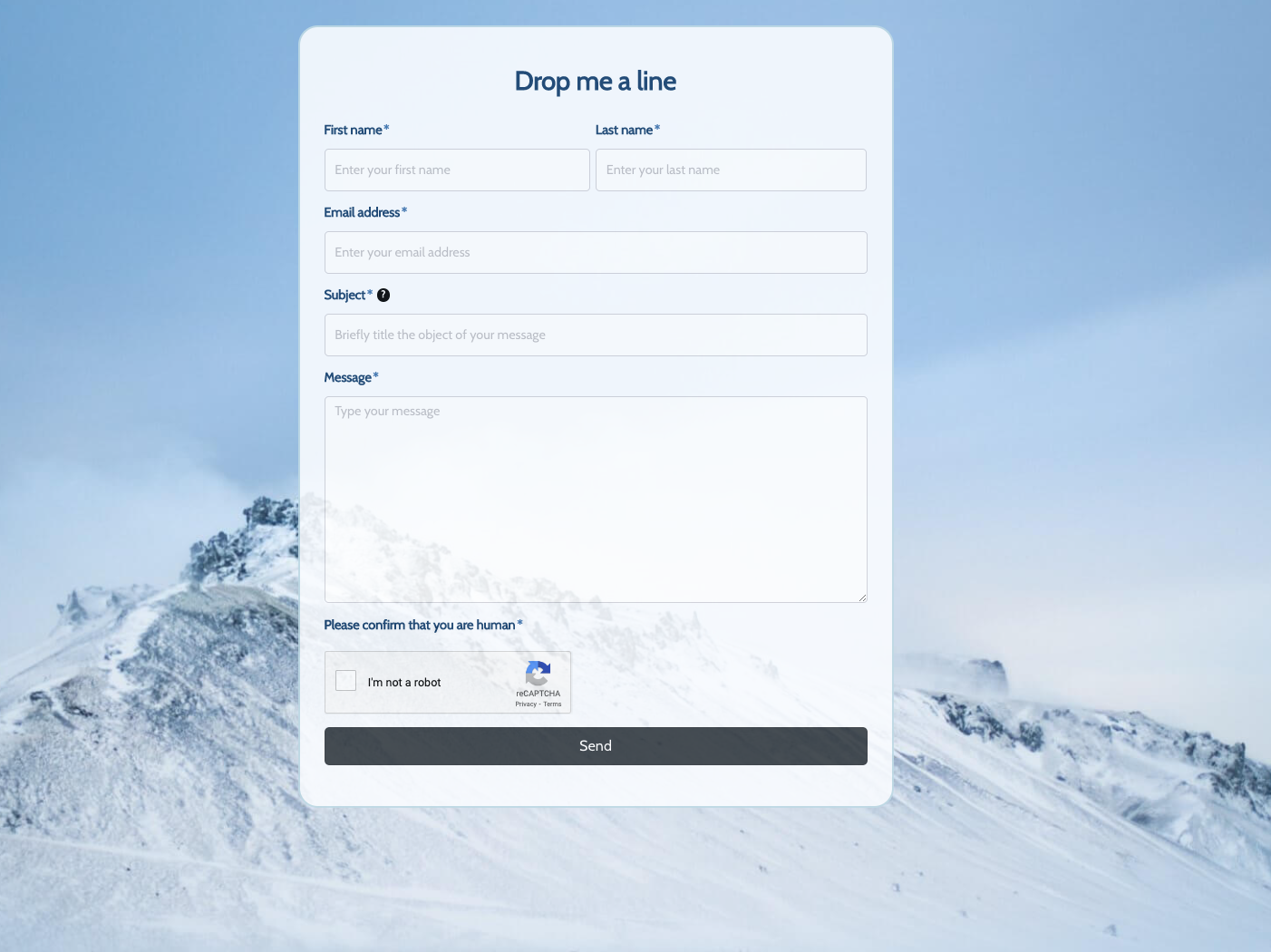 Drop me a line Form
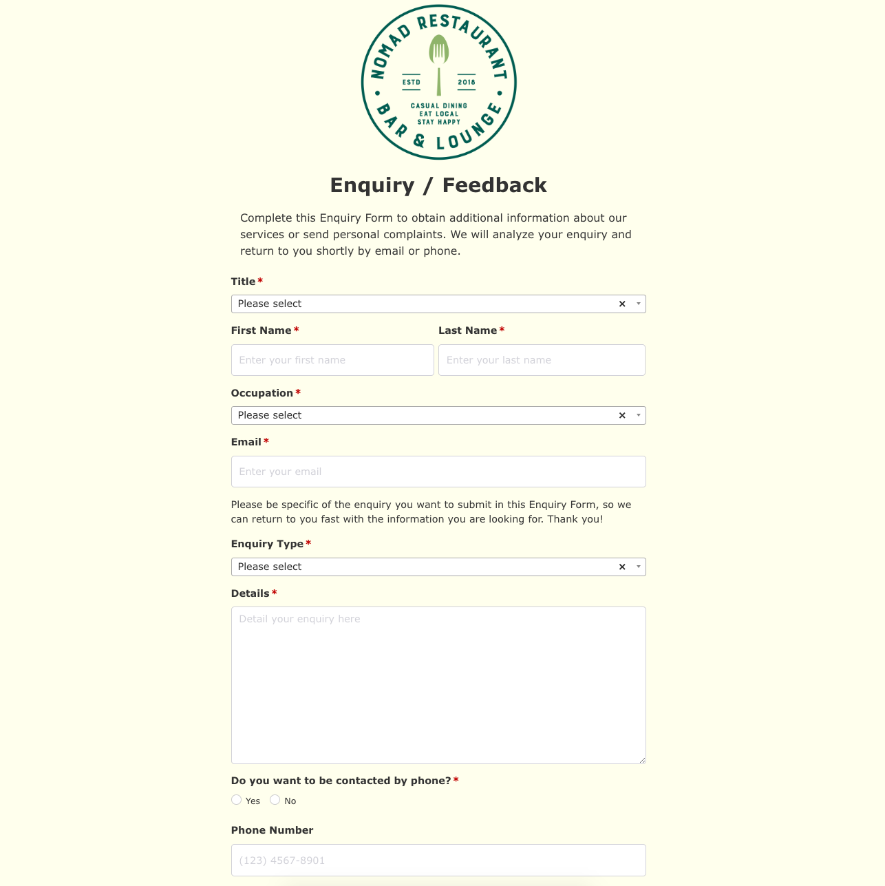 Enquiry / Feedback Form
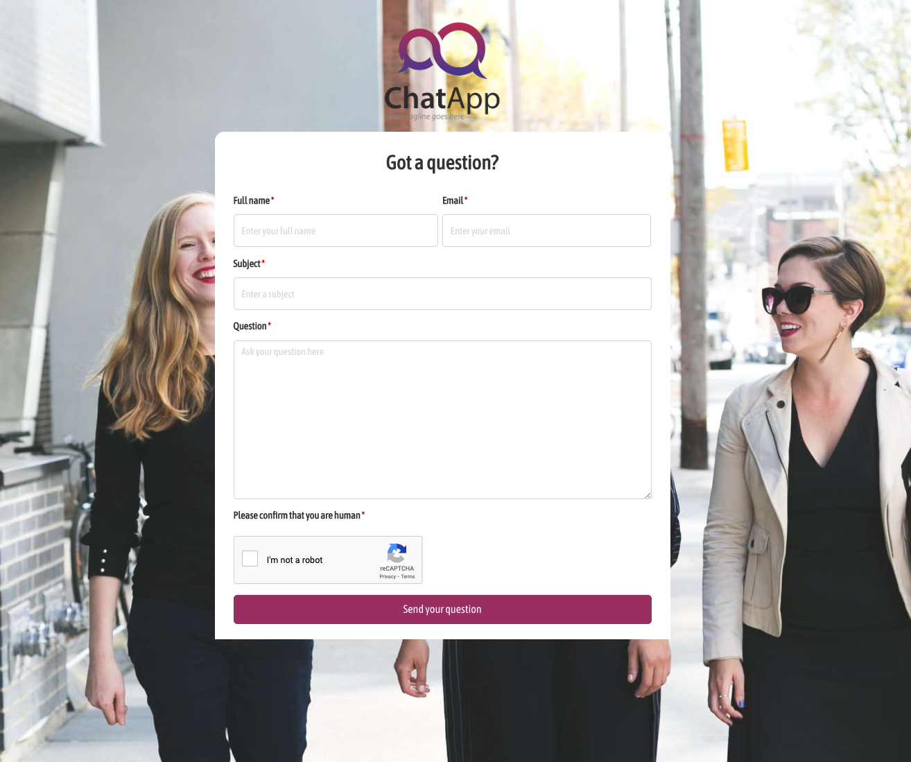 Got a question? Form
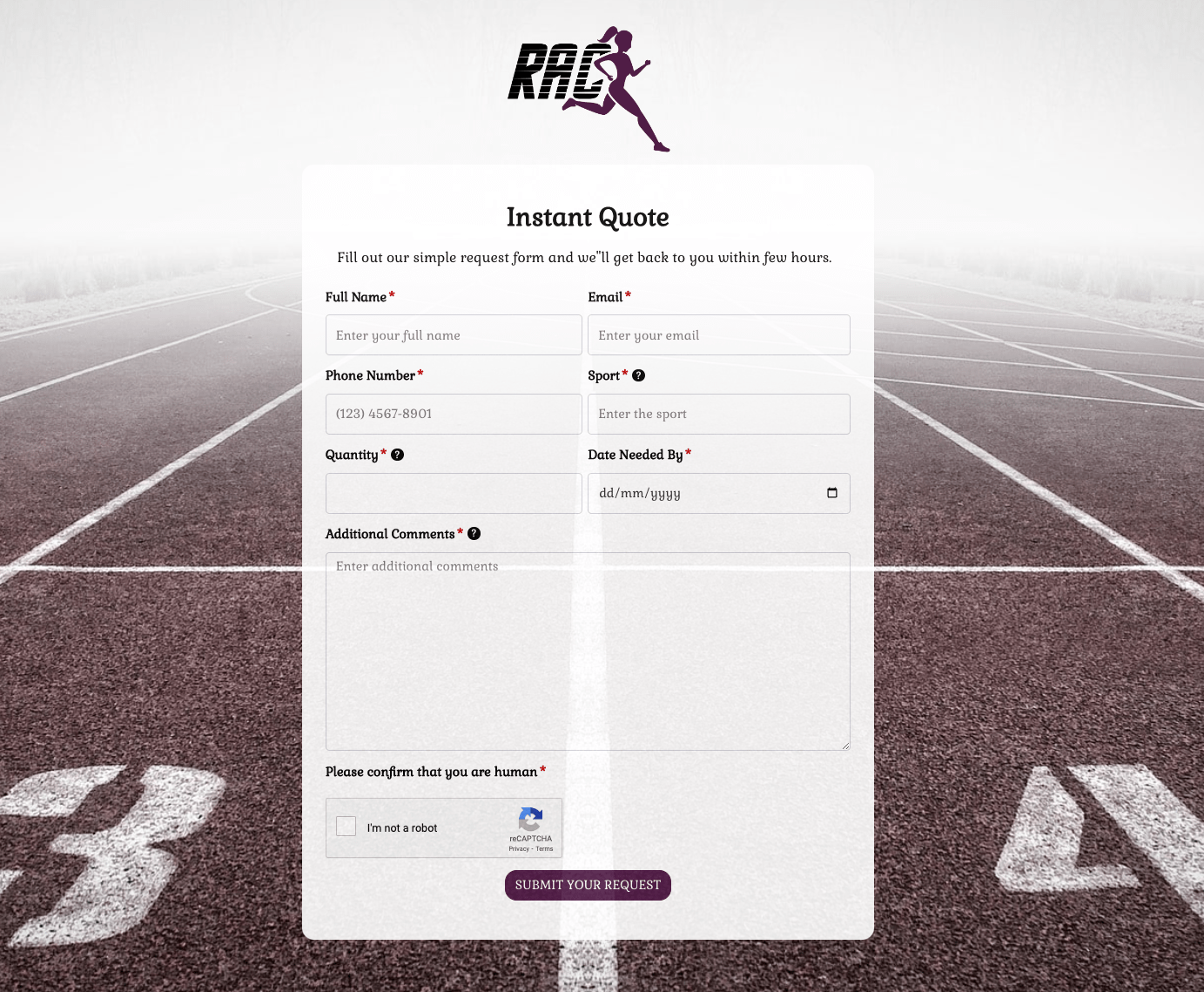 Instant Quote Form
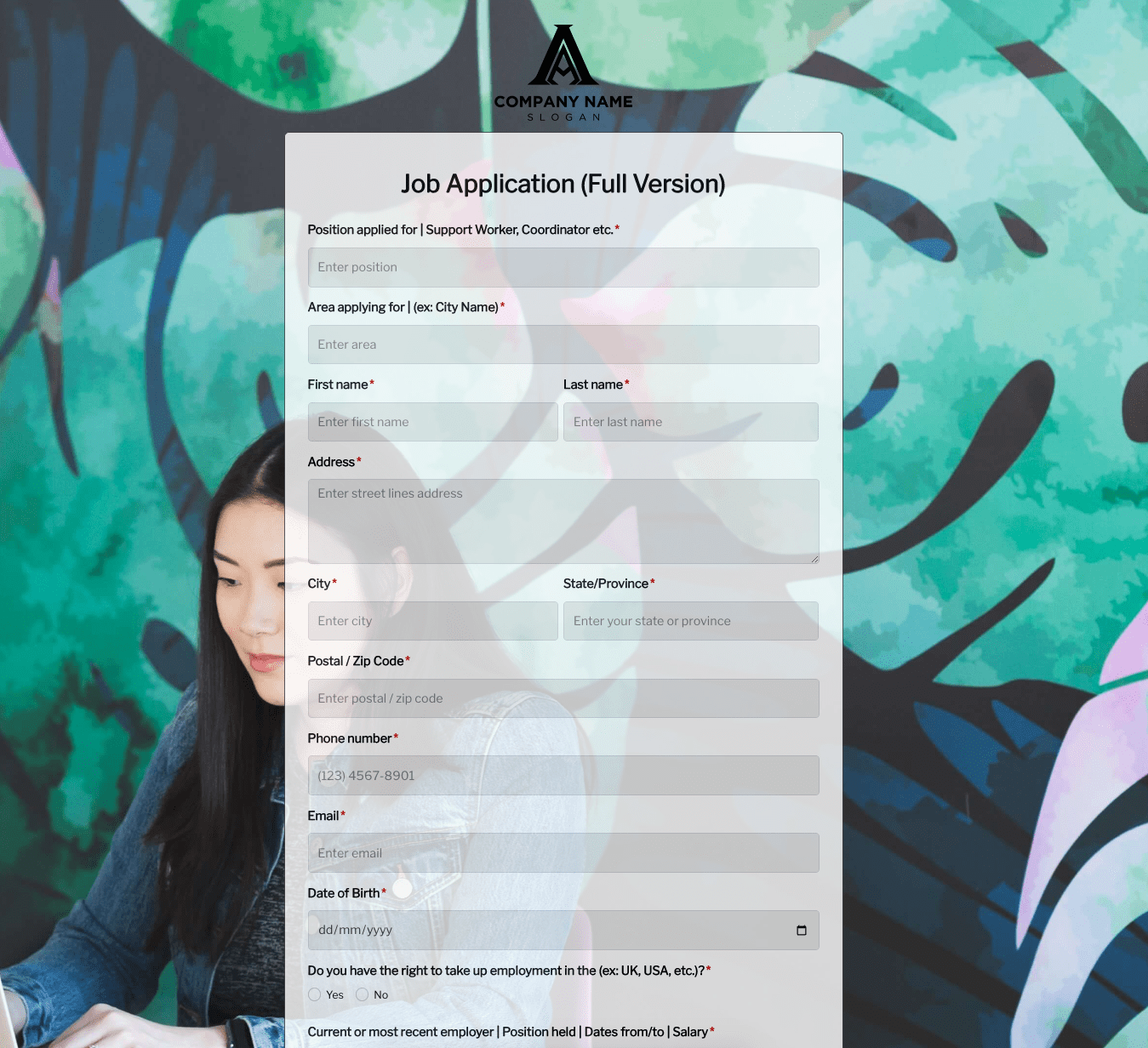 Job Application Form
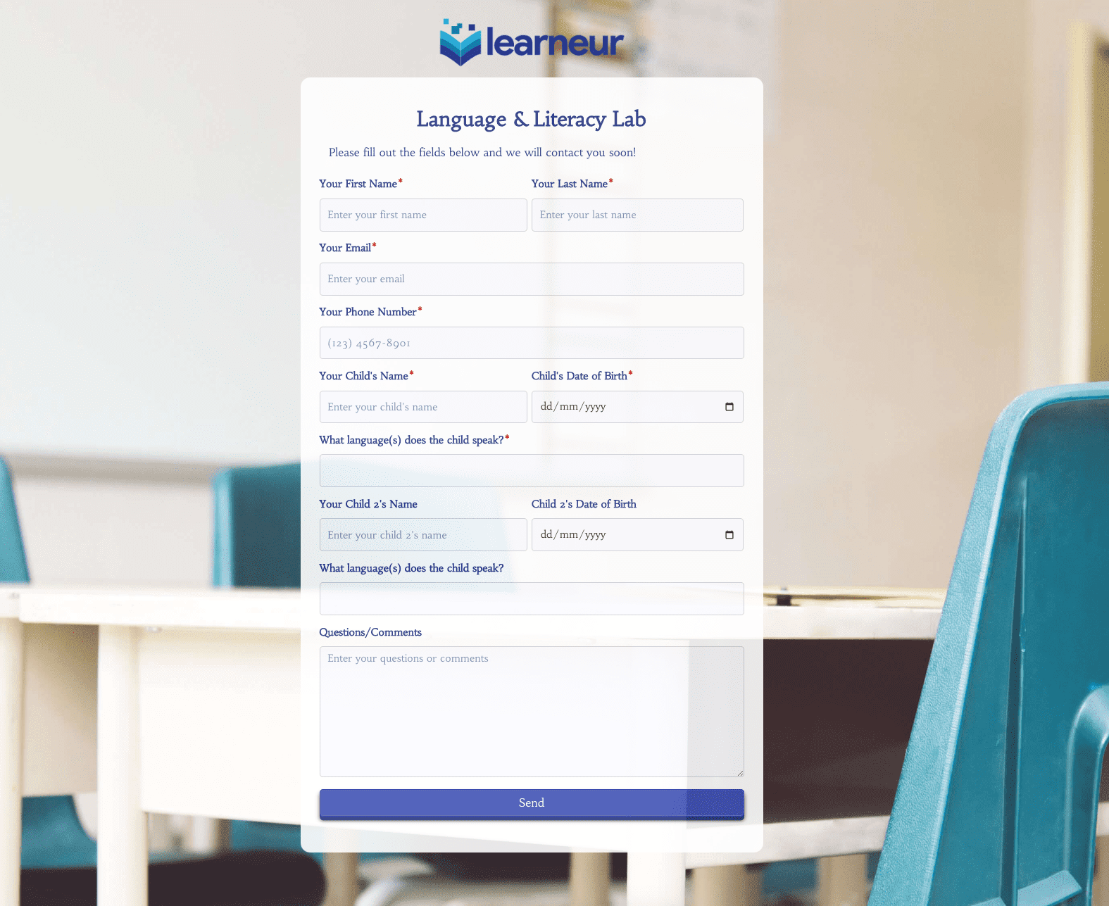 Language & Literacy Lab Form
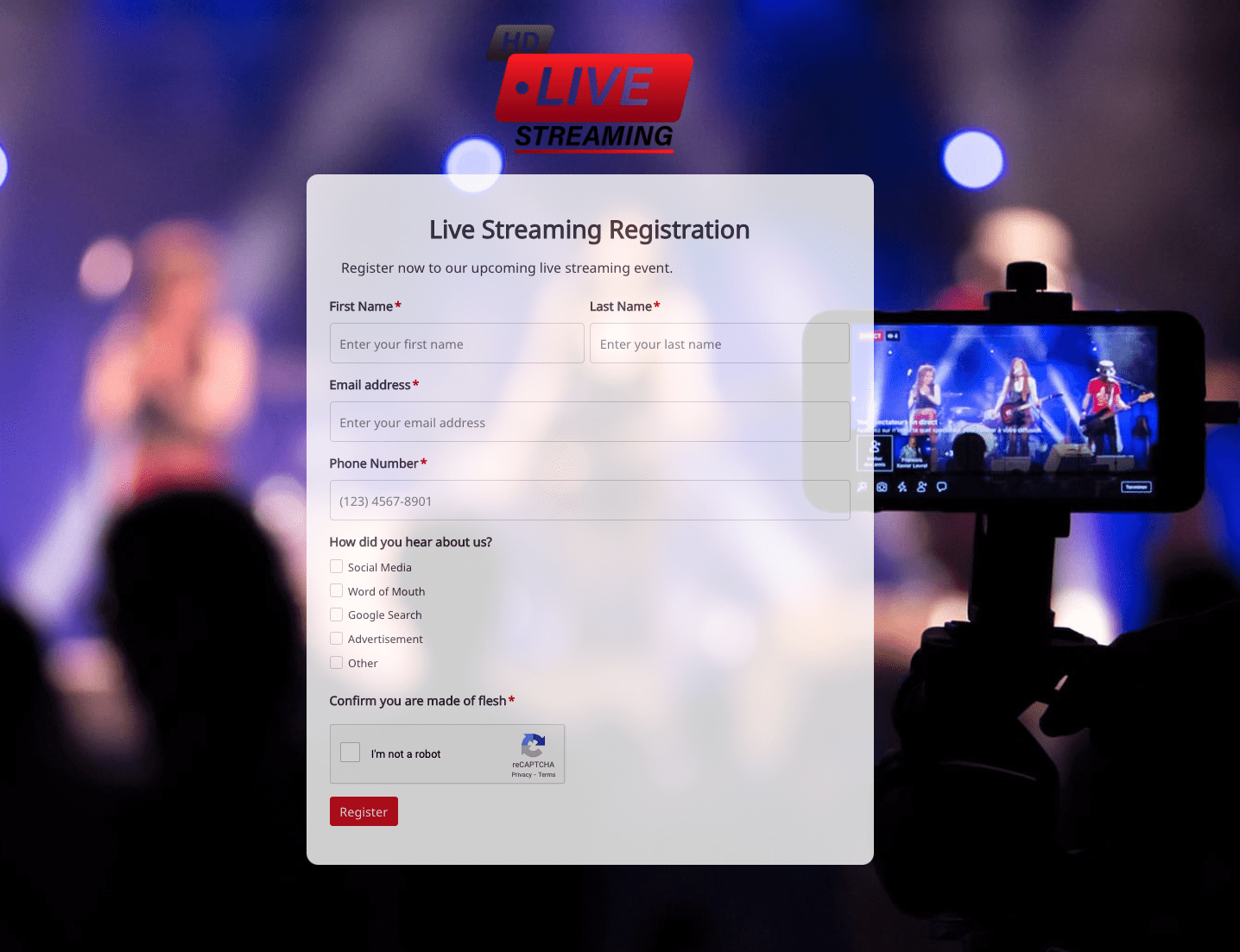 Live Streaming Registration Form
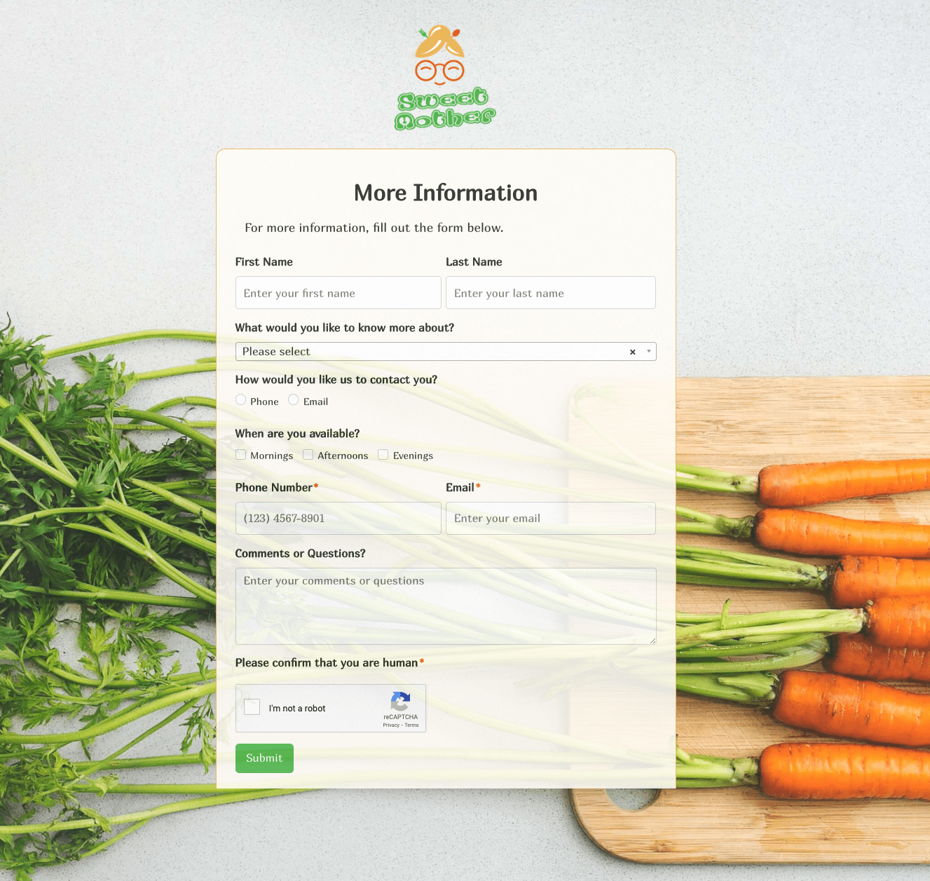 More Information Form
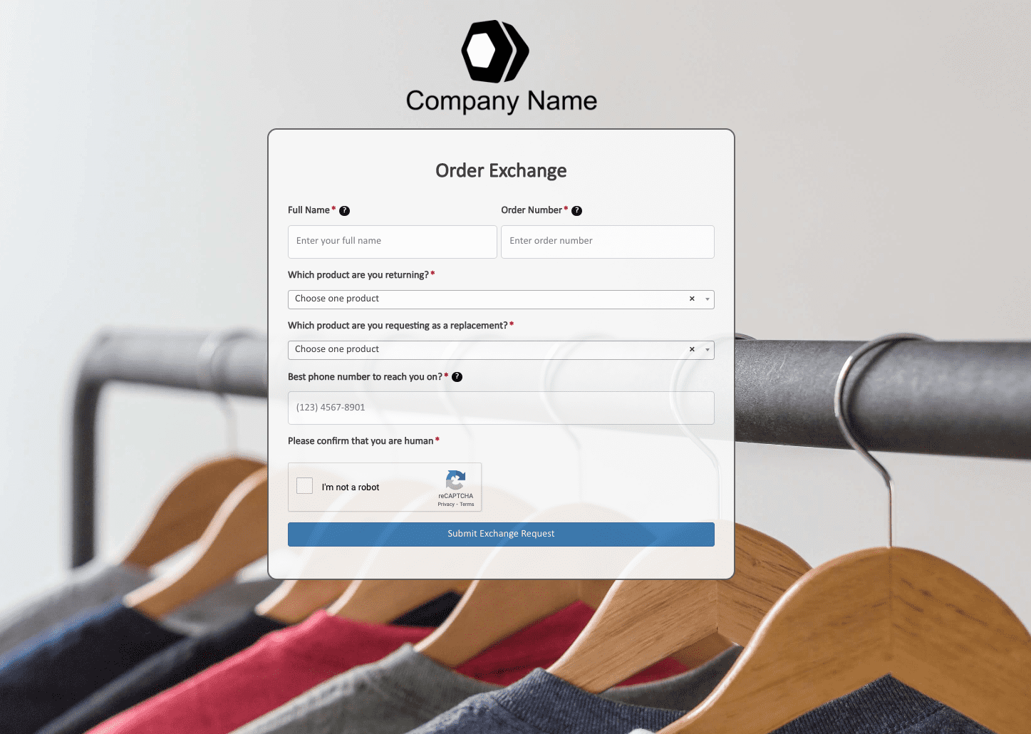 Order Exchange Form
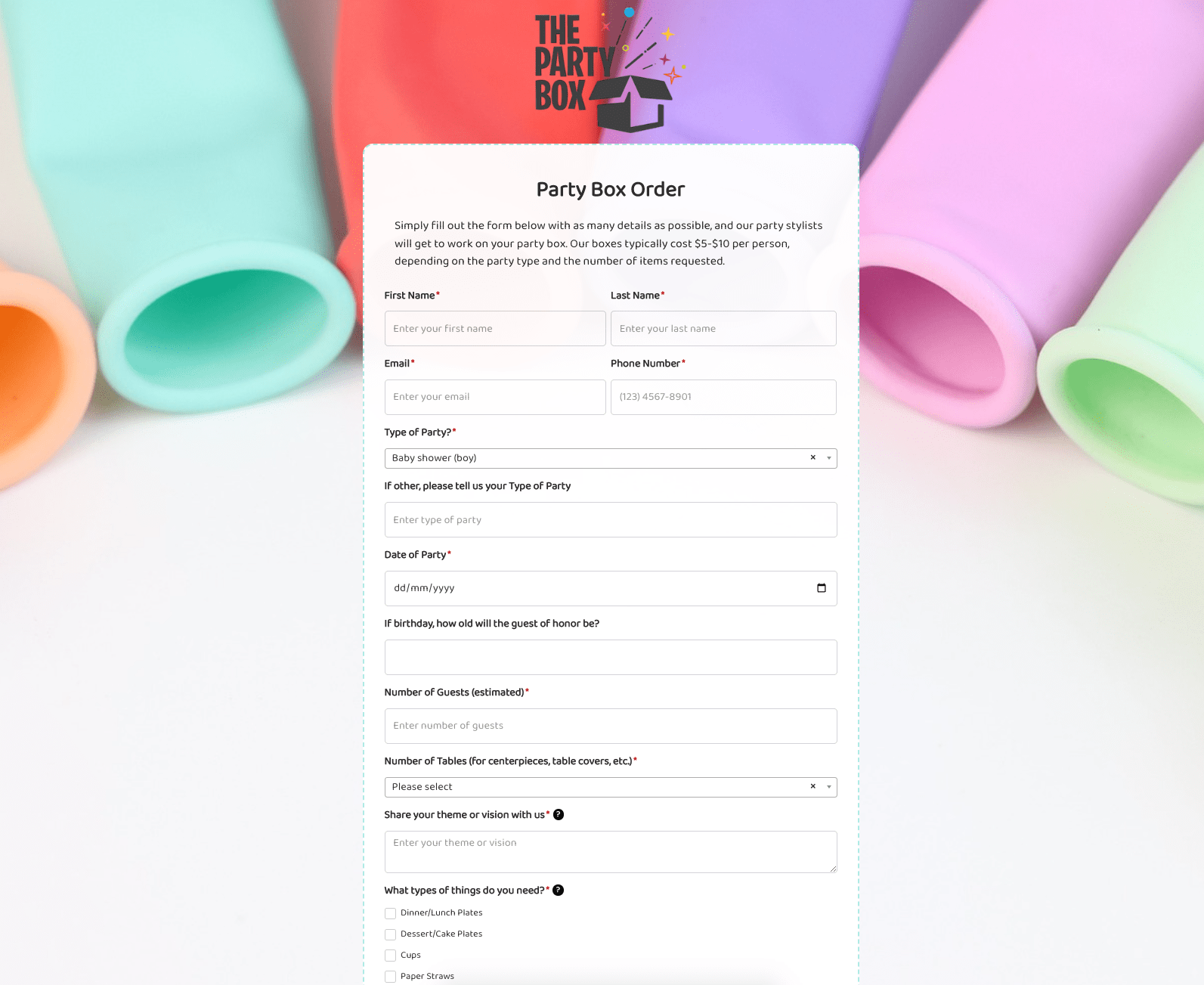 Party Box Order Form
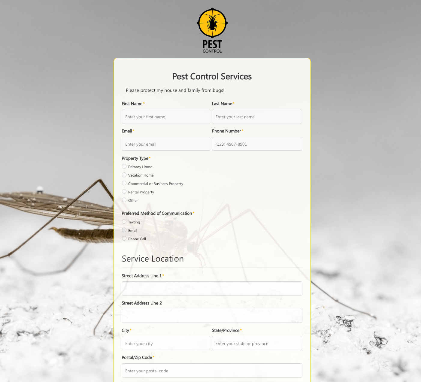 Pest Control Services Form
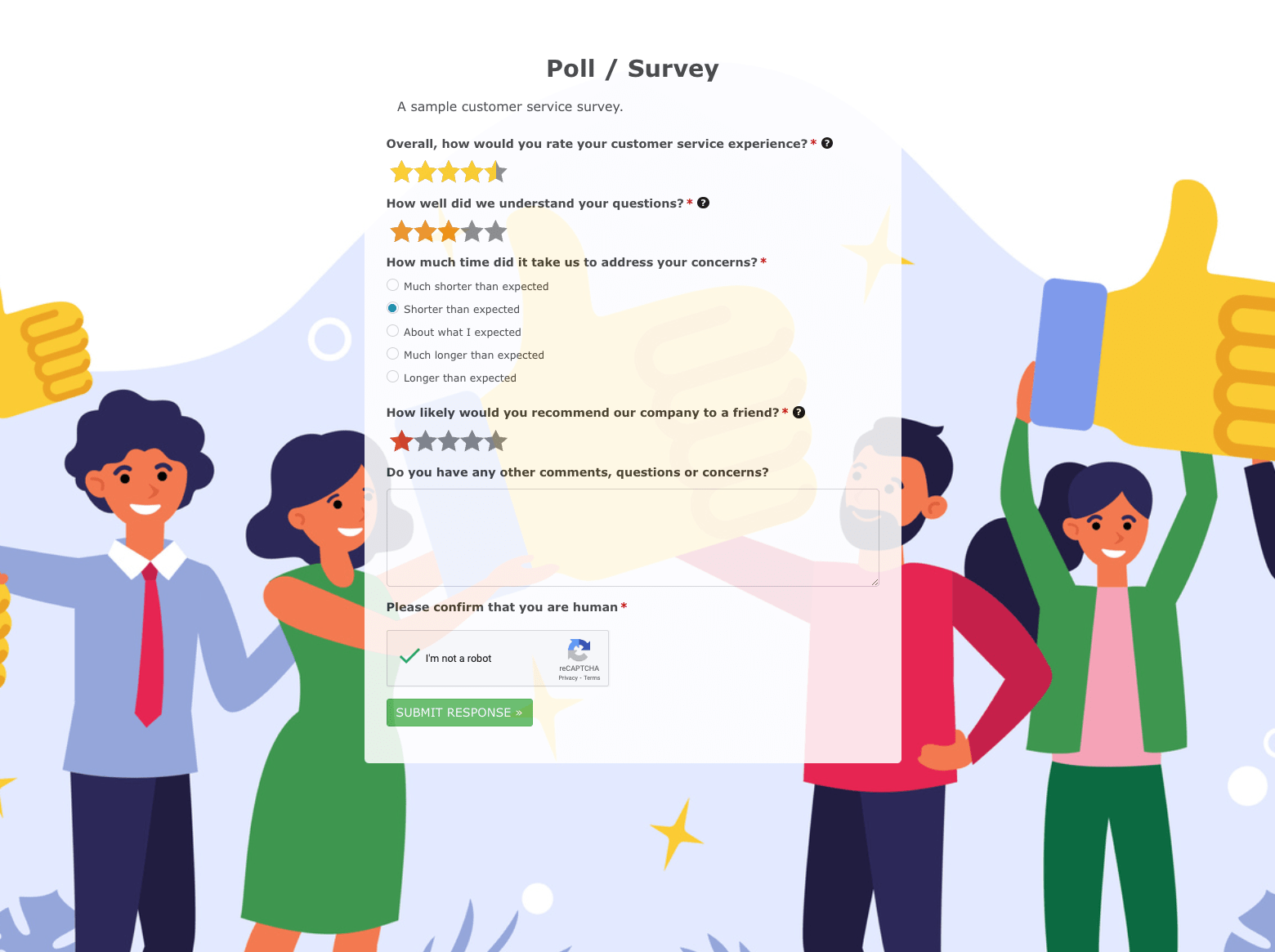 Poll / Survey Form
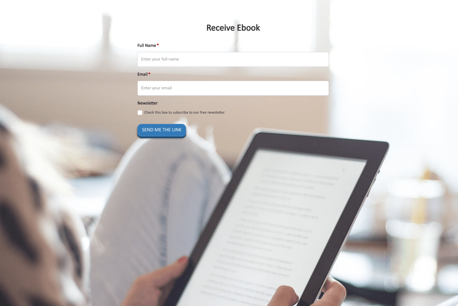 Receive Ebook Form
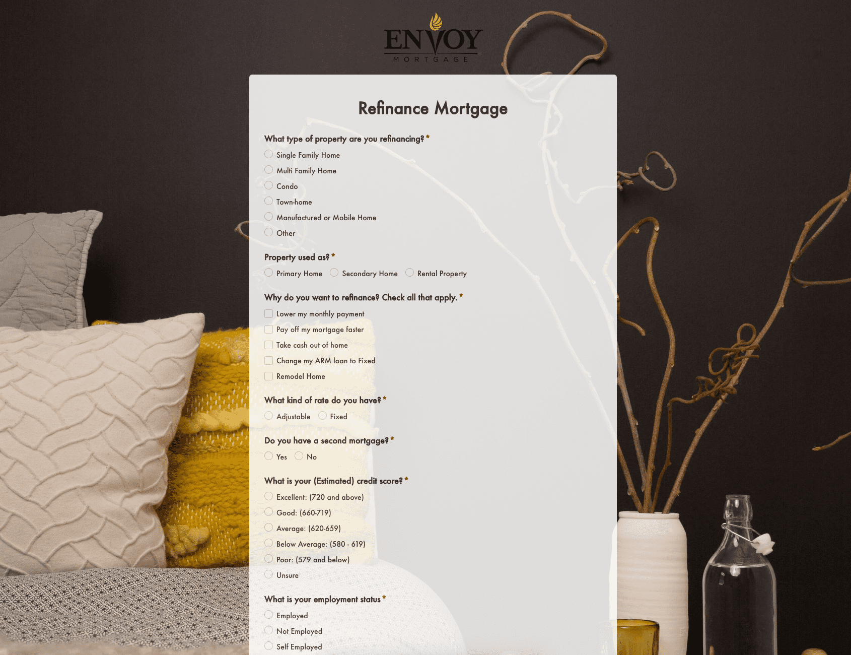 Refinance Mortgage Form
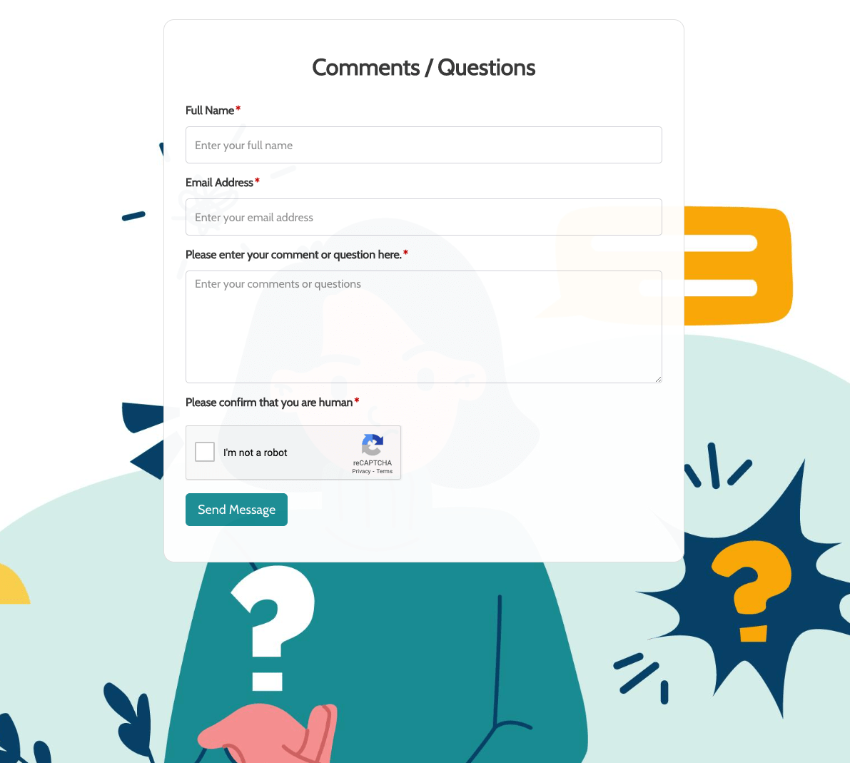 Remarks / Questions Form
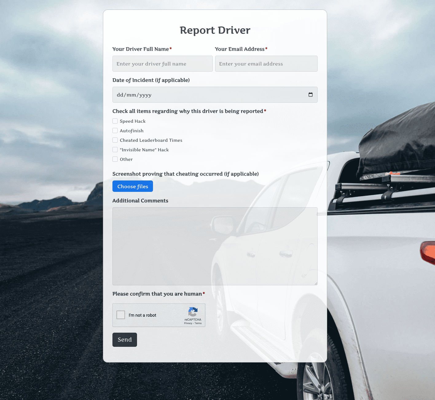 Report Driver Form
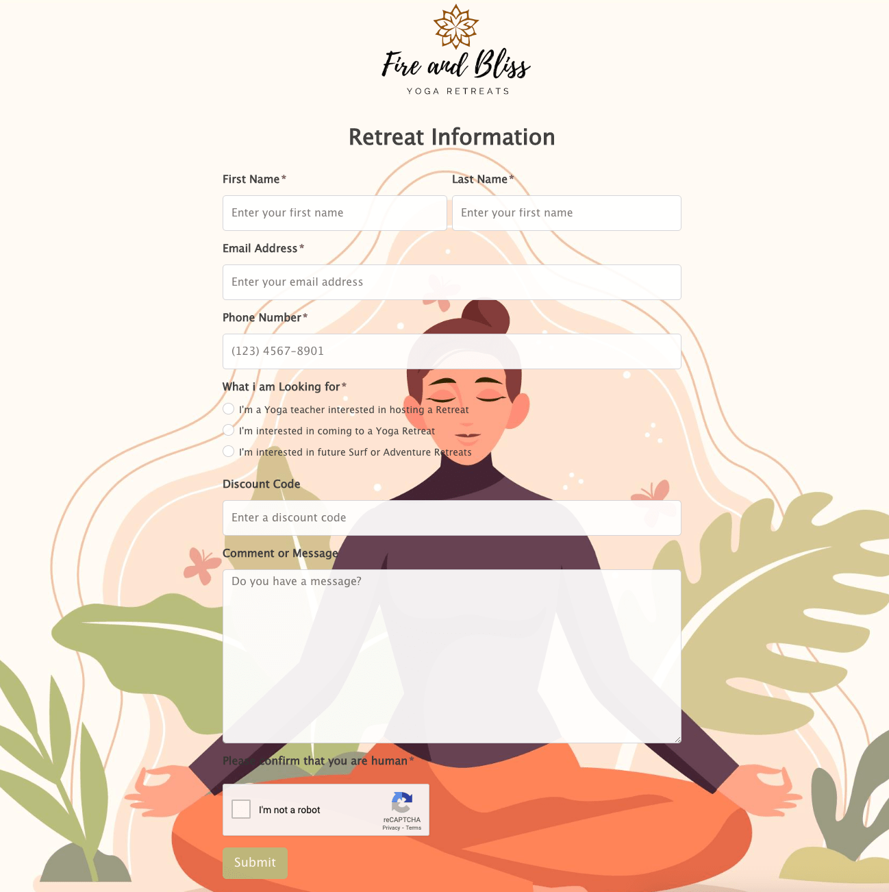 Retreat Information Form
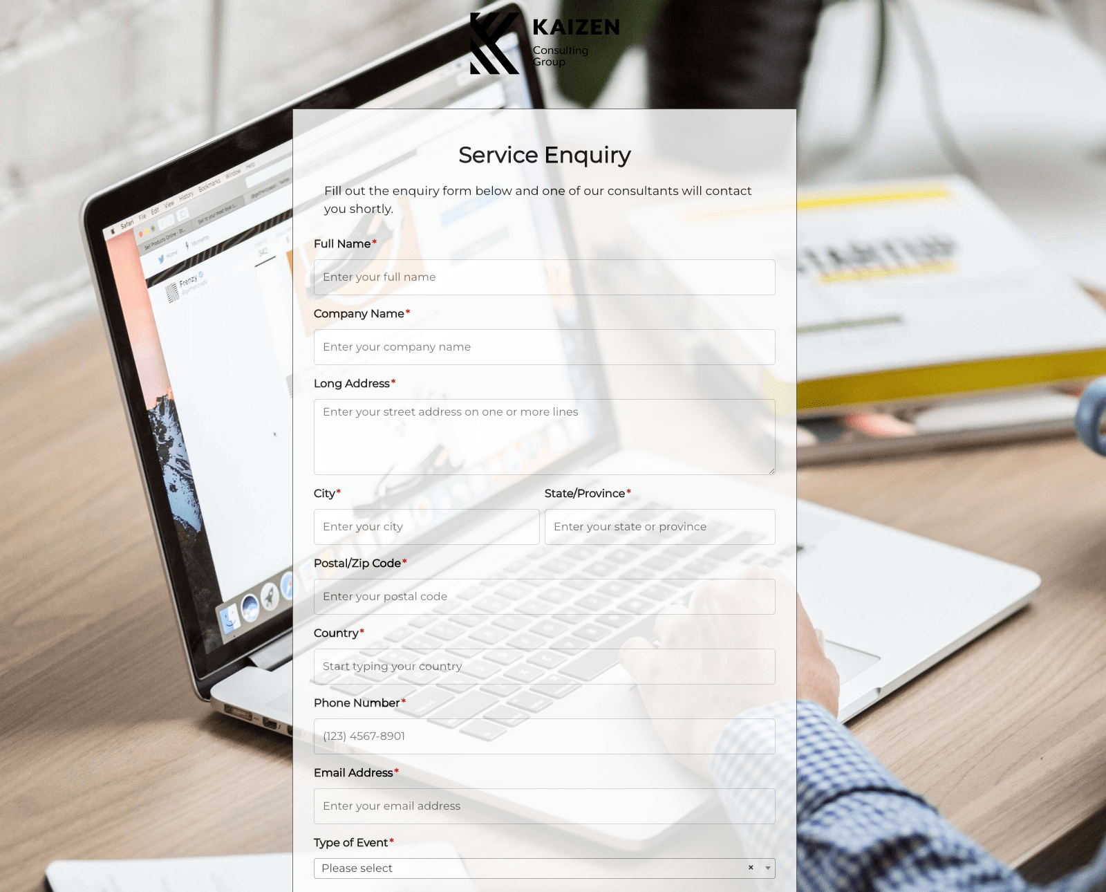 Service Enquiry Form
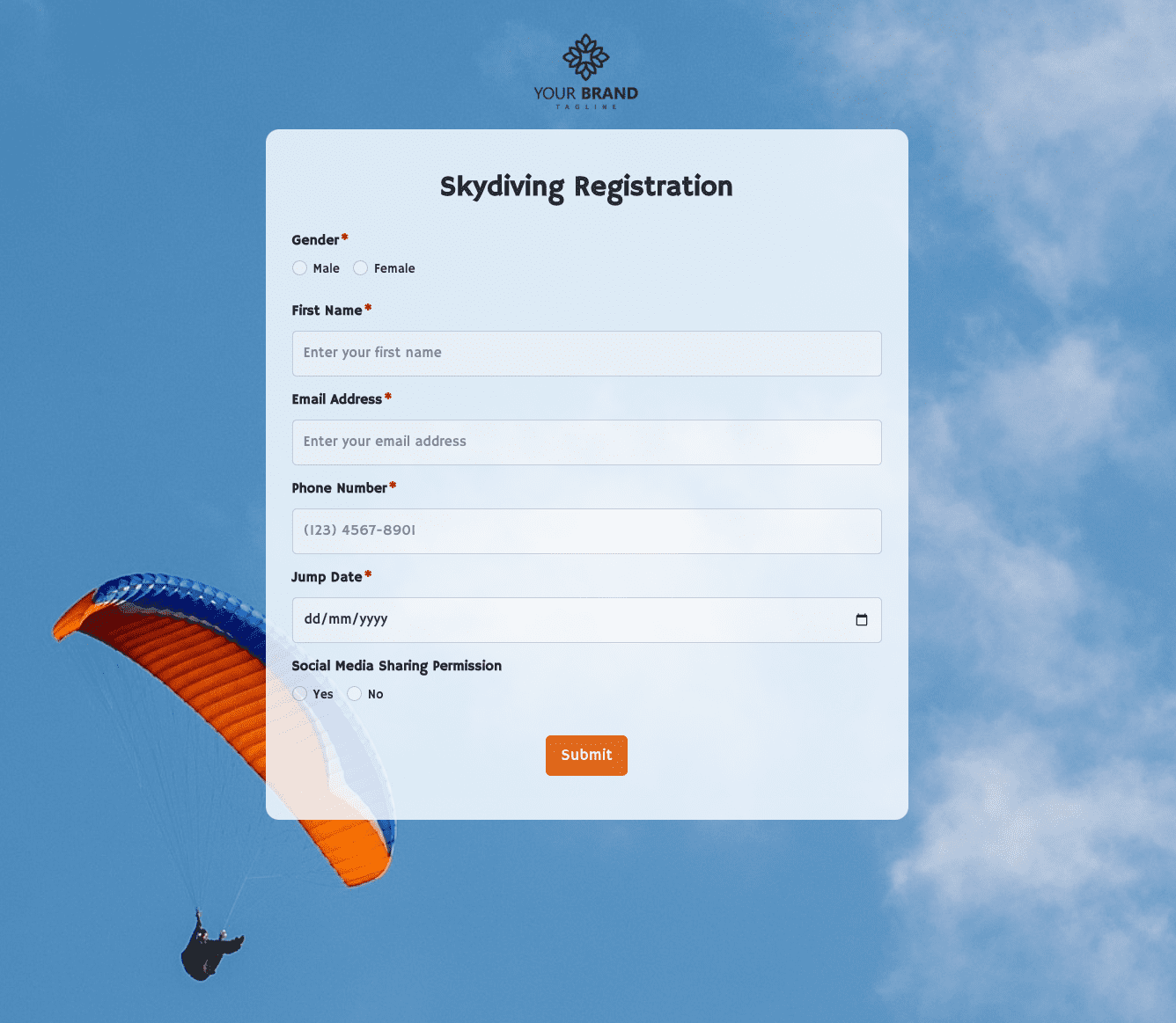 Skydiving Registration Form
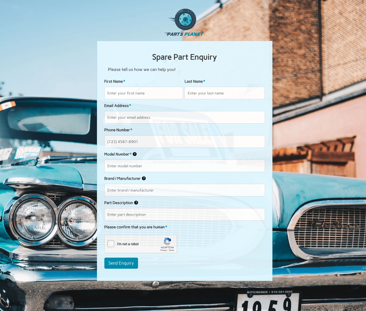 Spare Part Enquiry Form
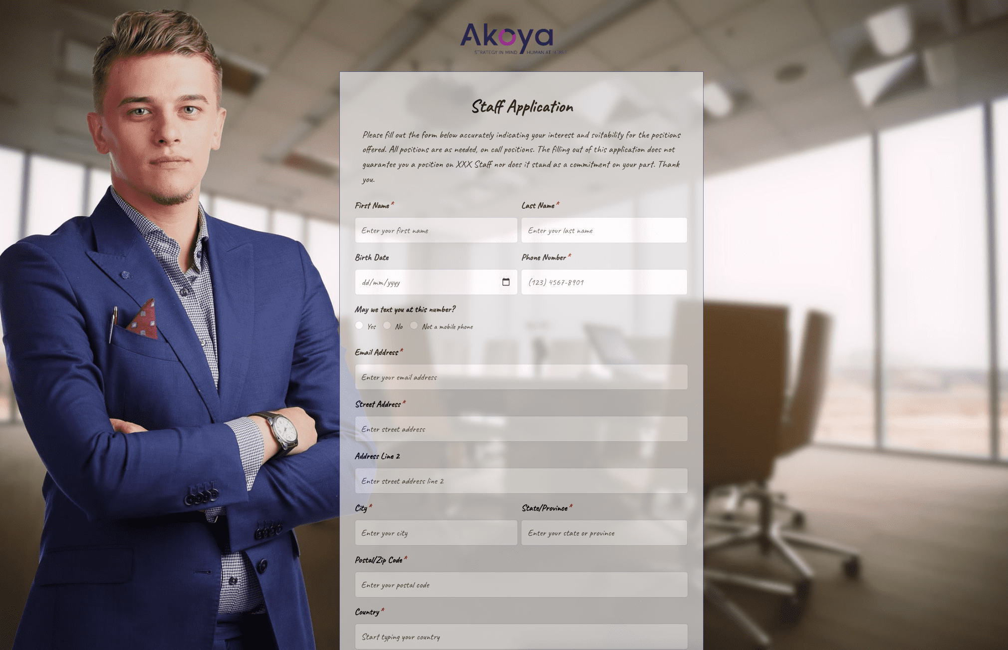 Staff Application Form
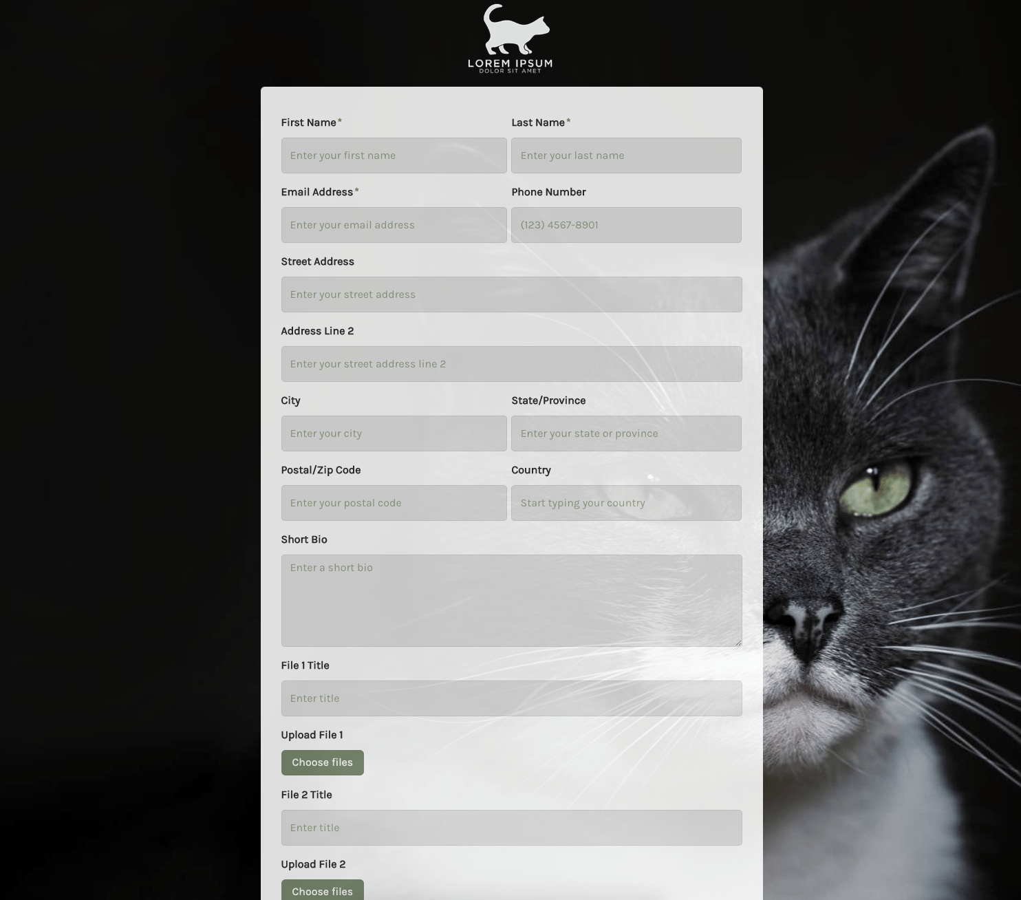 Submission Form
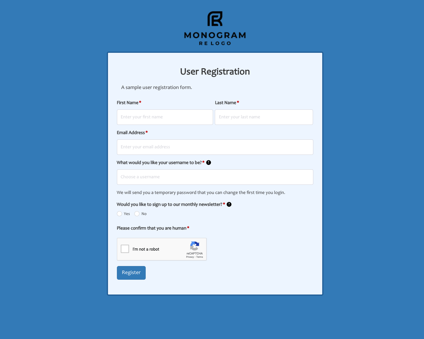 User Registration Form
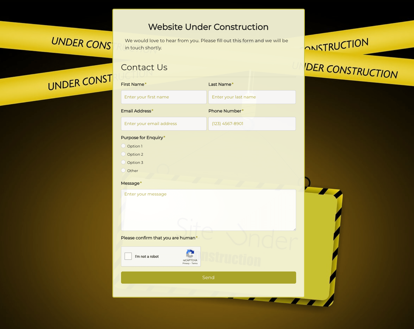 Website Under Construction Form
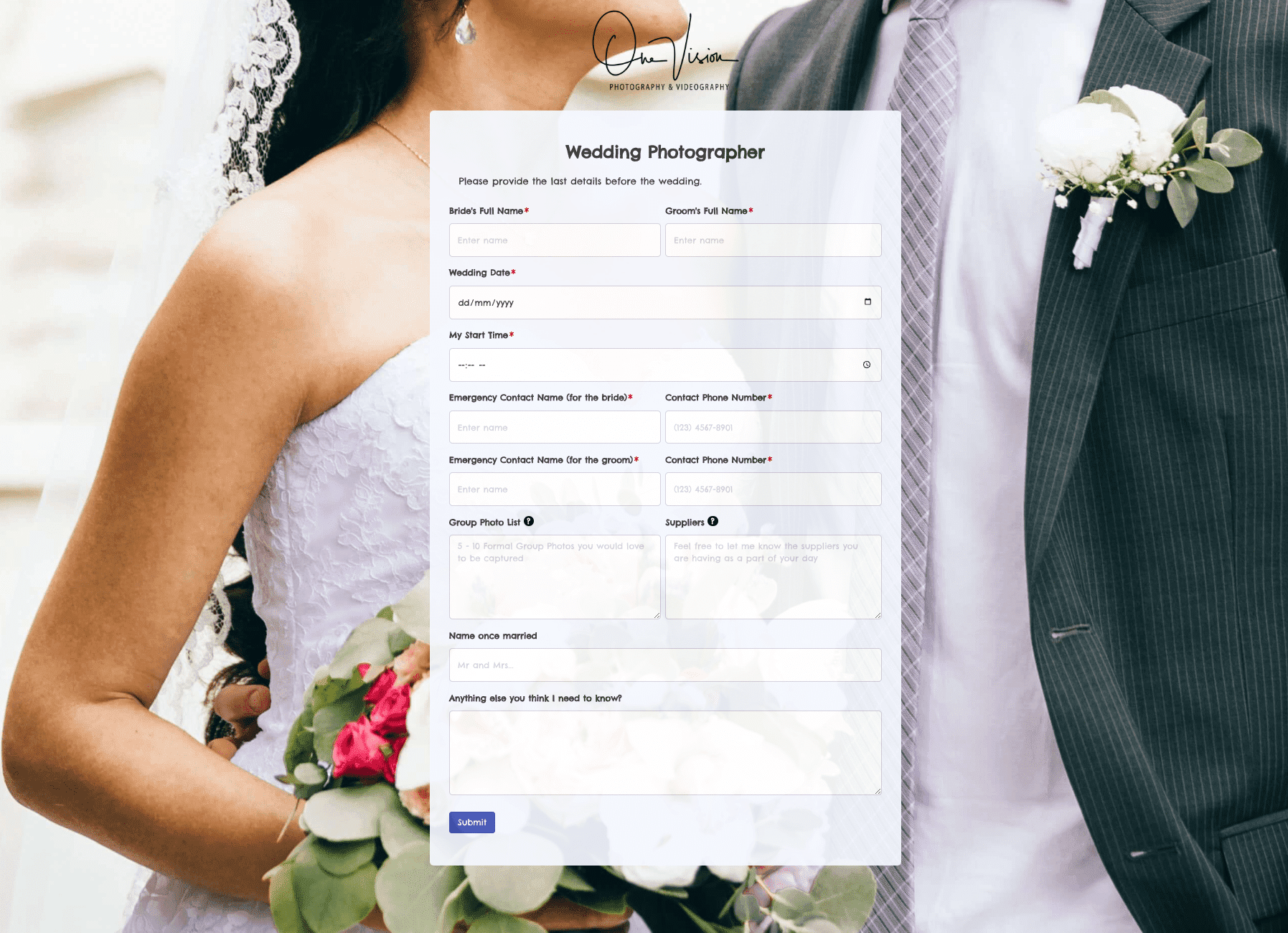 Wedding Photographer Form
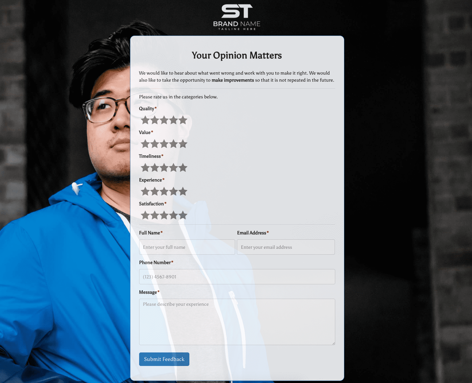 Your Opinion Matters Form