A visitor reaches a contact page because they are close to doing something: asking for a quote, booking a consultation, reporting a problem, requesting more information, or checking whether a service fits. At that moment, a dramatic brand image may be less useful than a simple visual that reduces uncertainty. Kimg AI can help businesses generate or edit supporting images, but the best contact-page visuals should clarify the next step instead of adding another layer of promotion between the visitor and the form.
Start With the Questions a Visitor Has Before Submitting
Contact forms often ask people to act before explaining what will happen afterward. Will someone call or email? Does submitting create a booking? How much detail should the message include? Is the form for sales, support, partnerships, or everything at once?
The visual should support those questions rather than distract from them. A service business might show a calm consultation setting, a repair company could use an accurate team-in-context photograph, and a B2B firm might use a simple process illustration showing “send request → team reviews → response follows.” The image does not need to explain the entire company. It should make the interaction feel understandable at the exact point where the visitor is deciding whether to submit.
Choose a Visual That Matches the Actual Response Process
The fastest way to create mistrust is to show an experience the business does not provide. A friendly video-call scene makes sense if the next step is genuinely a remote consultation. It is misleading if every inquiry receives an automated email and no call. A photograph of a local technician is useful only if the service actually involves on-site visits.
Before choosing imagery, write the real response process in one sentence. For example: “We review the form during business hours and reply by email with the next available consultation options.” Now the team can choose a supporting visual that fits that process. Accuracy here matters more than spectacle because the contact page is where expectations become operational.
Use Three Visual Questions Instead of “Does This Look Good?”
A contact-page image can be attractive and still make the page harder to use. Review it with three practical questions.
- Does It Explain or Distract?
If the visual sits beside a form, it should not compete with the fields. Busy scenes, multiple faces, decorative text, and strong movement can pull attention away from the action. A quieter composition often works better. Check the page at realistic size. If the visitor notices the image but loses track of the form, the visual is doing too much. Try reducing contrast or visual detail before replacing the entire concept.
- Does It Create the Right Expectation?
Look for implied promises. A 24-hour call-center image can suggest round-the-clock support. A boardroom scene can make a solo consultant appear to be a large agency. A medical-looking environment can imply regulated expertise that the company does not offer. The visual should feel representative without enlarging the business beyond reality. Check it against the service description and the actual people or places customers may encounter.
- Does It Still Work on Mobile?
On a phone, the image may appear above the form and push the actual action far down the page. Test whether it remains useful when stacked vertically. Sometimes the best mobile decision is a smaller crop, a simpler illustration, or no image at all. Visual design should help the contact task, not force every device to carry the same decoration. A mobile test should include the full path from arriving on the page to reaching the submit button.
Edit Existing Business Photos Before Generating a New Scene
A real photograph often provides stronger trust than a synthetic scene because it shows the actual environment, people, or service context. If the source is useful but messy, reference-based editing can be more appropriate than starting over. With Nano Banana AI, users can work from an uploaded image and describe focused changes.
A business might simplify a distracting background, adjust the visual treatment, or explore a crop that leaves more space beside the form. Keep the essential facts fixed: staff identity, uniforms, room layout, equipment, signage, and anything the visitor could later encounter in person. The edited result should still be checked against the original. If the tool changes a real detail, either correct it or choose another asset rather than publishing a cleaner but less truthful version.
Show Process When Process Is the Real Concern
Some contact pages benefit more from a small process graphic than from photography. A three-step sequence can answer what visitors are nervous about: submit details, receive a response, decide whether to continue. Keep the steps aligned with the real workflow and avoid invented timing such as “reply in five minutes” unless the business genuinely guarantees it.
The graphic can also reduce unnecessary form submissions. If the page explains that the first response will request project scope and budget range, visitors can prepare those details before writing. If support inquiries belong elsewhere, a visual or short note can direct customers to the correct channel. A useful contact page does not simply increase submissions; it helps the right person send the right information to the right team.
Put Reassurance Near the Action, Not Inside the Image
Important information should usually remain in HTML text rather than being baked into a generated visual. Response expectations, privacy notes, required fields, service areas, and accessibility information need to remain readable, searchable, and easy to update. The image should support the message, not contain the only copy that explains it. This is especially important for accessibility. A visitor using a screen reader should not lose critical instructions because the explanation exists only inside a decorative graphic. Keeping operational copy in the page also allows the business to translate, revise, or test it without recreating the image.
This also makes future changes easier. If the team changes its response method from phone to email, it can update a sentence without commissioning a new graphic. If a contact route closes temporarily, the notice can change immediately. Keep the visual relatively evergreen and put operational details in text the business controls directly.
Measure Whether the Page Reduces Friction. Do not judge the contact-page image only by form completion rate. A better page may reduce low-quality inquiries while helping serious visitors provide more useful information. Look at whether people abandon the form, whether common questions decrease, and whether staff spend less time clarifying what happens next.
You can also run simple user checks. Show the page to someone unfamiliar with the business for ten seconds, then ask what they think will happen after submitting. If their answer is wrong, the page needs clearer communication. The fix may be copy, layout, or visual choice. The important point is that the contact page should be evaluated as a task, not as a miniature brand campaign. If visitors consistently ask the same question after submitting, add the answer before the form or in the confirmation message. The best visual system works together with clear copy and routing; it cannot rescue a confusing process by itself.
Conclusion
Contact-page visuals should reduce uncertainty at the moment a visitor is deciding whether to reach out. Start with the real response process, choose imagery that matches it, test the page on mobile, and keep important operational information in text. AI can help explore or refine supporting visuals, but it should not create a fictional service experience. Open your current contact page and ask what a first-time visitor would expect after clicking submit. If the image suggests something different from the real process, change the expectation before you change the style.
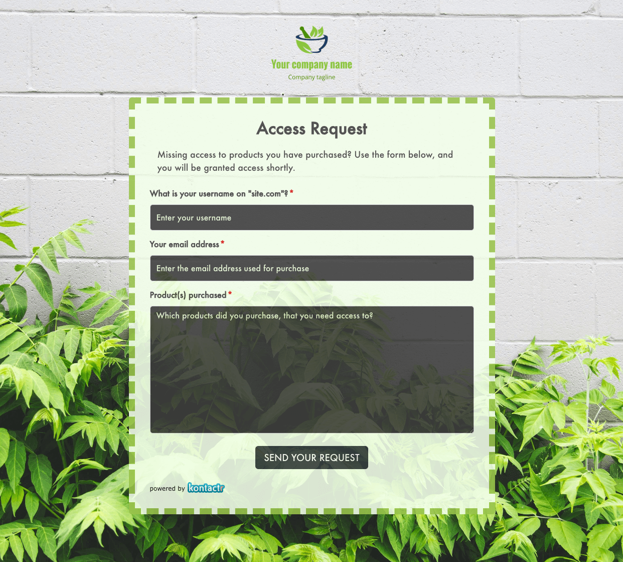 Access Request Form
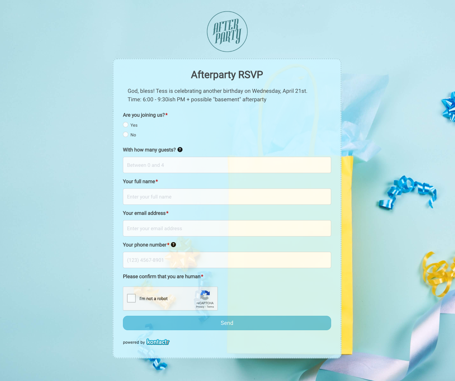 Afterparty RSVP Form
 Band Discovery Form
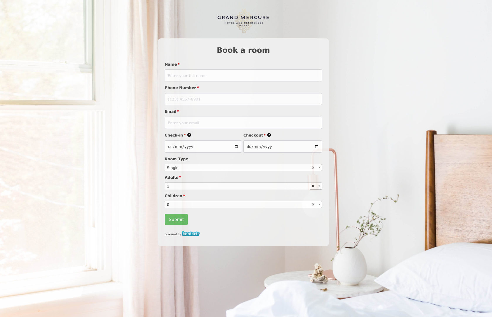 Book a room Form
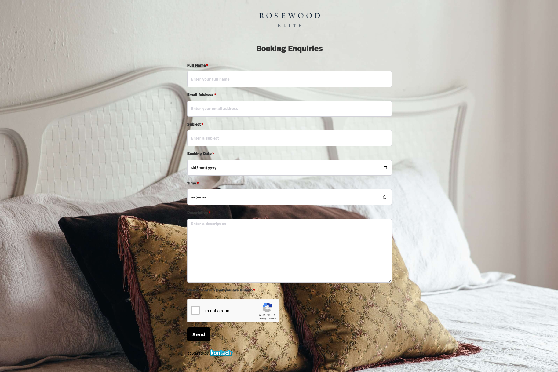 Booking Enquiries Form
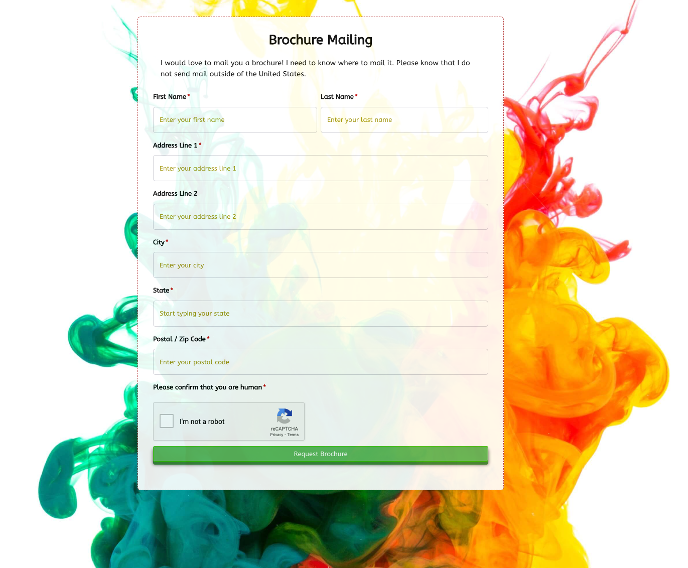 Brochure Mailing Form
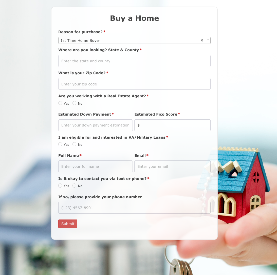 Buy a Home Form
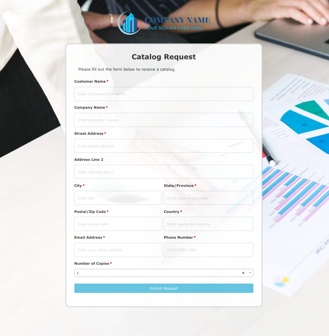 Catalog Request Form
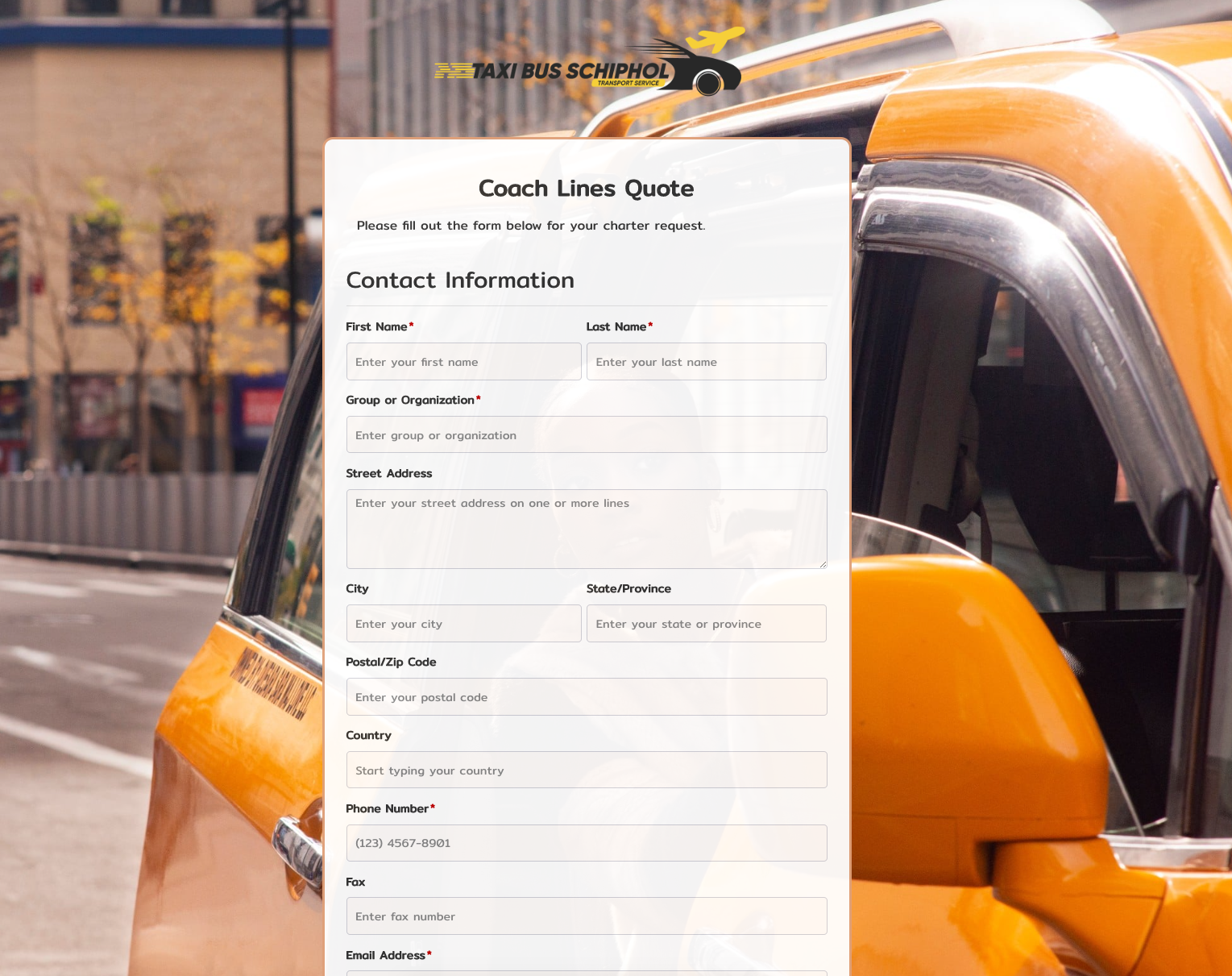 Coach Lines Quote Form
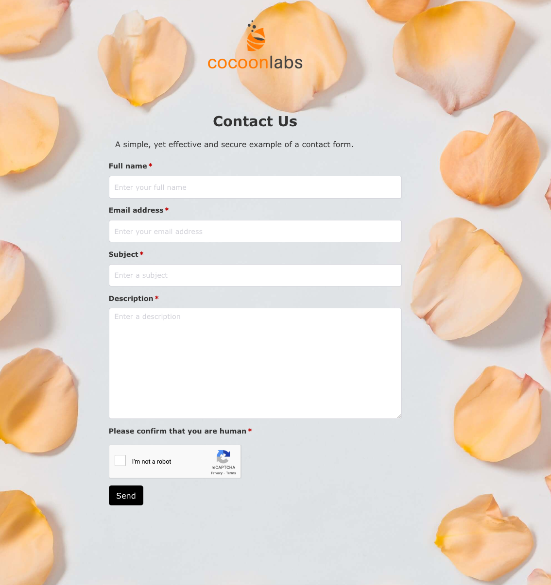 Contact Us Form
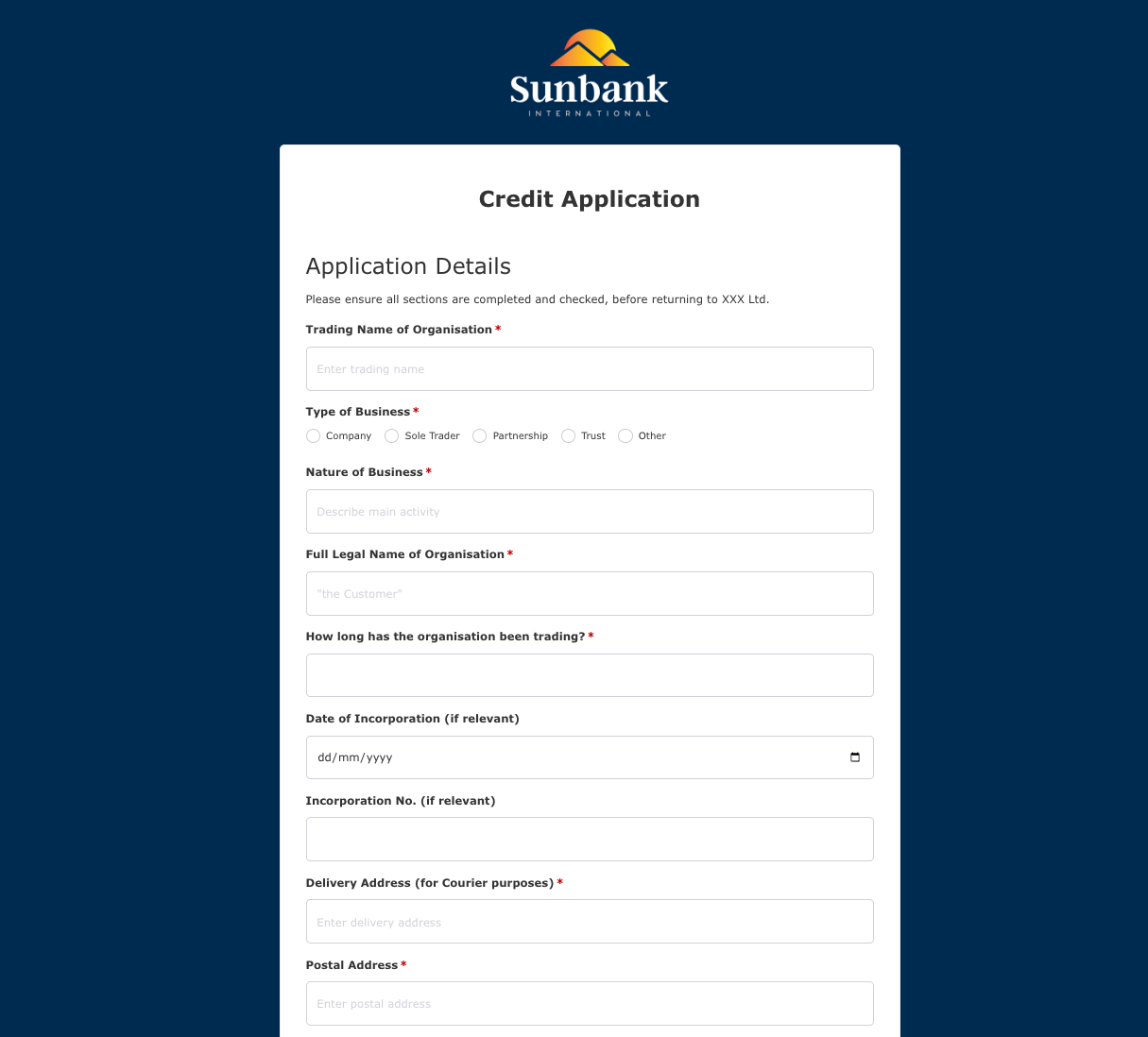 Credit Application Form
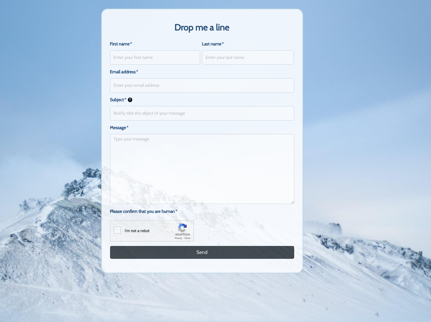 Drop me a line Form
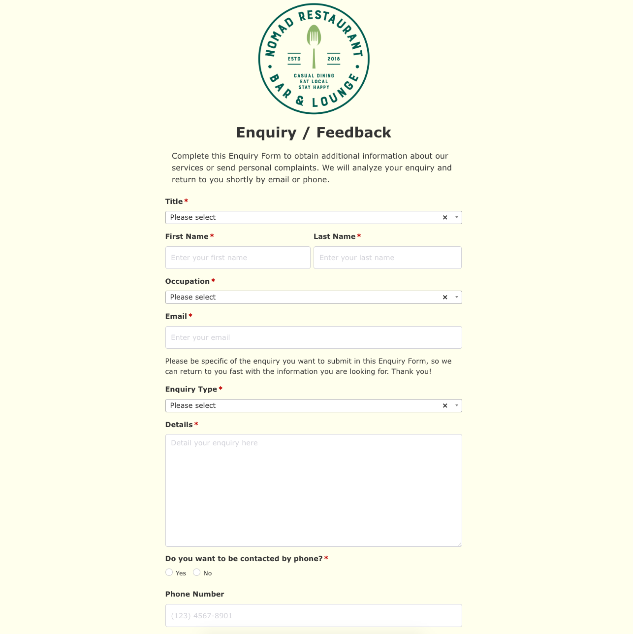 Enquiry / Feedback Form
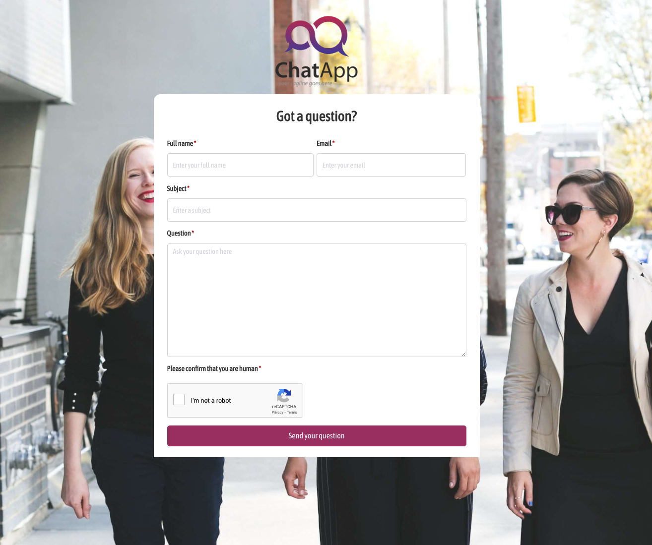 Got a question? Form
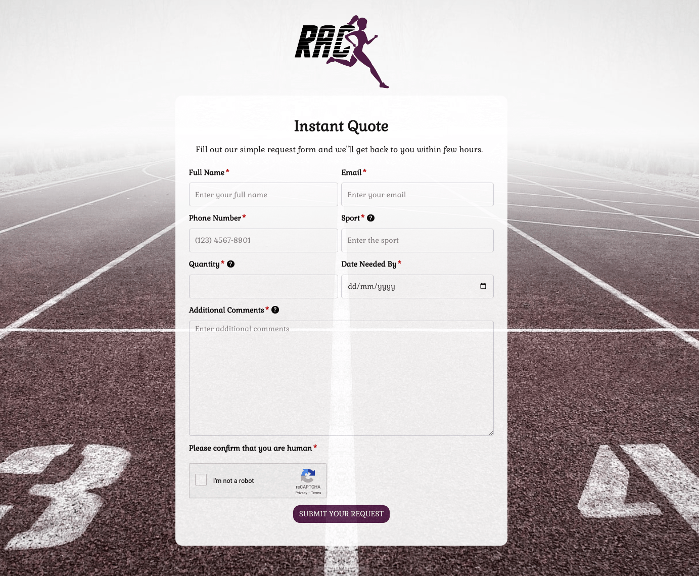 Instant Quote Form
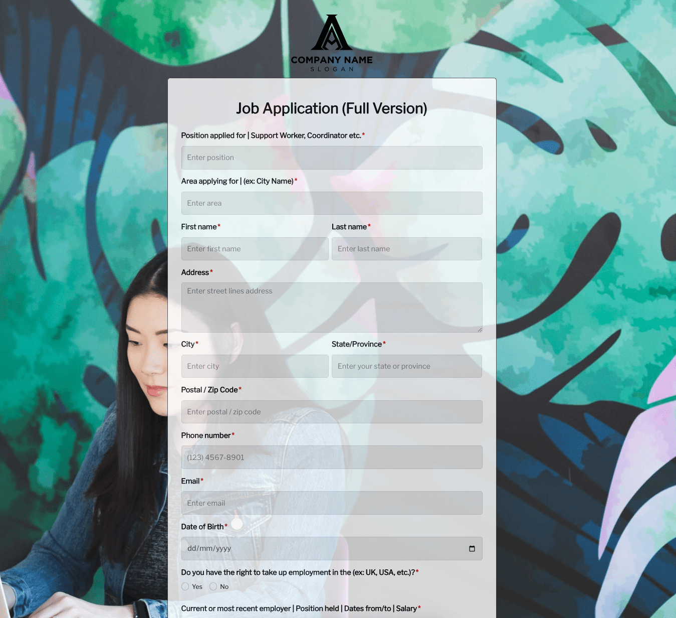 Job Application Form
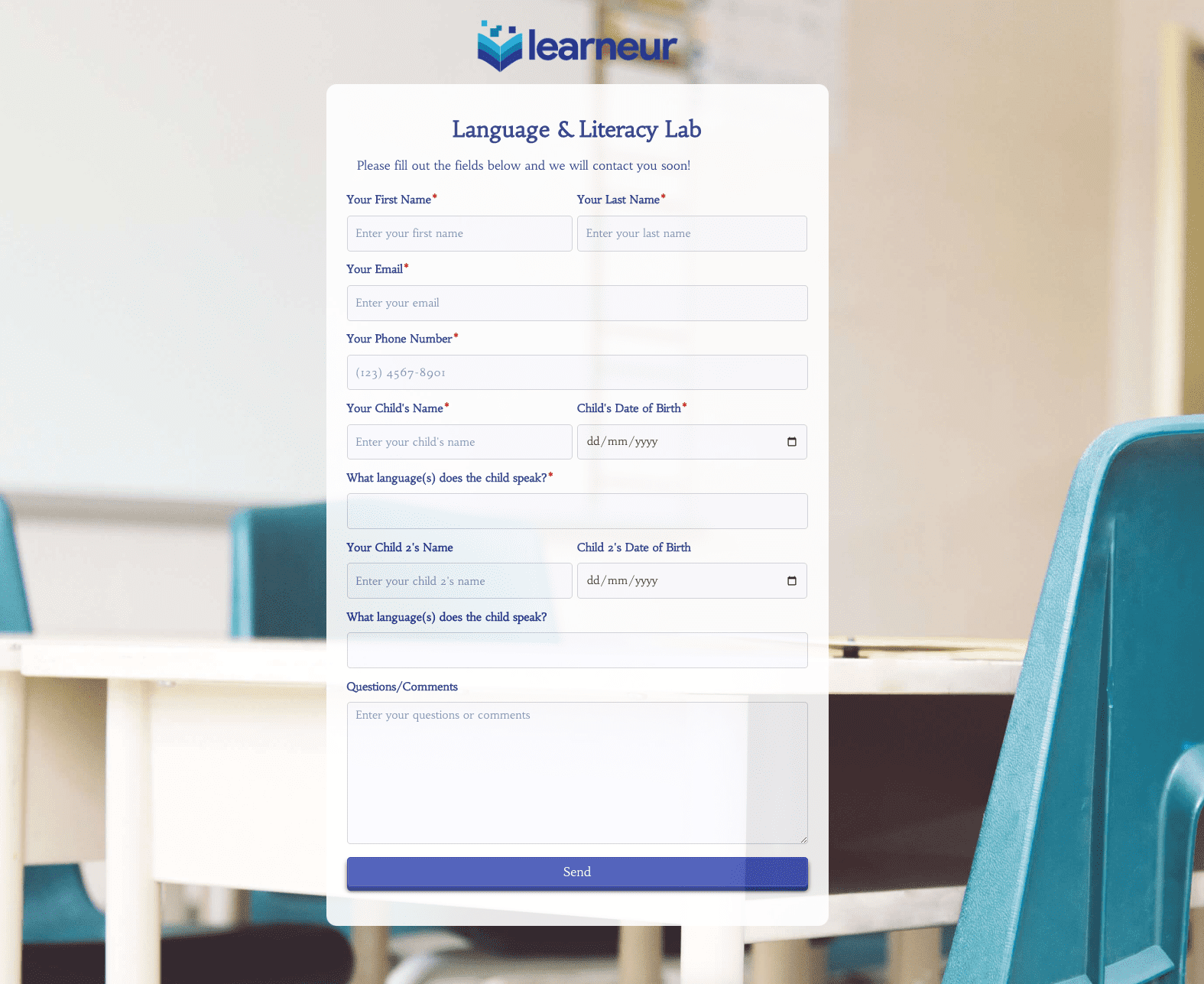 Language & Literacy Lab Form
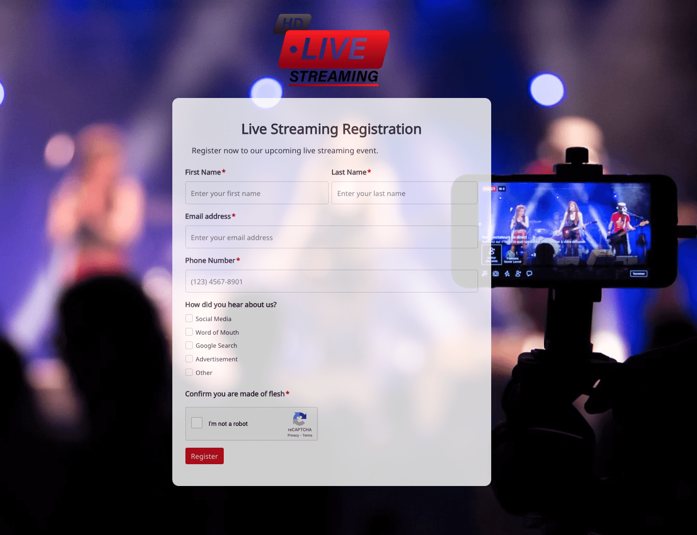 Live Streaming Registration Form
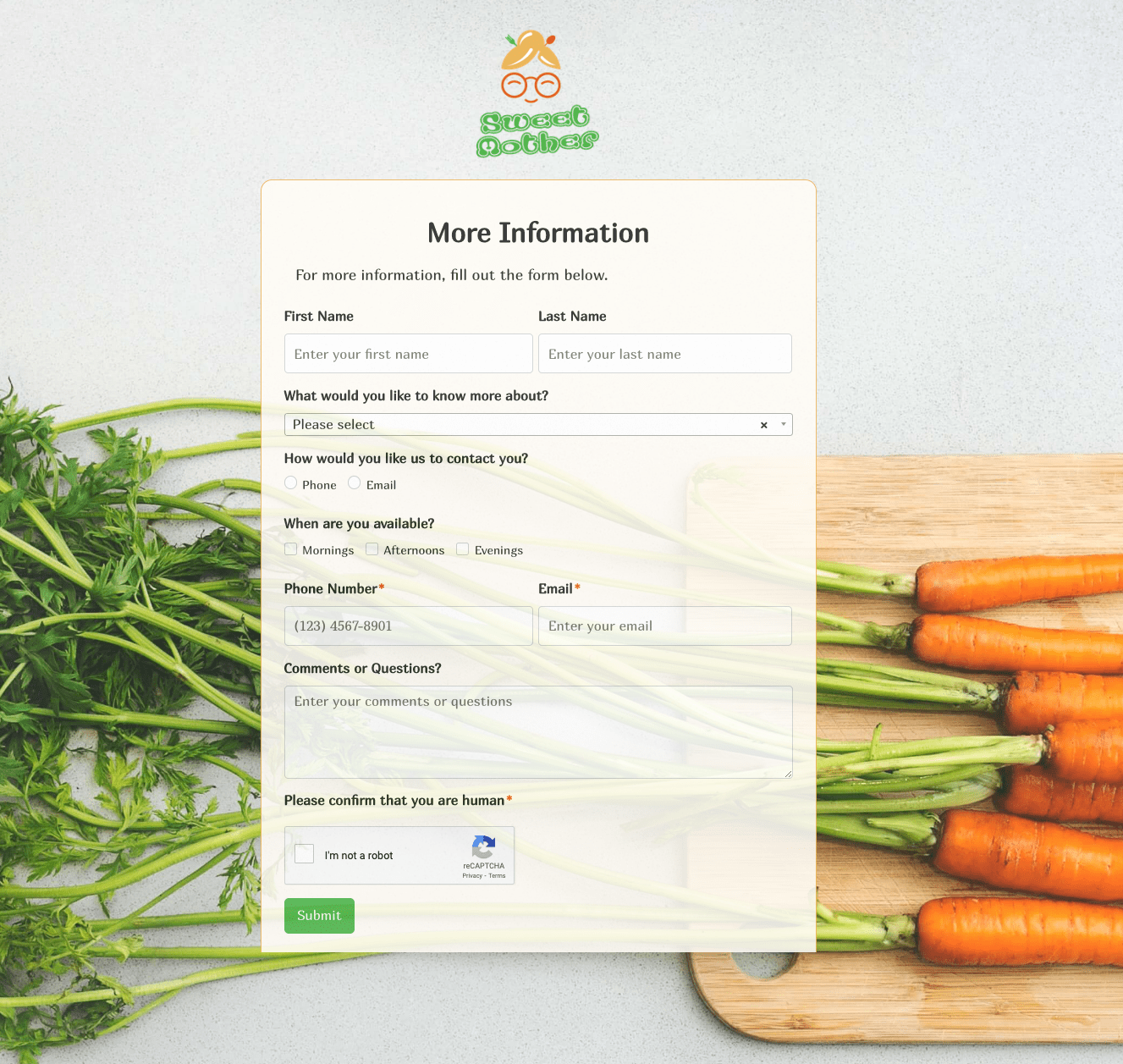 More Information Form
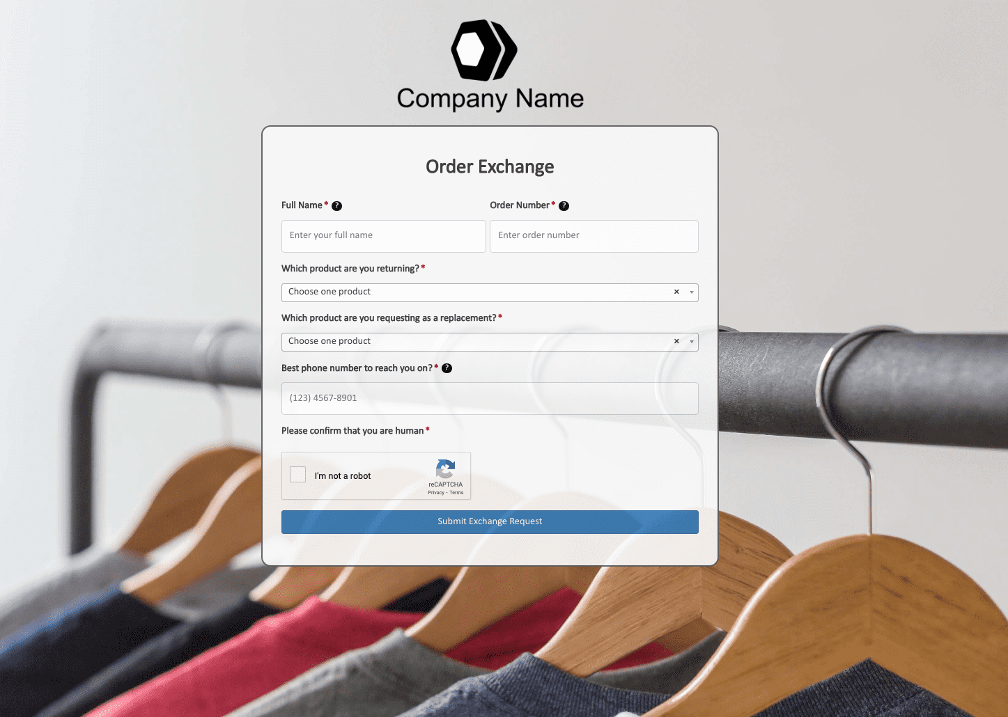 Order Exchange Form
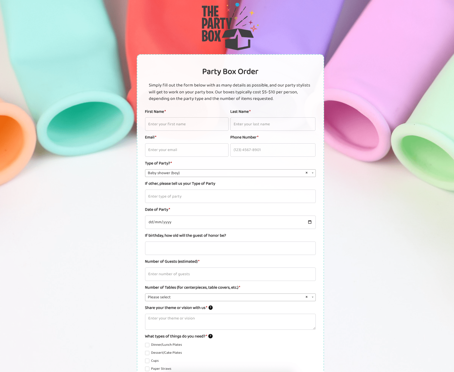 Party Box Order Form
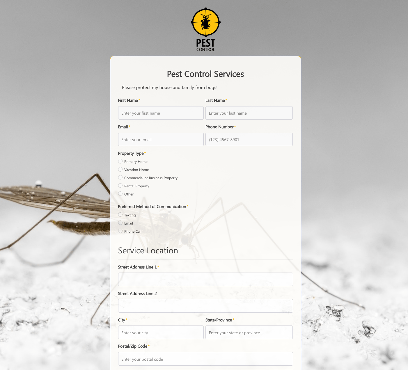 Pest Control Services Form
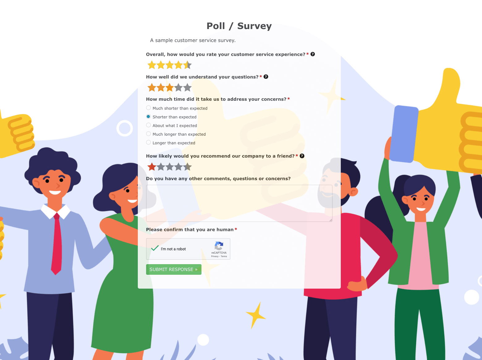 Poll / Survey Form
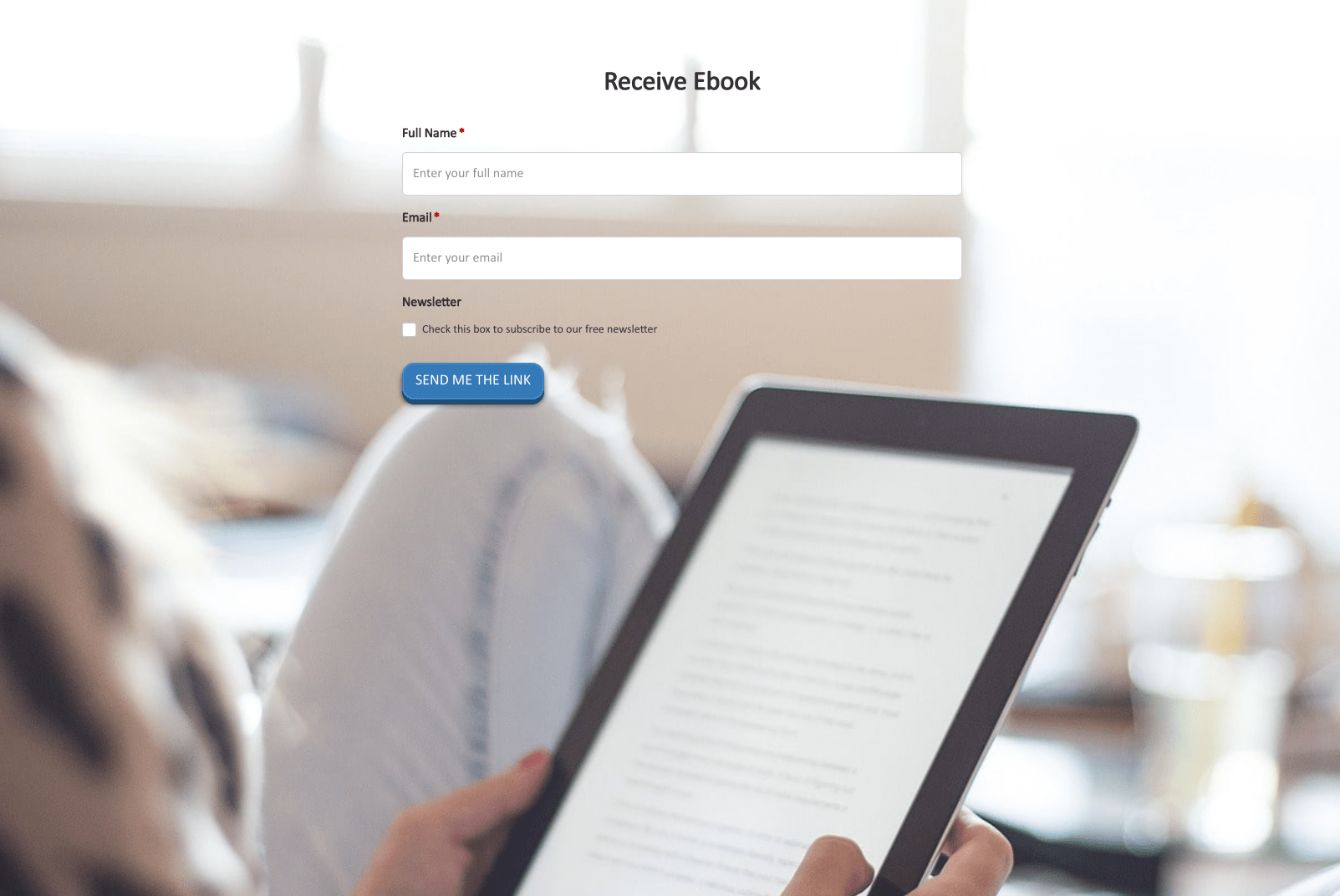 Receive Ebook Form
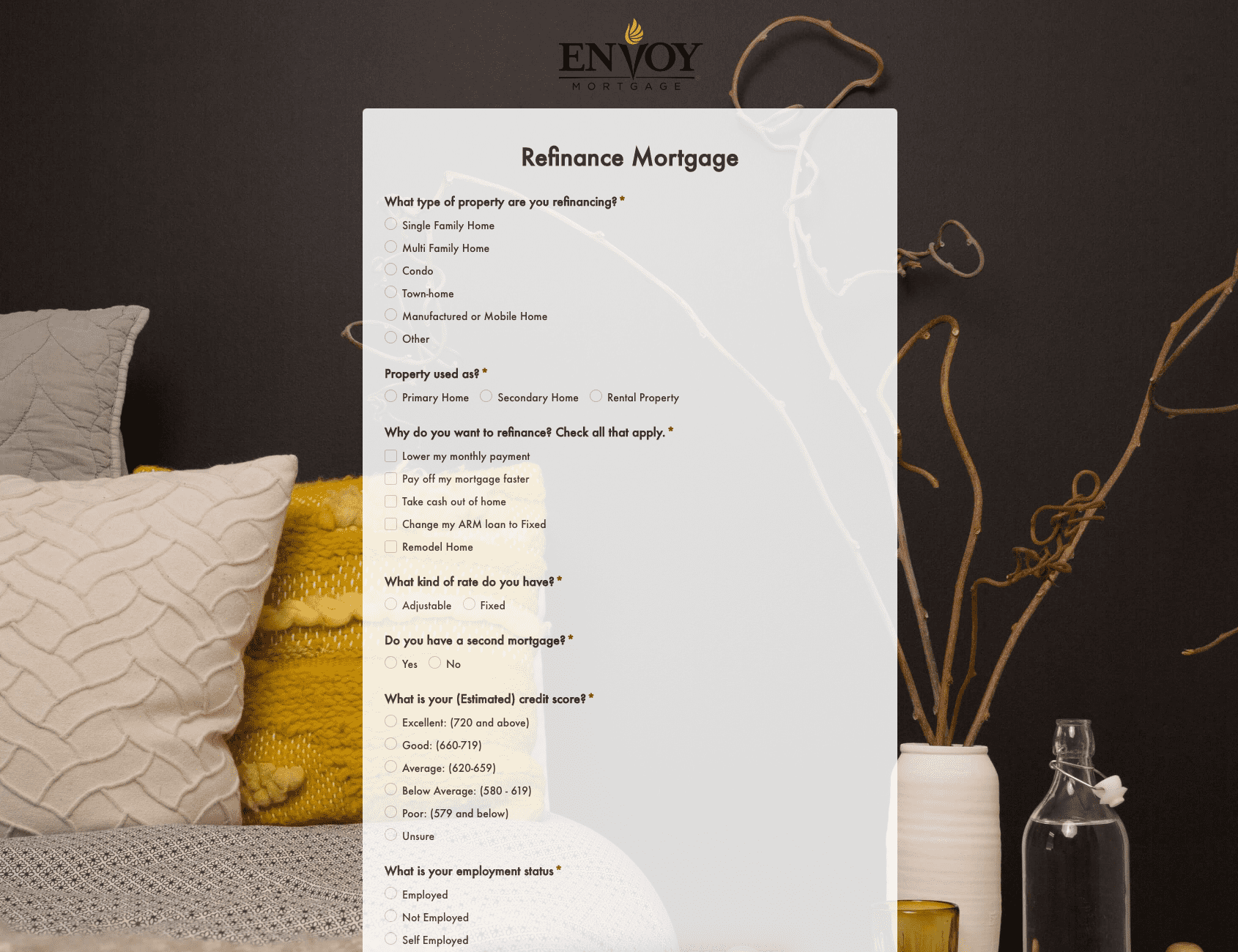 Refinance Mortgage Form
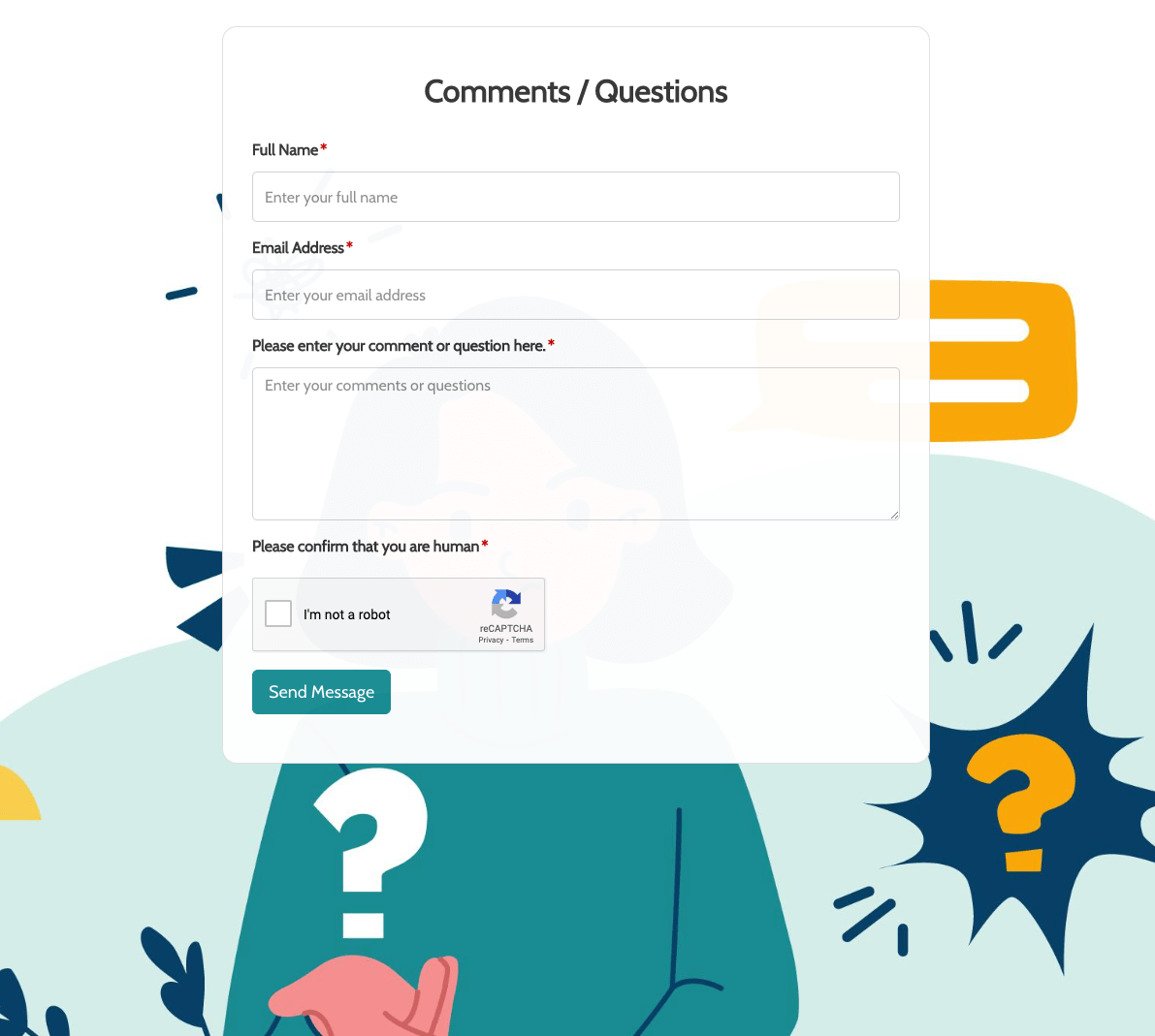 Remarks / Questions Form
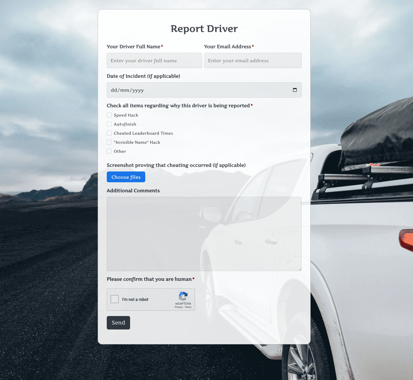 Report Driver Form
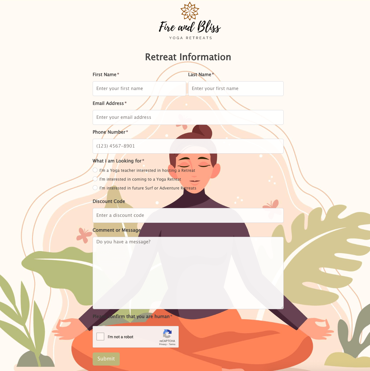 Retreat Information Form
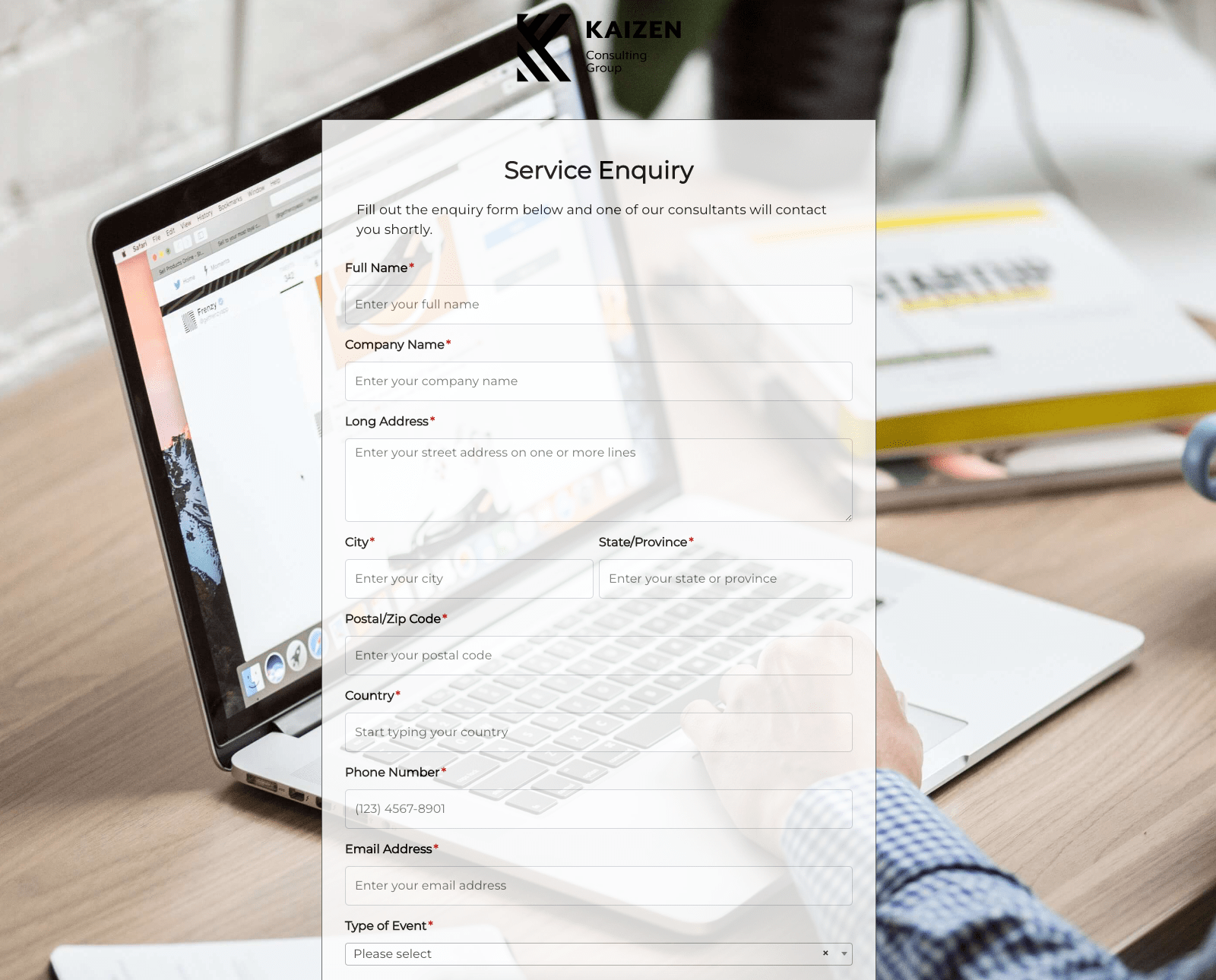 Service Enquiry Form
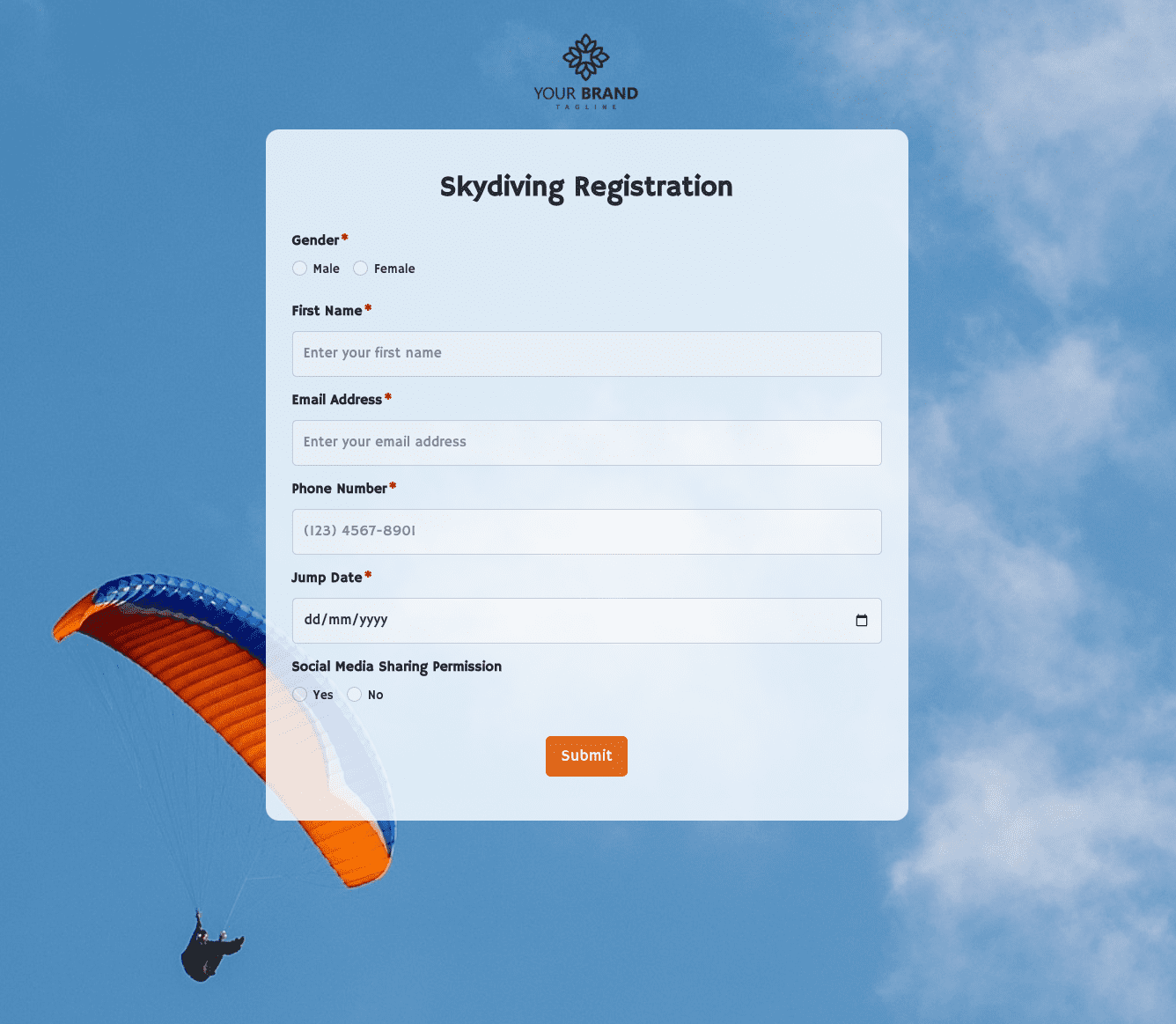 Skydiving Registration Form
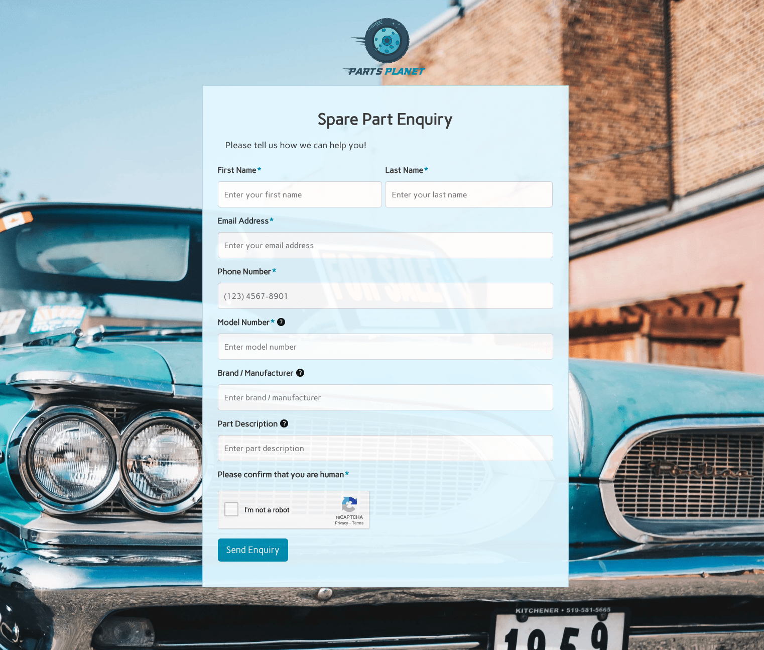 Spare Part Enquiry Form
 Staff Application Form
 Submission Form
 User Registration Form
 Website Under Construction Form
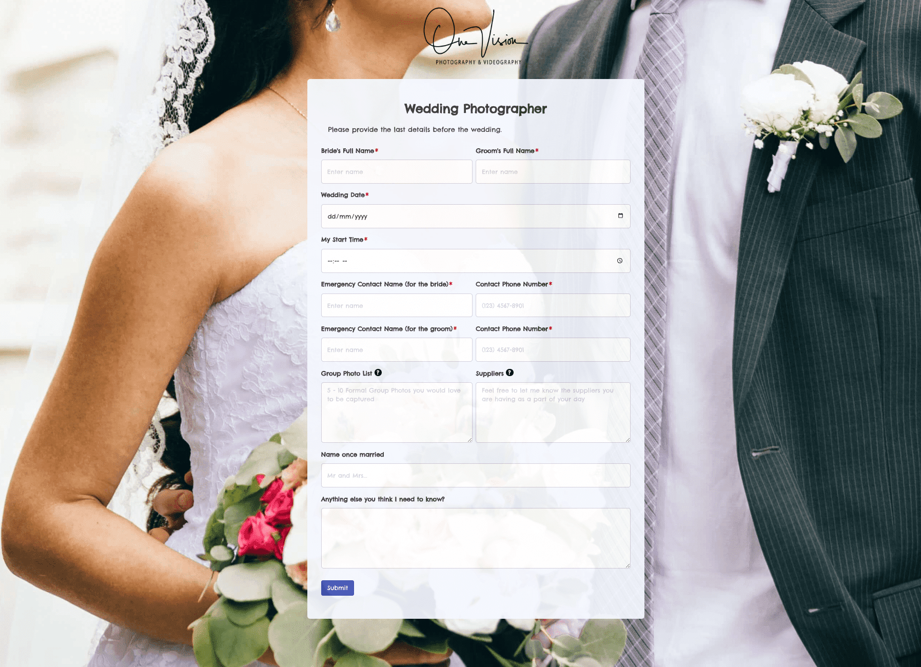 Wedding Photographer Form
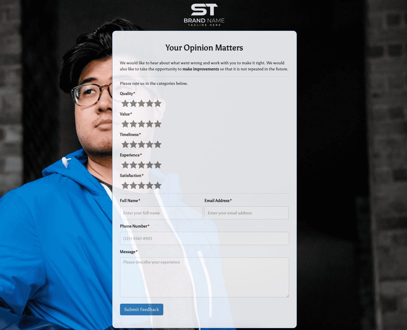 Your Opinion Matters Form